

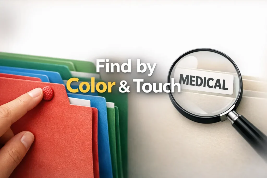
Stop the Paperwork Panic
A retrieval-first system designed for low vision and real-life pressure.
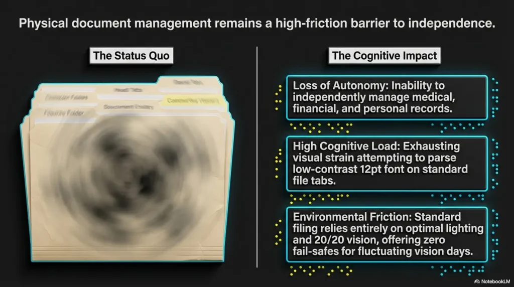
Paper rarely becomes a problem at a convenient hour. It hits when that insurance letter is needed now, the school form is due today, or the appointment note has vanished into a drawer that looked organized until real life touched it.
A low vision filing system using color + tactile tabs solves this chaos by making paper easy to find by sight, by feel, or both.
The frustration isn’t just clutter—it’s slow retrieval, illegible labels, and systems that fail when lighting is poor or fatigue sets in. We’re replacing domestic emergencies with reliability.
Table of Contents
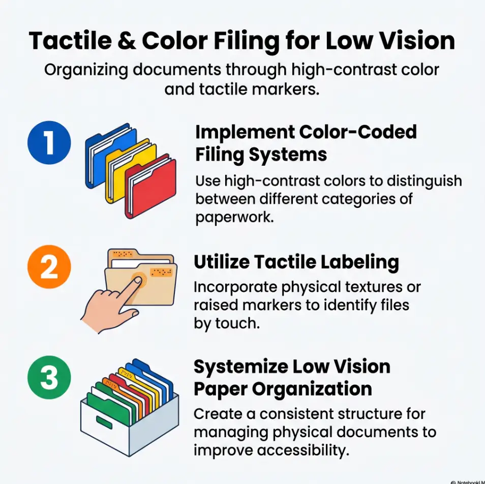
Infographic: The 3-Layer Filing Logic
Use color for the broad bucket: bills, medical, insurance, taxes, school.
Use one tactile signal per category: dot, ridge, square, strip, corner cut.
Use large-print labels and a fixed placement so the hand and eye learn one route.
Rule of thumb: if you cannot find an urgent paper in under one minute, the system is too complicated.
Low Vision Filing System First: What Problem Are You Actually Solving?
Is the real issue reading labels, finding categories, or remembering where papers belong?
Many people say, “I need a better filing system,” when the real problem is narrower. Sometimes labels are too small. Sometimes categories are too numerous. Sometimes the issue is memory: you filed something “somewhere safe,” which is organizational code for “future me will suffer.” The best low vision filing system begins by naming the exact breakdown point.
I learned this the boring way, which is how most good systems are born. I once helped sort a family drawer packed with receipts, lab summaries, old warranties, and one heroic coupon from another era. The owner did not actually struggle with sorting. She struggled with retrieval under pressure. Once we saw that, the whole design changed.
Retrieval speed matters more than perfect visual neatness
A beautifully arranged set of folders can still fail if it asks too much of your eyes or too much of your memory. In daily life, the winning question is not, “Does this look tidy?” It is, “Can I find the Medicare letter, school form, or tax receipt quickly without a little emotional weather event?”
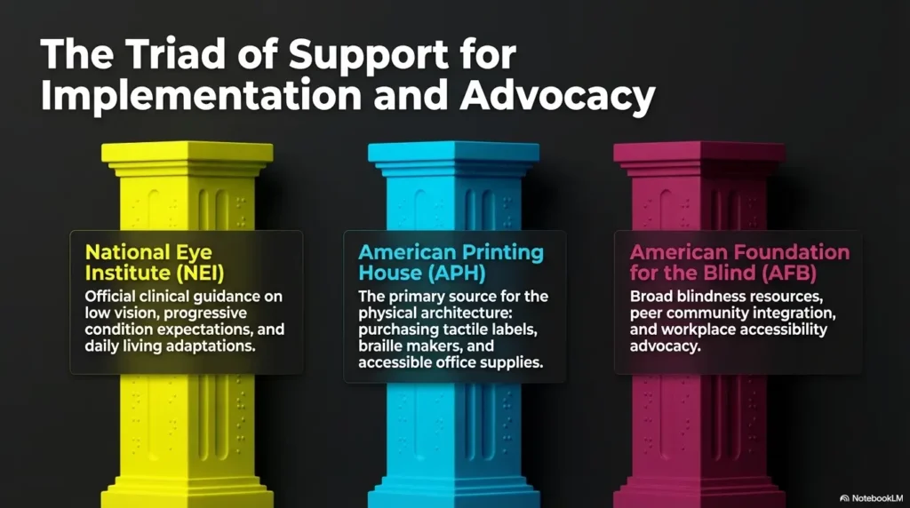
The National Eye Institute explains that low vision can interfere with everyday tasks and that higher contrast and larger text can help with reading and daily function. That matters here because filing is really a repeated reading-and-recognition task wearing the costume of a storage problem.
A better filing system reduces decision fatigue before it reduces clutter
Every extra category is a tiny choice. Every tiny choice taxes attention. If you are living with low vision, or supporting someone who is, that tax can pile up long before the drawer looks “messy.” A good system removes unnecessary choices. It lets your hands and eyes rehearse the same logic again and again until it starts to feel like muscle memory.
- Notice whether the failure happens during filing or retrieval
- Separate reading difficulty from category confusion
- Design for urgent moments, not ideal afternoons
Apply in 60 seconds: Pick one paper you needed this month and ask what made it hard to find.
Before You Buy Anything: Build Around How You Search
Do you look first, touch first, or use both?
This is where most advice gets too generic. Not everyone uses vision the same way, even under the broad label of low vision. Some people rely on contrast and shape. Some rely on touch first and visual confirmation second. Some move between the two depending on lighting, fatigue, glare, or time of day. Your filing system should respect that reality instead of pretending there is one “correct” sensory route.
Try a tiny experiment. Close your eyes and reach for a folder mock-up with one tactile marker. Then open your eyes and confirm the large-print label. If that sequence feels smoother than scanning with sight alone, your system should lean more heavily on touch. If color cues help you orient faster, keep them. Just do not ask color to do the entire job.
Home paperwork, medical records, and school papers need different logic
Paper categories often fail because they are organized by topic instead of by use. Medical papers are usually retrieval-sensitive. School papers can be deadline-sensitive. Bills can be action-sensitive. A warranty sheet may be archive-only until the one week it becomes the star of the show. The logic should reflect what you need to do with the paper, not just what the paper is.
Start with the papers you reach for under pressure
Begin with the documents that produce the most frantic drawer-diving. Insurance cards, medication summaries, tax forms, lease papers, school notices, utility bills, bank notices, benefit letters. These are the papers that reveal the true shape of the problem. Build around them first. Decorative order can wait in the lobby.
| Choose This | When It Fits | Time / Cost Trade-Off |
|---|---|---|
| By task | You need papers fast for action: pay, call, attend, submit | Faster retrieval, less “Where did I put it?” stress |
| By document type | You archive lots of similar records and review them in batches | Can be neat, but slower when urgency is high |
Neutral next step: Sort one stack into “needs action,” “needs reference,” and “archive later” before naming any folder.
Color Is a Cue, Not a Crutch: How to Use Color Without Overloading the System
Pick fewer categories so each color still means something
Color works best when it stays broad. Five or six main categories is often enough for a home system: bills, medical, insurance, taxes, school, and household records. Once you start inventing a separate shade for every tiny subcategory, color stops being helpful and becomes confetti with office-supply ambitions.
High contrast beats decorative color palettes every time
High contrast matters because many people with low vision find low-contrast materials harder to distinguish, especially in mixed or dim lighting. If two folders look lovely together but behave like cousins at dusk, they are not helping. Bold, distinct colors with clear contrast against labels and tabs usually win over anything pastel, glossy, or elegant in a suspiciously fragile way.
A practical note here: glossy materials can create glare, which is the visual equivalent of static. Matte folders, matte labels, and bold black text often outperform shinier supplies, even when the shiny ones look very convincing on a website. If glare is already a household headache, the same logic behind reading glossy mail without glare applies surprisingly well to paperwork storage too.
Why similar shades quietly sabotage fast retrieval
Blue versus blue-green sounds fine until the room light changes. Red versus dark orange sounds reasonable until fatigue arrives. The filing system should not require a color theory seminar before coffee. Distinct categories need distinctly different colors, and even then, color should only provide the first clue.
One system I liked used red for bills, green for medical, yellow for taxes, blue for insurance, and black for archive. Clean. Decisive. No folder looked like it was trying to be two things at once. That is the energy you want.
Show me the nerdy details
Color is useful because it speeds category recognition, but it is unstable across lighting conditions, material finishes, and individual differences in contrast sensitivity or color discrimination. Tactile confirmation reduces this variability. In practice, the most robust systems use color for broad orientation and texture or position for error-checking. Think of color as the headline and touch as the proofread.
Tactile Tabs Do the Heavy Lifting: What Your Fingers Should Recognize Instantly
Raised dots, textured stickers, cut shapes, and tab position all create different signals
Tactile tabs do the job that color cannot finish. Your fingers should be able to tell you, quickly and without drama, which broad category you are touching. Raised dots, foam stickers, textured tape, hook-and-loop pieces, corner cuts, or even tab placement can all work. The best choice is the one that remains distinct after repetition, dust, rushed handling, and the occasional encounter with a crowded drawer.
One texture per category is easier than one texture per file
This point saves people from building a system that feels clever on day one and impossible by week three. Assign one tactile marker to each main category, not each individual file. For example: raised dot for medical, horizontal strip for bills, square bump for insurance, corner notch for taxes, ribbed tape for school. Keep the vocabulary small enough that the hand can learn it. The same principle shows up in tactile label placement for pill bottles: one clean, repeated signal usually beats elaborate customization.
American Printing House has long supported tactile communication and tactile labeling systems, and that principle carries beautifully into home paperwork: tactile information works best when it is simple, repeated, and meaningful.
Here’s what no one tells you: tactile clutter becomes its own confusion
If every folder sprouts three textures, two stickers, a giant clip, and a heroic attempt at customization, the result is not more accessible. It is a tiny hedge maze. Tactile systems need restraint just as much as visual systems do. Your fingers should encounter one decisive clue, not a committee meeting.
Practical benchmark: With eyes closed or softened, you should be able to separate the five main categories by touch in under 20 seconds.
| Tier | Best For | What Changes |
|---|---|---|
| Tier 1 | Mostly visual users | Large print + color only |
| Tier 2 | Mixed sensory users | One tactile marker per category |
| Tier 3 | Touch-first retrieval | Tactile markers + fixed tab positions + bold labels |
Neutral next step: Build one sample folder for each main category and test them with your hands before buying more supplies.
Category Design That Holds Up on Busy Days
Use broad top-level folders before creating subfolders
People often overestimate how much detail they need and underestimate how tired they will be when using the system. Start with broad top-level folders. Inside those, you can add one or two subfolders later if a category becomes unruly. But do not begin with twelve micro-sections unless you enjoy filing papers as a side quest.
Bills, medical, insurance, taxes, school, and receipts need distinct retrieval logic
These categories are not all equal. Bills need current action. Medical papers often need quick history or appointment support. Insurance papers may need reference during calls. Taxes require both current-year focus and long-term storage. School papers swing between deadline panic and archive quiet. Receipts are usually temporary until proven otherwise. Design around how long each paper remains useful and how urgently it may be needed.
If every folder feels important, the system will fail when you are tired
This is the paradox of home paperwork. If everything is marked “important,” then nothing is easily retrievable. Give a small number of categories the premium front-row location. Urgent, active papers go where the hand lands first. Archive material goes farther back, lower down, or in a separate bin. Accessibility is also geography.
In one household I helped reorganize, the breakthrough was not a fancy label maker. It was moving active medical and bills to the first six inches of the drawer. The user stopped “searching” and started “reaching.” That is a very different feeling. The same retrieval-first mindset also helps in other routines, like a low vision grocery list system where the point is not prettier categories, but less friction when real life is moving fast.
- Separate active papers from archive papers
- Keep high-urgency categories physically closest
- Add subfolders only after repeated real-world use
Apply in 60 seconds: Move the two categories you need most often to the easiest-to-reach spot.
Who This Is For and Who It Is Not For
Best for people who handle recurring paper documents at home
This setup shines for households where paper still arrives like a steady little weather system. Benefit notices, bank mail, appointment summaries, school forms, household receipts, rental paperwork, tax documents. If these papers keep recurring, a color-plus-tactile system can lower friction every single month.
Helpful for caregivers creating a shared system another person can learn
Caregivers often inherit a double challenge: creating order while protecting independence. A good shared filing system should not turn the person with low vision into a guest in their own paperwork. It should make the system more legible to everyone while still being learnable by the primary user. That means consistent names, predictable placement, and tactile cues that do not require somebody else to translate them each time. If you are building this system with a partner or spouse, some of the same emotional and practical ground appears in helping a spouse with vision loss.
Not ideal for households that should switch to mostly digital storage instead
Some homes are drowning in paper because the paper should no longer exist in its current form. If nearly every document can be scanned, stored digitally, and retrieved more reliably by voice search or accessibility tools, then building a large paper architecture may be the wrong project. A hybrid approach often works best: keep only active originals and legally important papers in tactile folders; move the rest to accessible digital storage. In that kind of setup, iPhone scan settings for low vision can make the digital half of the system much more usable.
- Strong fit: recurring home paperwork, mixed-ability households, routine document retrieval
- Partial fit: mostly digital households that still keep a few critical originals
- Poor fit: giant paper archives better handled by scanning and secure digital indexing
Labeling Rules That Stay Readable Six Months Later
Large print, plain language, and short category names win
Labels should read like road signs, not like essay titles. “Medical,” “Bills,” “Insurance,” “Taxes,” “School,” “Receipts,” “Archive.” Short words reduce visual clutter and make re-learning easier. Large print matters. High contrast matters. Plain language matters. A label that feels too obvious is often exactly right.
Put labels in predictable places every single time
Consistency is underrated because it is not glamorous. But consistency is what lets the hand and eye learn a route. If labels appear on the top right sometimes, middle left other times, and tucked under the tab on one unusually creative afternoon, the system becomes a guessing game. Predictable placement reduces search time far more than decorative variation ever will.
Let’s be honest: tiny handwritten labels turn into guesswork surprisingly fast
At setup time, handwriting often feels charming and flexible. Six months later, it often feels like archaeology. Smudges happen. Pen pressure varies. Abbreviations drift. If you can use printed labels, do it. If handwriting is the only option, use thick black marker, block letters, and repeat the same word every time. “Med” on one folder and “Health” on another is how confusion slips in wearing polite shoes.
Eligibility checklist
Use large-print, fixed-position labels if the answer is “yes” to most of these:
- Yes / No: Do labels become hard to read in evening light?
- Yes / No: Do multiple people use the same drawer or binder?
- Yes / No: Do you confuse similar categories when rushed?
- Yes / No: Do handwritten labels vary from month to month?
Neutral next step: If you answered “yes” to two or more, standardize all front-facing labels this week.
Common Mistakes That Make a Low Vision Filing System Harder, Not Easier
Using too many colors because the supplies looked helpful
Office stores are full of optimism. Multicolor tabs whisper sweet promises. Resist. Too many colors dilute meaning. You do not need a rainbow if your system only has five decisions. A smaller palette creates stronger recognition.
Changing label language from folder to folder
Humans love synonyms. Filing systems do not. “Utilities,” “Bills,” “Monthly,” and “Pay Now” may all make sense in the moment, but not together. Pick one naming logic and keep it. Either label by category or by action, but do not wander between the two every time inspiration strikes.
Mixing temporary papers and permanent records in the same category
This is one of the quietest causes of drawer chaos. Temporary papers move quickly. Permanent papers should stay stable. When they live together, the whole folder becomes a rummage event. Use an “active” and “archive” split whenever a category contains both current action items and long-term records.
Building a system that only makes sense when the creator is standing beside it
If another person cannot use the system without a tour, it is too custom. This matters for caregivers, spouses, older parents, and future-you on a sleep-deprived Tuesday. Good systems are teachable. Great systems are almost self-explanatory.
Quick reality test: ask someone else to retrieve one document using only the folder names and tactile cues. If they freeze, the system needs simplification.
Don’t Do This: The “Pretty but Fragile” Setup Trap
Fancy tabs that peel off, bend, or feel too similar create daily friction
Some supplies are designed more for a photo than for a household. Thin tabs peel. Soft textures flatten. Delicate stickers curl like they have strong opinions about humidity. If the tactile cue disappears after a few weeks, you do not have a system. You have a short-lived craft project with paperwork attached.
Overstuffed folders erase both color and tactile clarity
Overstuffing is the enemy of recognition. When folders bulge, tabs hide, colors compress, and tactile markers become harder to find. The fix is not better searching. The fix is capacity management. Split thick categories, archive regularly, and stop asking one folder to behave like a suitcase.
A filing system should survive rushed mornings, not just a setup afternoon
This is the standard that matters. Can the system survive a doctor’s call, a caregiver handoff, a late school notice, and a phone battery at 9 percent? If not, simplify. The goal is not fragile perfection. The goal is dependable function when life gets loud.
Short Story: A caregiver once told me she knew her old system had failed when everything looked beautiful until someone actually needed something. The folders matched. The tabs were crisp. The labels were tasteful in that expensive, whispery way. Then came an urgent call about an appointment time and nobody could quickly find the updated paperwork.
We replaced the elegant palette with five bold colors, swapped the thin tabs for chunky tactile markers, and moved active medical papers to the front. It was less charming. It was far more humane. A week later, she said the drawer no longer felt like a test. That sentence stayed with me. Good organization should not feel like an exam you forgot to study for.
- Choose matte, sturdy supplies over delicate ones
- Split overfilled categories before they become hard to handle
- Test the system during a rushed moment, not only during setup
Apply in 60 seconds: Open your fullest folder and remove anything that clearly belongs in archive storage.
Don’t Over-Sort Too Early: Why Micro-Categories Usually Backfire
Too many subfolders slow filing and retrieval at the same time
Micro-categories promise control, but they often produce friction. “Medical” becomes “labs,” “appointments,” “prescriptions,” “specialists,” “imaging,” “referrals,” “insurance correspondence,” and suddenly the system requires both concentration and a decent memory. That defeats the purpose.
A simple “active vs archive” split often fixes more than extra detail does
Most paper confusion is not caused by too little detail. It is caused by mixing current material with old material. An “active” folder handles what you may need soon. An “archive” folder stores what you keep for records. This split solves more problems than many households expect. It is not flashy, but neither is finding your form on the first try. That kind of success tends to be modest and glorious at the same time.
The best system is the one you can reset after a messy week
A resilient system is not one that prevents all mess. It is one that lets you recover quickly. If papers pile up for four days, can you sort them back into place in ten minutes? If yes, the architecture is sound. If no, you may have built a museum instead of a working drawer.
Mini calculator
Estimate whether your categories are too detailed:
- Input 1: Number of top-level categories
- Input 2: Average subfolders per category
- Input 3: Times per month you retrieve urgent papers
If top-level categories exceed 6 and average subfolders exceed 3, your paper system is probably asking too much during urgent retrieval. If urgent retrieval happens more than 4 times a month, simplify first and refine later.
Neutral next step: Merge any subfolder you have not needed in the last 60 days.
Shared Home, Shared System: How to Make It Work for Other People Too
Teach the meaning of each color and texture with a one-page key
A shared system needs a common legend. Keep one printed key inside the drawer lid, on the binder cover, or beside the file box. Red dot = bills. Green ridge = medical. Blue square = insurance. Yellow notch = taxes. The key should be plain enough that a visitor, spouse, adult child, or respite caregiver can use it without ceremony.
Keep household naming consistent across binders, drawers, and trays
If the drawer says “Bills” but the incoming tray says “To Pay” and the binder says “Utilities,” you are quietly teaching three systems at once. Do not do that to yourself. Use the same words everywhere. Shared language is an accessibility feature.
A caregiver-friendly system should still preserve the user’s independence
This matters more than it may appear. Accessibility is not just about helping someone retrieve a paper. It is also about protecting agency. A good caregiver setup lets help happen without making the user more dependent than necessary. That often means tactile confirmation, one-page instructions, and a small number of front-row categories that the user can reach and interpret on their own.
Hadley and similar vision-loss support organizations often emphasize practical, daily-life independence, and this is exactly that kind of work. Not glamorous. Deeply useful. For some families, pairing the paper drawer with a low vision calendar system for appointments makes the whole routine feel more coherent and less improvisational.
Setup Day Blueprint: How to Build the System in One Afternoon
Step 1: Reduce categories before labeling anything
Start with broad buckets. Aim for five main categories. Put every paper into one of them. If you are hovering over a pile muttering “Well, technically…,” that is your sign to keep the category broad for now.
Step 2: Assign one color and one tactile signal to each main category
Do not skip the one-to-one pairing. Each main category gets one color and one tactile cue. Keep a simple record while building. This prevents mid-project improvisation, which is often how systems wander off into the woods.
Step 3: Label folders in large print with consistent wording
Use short words, bold print, high contrast, and fixed placement. Make every folder feel like it belongs to the same system, not to a family of distant cousins who stopped speaking in 2019.
Step 4: Test retrieval with real-life papers, not empty folders
Empty folders flatter us. Real paperwork tells the truth. Load each category with actual papers and practice retrieval. Can you find a bill, insurance card, appointment sheet, and tax receipt quickly? If not, the test is doing you a favor. If receipts are one of your chaos pockets, building them into a broader paper routine can pair nicely with iPhone receipt reading settings for the moments when you need to read rather than file.
Step 5: Remove any cue that causes hesitation
Hesitation is data. If a color looks too similar, change it. If two textures feel alike, replace one. If a label feels vague, rewrite it. Do not defend a bad cue just because you already bought it. Sunk costs make terrible organizers.
Quote-prep list
If you are buying supplies or comparing accessible storage options, gather these first:
- How many main categories you actually need
- Whether the user is touch-first, sight-first, or mixed
- Drawer, binder, portable file, or desktop tray dimensions
- Whether labels need to be removable or permanent
- How many active papers each category holds in an average month
Neutral next step: Measure your storage space before you buy tabs, bins, or folders.
FAQ
What colors are easiest to distinguish in a low vision filing system?
Usually the best choices are bold, high-contrast colors that are clearly different from one another, such as red, blue, green, yellow, and black. Avoid similar shades, glossy finishes, and decorative palettes that blur under changing light. Test colors in the actual room where the files will live. If lighting is part of the problem, even small changes like better reading lamp placement for central vision loss can make labels easier to distinguish.
Are tactile tabs better than large-print labels alone?
For many users, yes. Large-print labels help with visual confirmation, but tactile tabs make retrieval more reliable when lighting is poor, fatigue is high, or contrast is inconsistent. The strongest system often uses both, with touch confirming what color suggested.
How many filing categories should a beginner start with?
Five to six main categories is a sensible starting point for most households. That is enough to create order without asking the user to memorize an entire filing taxonomy. You can always refine later if one category becomes too full.
What papers should stay in an active file versus an archive file?
Active files should hold documents you may need soon: unpaid bills, current appointment papers, recent school notices, this year’s tax documents, pending insurance correspondence. Archive files should hold records you keep for reference but do not need often, such as past statements, older receipts, prior-year school papers, or completed claim documents.
How do I make a filing system that a caregiver can also use?
Use broad categories, fixed label placement, one tactile cue per category, and a one-page legend. The system should make sense even when the primary organizer is not present. Shared language across drawers, trays, and binders matters more than clever customization.
What if color perception is inconsistent or changes in different lighting?
Lean more heavily on tactile cues and large-print labels. Color should still help with orientation, but it should not be the only signal. Low vision can interact with glare, contrast, and fatigue in ways that make color less dependable than people expect. If evening brightness or harsh screens make visual confirmation harder, adjustments like Reduce White Point vs. Night Shift can also support the digital side of your workflow.
Can this kind of filing system work in a small apartment?
Absolutely. In smaller homes, a compact file box, one drawer, or a slim binder system can work very well. The trick is limiting categories, keeping active papers separate from archive papers, and choosing tactile markers that do not add bulk.
Should important documents be stored in folders, binders, or portable cases?
It depends on use. Folders are good for quick category sorting. Binders work well when you need sequential review and protected sleeves. Portable cases are useful for grab-and-go papers or emergency records. Many households benefit from using all three for different purposes rather than forcing one tool to do every job.
Next Step: Build One Drawer Before You Reorganize the Whole House
Choose five real-life categories you use every month
Do not start with the attic, the mystery box, or the archive cabinet that contains three user manuals for appliances that have already gone to a better place. Start with one drawer and five categories you touch regularly. That is where confidence grows.
Assign one color and one tactile signal to each
Make the pairings obvious, durable, and easy to remember. If you need to write them down, good. Write them down. Clear systems are not born from bravado.
Test whether you can retrieve two urgent documents in under one minute
This is the closing loop from the beginning. The point was never a prettier drawer. It was dependable retrieval under real conditions. If you can locate two urgent documents in under one minute, your system is beginning to do its job. If not, simplify before expanding. One working drawer is worth more than a whole house of ambitious categories.
- One drawer is enough to prove the system
- Five categories are enough to begin
- Retrieval speed is the success metric that matters
Apply in 60 seconds: Write your five categories on a scrap sheet and assign each one a color and texture before buying anything.
| What competitors usually do | How this article avoids it |
|---|---|
| Treat color coding as the whole solution | Frames color as secondary to tactile confirmation and retrieval behavior |
| Offer generic decluttering advice | Centers accessibility, recognition by feel, and low-friction retrieval |
| Focus on aesthetic organization | Prioritizes function under stress, fatigue, and real household use |
| Recommend too many supplies and categories | Pushes category restraint, cue consistency, and simpler architecture |
| Ignore shared-use households | Includes caregiver and household usability from the start |
| End with vague encouragement | Gives one concrete next action tied to a measurable test |
The quiet promise of a good filing system is not visual order. It is relief. It is the feeling that when life asks for a paper, your hand knows where to go. Build one drawer. Keep the categories broad. Let color point, let touch confirm, and let the layout earn trust through repetition. In the next 15 minutes, choose five categories, assign one color and one tactile cue to each, and test your first retrieval. That small beginning is often where the whole house finally starts to feel more navigable.
Last reviewed: 2026-04.