

Design with Clarity: High-Contrast Solutions for Low Vision Safety
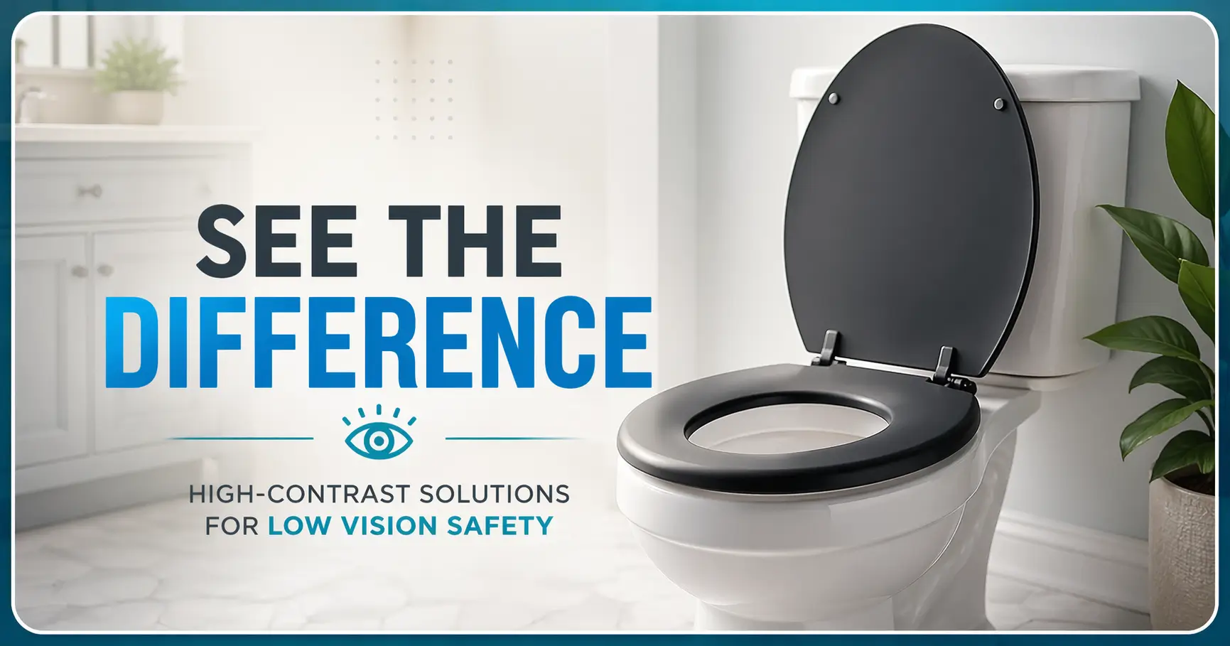
Some bathrooms look calm and perfectly ordinary until the toilet seat disappears into shadows. For those with low vision, this visual failure turns a familiar room into a place of hesitation. Contrast is not about being loud—it’s about restoring confidence.
Choosing the right seat color helps the eye find its target instantly, especially during nighttime trips or in “white-on-white” bathrooms where edges blur. By changing one high-impact variable, you prioritize dignity-friendly design over costly renovations.
Judge the seat in your real environment, not from a polished photo. Let the room tell the truth.
Table of Contents
Fast Answer: Toilet seat contrast color for low vision works best when the seat clearly stands apart from both the toilet bowl and the floor without making the bathroom feel clinical or harsh. In most homes, the smartest choice is not a trendy color but a high-contrast, low-glare seat that helps the toilet read quickly at a glance, especially in dim light, at night, or against white-on-white surfaces.
Start Here: Why Toilet Visibility Fails in Otherwise “Normal” Bathrooms
Why white-on-white bathrooms quietly erase the toilet’s edges
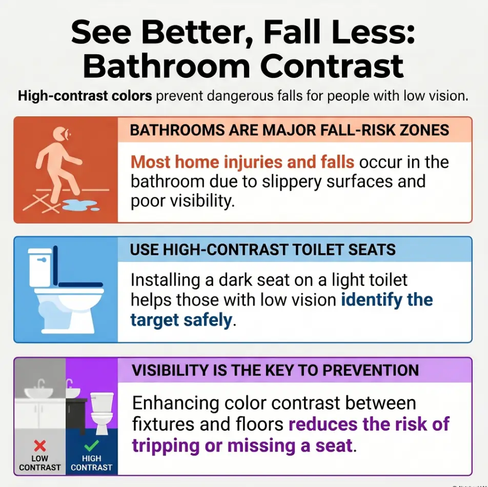
A lot of bathrooms are built from polite near-matches. White toilet. Off-white wall. Pale floor. Chrome hardware catching stray light like a tiny trumpet section. Nothing is technically wrong, yet the toilet can lose its outline. That matters because the eye does not simply look for “a toilet.” It looks for edges, boundaries, and contrast. When those edges soften, the whole fixture starts to read like one vague shape.
I have seen this happen in bathrooms that looked lovely in a listing photo. Stand in the doorway in daylight and the room feels serene. Come back half-awake at 2 a.m. and the same serenity becomes visual camouflage. The seat is there, of course. But the brain has to work harder to separate seat from bowl, bowl from wall, wall from shadow. For a broader room-level view, this is exactly why low vision nighttime bathroom safety often starts with visibility before it moves on to products.
How low vision turns familiar fixtures into low-contrast shapes
Low vision does not always mean total blur. Sometimes it means reduced contrast sensitivity, slower recognition, more trouble in dim lighting, or more visual confusion when similar surfaces sit together. That is why a bathroom can feel “basically fine” during the day and oddly uncooperative at night. A familiar object becomes harder to parse, especially when there is glare, shadow, or low color separation.
The National Eye Institute explains low vision as vision loss that makes everyday tasks harder even after standard correction. In plain household language, that often means the room still exists, but it stops introducing itself clearly. The toilet seat color question matters because it can restore some of that missing introduction.
Why this is about faster recognition, not decoration
This is the heart of it. A good seat color is not trying to win a style award. It is trying to reduce hesitation. Faster recognition means less leaning, less squinting, less last-second adjustment, and less awkward body negotiation in a room where balance already matters. In a bathroom, a half-second of uncertainty is not very glamorous, but it can be expensive in energy and confidence.
- Bathrooms often fail through near-matched surfaces, not obvious clutter
- Low vision can turn a familiar fixture into a low-contrast shape
- The goal is faster recognition with less hesitation
Apply in 60 seconds: Stand at your bathroom doorway and notice whether the seat edge reads instantly or blends into the bowl.
Contrast First: What “The Right Color” Actually Means
Why the best seat color depends on the toilet, wall, and floor together
People often ask for the best single color, as if there were a universal champion waiting on a podium. There is not. The seat lives inside a three-part visual sentence: toilet body, surrounding room, and lighting. A dark seat on a white toilet may look crisp in one bathroom and muddy in another if the floor is nearly the same tone or the wall behind it pulls the whole composition into shadow.
Think of color choice less like picking a paint chip and more like building a silhouette. The seat should be easy to separate from the porcelain body, but the toilet as a whole should also remain readable from the room. It is a small distinction, yet it changes everything. A seat can contrast nicely with the bowl and still disappear into the overall space.
How contrast helps the eye find the seat faster during urgent bathroom trips
Bathroom trips are not leisurely museum walks. They are often urgent, sleepy, stiff-kneed, or underlit. This is especially true for older adults, people with low vision, and caregivers helping someone who does not have much patience left for fiddly visual puzzles. In those moments, the eye benefits from a strong cue. Contrast gives the toilet a cleaner visual headline.
I once compared two bathrooms that were almost identical except for the seat finish and tone. In one, the seat looked fashionable online but became a glossy blur under warm bulbs. In the other, a simple matte deep gray seat made the toilet read immediately. Not thrilling. Not dramatic. Just quietly better. That is often how the best home changes behave. They improve the room without demanding applause.
Why bold is not always better when glare enters the picture
Contrast is not only about dark versus light. It is also about edge clarity. A very dark glossy seat can reflect window light, vanity lights, or overhead bulbs, and those reflections can soften the shape you were trying to sharpen. A moderate contrast with a matte finish often outperforms a stronger color with a shiny surface. The bathroom, in other words, is a place where theater lighting can sabotage good intentions.
Show me the nerdy details
Contrast is not just hue difference. It includes luminance difference, edge definition, and how surfaces behave under directional light. In practical bathroom testing, matte finishes usually maintain more stable edge visibility across time-of-day changes than glossy surfaces that create specular highlights.
| Decision card | When it works | Where it fails | Best next step |
|---|---|---|---|
| High contrast + matte | White toilet, pale room, night use | Rarely fails unless room is very dark overall | Start here first |
| High contrast + glossy | Can look striking in photos | Glare, reflected bulbs, blurred edges | Only choose if lighting is very controlled |
| Mid-tone + matte | Homes that want softer contrast | May be too subtle in dim bathrooms | Test at night before committing |
Neutral action: compare color and finish together, not color alone.
- National Eye Institute: Low Vision
- CDC STEADI: What You Can Do to Prevent Falls
- National Institute on Aging: Preventing Falls at Home, Room by Room
Dignity Matters: The Goal Is Confidence, Not a Medical-Looking Bathroom
How to improve visibility without making the room feel institutional
People sometimes resist bathroom changes not because they are vain, but because the room is intimate. They do not want it to feel like a facility. That resistance deserves respect. A bathroom is one of the few rooms where privacy and dignity live very close together, and heavy-handed safety choices can feel emotionally louder than they need to be.
The encouraging news is that better visibility does not require an institutional aesthetic. A matte charcoal seat, a deep gray seat, or a restrained navy can improve contrast while still feeling domestic. Even warm taupe or espresso can help in the right room. You are not trying to make the toilet dramatic. You are trying to make it legible.
Why people often resist helpful changes when they look too clinical
Home changes succeed when the person actually accepts them. I have watched families buy the most “helpful” option on paper, only to let it gather dust because it made the room feel foreign. This is not a failure of character. It is a reminder that human beings do not live inside checklists. We live inside feelings, habits, and rooms that tell us who we are.
If a seat color feels humiliating, it will be resented. If it feels calm, thoughtful, and easy to live with, it has a better chance of staying in place long enough to help. That is why dignity is not an extra. It is part of usability.
Let’s be honest… nobody wants their bathroom to feel like a facility
And it does not have to. The sweet spot is not “most medical-looking.” It is “most readable without making the room feel stripped of self-respect.” That is a subtle target, but it is the right one. A bathroom can be safer and still feel like home. In fact, the best choices are often the ones visitors barely notice while the person using the room notices the difference immediately.
- Visibility and dignity can work together
- Matte dark neutrals often feel calmer than harsh medical cues
- Acceptance matters because the best product is the one people keep using
Apply in 60 seconds: Ask whether the proposed seat color would feel quietly helpful or emotionally loud in daily life.

Best Color Logic: Which Toilet Seat Colors Usually Work Best
Dark seat on a white toilet: why black, charcoal, or deep gray often succeed
On a standard white toilet, dark tones usually create the strongest immediate separation. Black can work. Charcoal often works even better because it softens the look without sacrificing too much contrast. Deep gray is the diplomat of this category. It knows how to be clear without barging into the room wearing combat boots.
These shades tend to perform well when the toilet itself is white and the surrounding bathroom is pale. They help the eye find the seat opening and the seat edge quickly. That is especially useful in bathrooms where walls, counters, and fixtures all lean light. In many homes, a matte charcoal seat is the most practical first choice.
Mid-tone contrast: when navy, espresso, or muted slate feel softer but still useful
Not every household wants a strong black-on-white effect. That is where mid-tone contrast can shine. Navy, muted slate, and espresso often feel warmer and less stark. They can still offer a meaningful visual cue, especially when paired with low-sheen finishes and decent nighttime lighting.
These colors are good candidates when the bathroom already has medium-value elements like wood vanity tones, taupe flooring, or gray wall paint. They often preserve a more residential feeling. The trade-off is simple: softer visually usually means you need to be more careful about testing in dim light.
Warm neutrals: when contrast can stay dignified instead of shouting for attention
Warm neutrals are the quiet professionals of this category. They rarely create the strongest contrast, but they can work beautifully in bathrooms with beige, cream, stone, or warm wood elements. Espresso, tobacco brown, or even a well-chosen warm taupe can create enough distinction to help recognition while blending more naturally with the room.
The key word here is enough. Warm neutrals are not for every bathroom. In a white-on-white space with weak lighting, they can be too polite. But in a bathroom with warmer finishes, they may provide the balance many families want: improved readability without a jarring visual interruption.
| Color family | Usually best for | Visual feel | Watch out for |
|---|---|---|---|
| Black | Strong contrast on white toilets | Bold, crisp | Gloss glare, harsh feel in small rooms |
| Charcoal / deep gray | Most homes needing strong but softer contrast | Balanced, modern | Can blend into dark flooring |
| Navy / slate | Bathrooms with cooler mid-tone palettes | Less clinical, slightly decorative | May underperform in very dim rooms |
| Espresso / warm neutral | Bathrooms with beige, wood, or warm stone | Homey, gentle | Can be too subtle on cream or tan backgrounds |
Neutral action: narrow your shortlist to two colors, then test them against your actual room at night.
Color Can Backfire: When “High Contrast” Creates New Problems
Why glossy black can reflect light and blur edges instead of sharpening them
Black is often recommended as the obvious answer, and in some bathrooms it is excellent. But glossy black can betray you. Instead of reading as a solid edge, it may collect reflections from bulbs, windows, or mirrors. Those bright streaks can confuse the boundary, especially if the user already struggles with glare or changing light conditions.
I have seen glossy black seats look sharp in product photos and oddly slippery in real life, visually speaking. The seat was technically visible, yes, but its edge kept changing shape as the viewer moved. That is not what you want in a room that asks for stable cues. Matte finishes are less theatrical and therefore often more useful. The same practical logic applies beyond toilet seats, which is why comparing matte vs glossy paint can be surprisingly helpful when a room keeps throwing glare back at tired eyes.
How patterned seats can confuse visual boundaries rather than clarify them
Patterns, marbling, faux wood grain, and decorative surfaces tend to break up the very outline the eye needs. They may create visual interest, but visual interest is not the job description here. A low-vision-friendly seat should simplify the signal, not add texture that forces the eye to sort noise from boundary.
Bathrooms have enough going on already: grout lines, tiles, reflections, metal hardware, towel shadows. Adding a patterned seat can turn the focal point into another visual conversation piece. That might please a catalog. It rarely helps a tired person at night.
Why trendy colors may photograph well but fail at 2 a.m.
Trendy colors are often chosen under bright showroom conditions or through carefully edited online photos. But product images are famous for making almost everything look more distinct than it will in a real home. The bathroom at 2 a.m. is not a showroom. It is dimmer, flatter, and much less interested in aesthetics than your shopping tab suggested.
This is why “looks great online” is a terrible final test. A seat color has to survive your actual bulb temperature, your actual shadows, and your actual flooring. The room always gets the last word.
Night Trips Change Everything: Test for Low Light, Not Daylight Only
Why a seat that works at noon may disappear after sunset
Many buying mistakes happen because people judge contrast in daylight only. Daylight is generous. It fills edges in. It forgives subtle differences. At night, the room becomes less charitable. Shadows deepen. Warm bulbs flatten some colors. Sleepy eyes take longer to decode shapes. The result is that a seat that felt “totally fine” at noon can suddenly lose authority after sunset.
This is not trivial. The CDC’s fall-prevention guidance emphasizes better lighting as part of home safety, and bathroom use is one of those ordinary moments where visibility and balance intersect. A seat color cannot replace good lighting, but it can make good lighting work harder for you.
How shadows, warm bulbs, and sleepy eyes change color performance
Warm bulbs can make some deep colors feel richer and some mid-tones feel muddier. Shadows from vanity lights can distort the seat opening. If the bathroom light is off and only a hall light is spilling in, the toilet may read mostly as silhouette. In that situation, what matters is not how “beautiful” the seat color is but whether its edge remains understandable from the doorway.
I like to think of nighttime testing as the honesty round. Daylight may flatter the choice. Nightlight conditions interrogate it. That sounds severe, but it saves money and frustration. Better to discover visual weakness during a test than after installation. If bulb warmth is part of the problem, a comparison like 2700K vs 3000K for glare-sensitive eyes can help you think beyond color alone.
Here’s what no one tells you… nighttime bathroom success is often a lighting problem wearing a color disguise
A seat color might not be failing because the color is wrong in theory. It might be failing because the room is underlit, the bulb is too dim, the finish is too shiny, or the shadow pattern is doing strange little acrobatics. Sometimes the correct answer is a better bulb plus a better seat. The bathroom is annoyingly collaborative that way.
- Daylight flatters subtle contrast
- Night use exposes weak edges and glare problems
- Color and lighting often need to be fixed together
Apply in 60 seconds: Tonight, stand in the doorway with your normal evening lighting and see whether the seat still reads clearly.
Common Mistakes: What People Get Wrong When Choosing Contrast
Choosing a seat that contrasts with the wall but not the toilet
People sometimes evaluate the seat as if it were wall art. They ask whether it stands out against the room, but forget to check whether it stands out against the bowl itself. The more important question is often simpler: can the eye quickly parse seat from porcelain? If not, the whole object remains visually mushy.
Ignoring glare, sheen, and reflections on smooth surfaces
Finish is not a side note. It is a major part of performance. A beautiful glossy seat can cause enough reflection to undermine the very contrast you paid for. Bathrooms are full of hard surfaces and directional light. That makes sheen a practical issue, not a picky one. If reflected light is part of the daily problem, it may also be worth looking at bathroom mirror glare, because the mirror can quietly turn one bright bulb into several competing visual signals.
Matching the seat to the decor so perfectly that it vanishes
Design coherence is lovely until it becomes camouflage. I understand the temptation. A bathroom feels “finished” when everything coordinates. But a toilet seat is not a candle holder. It has a job. If matching the palette makes the seat vanish, the room has overachieved in the wrong direction.
Adding visual “interest” when the real need is faster recognition
This is the classic mistake. The homeowner goes looking for style and forgets the problem to be solved. When the need is recognition, the best choice is often plainer than expected. No swirls. No faux stone fantasy. No clever motifs. Just a surface that says, clearly and without drama, here I am.
- Yes / No: The toilet is hard to identify quickly from the doorway
- Yes / No: The bathroom is used in dim light or at night
- Yes / No: The current seat is glossy, decorative, or nearly the same tone as the bowl
- Yes / No: Someone in the household has low vision, slower night vision, or balance concerns
Neutral action: if you answered yes to two or more, contrast and finish deserve attention before bigger bathroom changes.
Don’t Do This: Small Design Choices That Quietly Reduce Safety
Do not rely on decorative prints, marbling, or faux wood grain for visibility
These finishes tend to break up the edge and add visual noise. The bathroom needs a clean cue, not a tiny abstract painting. If the surface looks “interesting,” it is probably doing extra work your eye did not request.
Do not assume raised seats or padded seats are easier to see
Raised or padded seats may address other needs, but visibility is not automatic. Some padded finishes are shiny. Some raised attachments are bulky in ways that change the silhouette without clarifying it. A helpful product in one category is not automatically helpful in another.
Do not judge contrast from online photos alone
Online images lie gently but consistently. Screen brightness, color correction, staged lighting, and bathroom styling can all make a seat seem more visible than it will be in your home. I trust doorway tests more than online glamour shots every single time.
Short Story: A family once chose a seat online because it looked “perfectly contrasted” in the product photos. The bathroom had a white toilet, pale walls, and gray-beige flooring, so the seat seemed like an easy win. When it arrived, the finish turned out glossier than expected. Under the vanity light, it reflected a bright stripe that made the front edge harder to read, not easier.
Nobody had made a ridiculous mistake. They had simply trusted the wrong test. We swapped the seat for a lower-sheen charcoal option. Same bathroom. Same toilet. Same person using it. The room immediately felt calmer. That is what good home design often looks like: not dramatic transformation, just less negotiation in the moments that used to catch you off guard.
Room-by-Room Logic: The Floor, Lighting, and Walls Matter More Than People Expect
How dark flooring can change which seat color stands out best
If the floor is dark charcoal, black tile, or deep stone, a very dark seat may still contrast well with a white bowl while making the overall toilet feel less distinct from the room. That does not mean the seat is wrong. It means you must look at the entire fixture, not just the seat in isolation. Sometimes a deep gray or mid-tone slate gives you a better balance than true black.
Why beige walls, gray tile, and off-white porcelain create tricky near-matches
Near-matches are sneaky. Beige walls and warm floors can swallow warm neutral seats. Cool gray tile can blur into slate or navy. Off-white porcelain can complicate what looked like a crisp contrast decision online. This is where real-life testing beats theory. A bathroom palette can create visual relationships nobody predicted at the shopping stage.
What to check before buying anything: toilet body, floor tone, and bulb temperature
Before you buy, check three things. First, the toilet body color. Bright white, soft white, and cream are not the same. Second, the floor tone. Dark, mid-tone, or pale flooring changes how the toilet reads in the room. Third, bulb temperature. Warm bulbs can flatten some colors and enrich others. These three variables explain a surprising number of “but it looked good online” disappointments. Pale flooring can add its own glare story too, especially in bathrooms with shiny surfaces; a guide to white tile floor glare can help you spot that quieter part of the problem.
Show me the nerdy details
Bathrooms are full of reflective materials, which means apparent contrast shifts with the light source angle and color temperature. That is why a seat can look crisp under cool daylight and softer under warm evening bulbs. Always test with the bulbs and shadows the room actually uses.
| Quote-prep list | Why it matters |
|---|---|
| Photo of toilet in daylight and at night | Shows real contrast instead of guessed contrast |
| Current bulb type and warmth | Affects edge clarity and glare |
| Floor and wall tones | Prevents accidental near-matching |
| Seat finish preference: matte or glossy | Finish often matters as much as color |
Neutral action: gather these details before comparing options so you do not overbuy or guess badly.
Who This Is For, and Who It Is Not For
Best for older adults, low-vision households, caregivers, and families updating a bathroom for easier use
This guide is for people trying to make the bathroom easier to read and easier to trust. That includes older adults, people with low vision, family caregivers, and households dealing with dim bathrooms or white-on-white fixtures. It is also useful for people planning ahead. Not every smart home change has to wait for a crisis to earn permission.
Helpful for anyone dealing with reduced contrast sensitivity, dim bathrooms, or white-on-white fixtures
You do not need a formal diagnosis to benefit from better visual cues. Sometimes the issue is simply poor contrast, weak nighttime lighting, or a bathroom palette that prioritizes calm beauty over legibility. If the toilet seems to disappear until you get closer than you would like, the room is already telling you something.
Not enough on its own if the real problem is balance, transfers, or inadequate bathroom lighting
This part matters. A better seat color is helpful, but it is not a full bathroom safety plan. If the real issue is transfer difficulty, poor balance, slippery flooring, or bad lighting, then color alone will not carry the whole burden. The National Institute on Aging and the CDC both emphasize practical home changes like better lighting, grab bars, and fall-prevention habits. Color is a useful layer. It is not the whole orchestra. For a bigger-picture checklist, aging vision fall prevention at home can help connect visibility, walking paths, lighting, and safer routines.
- Use seat color for visibility
- Use lighting and bathroom supports for broader safety
- Do not expect one product to solve every bathroom problem
Apply in 60 seconds: Ask whether the hardest part is finding the toilet quickly or physically using the bathroom safely once you get there.
Before You Buy: A Simple At-Home Contrast Test
Stand in the doorway and ask: can the seat be identified in one glance?
This is my favorite test because it respects real use. Stand where you normally enter the bathroom. Look once. Can you identify the seat clearly without leaning in, pausing, or “finding” it in stages? If yes, your current setup may already be decent. If no, your room is asking for contrast help.
Test in daylight, evening light, and one middle-of-the-night bathroom visit
Do not stop with one lighting condition. Test at three moments: daylight, ordinary evening lighting, and one true sleepy nighttime visit. That last test matters most. It is unglamorous and mildly annoying, which is precisely why it is so valuable. Home decisions should survive ordinary inconvenience.
Compare matte versus glossy finishes before deciding on color alone
If possible, compare two finish types as well as two colors. In many bathrooms, a matte charcoal will outperform a glossy black. You are trying to reduce visual labor, not stage a high-contrast photoshoot. Let the winner be the option that reads fastest and keeps its shape under changing light.
Score your current setup from 0 to 3.
- +1 if the seat blends into the bowl in daylight
- +1 if it becomes harder to read at night
- +1 if the finish throws glare or reflections
0 to 1: your current setup may be adequate. 2 to 3: a matte higher-contrast seat is worth serious consideration.
Neutral action: use the score to decide whether you need a product change, a lighting change, or both.
FAQ
What color toilet seat is easiest to see for low vision?
In many homes with a standard white toilet, a matte dark gray or charcoal seat is the easiest place to start. It often creates strong contrast without the extra glare or harshness that glossy black can introduce. That said, the best answer depends on your floor, wall color, and nighttime lighting.
Is black the best toilet seat color for a white toilet?
Sometimes, yes. But not automatically. Black can offer excellent contrast on a white toilet, especially in pale bathrooms. It starts to fail when the finish is glossy, the room has heavy reflections, or the overall bathroom palette makes the toilet feel too visually harsh. Charcoal often gives nearly the same usefulness with a calmer look.
Can a dark toilet seat look too harsh in a small bathroom?
It can, especially if the room is tiny, stark, and very bright. But the answer is not always to avoid dark colors altogether. Instead, consider a softer dark like charcoal, slate, or espresso in a matte finish. Those tones often preserve dignity while still improving recognition.
Does a matte finish help more than a glossy finish?
Very often, yes. Matte and low-sheen finishes usually maintain clearer edges under mixed lighting. Gloss can reflect bulbs, windows, and mirror light in ways that blur the boundary you were trying to strengthen. In practical home testing, finish is one of the most underrated parts of the decision.
Should the toilet seat contrast with the bowl or the floor?
Both matter, but start with the bowl. If the eye cannot separate seat from toilet body, the fixture remains visually weak. After that, check whether the toilet as a whole still reads clearly against the floor and room. The best choice usually works at both levels.
Are colored toilet seats harder to keep looking clean?
Some dark seats may show dust, dried droplets, or residue differently than white seats. That is not necessarily worse, only more visible in a different way. A practical rule is to choose a finish that is easy to wipe and a tone you do not mind seeing in ordinary bathroom life.
Do raised toilet seats help with visibility too?
Not necessarily. Raised seats may help with height or transfers, but visibility depends on contrast, shape clarity, and finish. Some raised models are helpful visually. Others are bulky, shiny, or oddly shaped. Treat them as a separate decision, not a guaranteed visibility fix.
What if the bathroom already has dark floors and dark walls?
Then the question becomes more nuanced. A very dark seat may still contrast well with a white bowl, but the overall toilet may feel less prominent in the room. In that case, test whether a slightly lighter dark, such as charcoal or slate, makes the entire fixture easier to recognize.
Next Step: Change One Variable Before Replacing the Whole Bathroom
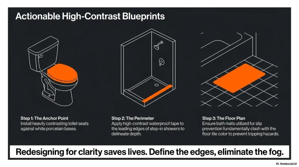
Take one photo in daylight and one at night, then compare whether the seat edge is instantly visible from the doorway
You do not need a renovation budget to learn something useful. Take one photo in daylight and one under your ordinary nighttime conditions. Stand back and ask a brutally simple question: does the seat edge announce itself, or do you have to hunt for it? Photos are not perfect, but paired photos can reveal contrast problems your daily familiarity has taught you to ignore.
If the toilet still disappears into the room, start with a matte high-contrast seat before making bigger bathroom changes
This is the most sensible pilot step for many homes. Start with a matte higher-contrast seat that respects the room and the person using it. If recognition improves, excellent. If the bathroom still feels visually uncertain, then widen the plan to include lighting, floor safety, and transfer support. Home improvement works best when it solves the next real problem, not all imagined problems at once.
The curiosity loop we opened at the beginning has a simple answer now: a bathroom can look perfectly normal and still be hard to use because normal is not the same thing as readable. In the next 15 minutes, you can run the doorway test, the nighttime test, and the glare test. That is enough to tell you whether your next step is a different seat color, a different finish, better lighting, or a combination. Quiet clarity beats stylish ambiguity every time.
Last reviewed: 2026-04.