

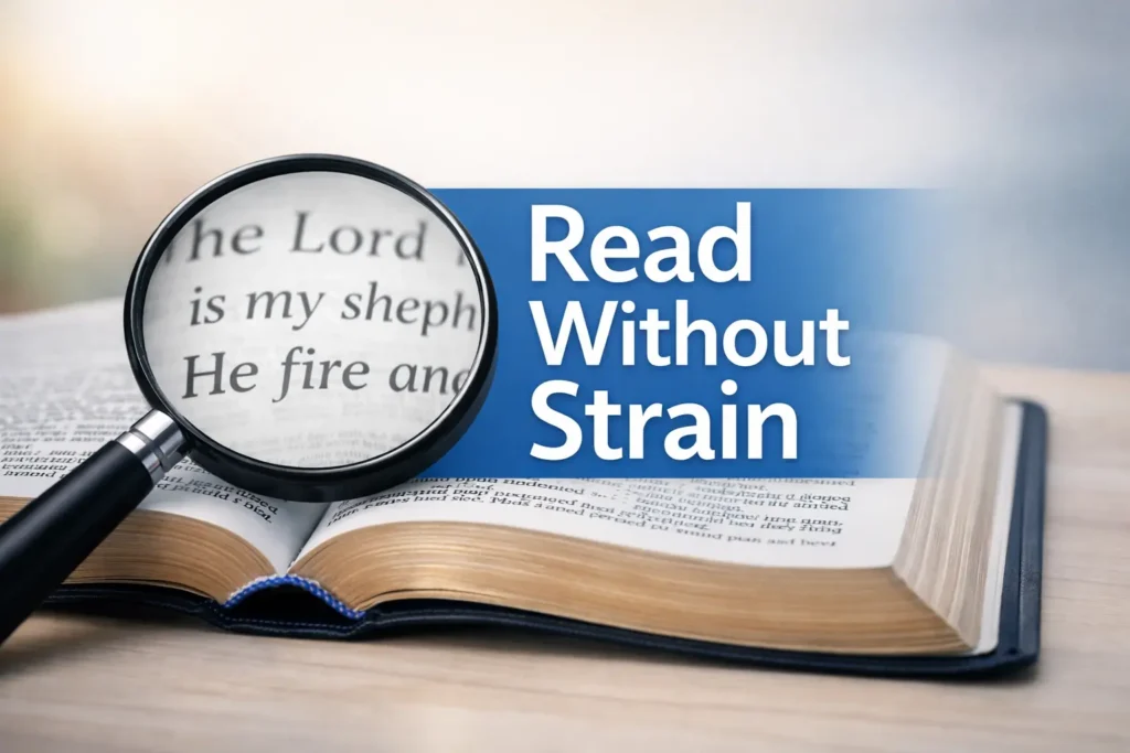
Beyond the Label: Finding True Readability in Super Giant Print Bibles
“Super Giant Print” is a publisher’s term, not a universal promise. Real readability for those living with macular degeneration depends on the friction between ink, paper, and light.
Vanishing verse numbers, crowded lines, and glossy paper that turns into a mirror at 10 p.m. under your lamp.
Calm pages designed with 16–18pt+ type, intentional line spacing, and high-contrast, glare-free finishes.
Stop paying twice—once at checkout and again in eye fatigue. Use our 90-second passage test to find the layout that lets you read longer and lose your place less.
Let’s choose calm.
Fast Answer: For macular degeneration, “best” usually means more than large type: you want true big print (often around 16–18pt+), high-contrast ink, non-glare paper, and a layout that helps you keep your place (clear verse numbers, generous spacing, minimal clutter). “Super Giant Print” varies by publisher, so verify point size, line spacing, and paper reflectivity—not just the label. The right combo reduces fatigue and makes reading feel possible again.
Table of Contents
Who this is for / not for
For: “I can read, but it’s exhausting”
This guide is for you if you can still read print, but it costs you. You finish a chapter and realize you’re holding your breath. Your shoulders creep upward. Your eyes feel “hot.” You blink like you’re rebooting a stubborn computer. (I’ve done the same thing with menus, by the way—squinting like I’m decoding a treasure map.)
- You can read print, but small type triggers fatigue fast—especially if you’re also dealing with digital eye strain in seniors day-to-day.
- You’re tired of “large print” that’s not actually large (the same frustration many people feel with large print prescription labels that still aren’t truly readable).
- You want something that works for daily reading, church, or study without fighting every page.
Not for: “Print is no longer workable”
If print is no longer your main lane, that’s not failure—that’s strategy. Many people with macular degeneration do better with audio-first tools, magnification, or a mix. This article can still help you choose a backup print Bible, but it won’t replace professional vision guidance.
- You need audio-first or magnification as primary (print may still help as a secondary option).
- You’re seeking diagnosis or medical treatment advice (this is a product + usability guide). If you’re unsure what “type” of AMD you’re dealing with, this quick explainer on dry vs wet age-related macular degeneration can help you frame conversations with your clinician.
- Comfort beats labels.
- Layout matters as much as type size.
- Lighting changes everything (and yes—small home tweaks can matter as much as the book itself, like glare-free under-cabinet lighting setup).
Apply in 60 seconds: Grab any book nearby and notice what makes you lose your place—tiny line spacing, glare, or busy notes.
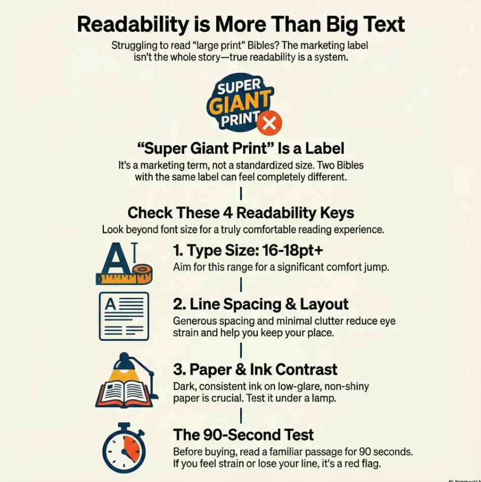
“Super Giant Print” decoded: what the label hides
Point size isn’t the whole story (but it matters)
In Bible publishing, “Large Print,” “Giant Print,” and “Super Giant Print” sound like neat categories. In real life? They’re more like vibes. Point size (pt) is a useful anchor—especially when you’re choosing between something like 16pt and 18pt—but it’s not a magic number that guarantees comfort.
Why does 16pt vs 18pt sometimes feel like stepping from dim light into daylight? Because small increases aren’t just “a little bigger.” They can be the difference between effortful decoding and smooth recognition.
The 3 silent variables: leading, letterforms, and ink density
Here’s the part most product descriptions don’t celebrate: the typography mechanics that make reading easier. If macular degeneration has taught you anything, it’s that your eyes don’t enjoy being surprised.
- Line spacing (leading): More space between lines can reduce “line jumping.”
- Letterforms: Some fonts keep shapes clearer; others blur into each other when you’re tired.
- Ink density: Dark, consistent ink helps the page “hold” contrast under different lighting.
Curiosity gap: why two “18pt” Bibles can feel totally different
Two Bibles can both claim “18pt” and still give you two totally different experiences. One feels calm and readable. The other feels like your eyes are on a treadmill. That difference often comes down to:
- Column width: Long lines can be harder to track; shorter lines can feel steadier.
- Visual noise: Tiny cross-reference letters, dense footnotes, and busy headings compete for attention.
- Paper reflectivity: Glossy pages can erase contrast exactly when you need it most.
If you’ve ever thought, “My eyes are worse today,” sometimes the honest answer is: the page is worse today. Different lighting, different paper, different fatigue level—same eyes.
The shopping checklist that actually predicts readability
The “Read for 90 seconds” test (before you buy)
If you only do one thing from this entire article, do this. Don’t skim a page for five seconds and guess. Read for 90 seconds. Why 90? Because that’s long enough for your eyes to reveal the truth—without you powering through on adrenaline.
- Pick a passage you know well (Psalm 23, John 1, Romans 8—your choice).
- Read at a normal pace. Quietly is fine.
- Notice: Do you lose your line? Do verse numbers interrupt you? Do you feel a “grip” in your forehead?
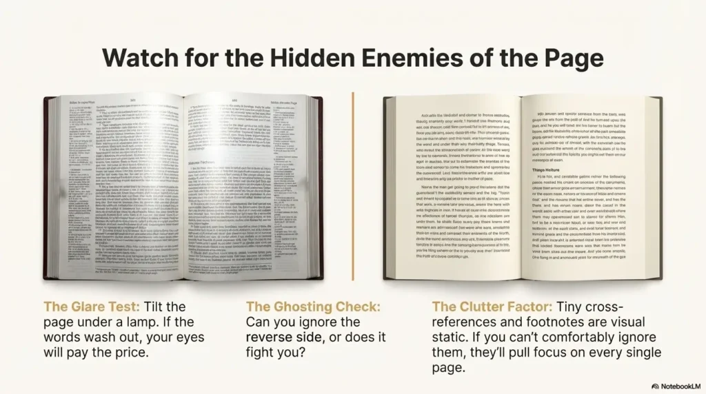
Paper matters: glare, show-through, and the “lamp test”
Bible paper is thin by design—portable, traditional, and capable of fitting a lot into one volume. But thin paper + bright light can create a gray “ghost layer” from the text on the other side. If you’ve ever found yourself turning the page and thinking, “Why is this page already exhausted?”—that’s show-through.
- Glare test: Tilt the page under a lamp. If the words wash out, your eyes will pay the price (and if glare is a constant enemy at home, borrow ideas from glare-free lighting placement—the angles matter).
- Ghosting check: Hold the page at reading distance. Can you ignore the reverse side, or does it fight you?
- Contrast check: Does the black look confidently black, or politely gray?
Binding and opening angle: the hidden strain factor
This one is sneaky. A Bible that doesn’t open well turns reading into a posture problem: you press down, you hunch, you chase the page curve. The best giant print Bible for macular degeneration often has one unglamorous superpower: it stays open.
- Lies-flat: Easier to read without wrestling the spine.
- Weight: Bigger print often means heavier pages and more bulk—good at home, less fun in a tote bag.
Show me the nerdy details
If you want to compare two “Super Giant Print” options without relying on marketing terms, look for: type size (pt), line spacing (sometimes called leading), and page layout (single vs double column, plus margin width). If the product page doesn’t list these, you can often infer layout density from the “Look Inside” preview. The goal is not “maximum information per page.” The goal is “maximum clarity per glance.”
- Do the 90-second test.
- Test under your real lighting (night reading especially benefits from making your iPhone screen dimmer than the minimum if you use a phone as a companion light or reference).
- Refuse glossy glare like it’s a bad deal (because it is).
Apply in 60 seconds: Open a product preview and zoom in on verse numbers and footnotes—if they look like confetti, they’ll read like confetti.
Money Block: “Will Super Giant Print actually help me?” (Quick checklist)
- Yes if you can read regular print briefly but fatigue hits fast (and if your eyes burn late in the day, this pattern can overlap with 3 p.m. burning eyes—separate issue, same “friction” feeling).
- Yes if you lose your place more than you misunderstand the words.
- Yes if glare and crowded lines are your main enemies.
- Maybe if you already rely on strong magnification for most reading.
- Maybe if contrast sensitivity is your biggest barrier (paper/ink matters a lot).
Neutral next action: Pick one Bible candidate and verify three things: point size, paper glare, and layout clutter.
Best format choices for macular degeneration (and why they win)
Single-column vs double-column: choose your fatigue
People argue about single-column vs double-column like it’s a personality test. For low vision, it’s more practical than philosophical.
- Single-column often feels calmer, especially if you like a more “book-like” flow.
- Double-column can reduce line length, which may help you track the next line without wandering.
My honest take: if you often lose your place, shorter lines can be your friend. If you feel visually overwhelmed, fewer columns can be your friend. You’re not choosing “the right answer.” You’re choosing the reading experience you can repeat tomorrow. (If you want a companion guide written specifically for aging eyes, see low-vision reading for 80+ with AMD.)
Red-letter, cross-references, and study notes: friend or enemy?
Red-letter text can be meaningful. It can also be lower contrast depending on ink and paper. Study notes can be helpful. They can also become tiny-text wallpaper you never read but always see.
- Red-letter: If the red looks soft or faded in previews, consider a black-letter option for clarity.
- Cross-references: Great if readable; otherwise they become visual static.
- Study notes: Only worth it if the note font is actually readable for you.
Let’s be honest—study Bibles can be visual chaos
A study Bible can be like walking into a room where five people talk at once. Main text, footnotes, cross-references, headings, maps, columns… your eyes are trying to host a panel discussion.
A simple rule that saves money and frustration: Only buy notes if you can comfortably ignore them. If you can’t ignore them, they’ll pull focus every single page.
Money Block: Decision Card — “Single-column vs double-column”
| Choose this | When it fits you | Trade-off |
|---|---|---|
| Single-column | You want a calmer page and fewer visual interruptions. | Lines can be longer, which may increase tracking effort. |
| Double-column | You lose your place often and prefer shorter lines. | More elements can feel busier depending on design. |
Neutral next action: Compare two layouts using the same passage for 90 seconds each.
Giant print features that quietly save your place
Verse numbers that don’t sabotage the line
Verse numbers are supposed to help you find your place, not steal it. When they’re tiny superscripts, they can vanish. When they’re oversized and loud, they can interrupt. The best designs for low vision tend to do something simple: they keep verse numbers clear without making them the star of the show.
- Larger, legible verse numbers that don’t blur into punctuation.
- Spacing that prevents numbers from “gluing” to the next word.
- Consistent formatting so your eyes aren’t surprised every line.
Page design that reduces “where was I?” moments
When your eyes are tired, you don’t just read words—you re-enter the page again and again. Paragraph layouts can feel more natural for continuous reading. Verse-by-verse layouts can feel more navigable for short reading sessions. Neither is morally superior. One is simply easier for you.
Curiosity gap: the “crowding effect” and why generous margins help
Crowding is that feeling where letters and words seem to press together, especially when your vision is already working harder. Generous margins and breathing room can make the page feel calmer, even if the point size is the same. It’s not “extra space.” It’s usable space.
Infographic: The Readability Stack (what actually makes a Bible readable)
If you improve the top 3, most people feel relief fast.
- Clear verse numbers reduce “re-finding” effort.
- More spacing often beats more information.
- Margins are not wasted space—they’re stability.
Apply in 60 seconds: In previews, look for a page where you can instantly re-enter after looking away.
Top picks by use-case: match the Bible to your reading life
For daily reading (low clutter, high comfort)
Daily reading is where the page either becomes a companion or a chore. For macular degeneration, “daily reading” often means choosing a calmer design over a feature-packed one. Reader’s Bibles and simpler editions can shine here.
- Prioritize: true super-giant type, low-glare paper, simple layout.
- Avoid: tiny footnotes, dense reference systems, and busy sidebars.
Anecdote: I once bought a book because it had “helpful notes.” The notes were indeed helpful—at reminding me I couldn’t read them. I stopped opening it. Not because I didn’t care. Because it felt like failing every time.
For church (portable enough, still readable)
Church introduces a new set of realities: distance to the pulpit, lighting that you don’t control, and the “carry it” factor. If you’re choosing between readability and portability, decide what matters most: Do you want a Bible you bring, or one you use? The best answer is often: one for home, one for church.
- Prioritize: stays open, clear headings, manageable weight.
- Trade-off: slightly smaller type might be acceptable if everything else is clean and calm.
For serious study (only if the notes are readable)
Study doesn’t have to mean tiny print. But many study Bibles pack the page so tightly that the “main text” starts to feel like a guest in its own home. If you love study notes, look for editions that explicitly offer larger note fonts—or consider a simpler giant print Bible plus separate study resources.
Real-world publisher note (neutral, not a sales pitch): major publishers like Zondervan, Thomas Nelson, Crossway, Tyndale, and Holman (CSB) offer multiple print sizes and layouts. The trick is not brand loyalty. It’s matching design choices to your eyes.
Short Story: I watched someone at a church pew do the quiet kind of bravery that rarely gets named. They had a new Bible—big, sturdy, beautiful—and still, the page fought them. They didn’t make a scene. They didn’t apologize. They simply slid a thin line guide under the sentence and let it do the work. Every few seconds, they paused, not because they were lost in thought, but because the lighting from above kept catching the paper like a small glare-wave.
After the service, they laughed softly and said, “I brought the wrong lamp in my head.” Then they told me the truth: the week before, they’d bought a “super giant print” Bible online. It arrived, and the type was big—but the paper shone like a mirror. They returned it. Not dramatic. Not bitter. Just determined. “I’m not quitting reading,” they said. “I’m quitting bad pages.”
Money Block: Quote-Prep List — What to gather before you compare options
- Your “test passage” (one you know well).
- Your usual reading light (lamp type or room lighting). If you’re still dialing in home lighting, start with glare-free lighting ideas that reduce washout.
- Your preferred size range (e.g., “I suspect 16–18pt+ is my zone”).
- Layout preference guess (single vs double column).
- One must-have (lies-flat, minimal notes, red-letter or not).
Neutral next action: Use this list to narrow to 2–3 candidates before you spend money.
Common mistakes (the expensive ones)
Mistake #1: Trusting the label instead of the measurements
“Large print” and “super giant print” are not standardized across publishers. That doesn’t mean the labels are useless—it means they’re incomplete. If the product listing includes point size, great. If it doesn’t, use previews and user photos (when available) to compare relative scale and layout density.
- Look for point size (pt) if listed.
- Check line spacing and how crowded the page feels.
- Zoom in on verse numbers and footnotes—those reveal how the page behaves.
Mistake #2: Buying the biggest type… on the worst paper
Big letters on shiny paper are a classic trap. Under store lighting they look fine. Under your bedside lamp? Suddenly you’re reading through a reflection of your own disappointment.
Anecdote: I once thought, “This is readable!”—then realized I’d unconsciously tilted the book to escape glare. If your wrists are doing gymnastics, the page is not actually helping you. (If you want a quick “lighting sanity check” beyond books, your overall setup matters—especially at night, alongside basics like low-vision nighttime bathroom safety in the same home environment.)
Mistake #3: Choosing a layout that fights your eyes
Dense cross-reference systems and tiny footnotes don’t just take space. They take attention. Even if you never read them, your eyes still see them. For macular degeneration, reducing visual competition can be the difference between reading 5 minutes and reading 25.
Here’s what no one tells you… the “best” Bible changes by lighting
The same Bible can feel easy in daylight and brutal at night. Overhead LEDs can create hotspot glare. Warm lamps can soften contrast if the ink isn’t strong. That’s why “best” is not a throne you crown once. It’s a setup you test where you actually live.
- Labels aren’t measurements.
- Paper can ruin big print.
- Lighting is part of the product.
Apply in 60 seconds: Test a page under a lamp angle you actually use—if it washes out, cross it off.
“Don’t do this” buying traps (quick saves)
Trap #1: “Thinline” promises with giant-print claims
Thin + giant print is a tough combination. Sometimes it works with clever design, but often it means compromises: more show-through, tighter spacing, or a layout that squeezes the text. If portability is your main goal, consider two-Bible strategy: one readable at home, one manageable for travel or church.
Trap #2: The “I’ll get used to it” gamble
This one is emotionally expensive. If you struggle in the first minute, you may tell yourself you’re just “out of practice.” But if the page design is wrong for you, practice won’t fix it—it’ll just train you to endure.
- If you lose your place repeatedly in 90 seconds, it’s a red flag.
- If glare makes you tilt the page, it’s a red flag.
- If you feel tense after one page, it’s a red flag.
Money Block: Mini Calculator — “How big should I go?” (3 inputs)
Input 1: Your comfortable reading session right now (minutes): __
Input 2: Your main problem: glare / losing my place / too small
Input 3: Where you read most: daylight / lamp / overhead lights
Output (rule-of-thumb):
- If you can only read <10 minutes, prioritize 18pt+ (if available) and low-glare paper.
- If you lose your place more than you squint, prioritize shorter line length (often double-column) and generous spacing.
- If glare is the villain, prioritize paper finish first, then type size.
Neutral next action: Use this to choose one “must-have” and filter your shortlist.
Accessibility upgrades that make any Bible easier (even your current one)
Low-cost upgrades (fast wins)
Sometimes the best “new Bible” is a better setup. Before you spend again, a few low-cost tools can rescue the Bible you already love.
- Line guide: A high-contrast bookmark ruler or reading guide can reduce line jumping.
- Book stand: Holds the page at a stable angle (your neck will thank you).
- Lighting placement: Put the lamp slightly behind and to the side, aiming across the page instead of straight down (this same principle shows up in glare-free lighting setups—side-lighting often beats overhead hotspots).
Anecdote: The first time I used a stand for reading (not even a Bible—just a book), I realized I’d been doing “neck taxes” for years. Your eyes shouldn’t be the only ones working overtime.
Audio + print pairing (the underrated combo)
Many readers with macular degeneration find a two-format approach sustainable: audio for longer stretches, print for slower reflection. It’s not either/or. It’s rhythm.
- Use audio for whole chapters when fatigue starts creeping in.
- Use print for short passages, notes, and re-reading.
- Use both together when you want your place held steady.
Curiosity gap: the “two-format habit” that keeps reading sustainable
The surprising win: you may read more overall by reading less in print at one time. Short, comfortable sessions beat long, punishing ones. Consistency is the real superpower.
- Line guides reduce place-losing stress.
- Stands reduce posture strain.
- Audio keeps your momentum on tired-eye days.
Apply in 60 seconds: Try reading with the book slightly tilted and supported—notice how quickly tension drops.
Next step
Here’s the concrete move that doesn’t require a perfect plan or a perfect day: Pick one passage you know well (Psalm 23 and John 1 are popular because your brain already knows the road), then do a 90-second readability test on your top 2–3 candidates.
- Confirm point size (if listed) or compare visually in previews.
- Check paper glare and show-through under your real lighting.
- Scan for layout clutter (busy notes, tiny cross-reference systems, verse number chaos).
If one candidate fails any single category, remove it. Your eyes shouldn’t have to “push through” a Bible.

FAQ
1) What point size is best for macular degeneration—16pt or 18pt?
Many people find 16pt a meaningful step up, but 18pt can be a bigger comfort jump—especially when fatigue hits quickly. The better question is: Which one lets you read for 10–20 minutes without strain? If 16pt still feels like effort, 18pt (plus good spacing and low glare) often feels more stable.
2) Is “Super Giant Print” the same across publishers?
No. It’s a marketing label, not a standardized measurement. Some publishers provide exact point size and layout details, while others don’t. If you can, verify point size and review a page preview—especially verse numbers and footnotes.
3) Are single-column Bibles easier to read than double-column?
Sometimes. Single-column can feel calmer and less visually busy. Double-column can reduce line length, which may help you keep your place. The best choice depends on whether your main struggle is overwhelm (single-column may help) or line tracking (shorter lines may help).
4) Does red-letter text reduce contrast or help clarity?
It depends on the ink and paper. Some red-letter editions use a softer red that can look lower-contrast than black text. If contrast is your top priority, consider black-letter—unless you’ve confirmed the red holds up clearly under your lighting.
5) What paper is best to reduce glare—matte, opaque, or “Bible paper”?
“Bible paper” describes thin paper commonly used in Bibles, but finishes vary. A low-glare, more matte feel usually helps under lamps and overhead lights. Opaqueness helps reduce show-through, but it often increases weight.
6) Should I buy a study Bible or a reader’s Bible for low vision?
If your eyes fatigue easily, a reader’s Bible (less clutter, cleaner page) is often the easier daily choice. If you love study notes, look carefully at the note font size and page density. If the notes aren’t readable, they become visual noise—even if you never intended to read them.
7) How can I test readability online before ordering?
Use “Look Inside” previews (when available) and zoom in on a typical page: check line spacing, verse number legibility, and how crowded the margins are. If the product page lists point size, great—still confirm the layout feels calm. If it doesn’t list point size, the preview becomes your best evidence.
8) What’s the best Bible size for church vs at-home reading?
At home, bigger and heavier can be a win: stable, readable, lies-flat. For church, weight and portability matter more. Many people end up with a “home Bible” (maximum readability) and a “church Bible” (good readability, easier to carry).
9) Do larger print Bibles always weigh more?
Often, yes—because larger type can increase page count and thickness. Paper choice also matters: more opaque paper reduces show-through but adds weight. If weight is a concern, prioritize low-glare paper and a calm layout, then choose the largest type size you can realistically carry.
10) What accessories help most—lighting, stand, or line guide?
If glare is your main enemy, lighting placement usually gives the fastest improvement. If you lose your place, a line guide can be surprisingly effective. If you get neck/shoulder strain, a stand can make reading feel easier within one session. Many people do best with two: lighting + line guide or lighting + stand.
Conclusion
“Super Giant Print” sounds like a promise. But now you know the real promise isn’t the label—it’s the experience: a page that stays readable under your lighting, with spacing that helps you keep your place, and paper that doesn’t fight back.
If you came here wondering what “super giant print” really means, here’s the honest answer: it means you don’t buy a Bible by the title on the box. You buy it by the way your eyes feel after one chapter.
Your next 15 minutes: choose your test passage, pick 2–3 candidates, and run the 90-second test. Keep the one that feels calm. Return the one that turns reading into a contest. You’re not quitting reading. You’re quitting bad pages.
Last reviewed: 2026-01