

Glare-Free Under-Cabinet Lighting for Low Vision Cooking
If your under-cabinet lights feel like a row of tiny headlights, the problem isn’t “not bright enough.” It’s light behaving badly—visible diodes, shallow angles, and glossy surfaces turning your countertop into a mirror with opinions.
The Solution: Your task light should be diffused and aimed so it lands on the food (not your eyes), with low-end dimming for night use. Done right, edges sharpen, labels stop swimming, and you stop playing musical chairs with the cutting board.
Keep guessing and you’ll repeat the expensive loop: buy → install → hate → avoid → replace. This guide provides quick tests (the white-plate “sparkle” check, a phone hotspot sweep) and a definitive “buy once” setup: diffused LED strips in an aluminum channel, smarter front-lip placement, and the right color temperature (often 4000K–5000K daylight) without the bounce.
I’m writing this from the side of the counter where I’ve installed the “cheap bright” strip, hated it by day two, and learned what actually calms the glare.
- No remodel
- No overbuying
- Just predictable light
Table of Contents
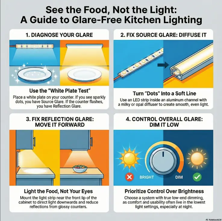
Glare first: 60-second diagnosis
If under-cabinet lights make you squint, it’s usually one of two things:
- Source glare (you’re seeing the LED “dots” or a harsh lens directly), or
- Reflection glare (your counter or backsplash is bouncing light into your eyes).
The good news: you can tell which one you have in under a minute. No tools. No ladder. No buying “just to try.”
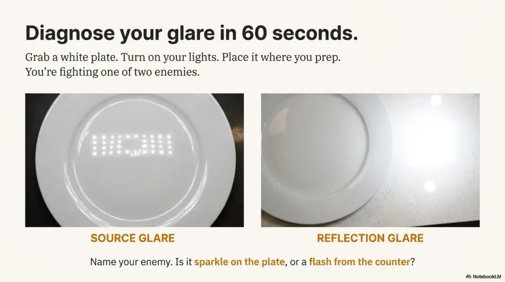
White-plate “sparkle test”: diode glare vs reflection glare
Grab a white plate (or a sheet of plain printer paper). Turn your current under-cabinet lights on. Place the plate where you prep most (near your cutting board).
- If you see a glittery sparkle or “runway dots” shimmering across the plate, that’s usually source glare.
- If the plate looks fine, but the counter or backsplash flashes when you change your head angle, that’s usually reflection glare.
Quick read: Source glare is fixed with diffusion + deeper channel. Reflection glare is fixed with placement + aim + dimming.
Phone-camera sweep: hotspot map along the counter
Open your phone camera. Slowly pan left to right along the counter under the cabinets. Don’t zoom. You’re looking for hotspots—bright patches that “blow out” on camera.
- Hotspots in a row → your LEDs are too “point-source” (diffuser/channel issue).
- Hotspots that appear only near shiny sections → reflective-surface bounce.
Which task fails you first? (prep / sink / stove) — pick your “critical zone”
Low vision isn’t one-size-fits-all, and kitchen lighting shouldn’t pretend it is. Pick the one zone that causes the most mistakes:
- Prep zone (knife work, reading labels, measuring)
- Sink zone (rinsing, scrubbing, detecting residue)
- Stove zone (stirring, checking simmer/boil, avoiding burns)
We’re going to optimize that zone first, then expand—using the same “reduce surprises” mindset you’d use in a broader wet AMD home safety checklist.
Let’s be honest… if you can “see the dots,” your eyes never get to rest
I once installed bare LED tape under a cabinet because it was “bright” and “cheap.” It was also the visual equivalent of staring into a row of tiny headlights. I used it for two nights, then started cooking in the dark out of spite.
If you’re seeing dots, your brain spends energy fighting the light instead of tracking the food. You deserve better.
- “Sparkle” on a white plate = add diffusion/deeper channel.
- Flashes on glossy surfaces = adjust placement/aim and add low-end dimming.
- Choose one “critical zone” to optimize first.
Apply in 60 seconds: Do the plate test at your cutting board and name your glare type out loud.
Money Block: Eligibility checklist (Yes/No)
- Yes — You see “sparkle” dots on a white plate under your current lights.
- Yes — Your counter/backsplash is glossy (quartz, polished granite, glass tile, stainless).
- Yes — You avoid using your under-cabinet lights because they feel harsh.
- Yes — You want an upgrade that’s mostly “set it and forget it.”
One-line next step: If you checked two or more “Yes,” prioritize diffuser channel + front-lip placement + low-end dimming.
Neutral action: Take one photo of your current setup so you can compare before/after.
Strip vs bar vs puck: which fails least for low vision
Most buying guides start with product types because it’s tidy. For low vision, the smarter starting point is: which option creates the fewest visual surprises (shadows, scallops, glare spikes) while you move around the counter.
Here’s the practical truth: diffused strips in a channel usually win because they create a continuous wash. But that doesn’t mean bars or pucks are “bad.” It means each one fails in a predictable way—and predictable is good.
LED strips in channels: best “continuous wash” when diffused
When you put an LED strip inside an aluminum channel with a frosted or milky diffuser, you’re turning dozens of point-sources into one gentle light line. That reduces sparkle and makes edges easier to read—especially on busy counters (cutting boards, patterned granite, labeled jars). If label-reading is a daily battle beyond the kitchen, you may also like the same “reduce friction, reduce mistakes” approach used in medication management for low vision.
Light bars: cleaner install, but watch lens quality and brightness floor
Bars are often simpler to mount and look “finished” out of the box. The risk is the lens: some bar lenses still create hotspots, and some “dimmable” bars don’t dim low enough for glare-sensitive evenings.
If you like bars, your non-negotiables are a frosted lens and true low-end dimming.
Pucks: easy, but pooling/scallops can sabotage contrast (spacing matters)
Puck lights create circles of light. Circles are cute on Instagram; they’re less cute when your knife hand lands in a shadow gap. If you do pucks, you’ll want:
- More pucks than you think (so circles overlap),
- A diffuser/frosted cover, and
- Careful placement so the brightest spot isn’t reflecting into your eyes.
Rope/tape: when they help—and when they look bright-but-wrong
Some “rope” styles are already diffused, which can be comfortable. The tradeoff is often lower color quality or less precise aiming. If you’ve ever looked at chicken and thought, “Is it done… or is my lighting gaslighting me?” that’s a color rendering issue, not a personality flaw.
Money Block: Decision card (When A vs B)
- When you want the smoothest, most even countertop wash.
- When you see “dots” or sparkle now.
- When you have a glossy counter and want fewer reflections.
Tradeoff: Slightly more planning (lengths, corners, power supply).
- When you want the simplest install with a finished look.
- When your cabinets are short and strips feel fiddly.
- When you can confirm low-end dimming and a frosted lens.
Tradeoff: Some bars still hotspot if the lens is too clear.
Neutral action: Pick one option for your “critical zone” and ignore the rest for now.
Diffusion choices: the dotless, soft-countertop look
Diffusion is the difference between “helpful task lighting” and “tiny stadium lights under my cabinets.” For low vision cooking, diffusion is not a luxury add-on. It’s the main event.
Two concepts matter here:
- Distance between LEDs and the diffuser (more distance = fewer dots), and
- Diffuser finish (how the cover scatters light).
Aluminum channel vs bare strip: why the profile matters for glare control
An aluminum channel does three quiet but important jobs:
- It creates a consistent mounting surface (no sagging tape that changes glare angles).
- It acts as a heat sink, which helps LED longevity and stability.
- It gives you a real diffuser system, not a flimsy “maybe.”
Frosted vs milky vs prismatic: what each diffuser fixes (and breaks)
- Frosted: softens light and reduces sparkle; can still show dots if LEDs are close.
- Milky/opal: stronger dot-hiding; slightly more brightness loss; often best for low vision comfort.
- Prismatic: can reduce glare while directing light downward; good when reflections are the main enemy.
“Dot-free” reality check: when you need deeper channels or denser LEDs
“Dot-free” depends on the combination:
- LED density (more LEDs per foot = smoother line),
- Channel depth (deeper = more mixing),
- Diffuser opacity (more opaque = fewer dots), and
- Your counter reflectivity (glossy surfaces reveal everything).
Show me the nerdy details
When LEDs sit very close to a clear or lightly frosted cover, each diode behaves like a tiny point-source. Your eye (and especially a glossy counter) resolves those points as separate bright spots. Increasing LED density reduces the spacing between points; increasing channel depth increases “mixing distance” before light exits the diffuser; using an opal diffuser scatters light more aggressively. If you want “dotless,” you’re usually trading either higher density or a deeper channel (or both) for comfort.
Small lived-experience note: The first time I used an opal diffuser, I thought, “Oh… this is what people mean by ‘soft’ light.” It wasn’t dim. It was just not yelling.
Short Story: The night I stopped trusting my countertop (120–180 words) …
It was a normal Tuesday. I was slicing tomatoes, feeling very adult about it, when I realized I couldn’t tell where the glossy counter ended and the tomato juice began. The under-cabinet strip I’d installed was bright—technically. But it was also reflecting off the quartz like a mirror with opinions. Every time I leaned in to see better, the light hit my eyes harder.
I started moving the cutting board around like it was a Ouija planchette. By the end, I wasn’t cooking; I was negotiating with glare. The fix ended up being almost embarrassing: I swapped the clear cover for a milky diffuser and moved the strip forward toward the cabinet lip. Same kitchen. Same counter. Suddenly the light belonged to the food again. I didn’t “try harder.” The setup stopped fighting me.
- Use an aluminum channel to stabilize aiming and improve comfort.
- Opal/milky diffusers usually feel best for glare-sensitive eyes.
- Glossy surfaces reveal hotspots—plan diffusion accordingly.
Apply in 60 seconds: If your current cover is clear, put “opal/milky diffuser” at the top of your upgrade list.
Front-lip placement: make light hit food, not eyes
Placement is the most underrated lever in glare-free under-cabinet lighting. You can buy the “right” LEDs and still hate them if they’re mounted in the wrong spot.
The goal is not “light everywhere.” The goal is light on the work surface without shining directly into your line of sight or bouncing off glossy surfaces.
The front-edge rule (and why back-wall mounting bounces at you)
In most kitchens, mounting near the front lip of the cabinet reduces reflections because the light travels more downward onto the counter instead of across it.
When strips are mounted near the back wall, the light often skims the countertop and backsplash at a shallow angle—exactly the angle that turns gloss into glare.
Knife-shadow control: keep hands from casting “danger shadows”
If your hands cast sharp shadows on the cutting board, you’ll compensate by leaning in, and glare gets worse. Better placement reduces shadow edges, so your eyes can track shapes with less effort.
- Front-lip placement reduces hand shadows for many people.
- Even coverage matters more than maximum brightness.
- Two shorter runs can be better than one super-bright run.
Backsplash aiming: when “toward the backsplash” helps—and when it backfires
Sometimes you want a bit of backsplash light for visual context (especially if your cabinets are dark). But if your backsplash is glossy glass tile, too much back-aim becomes a glare cannon. This is where a prismatic diffuser or a slightly warmer dimmed evening mode can save you.
Here’s what no one tells you… glossy tile can undo a perfect install
If your backsplash is shiny, it’s not “you being picky.” It’s physics. A glossy plane reflects light more like a mirror. The fix is almost always one of these:
- Move the light forward.
- Increase diffusion.
- Lower brightness (especially at night).
5000K daylight: sharper contrast, if you tame the bounce
Let’s talk about the “daylight” setting—because it’s often recommended, often helpful, and sometimes absolutely unbearable.
5000K tends to look crisp. It can make edges cleaner and labels easier to read. For many low vision cooks, that crispness improves confidence at the cutting board. But if your surfaces are reflective and your lighting isn’t diffused, 5000K can feel like your kitchen is interrogating you.
When 5000K helps: edges, ingredient separation, “cleaner” prep vision
Daylight tones can improve the visibility of:
- Translucent ingredients (onions, garlic skins),
- Texture differences (raw vs cooked surfaces),
- Printed labels and measuring marks,
- Color separation on busy cutting boards.
When 5000K hurts: light counters + shiny finishes = glare sandwich
If you have a pale quartz countertop and a glossy backsplash, the light bounces twice—first off the counter, then off the backsplash—right back into your eyes. Cooler light can make that feel sharper and more fatiguing.
Practical range: 4000K–5000K + dimmer finesse (don’t “solve” with color alone)
If you’re choosing between 4000K and 5000K, consider this sane approach:
- If you crave comfort at night, start around 4000K.
- If you crave crisp prep visibility, start around 5000K.
- Either way: diffuse and dim. Color temperature can’t fix glare by itself.
My honest take: I like daylight for prep, but I only love it once the diffuser is doing its job. Otherwise it’s like turning on a flashlight inside a mirror box.
Brightness targets: lumens per foot without washout
Brightness is a weird one: you need enough light to see, but too much light can reduce usable vision by increasing glare and fatigue. The win condition is control, not maximum output.
Instead of chasing a single “perfect” number, think in tiers. Your goal is to match the tier to your kitchen surfaces and your eyes on your worst day (tired, evening, low contrast).
Low / medium / high output tiers (and when low vision needs control, not max)
- Low tier: for small counters, matte surfaces, or people who are very glare-sensitive.
- Medium tier: the sweet spot for most kitchens—especially with good diffusion.
- High tier: for deep counters, dark surfaces, or when you’ll reliably dim down for comfort.
CRI & R9: food color accuracy for safety (meat doneness, bruising, mold cues)
Color rendering sounds nerdy until you’re trying to tell if something is browned, bruised, or “time to toss.” Look for high CRI (often stated on packaging). If you can find mention of strong red rendering (often called R9), that can help with food cues that live in the red spectrum.
The dimming floor matters more than the peak
Many products advertise how bright they get. Fewer talk about how low they can go without turning off, flickering, or looking uneven. For glare-free cooking, the low end is where comfort lives—and it’s also where digital eye strain in seniors logic quietly applies: reducing overstimulation often increases usable clarity.
Money Block: Mini calculator (3 inputs, 1 output)
Use this to plan one zone without overbuying.
- Counter length (feet): Measure the “critical zone” only.
- Surface reflectivity: Matte / Semi-gloss / Glossy.
- Comfort priority: Comfort-first / Balance / Brightness-first.
Output: If your surfaces are glossy or you’re comfort-first, choose a setup that can dim low and add stronger diffusion (opal cover). If you’re matte and brightness-first, choose higher output but still use a diffuser channel.
Neutral action: Write your three inputs on a sticky note before you shop.
Dimming & controls: prevent mistakes, not just mood
Controls are not “nice-to-have” for low vision. They’re how you keep lighting usable across time of day, fatigue level, and surface reflections. The best setup is the one you’ll actually turn on—because it doesn’t punish you for doing so.
Low-end dimming test: can it go truly low?
Here’s a simple test question for any system you’re considering: Does it dim low enough to feel calm at night? Many systems dim from “sun” to “less sun.” That’s not a solution.
- Ask if the dimmer is compatible with the driver/power supply (especially for LED strips).
- Test the low end if you can—your eyes will tell you in seconds.
- If it flickers at low levels, treat that as a dealbreaker.
Motion sensors: convenience that can startle (and how to make them predictable)
Motion sensors sound perfect until the light snaps on at full brightness when you walk in for water at 2 a.m. If you love sensors, look for:
- A brightness memory feature (returns to your last setting),
- An adjustable timeout, and
- A way to keep it from triggering constantly during prep.
If late-night glare is already a problem in your home, pair this with a bigger safety routine like low vision nighttime bathroom safety—same idea, different room: low surprises, low stress, fewer mistakes.
Zones that matter: prep vs sink vs stove (one switch is rarely kind)
One of the best “why didn’t I do this sooner” upgrades is zoning. Even if you only have two zones, you can separate:
- Prep (the brightest, most color-accurate), and
- Everything else (comfortable, lower, less reflective).
Commercial-safety signal (calm version): For kitchen lighting products, seeing reputable safety marks and guidance (like UL listings and proper certification pathways) is a good sign you’re not buying mystery electronics for a humid, splash-prone environment. UL Solutions exists for safety testing and certification in lighting products, and that mindset—tested, certified, appropriate components—matters in real kitchens.
Power & install: plug-in, battery, hardwire—safe choices
This is the part where I get fiercely boring on purpose: kitchens are wet-adjacent, heat-adjacent, and often “oops I spilled” adjacent. Choose an install path that makes safety easy, not heroic.
Plug-in: fastest win (cord routing rules that reduce trip/fire risk)
Plug-in systems are a great fit for time-poor, purchase-intent readers because the upgrade is fast and reversible. The keys are:
- Use a proper cable route (clips, channels) so cords don’t droop into work zones.
- Avoid running cords across the backsplash like spaghetti art.
- Keep power supplies away from heat sources.
Battery: simplest, but maintenance can break routines
Battery lights can be renter-friendly and low-commitment. The tradeoff is that charging becomes a chore—and chores are where good intentions go to die. If you go battery, choose a system that’s easy to recharge and doesn’t surprise you mid-task.
Hardwired: cleanest look—when to call an electrician
Hardwired installs can look gorgeous and feel seamless. They’re also the moment to respect your future self. If you’re not experienced, hire a licensed electrician—especially when working near existing kitchen circuits.
Electrical rules evolve across code cycles, and local requirements vary. The National Fire Protection Association (NFPA) publishes and discusses the National Electrical Code (NEC), and the main takeaway for homeowners is simple: follow local code and use safe, certified components, especially in kitchens.
Safety note: electricity + kitchens = no improvising (GFCI awareness, moisture, heat zones)
- If a connection could get splashed, treat it as a serious risk.
- Keep drivers/power supplies ventilated and away from stove heat.
- Don’t overload power strips under the sink or behind appliances.
Small lived-experience note: The most “expensive” lighting mistake I’ve seen wasn’t the fixture—it was the messy power setup that made someone nervous to use it. If your setup feels sketchy, you’ll avoid it, and the whole point disappears.
Reflective surfaces: quartz, granite, steel, glossy tile
If your kitchen has glossy surfaces, you’re not imagining it: reflections can turn good lighting into bad lighting fast. Under-cabinet lighting is especially vulnerable because it’s close to the counter—meaning the angles matter a lot.
Matte vs glossy counters: why some kitchens feel “brighter but harder”
Glossy counters reflect light more directly. That means you can have more light and still see less—because glare steals contrast. This is why “just add brightness” often backfires for low vision.
Small fixes that matter: aim, diffuser upgrade, warmer dimmed evening mode
Try this ladder of fixes in order (each one is a small, high-leverage change):
- Move forward: mount closer to the cabinet lip.
- Diffuse more: upgrade to a milky/opal diffuser or a deeper channel.
- Dim lower: lower brightness often reduces reflections more than you’d expect.
- Adjust color: if evenings feel harsh, consider a slightly warmer setting at night.
Temporary “matte the bounce” options (non-permanent, renter-safe)
- Use a larger matte cutting board as your primary prep “landing pad.”
- Try a matte work mat in your critical zone.
- Keep the brightest zone focused on the cutting surface, not the whole counter.
If you’re changing food routines at the same time (new groceries, new prep patterns), consider planning “critical zone” cooking around a simpler menu like the 7-day DASH meal plan with grocery list—less visual chaos means your lighting improvements feel bigger.
- Front-lip placement reduces shallow-angle reflections.
- Opal diffusion hides hotspots that glossy stone loves to reveal.
- Low-end dimming prevents late-night glare spikes.
Apply in 60 seconds: Prep on a matte board and see if glare drops immediately.
- Channel + opal cover
- Deeper profile for dotless
- Near cabinet front lip
- Reduce hand shadows
- True low-end dim
- Avoid flicker
Bottom line: You don’t need “more light.” You need better light behavior.
Common mistakes: the expensive glare loops
If you want to save money, save your future self from uninstalling something you “should” like. These are the mistakes that create the loop: buy → install → hate → avoid → replace.
Mistake #1: bare strips with visible diodes (“sparkle trap”)
If you can see individual diodes, your visual system gets peppered with micro-glare. Even if the kitchen looks bright, your usable vision can drop because your eyes are constantly adapting to tiny bright points.
Mistake #2: back-edge placement that lights reflections instead of food
Mounting near the back wall often creates shallow angles that reflect off counters and backsplashes. Then you lean in to see better… and the reflection hits harder. It’s a trap.
Mistake #3: “dimmable” that doesn’t dim low (and flicker that sneaks in)
Some LED systems dim poorly, flicker at lower settings, or behave oddly with mismatched dimmers and drivers. Flicker is not always obvious, but it can feel like fatigue, irritation, or “why do I suddenly want to turn these off?”
There’s a reason organizations like IEEE publish recommended practices around LED modulation and flicker risk: it’s a real design variable, not internet superstition.
Don’t do this: mirror backsplash + cool max brightness (instant eye strain)
If you have a mirror-like backsplash, treat it like a reflector, because it is one. Max brightness + cool temperature + low diffusion is the fastest way to make lighting “technically correct” and practically unusable.
Small lived-experience note: I’ve never met anyone who regretted a diffuser upgrade. I have met a lot of people who regretted trying to “power through” glare.
Who this is for / not for
This guide is for time-poor readers who want a purchase they won’t hate later. It’s not for people who enjoy rewiring their kitchen “for fun.” (Bless you. I am not you.)
Best for: low vision cooking, contrast loss, glare sensitivity
- You feel safer when the counter is evenly lit.
- You struggle with reflections, sparkle, or harsh hotspots.
- You want lighting that works across morning/day/evening.
If you’re noticing broader changes in contrast, reading, or glare tolerance, you might also find practical overlap in low vision reading tips for AMD in your 80s—different task, same principle: make the environment do more of the work.
Not ideal for: “no-mods” rentals (until you pick the right workaround)
If you can’t drill or hardwire, you still have options. Plug-in bars with frosted lenses, rechargeable light bars with good diffusion, and non-damaging mounting solutions can get you most of the comfort benefits.
Renter-friendly swaps: dimmable bars + frosted covers + non-damaging mounts
- Choose frosted, not clear.
- Prefer systems with brightness memory.
- Use adhesive mounts designed for clean removal (and test a small area first).
FAQ
Is 5000K daylight good for low vision in the kitchen?
Often, yes—because it can make edges and printed marks look crisper. But it’s only comfortable when you also control glare with diffusion and low-end dimming. If your surfaces are glossy, plan on extra diffusion or a dimmer setting at night.
Is 4000K better than 5000K for glare-sensitive eyes?
Sometimes. 4000K can feel calmer, especially in the evening, while still being “clean” enough for food prep. If you’re unsure, choose the system with the best diffusion and dimming first—color temperature is the final seasoning, not the main ingredient.
How many lumens per foot do I need for under-cabinet task lighting?
It depends on your counter depth, surface reflectivity, and how low the system can dim. Many people do well with a medium-output setup plus strong diffusion, then adjust brightness as needed. If glare is an issue, prioritize a lower minimum brightness over a higher maximum.
Where should I mount LED strips under cabinets to reduce glare?
In many kitchens, mounting closer to the cabinet front lip reduces glare because it directs light down onto the counter rather than skimming across reflective surfaces. If your backsplash is glossy, forward placement is even more helpful.
Do diffusers make under-cabinet lights too dim for low vision?
A diffuser reduces raw brightness, but increases usable visibility by reducing hotspots and sparkle. For low vision cooking, “even and calm” often beats “brighter but harsh.” If you need more light, increase output while keeping diffusion—don’t remove the diffuser.
What CRI should I look for in kitchen LED strips?
Look for high CRI when possible, because it helps food look more like itself—useful for judging doneness, freshness, and texture. If the packaging mentions strong red rendering (often called R9), that can be an extra boost for food cues.
How do I stop under-cabinet lights from reflecting off quartz or granite?
Use the fix ladder: move the light forward, add a more opaque diffuser, dim lower, and reduce backsplash bounce. A matte cutting board or work mat in your critical zone can also reduce glare immediately.
Can LED flicker cause eye strain—and how do I avoid it?
Flicker can contribute to discomfort for some people, especially at low dim levels or with mismatched dimmers and drivers. Choose compatible components, avoid bargain drivers of unknown quality, and test the system at the dimmest setting you’ll actually use. IEEE publishes recommended practices related to LED modulation and flicker risk—so this is a real design issue, not just vibes. If your eyes feel “fried” even with good lighting, pair this with a comfort routine like the 15-minute night routine for dry eyes so your baseline sensitivity doesn’t keep climbing.
Are puck lights better than LED strips for counters?
Pucks can work, but they often create circles of light and shadow gaps unless you use more units and overlap coverage. Diffused strips in a channel typically provide smoother, more predictable task lighting—especially helpful for low vision.
What’s the easiest renter-friendly under-cabinet lighting setup?
A plug-in light bar with a frosted lens and true dimming is often the easiest. Look for brightness memory (so it doesn’t blast you at night) and use non-damaging mounting methods that suit your cabinet material.
Next step
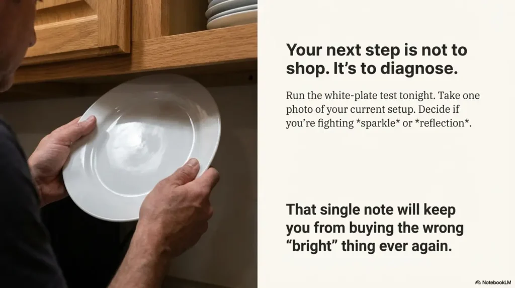
If you do nothing else, do this tonight: the white-plate sparkle test. It takes 30 seconds and tells you which fix you need.
Then pick one upgrade path for your critical zone (not the whole kitchen—yet):
- Add a diffuser channel (milky/opal if sparkle is your enemy).
- Mount near the front lip to reduce reflections and shadows.
- Add low-end dimming so the light stays usable at night.
Money Block: Quote-prep list (what to gather before comparing)
- Your critical-zone counter length (in feet).
- One photo of your counter + backsplash (to assess reflectivity).
- Cabinet depth/overhang (so you can plan front-lip placement).
- Power preference: plug-in / battery / hardwired.
- Must-have: true low-end dimming (yes/no).
Neutral action: Save these notes in your phone before you open a shopping tab.
Conclusion
The reason “daylight under-cabinet lighting” sometimes feels worse—especially with low vision—isn’t that daylight is wrong. It’s that undiffused, poorly placed light behaves badly on reflective surfaces. That was the open loop from the beginning: why a “helpful” upgrade can feel hostile. Now you know the answer, and you have a cleaner path.
If you want the simplest rule that still works in real kitchens: See the food, not the light. Diffuse the source, move it forward, and make sure it can dim low. Start with one zone, test it for a week, then expand. Your kitchen doesn’t need to be perfect. It needs to be predictable.
Do this in the next 15 minutes: run the plate test, take one photo of your current setup, and write down whether you’re fighting sparkle or reflection. That single note will keep you from buying the wrong “bright” thing again.
Last reviewed: 2026-01