
Navigating the Menu: A Low Vision Strategy
Restaurant menu reading with low vision often breaks down before the food choice even begins. It’s rarely just about print size, glossy pages, cramped layouts, QR scrolling, dim lighting, and table-side time pressure all gang up at once. This environment makes reading in public feel significantly harder than reading at home.
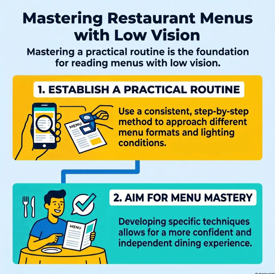
The result of “guessing” is often visual fatigue, rushed ordering, and settling for a mediocre meal just to end the moment. This guide offers a real-world routine to handle menus effectively without immediate dependence on staff.
Our method is practical, not performative, designed for the noisy and imperfect reality of dining out.
Small shift. Big difference.
Table of Contents
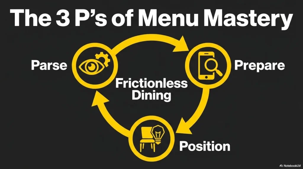
Quick Visual: The 4-Step Restaurant Menu Routine
1. Seat
Check light, glare, and your better viewing angle before the menu becomes a problem.
2. Scan
Find sections first. Do not magnify paragraphs before you know where you are.
3. Shortlist
Pick 2 or 3 likely dishes. Read only what helps you choose.
4. Decide
Confirm price, add-ons, and one backup option before the server returns.
Start Before You Sit: Why the Menu Gets Harder Than It Should
The real problem is rarely just print size
Many people assume restaurant menus become difficult because the text is too small. Sometimes that is true. More often, the trouble is layered. The print is small, yes, but it is also glossy, dense, low-contrast, oddly lit, and sitting in a room where everyone seems to decide faster than you can focus. A menu that looks manageable at home can feel slippery at a table because your eyes are doing two jobs at once: decoding text and fighting the environment.
I have watched this happen with totally ordinary menus. The letters were technically readable, yet the experience still felt exhausting. That is the part many advice pieces miss. Reading in public is not just a visual task. It is a timing task. The server is nearby. Someone else wants to split an appetizer. Music is humming. The menu has twelve cheerful fonts and no mercy.
Lighting, glare, layout, and time pressure create the pileup
Glare turns black text into a silver ghost. Tight columns make it easy to lose your place. Decorative script looks as though a wedding invitation wandered into lunch. QR menus add another layer of chaos because the page keeps moving under your eyes. Even a good magnifier can feel clumsy if you start using it before you know what part of the menu deserves your effort.
That pileup matters because it changes the emotional tone of the task. You are no longer calmly choosing dinner. You are negotiating with layout, light, and time. That is why a routine helps so much. A routine reduces decisions before the food decision even begins.
Why “I’ll figure it out at the table” often fails fast
Improvisation sounds brave until you are staring at a laminated menu reflecting three ceiling bulbs like tiny suns. Going in without a plan often leads to one of two outcomes: either you read too much too early and tire out, or you wait too long and feel rushed. Neither feels good.
A better approach is to stop treating the menu like a surprise exam. Think of it as a short sequence. First, orient. Then narrow. Then read only what matters. That shift alone lowers the temperature of the moment.
- Small print is only one part of the problem
- Glare and layout often cause more fatigue than font size alone
- A reading routine reduces pressure before ordering begins
Apply in 60 seconds: Before opening the menu fully, ask yourself: where is the light, where is the glare, and what kind of menu is this?
Use the First 60 Seconds: The Pre-Scan Routine That Cuts Stress Early
Check whether the menu is paper, laminated, wall-mounted, QR-based, or app-based
The first minute matters because it tells you what game you are playing. Paper menus behave one way. Laminated menus behave another. Wall boards demand distance strategy. QR menus belong to the kingdom of scrolling and pinch-zoom. App-based menus often have better text handling than browser pages, but not always. If you identify the menu type early, you stop wasting motion on the wrong tool.
A laminated menu may need angle changes more than extra magnification. A QR menu may need your text settings fixed before the page even loads. A wall menu may be easier to photograph and zoom than to read in place. This is not overthinking. It is fieldcraft, just with soup specials.
Scan headings first, not dish descriptions
Headings are anchors. Descriptions are rabbit holes. If you start with the descriptive text under every dish, you will spend your best visual energy too early. Instead, look for category labels: appetizers, salads, noodles, tacos, chef specials, desserts. These bigger labels give the page a shape. Once the menu has shape, your eyes have less wandering to do.
This sounds simple, but it changes everything. Without headings, magnification becomes a flashlight in fog. With headings, it becomes a tool with direction.
Mark your likely section before you start enlarging text
Pick the section most likely to contain what you actually want. If you know you are not ordering fish tonight, there is no prize for reading the fish section like a scholar preserving ancient tablets. Mentally mark your likely zone first. Then spend your magnifier time there.
One quiet advantage of this approach is emotional. You move from “I have to read this entire menu somehow” to “I only need to solve one section well.” That is a smaller hill. Smaller hills get climbed.
Let’s be honest… too much scanning too early creates visual fatigue
There is a strange temptation to scan everything at once just to feel prepared. In practice, that often burns energy before a real decision has formed. I have done this and ended up knowing that the restaurant serves six kinds of aioli while still not knowing what I wanted to eat. Information was gained. Dinner was not.
Keep the pre-scan brief. Think orientation, not deep reading. You are building a map, not writing a dissertation in the salsa aisle.
Eligibility checklist: Is the pre-scan routine likely to help you?
- Yes if you usually lose time deciding where to start on a menu
- Yes if glare or scrolling tires you before you choose a dish
- Yes if you can use a magnifier or phone better once you know the target area
- No if your vision has changed suddenly or worsened rapidly and the issue is new
Next step: Practice the pre-scan on one online menu before your next restaurant visit.
Pick the Right Seat First: Positioning Changes Everything
Face the light without placing glare directly on the page
Seat choice can rescue a difficult menu before any device comes out. You want enough light to increase contrast, but not so much direct reflection that the page turns shiny and unreadable. In real life, that usually means facing useful light or sitting beside it, then tilting the menu until the glare slides away from the text.
There is a little choreography here. Move the page. Move your body. Move the phone if needed. Most people try to hold everything still and force their eyes to do the heroic part. That is backwards. Let the objects move so your eyes do less work.
Why window seats can help at lunch and betray you at dinner
Window light at midday can be lovely. Soft, even light can make text easier to read. But late afternoon glare or nighttime reflections can turn the same seat into a mirror factory. Restaurants love ambiance. Your eyes may prefer honesty. A table that looks romantic can be terrible for actual reading.
I once picked the prettiest seat in a café and spent three minutes fighting a glossy menu that had become a full moon. Rotating the menu fixed it instantly. Vanity lost. Soup won.
Put your better eye angle and device hand to work, not by accident
If one side gives you a better viewing angle, build around that on purpose. If one hand handles the phone or magnifier more comfortably, let that shape where you sit and how you hold the menu. Tiny ergonomic choices matter because restaurant reading happens in short bursts. The smoother those bursts are, the less tired you feel by the time the order comes.
Small move, big payoff: rotating the menu is often easier than fighting the reflection
This is the quiet trick that deserves more applause. Many people keep the menu fixed in the position it was handed to them, as though moving it might be rude. It is not rude. It is paper. Rotate it. Tip it. Lay it flatter. Hold it more upright. Even a small change in angle can take a line of text from washed out to readable.
When the environment is bad, do not demand better performance from your eyes. Demand a better angle from the menu. That is often the cheapest win in the room. The same principle shows up in other daily tasks too, especially when you are trying to read glossy mail without glare or tame reflective household surfaces.
Show me the nerdy details
Angle changes help because glare is directional. If reflected light is landing where you need contrast, magnification alone may enlarge the problem. Adjusting the page angle first often improves usable contrast before you change zoom level.
Choose Your Magnifier on Purpose: What Works Better in Restaurants
Optical handheld magnifier vs phone magnifier vs built-in accessibility zoom
Restaurant settings reveal the strengths and weaknesses of each tool very quickly. A simple optical handheld magnifier is fast, quiet, and dependable. No battery. No notifications. No accidental selfie camera. It works especially well for spot-reading prices, ingredients, or one line at a time.
A phone magnifier can be better when the print is tiny, the menu is glossy, or the lighting is uneven. You can adjust zoom, freeze an image, and sometimes improve contrast with filters or brightness changes. The downside is motion. Holding the phone steady over a menu while the screen keeps adjusting can feel like chasing a dragonfly with a teaspoon. If you use an iPhone, setting up Back Tap to open Magnifier faster can make that transition much less fussy.
Built-in accessibility zoom helps most with digital menus and screenshots. It is less helpful when you are trying to read a physical page through a live camera unless you already use it comfortably. Restaurants are not the ideal place to learn a brand-new gesture sequence while your friend says, “I’m good with anything.” That sentence has ended many noble experiments.
When a small portable light helps and when it makes glare worse
A small light can help with matte paper or dim environments. It can also make glossy menus worse by creating a bright hotspot exactly where the text lives. This is why the best light is not always the brightest one. What you want is useful light, not a tiny interrogation lamp for the lasagna section.
Test light briefly and from the side. If the menu starts reflecting like wet pavement, stop. Angle first, then light. That order saves trouble. The same brightness logic matters when you need to make an iPhone flashlight less harsh instead of simply making everything brighter.
Why restaurants expose the weakness of “good enough at home” magnifiers
At home, a tool can seem perfectly acceptable because your chair, light, and timing are under your control. In a restaurant, the weaknesses become obvious. A magnifier that is slightly too small feels much smaller. A phone setup that is mildly awkward becomes wildly annoying. A case or stand that seemed unnecessary suddenly feels wise.
That is useful information. It does not mean your tool is bad. It means the environment is honest. Restaurant menus are a stress test. They show you what works in motion, not just in peace.
Decision card: When A vs B
Choose an optical handheld magnifier when you need quiet, quick spot-reading and want less screen fuss.
Choose a phone magnifier when you need more zoom, better lighting control, or a frozen image.
Time trade-off: handheld is usually faster to start; phone usually offers more flexibility once set.
Neutral action: bring both once, then notice which one you actually reach for first.
Read in Layers: The Menu Routine That Prevents Cognitive Overload
Layer 1: section names and anchors
Layered reading is the heart of this routine. The first layer is not content-heavy. It is structural. Find the major sections. Let the menu tell you where things live. This protects you from over-magnifying random text before you have context.
Layer 2: dish names only
Once you are in the right section, read dish names before descriptions. Names are lighter work. They let you build a shortlist quickly. You are not trying to understand every garnish, sauce, and adjective yet. You are asking a simpler question: what might I plausibly order?
I like this step because it returns dignity to the process. You stop behaving like the menu owns your evening. Instead, you act like a person selecting options. Which is, inconveniently for the menu, exactly true.
Layer 3: prices, sides, and add-ons
After you have two or three possible dishes, move to the decision details. Prices, included sides, substitutions, spice notes, portion clues, and extra charges belong here. This layer matters because it prevents a common trap: falling in love with an item and only later discovering that the thing you wanted costs extra, comes with something you cannot eat, or needs modification.
When you save these details for the shortlist stage, they become manageable. Reading every price on the menu from the start is like trying to memorize the grocery store before deciding what to cook.
Layer 4: only then read the fine print that changes the order
Fine print includes allergy notes, sauce choices, cooking options, and small phrases that change what the dish really is. By the time you reach this layer, you are reading with purpose. That is crucial. Purpose lowers fatigue.
Without layers, magnification can create cognitive overload because each enlarged line feels equally urgent. With layers, not every line gets equal access to your energy. That boundary is freeing.
- Structure first
- Dish names second
- Decision details third
Apply in 60 seconds: On your next menu, refuse to read any full description until you have found the right section and at least two likely dishes.
Don’t Chase Every Word: Build a Shortlist Before You Read Deeply
Narrow to two or three plausible choices first
The menu is not asking to be conquered. It is asking to help you choose dinner. That distinction matters. If you narrow to two or three plausible choices first, the rest of the reading becomes dramatically lighter. Your magnifier time drops. Your decision fatigue drops. Your chance of getting stuck between twelve similar entrées also drops.
For many people with low vision, independence improves when the task gets smaller, not when the effort gets grander. A shortlist is a kindness to your future self.
Use familiar food categories to reduce unnecessary magnifier time
If you already know your preferences, use them. Pasta, rice bowls, soups, grilled dishes, tacos, sandwiches, curries, noodle soups, salads. Familiar categories act like shortcuts. They help you skip text that is unlikely to matter and go where useful information is more likely to live.
This is not laziness. It is intelligent filtering. Airports, grocery stores, and computer menus all reward smart filtering. Restaurants are no different, even if they decorate the trap with truffle oil.
Here’s what no one tells you… the longest part of menu reading is often deciding what not to read
People often think the hard part is enlarging the text. Sometimes the harder part is choosing what deserves enlargement. If every item feels equally possible, you end up reading too much. If you quietly rule out categories you do not want, the visual load shrinks fast.
One trick that helps is the two-question filter: “Would I actually order this today?” and “Would I still consider this if the server came back in two minutes?” If the answer to either is no, let it go. Menus are full of decoys. Your job is not to admire all of them.
Mini calculator: How much reading can you skip?
If a section has 12 dishes and you narrow to 3 likely choices, you reduce deep-reading load by about 75%.
If each full description takes even 15 seconds to read carefully, that can save roughly 2 to 3 minutes of strained reading in a real restaurant setting.
Neutral action: try the shortlist method once and notice whether your decision arrives earlier than usual.
QR Menus Are a Different Beast: How to Make Digital Menus Less Annoying
Increase text size before opening the menu, not after frustration begins
QR menus create a very specific kind of irritation. The page loads in a browser, the text arrives too small, the layout shifts, and suddenly you are pinching, zooming, scrolling, and losing your place like a sailor in browser weather. The easiest improvement is to adjust text size, display size, or magnification settings before scanning the code.
That small bit of preparation prevents the classic spiral where you open the menu first, get annoyed second, and only then remember your phone has tools designed for this exact mess. It also helps to practice QR code scanning for low vision before you need it at a busy table.
Browser zoom, screen magnifier, and spoken content each solve different problems
Browser zoom is good for making the whole webpage bigger. Screen magnifier is better when only parts of the interface are difficult. Spoken content can help when fatigue sets in or when dense blocks of text become slow to decode visually. These are not competing tools. They solve different frictions.
Use the least complicated tool that solves the problem. That sentence could save a surprising amount of energy. Not every situation requires full digital acrobatics. Sometimes browser zoom alone is enough. Sometimes a screenshot plus zoom is calmer than a live webpage. Sometimes having text read aloud is the difference between strain and relief. On Android, many people do well with Select to Speak for menus and other dense screens.
Why endless scrolling is harder than many people expect
Scrolling adds motion to reading, and motion makes orientation harder. On paper, your place stays put. On a digital menu, the page can shift with the slightest swipe. Ads, pop-ups, sticky headers, and floating order buttons love to wander in like uninvited cousins. That instability is tiring because your eyes must keep re-finding context.
When people say they dislike QR menus, they are often reacting to this unstable reading experience, not just the screen itself.
A simple fix: screenshot key sections so the screen stops moving under your eyes
This is one of the best low-drama tricks for QR menus. Once you find the relevant section, take a screenshot. Then read that still image with your preferred zoom tools. A still image removes scroll drift and gives you a fixed field to work with. Suddenly the menu stops behaving like a nervous eel.
It is simple, discreet, and fast. More importantly, it returns control to you. If you rely on iPhone tools, it also pairs well with scan and accessibility settings that make small text easier to handle.
Short Story: A friend once told me she dreaded QR menus more than paper ones, which sounded backward until I watched her use one in a dim noodle shop. The browser kept jumping as images loaded. She would enlarge the text, then brush the screen and lose the line. By the time she found the soup section again, she looked as tired as if she had assembled furniture.
The next time, she changed her text settings before scanning, took one screenshot of the noodle page, and zoomed into the still image instead. The difference was almost theatrical. Same restaurant rhythm. Same kind of menu. But the stress vanished because the page stopped moving. Sometimes independence is not about reading more bravely. It is about making the thing sit still long enough to be read.
Show me the nerdy details
Fixed images reduce orientation loss because the visual target stops reflowing. For many users, still screenshots plus zoom are easier than continuous pinch-and-scroll interaction on live webpages.
Who This Is For and Not For
This is for diners with low vision who want more independence and less social friction
This routine is for adults who want a calmer way to read menus in public without having to rely on staff as the first solution every time. It is especially useful if you can still use a phone, handheld magnifier, or both in short, purposeful bursts. It is also helpful if your main frustration is not one dramatic obstacle, but the annoying combination of print size, glare, scrolling, and pressure.
This is for people who can use a phone, magnifier, or both in short bursts
You do not need a perfect setup for this to help. In fact, the routine is built for imperfect conditions. A lot of restaurant success comes from reducing effort in sequence, not solving everything at once. If you can orient, shortlist, and confirm one final choice, that is enough.
This is not for emergency vision changes or situations where reading difficulty is suddenly worsening
If your vision has changed suddenly, if reading is newly much harder than usual, or if other concerning symptoms are involved, a restaurant strategy is not the real issue to solve first. Sudden changes deserve medical attention rather than a better magnifier trick. In that case, it is more important to know the warning signs of senior vision changes than to optimize your seat at dinner.
This is not a promise that every restaurant setting can be fully controlled
Some environments are just bad. Dim bars. Menus printed in pale gray fonts for reasons known only to graphic designers with vendettas. Wall boards ten feet away. Not every setting can be tamed completely. The point of this guide is not perfection. It is a routine that improves your odds in ordinary real-world situations.
Decision card: When A vs B
Use this routine as your default when the difficulty is mostly environmental and predictable.
Pause and seek medical guidance when reading has become suddenly or sharply harder than usual.
Time trade-off: a routine saves minutes at the table; new unexplained vision changes deserve attention beyond the table.
Neutral action: separate “bad restaurant conditions” from “new vision problem” in your own notes.
Common Mistakes That Make Menus Harder Than They Need to Be
Mistake: reading descriptions before confirming the section
This is one of the biggest energy leaks. Descriptions feel useful, but without context they are just text debt. Read the section label first. Then the item names. Then the details that matter. That order protects you from accidentally studying a part of the menu you were never going to use.
Mistake: sitting down wherever the host leaves you without checking light
Many people are understandably reluctant to fuss over seating. But even a tiny adjustment can save visual effort for the rest of the meal. Checking light is not dramatic. It is practical. You do not need to stage a furniture revolution. Often rotating your chair or shifting the menu is enough.
Mistake: using maximum magnification too early and losing orientation
More zoom is not always more clarity. High magnification can make a menu easier to read line by line but harder to understand as a whole. If you zoom too far before you know where you are, orientation disappears. Suddenly every line looks important and none of it feels connected.
Mistake: trying to read through glare instead of changing the angle
Glare is stubborn. People often spend too long trying to power through it. In most cases, a change in angle works better than more effort. Shift the page. Shift the light. Shift your body. Fighting glare head-on is usually a losing duel.
Mistake: treating QR menus and paper menus as the same task
Paper menus are stable. QR menus are dynamic. The reading strategies overlap, but they are not identical. A QR menu may need screenshots, browser zoom, or spoken support. A paper menu may need angle changes and spot magnification. Treating them as the same can make both harder.
- Orientation should come before detail
- Angle often beats force
- Paper and QR menus need slightly different tactics
Apply in 60 seconds: Next time, lower your zoom level first and ask whether the problem is really position, glare, or menu type.
Don’t Do This at the Table: Small Habits That Quietly Backfire
Don’t keep enlarging and shrinking without a reading order
Constant zoom changes feel active, but they often create confusion. If your scale is changing every few seconds, your brain has to keep re-orienting. A simple reading order does more for clarity than frantic resizing ever will.
Don’t let the phone brightness blast your eyes in a dim restaurant
Brightness can help, but too much in a dark room creates another problem: eye strain and contrast fatigue. The screen becomes a small moon. Your eyes then have to keep adjusting between that bright rectangle and the darker table around it. Comfort matters. The right brightness is the one that helps you read without turning your retinas into overworked interns. Many people find it useful to compare Reduce White Point vs. Night Shift instead of assuming a darker-looking screen is automatically better.
Don’t read the whole menu when your real goal is one confident choice
Menu reading becomes much easier when the goal is clear. You are not auditing the restaurant. You are making a choice. That sounds obvious, but under pressure it is easy to forget. Many people exhaust themselves trying to become comprehensively informed when what they really need is one solid order and one backup.
Don’t wait until the server returns to begin deciding
The server’s return should be the moment of confirmation, not the beginning of panic. If you build a shortlist early, the final decision becomes smaller and calmer. This reduces self-consciousness too. You are not scrambling while everyone else is ready. You are simply choosing between known options.
Make Ordering Easier: A Low-Pressure Script for the Final Decision
Use a two-choice checkpoint before the server comes back
Once you have a shortlist, pause and narrow to two final choices. That checkpoint helps because it moves the process from reading into deciding. Reading and deciding are related, but they are not the same task. Giving each its own moment keeps the table calmer.
A useful private script is this: “If the server came now, which of these two would I actually say out loud?” That question cuts through a surprising amount of menu fog.
Confirm modifiers only after the main dish is settled
Do not get trapped in side-quest territory too early. Sauce choices, spice levels, side substitutions, protein upgrades, and add-ons can wait until the main dish is chosen. Otherwise you risk spending your best energy on details for a meal you may not order.
Keep one backup choice ready in case the first item is unavailable
This small habit saves a lot of stress. If your first choice is sold out, you do not have to re-enter the full reading process. You already have a second option. In noisy or busy settings, this feels especially good because it protects you from starting over under pressure.
Tiny victory, real effect: less rereading means less fatigue and less self-consciousness
When the final decision is structured, rereading drops sharply. That matters because rereading is often what makes people feel exposed at the table. The less you have to loop back over text, the more natural the whole interaction feels.
I have seen this change the mood of a meal. The difference is rarely dramatic from the outside. Inside, though, it feels like the room has stopped leaning on your shoulders.
Quote-prep list: What to gather before comparing your final two dishes
- Main dish name
- Price
- One important modifier or side note
- One backup choice
Neutral action: keep the final comparison to these 4 points rather than rereading full descriptions again.
What to Pack in Your “Restaurant Reading Kit”
One magnifier you already trust
The best restaurant tool is rarely the fanciest. It is the one you can use without a tutorial and without resentment. Pick one magnifier you already trust. Familiarity matters more than gadget glamour.
One phone shortcut for zoom or accessibility features
If your phone supports an accessibility shortcut, set it before you need it. The fewer taps and swipes between you and readable text, the better. Restaurants are excellent places to discover which features are actually convenient and which ones only sounded elegant in settings menus.
One small cleaning cloth because smudges steal contrast fast
This tiny item earns its place. Smudges dull contrast, add haze, and make screen reading more irritating than it needs to be. A quick wipe can make a bigger difference than one more round of pinch-zoom.
One habit checklist that becomes automatic with practice
The real kit is partly physical and partly behavioral. A simple internal checklist works well: seat, menu type, section, shortlist, detail, decide. Once those steps become familiar, the whole process feels lighter.
You are not trying to become a menu-reading machine. You are building a small system that lets dinner stay dinner. In the same spirit, many readers also like building a simple low vision filing system or a repeatable grocery list workflow that reduces visual effort before it turns into fatigue.
Show me the nerdy details
Prepared shortcuts matter because complex gesture sequences can increase cognitive load in busy environments. The most effective setup is often the one with the fewest steps between noticing a problem and solving it.
FAQ
How much magnification is usually enough for restaurant menus?
Enough magnification is the level that lets you read key information without losing orientation. In practice, that often means starting lower than you think, finding the right section, and only then increasing zoom for prices or fine print. Maximum magnification too early can make the menu harder to navigate.
Is a phone better than a handheld magnifier in dim lighting?
Sometimes, yes. A phone can help when the menu is very small or the lighting is uneven. But a handheld magnifier can still be faster for spot-reading if glare is under control. The better tool is usually the one that solves the problem with less motion and less setup.
What should I do when the menu has glossy pages and heavy glare?
Change the angle before increasing zoom. Tilt or rotate the menu, shift your seat slightly, or move the light source relative to the page. If glare remains severe, a phone photo or screenshot of the relevant area can sometimes create a more readable fixed image than the live page itself.
Are QR code menus easier or harder for people with low vision?
They can be easier or harder depending on the website and your phone setup. They help when text settings, screenshots, and screen magnification work smoothly. They become harder when scrolling is unstable, text reflows constantly, or the layout includes distracting elements. A screenshot often makes them easier.
How can I read prices and add-ons without losing my place?
Wait until you already have a shortlist. Then read only the price and the detail that affects the decision. If needed, use your finger, the edge of the phone, or the magnifier frame as a visual anchor so your eye can return to the same line more easily.
What is the best way to avoid visual fatigue before ordering?
Reduce unnecessary reading. Pre-scan the menu type, find the right section, narrow to two or three choices, and read in layers. Fatigue usually grows when you read too much too early or keep changing tools without a clear sequence.
Can I use built-in iPhone or Android accessibility tools for this?
Yes, built-in tools can help a lot, especially for QR menus and screenshots. The key is to set them up before you need them and to practice once in a low-pressure setting. A restaurant table is not the ideal place to learn unfamiliar accessibility gestures from scratch.
What if the restaurant lighting changes after I sit down?
Adapt in small steps. Rotate the menu, shift your chair slightly, lower or raise screen brightness, or switch from live reading to a still photo or screenshot. You do not need one perfect setup. You need a routine flexible enough to survive changing light.
Next Step: Practice the Routine Once Before You Need It
Pick one restaurant menu, simulate the first two minutes, and rehearse your pre-scan + magnifier sequence
The easiest way to make this routine real is to practice before you are hungry, social, and under mild time pressure. Open one menu online or use a takeout menu at home. Sit down somewhere with imperfect light. Then rehearse the first two minutes: identify the menu type, find the section, shortlist two dishes, and read one decision detail clearly.
Keep only the steps that reduce effort and delete the ones that create extra motion
Not every technique will suit every person. That is normal. Keep the steps that genuinely reduce effort. Delete the ones that create fiddling. A good routine should feel calmer after one or two tries, not more elaborate. Complexity is often dressed as sophistication. At the dinner table, simplicity usually wins.
The goal for next time is simple: find one section, shortlist two dishes, read one decision point clearly
That is enough. Truly. You do not need to dominate the entire menu to dine more independently. You need one working sequence that lowers fatigue and helps you make one confident choice. That is the curiosity loop from the beginning, now closed: the menu stops feeling like a surprise object when it becomes a short, repeatable routine.
- Practice once before the real outing
- Keep the routine short enough to remember
- Aim for one confident choice, not total menu mastery
Apply in 60 seconds: Save one restaurant menu on your phone tonight and rehearse the first two minutes before your next meal out.
Last reviewed: 2026-04.