

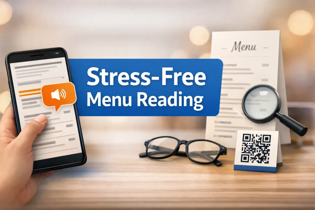
Mastering the Menu: Stress-Free Reading with Android Select to Speak
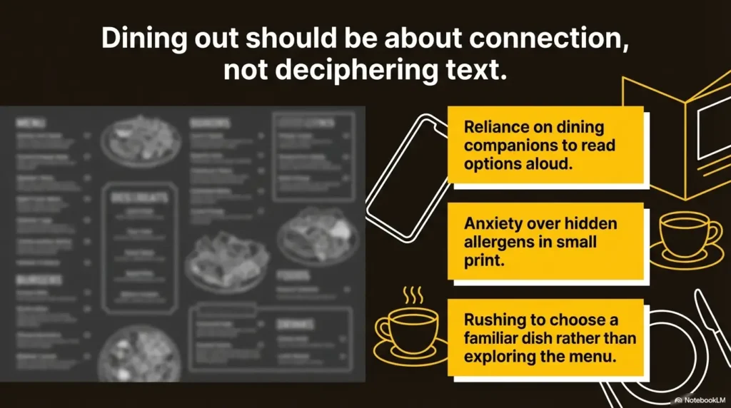
Restaurant menus rarely fail in dramatic ways. They fail in small, expensive ones: the tiny price line you miss, the side swap tucked under the entrée, or the allergen note hiding in pale gray text while the room gets louder.
That is exactly where Android Select to Speak earns its keep. For anyone dealing with low vision, glare, menu fatigue, or visual clutter, the challenge isn’t just “reading”—it’s making a confident choice before the table starts to feel like a stopwatch.
Table of Contents
Fast Answer: Android Select to Speak can make restaurant menus easier to use by reading selected text aloud from printed pages, QR-code menus, and many restaurant apps. The best results come from a simple routine: set it up before you leave, read the menu in small passes, slow the speech if needed, and double-check prices, modifiers, and allergen notes before ordering.
Android Select to Speak First, Because the Menu Problem Starts Before the Food
Why restaurant menus fail in the exact places accessibility matters most
Restaurant menus often collapse under the same pressures that make any reading task harder: poor contrast, tiny type, reflective paper, crowded layouts, and the social pressure to decide quickly. That is why the menu problem usually begins before the first dish appears. It starts with design choices that assume everyone can scan dense text at speed.
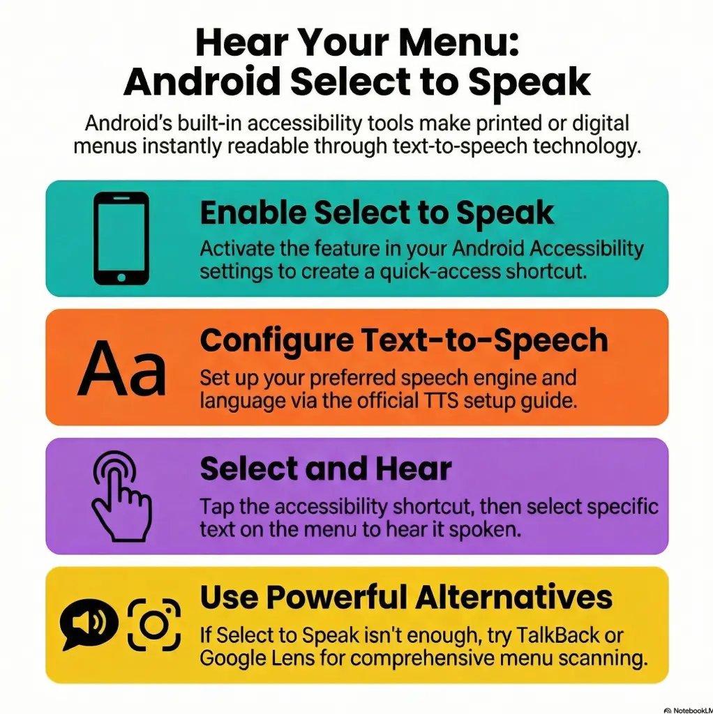
Google’s official Android accessibility help explains that Select to Speak can be started with an accessibility shortcut and then used by tapping text or dragging across items on screen. Android’s accessibility overview also notes that Select to Speak is part of the Android Accessibility Suite.
Small fonts, glossy paper, bad lighting, and time pressure create a perfect storm
I have seen this go sideways in very ordinary places: a bright brunch spot with sunlight skating across a laminated menu, a noodle shop with a QR code taped to the soy sauce bottle, a café where the daily special was written in a font that seemed to have taken a personal dislike to legibility. None of this is dramatic. That is precisely the problem. It is ordinary friction, repeated so often it starts to feel inevitable.
But it is not inevitable. When you use Select to Speak well, you are not trying to conquer the entire menu in one heroic sweep. You are making the page smaller. Section by section. Choice by choice. That shift alone reduces strain.
The real goal is not “use a feature,” but “order with less strain and less guesswork”
Accessibility tools work best when they serve a plain human outcome. In this case, the outcome is simple: understand what is on offer, compare options, catch the conditions, and order without feeling hurried into mistakes.
That might mean reading only the salad section. It might mean replaying the side options twice. It might mean taking a photo of the printed menu so you can enlarge it and read it in calmer pieces.
- Read one section at a time
- Prioritize prices and modifiers
- Treat the menu like a map, not a novel
Apply in 60 seconds: Decide now that your first scan at a restaurant will be section headers only.
Who This Helps Most, and Who May Need a Different Tool Instead
Best for low-vision diners, older adults, accessibility-minded users, and anyone dealing with menu fatigue
This setup can help several kinds of readers, not just one. It helps low-vision diners who need spoken support. It helps older adults who can still read but lose stamina on dense menus. It helps people dealing with glare sensitivity, fatigue, or decision overload. It also helps caregivers who want to support someone without turning the meal into a group project starring one increasingly sweaty smartphone.
Useful for printed menus, QR-code menus, digital menu boards, and takeaway apps
The most flexible use case is the phone itself. On QR menus, restaurant websites, and many food apps, Select to Speak can often read selected text directly. Google’s help page says you can tap a screen item, drag across multiple items, or choose to hear everything. That makes digital menus a strong match when the text is selectable and the layout is not too chaotic.
Printed menus are still workable, but they often need an extra move: using the camera view or taking a photo first. Google’s Select to Speak guidance notes that you can point the camera at text and use the shortcut to highlight what you want read aloud.
For some users, Google Lookout may be an even better companion because it is designed to use the camera and sensors to recognize text and other details in the environment for people who are blind or have low vision. If you already rely on iPhone tools in other parts of daily life, a similar habit of tuning scan settings for low vision can help you think more clearly about what kind of input quality makes menu reading easier.
Not ideal when the menu text is stylized, handwritten, badly photographed, or constantly moving
There are limits. If the menu is written in decorative script, if the photo is blurry, if the sign is backlit, if the digital board keeps changing before you finish listening, the tool can wobble. This does not mean you failed. It means the input is messy. Even excellent reading support becomes less elegant when the source looks like it was designed by a candle in a hurry.
Eligibility checklist:
- Can you use an Android accessibility shortcut comfortably? Yes/No
- Do you usually read menus on your own phone or from printed paper? Yes/No
- Do you need help mostly with dense text, glare, or speed pressure? Yes/No
- Would hearing short sections aloud reduce strain? Yes/No
If you answered “yes” to at least 3, Select to Speak is worth testing on your next menu. Neutral next step: practice on one restaurant website tonight.
Setup Before You Go, or the Table Turns Into a Tiny Tech Emergency
Turn on Select to Speak before the restaurant, not while the server is waiting
This is the most useful advice in the entire article. Set it up at home. Not in the queue. Not while someone asks whether you would like sparkling or still. Not while your friend has already chosen and is pretending not to notice your phone doing acrobatics.
Android’s official help says Select to Speak is started with its accessibility shortcut, including a gesture option and the Accessibility button. Text-to-speech settings on Android can also be adjusted for engine, language, speech rate, and pitch in Accessibility settings.
Practice on one dense page at home so the gestures feel automatic later
Pick a menu-like page at home. A restaurant site is perfect. Practice three actions only: launch the shortcut, select one block of text, replay a smaller part. That is enough. You do not need a grand rehearsal. A 3-minute practice session often saves 30 seconds of public fumbling, which somehow feels like 3 years.
A small anecdote here: the first time I practiced with a fake menu page, I kept selecting decorative text and the page footer, as if I were deeply interested in copyright notices. The second attempt was smoother because I stopped trying to read everything and aimed only for dish names and price lines. That tiny adjustment changed the whole experience.
Save brightness, speech rate, and volume habits that work in noisy rooms
Brightness matters more than people think. Too low, and you fight the screen. Too high, and glare wins. Speech rate matters too. Fast speech feels efficient until it turns modifiers into soup. In most restaurants, slightly slower is better because noise is already stealing syllables. Volume is trickier. Louder is not always clearer. Sometimes a modest volume with one earbud is the cleanest, least fatiguing route. If screen brightness itself is part of the strain, the same logic behind Reduce White Point versus Night Shift for glare-sensitive eyes can help you build a calmer setup before you leave home.
Show me the nerdy details
Select to Speak performance depends on the input layer. Clean digital text is usually easier to parse than camera-captured text. If you use camera-based reading for a printed menu, lighting angle, focus, paper reflectivity, and hand stability all affect how accurately text regions can be highlighted and spoken.
At the Table: How to Use Android Select to Speak Without Feeling Rushed
Start with section headers first so the menu becomes smaller and more navigable
When the menu lands, resist the urge to read from top to bottom. First, identify the terrain. Appetizers. Mains. Sandwiches. Drinks. Dessert. This is not just about organization. It is about nervous system management. The page becomes less hostile when it has neighborhoods.
Scan appetizers, mains, sides, and drinks in passes instead of trying to hear everything at once
Make passes. First pass: section headers. Second pass: likely category. Third pass: top 2 or 3 candidates. Fourth pass: details for the finalists. This sounds methodical because it is methodical. Good accessibility often looks like good editing. You cut the noise so the signal can breathe.
I once watched someone use this exact method with a sprawling brunch menu. She ignored 80 percent of the page on purpose, narrowed to egg dishes, replayed two descriptions, then checked the side options. Order placed in under 2 minutes. Calmly. No drama. That is the dream, honestly. Not perfection. Just less friction.
Use short listening bursts to avoid cognitive overload when the menu is crowded
Short bursts win. Eight to 20 seconds is often enough for one chunk. Longer playback can become muddy, especially when the menu includes nested descriptions, ingredient lists, and little symbols for spice, gluten, or chef’s recommendations. You do not need endurance. You need precision.
Let’s be honest… most menu stress comes from speed, not from the technology itself
Most people do not hate the feature. They hate the timing. They try it too late, under too much social pressure, and then blame the tool. So give yourself one sentence you can use at the table: “I just need a minute to check the menu.” That line solves more problems than any setting buried three screens deep.
- Pass 1: headers
- Pass 2: one likely section
- Pass 3: top candidates
Apply in 60 seconds: Save the phrase “headers first, details second” in your notes app before your next meal out.
Printed Menus Behave Differently Than QR Menus, and That Changes Everything
Why glossy paper, folds, shadows, and table lighting make printed menus harder to read aloud
Printed menus are physical objects, which means they come with physical annoyances. Gloss throws glare. Folds bend lines. Dim table lamps create shadows. A hand holding the page can block the exact corner where prices live. These are tiny sabotage artists, all working overtime.
For printed menus, the most reliable tactic is often to take a photo in better light, crop to the relevant section, zoom in, and then use your reading tool on a steadier image. Even when you can use the live camera, a still photo gives you more control and less drift. The same light-angle logic shows up outside restaurants too, especially in guides on reading lamp position for central vision loss and broader glare control.
Why QR menus can be easier to zoom, select, and replay, but still create their own friction
QR menus often win on control. Text can be enlarged. Sections are sometimes collapsible. You can replay the same chunk without wrestling a laminated page. But digital menus bring their own nonsense: sticky banners, auto-loading images, pop-ups for loyalty programs, and tiny “add-on” disclosures hidden behind arrows that look decorative until they charge extra.
Which format usually gives more control when you need to compare ingredients, prices, or sides
For straight comparison work, QR menus usually have the edge because selectable text is easier to revisit. Printed menus can still be better if the digital version is slow, overloaded, or badly structured. The test is simple: where can you isolate the exact text you need with the least fuss? Choose that format. Loyalty to format is overrated. Loyalty to clarity is better.
Decision card: When should you use paper, photo, or QR?
- Paper: good when layout is simple and lighting is decent
- Photo of paper: best when glare or hand movement makes live reading harder
- QR menu: best when text is selectable and you need to compare details
Neutral next step: test all three on the same menu once, then stick with the one that drains the least energy.
Don’t Make These Setup Mistakes Right Before Ordering
Do not wait until the server arrives to figure out gestures, permissions, or volume
This is the classic trap. The menu arrives, the room is loud, and suddenly you are trying to remember whether the shortcut is a gesture, a button, or both. Any tool feels worse when used under a stopwatch. Solve that problem upstream.
Do not try to read the full menu line by line when you only need a narrow section
If you already know you want seafood, do not read burgers, desserts, and cocktails first out of some misplaced moral duty to the whole menu. You are not grading it. You are ordering dinner. Aim narrow.
Do not assume louder audio automatically means better comprehension in a busy restaurant
Busy rooms are not just loud. They are layered. Music, cutlery, nearby conversation, espresso machines, one child who appears to be narrating the fall of Rome. All of this means blasting the phone speaker can actually make things more chaotic. Cleaner, closer audio usually beats louder, more public audio.
Android devices let users adjust text-to-speech output settings like speech rate and pitch, which means comprehension can often be improved by tuning delivery rather than simply turning the volume up.
Noise Is the Real Villain Here, Not the Menu
Why restaurant soundscapes break concentration even when text-to-speech is working correctly
Noise scrambles comprehension in subtle ways. You may hear every word and still miss the meaning because the brain is juggling too many inputs at once. That is why a functioning tool can still feel like it is failing. Often, the problem is not speech output. It is cognitive crowding.
How earbuds, phone placement, and speech speed can quietly change the whole experience
A single earbud can help. So can placing the phone closer rather than making it shout across the table. Slowing the speech rate by even a small amount can restore clarity when menu text is dense. Think of it like reading a map in rain: slower is not weaker. Slower is drier.
What to do when music, dishes, and conversation swallow key menu details
When the room gets too loud, stop trying to process full descriptions. Switch to a triage mode. Hear the dish name. Then the price. Then the one detail you care about most, such as spice level, side choice, or allergen note. If needed, move to a fallback: ask staff one precise question. “Does this come with fries or salad?” is faster and more useful than wrestling 6 lines of text in a sonic hurricane.
Short Story: A friend once tried to use menu reading support in a packed ramen shop where the music was loud enough to season the broth. She kept replaying the same section, growing more annoyed each time, until she switched tactics. First she scanned only dish names. Then she zoomed the photo she had taken and re-read just two finalists.
Finally, she asked whether one bowl could be made less spicy. Total time: maybe 90 seconds. What changed was not the restaurant. It was the order of operations. The moment she stopped treating the menu like a textbook and started treating it like a decision tree, the whole situation softened. That is the pattern worth remembering.
- Focus on dish name first
- Then confirm price
- Then check one critical detail
Apply in 60 seconds: Pick your one critical detail before the menu arrives: spice, sides, allergens, or cost.
Here’s Where People Get Stuck: Prices, Modifiers, and Fine Print
Why add-ons, allergens, combo rules, and side choices are where missed details hide
Menu friction rarely lives in the name of the entrée. It lives in the smaller print beneath it. Extra charges. Substitution rules. Side choices. “Comes with” conditions. That is where decisions become expensive or inconvenient. A sandwich is easy to identify. The fact that avocado adds $3 and soup replaces fries for $2 more? That is where attention gets taxed.
How to re-check just the high-risk parts without replaying the whole page
Make a high-risk checklist. For most diners, it has four items: price, side, allergens, add-ons. Replay only those. If you took a photo, crop close to the detail block. If it is digital text, select only that paragraph. Surgical reading is not cheating. It is efficient.
Here’s what no one tells you… the hardest part is rarely the entrée name, but the tiny conditions beneath it
The trouble with menu fine print is that it asks your eyes and ears to do accounting during a social event. No wonder people miss things. Once you know that, the fix becomes less emotional. You are not bad at menus. Menus are often bad at signaling what matters. That same pattern appears in everyday packaging too, which is why some readers also benefit from routines for reading expiration dates with low vision when the smallest line carries the biggest consequence.
Mini calculator: Compare dish cost in under 20 seconds.
Base dish price + likely add-on + side upgrade = realistic total.
Example: $14 entrée + $3 add-on + $2 side swap = $19 actual choice.
Neutral next step: do this once for your top two options before you order.
Common Mistakes That Make Select to Speak Feel Worse Than It Is
Using it too late, too fast, or on the wrong part of the menu
The most common error is timing. The second is speed. The third is targeting. People rush the setup, play back too much text, then decide the feature is awkward. Usually it is not awkward. The workflow is.
Treating the menu like a novel instead of a decision map
Menus are designed to persuade, cluster, decorate, and upsell. They are not built for linear comprehension. When you read them like chapters, you inherit all their clutter. When you read them like a map, you recover control.
Forgetting that light, angle, glare, and hand stability affect the result as much as settings do
This matters especially for printed menus. If the image is poor, the reading experience will be poor. I have seen people spend longer adjusting speech settings than adjusting the actual page angle, which is a bit like polishing glasses while standing in fog. Many of the same headaches show up in everyday environments with window glare, TV glare reduction, and other light-bounce battles that quietly wear readers down.
Show me the nerdy details
Camera-based reading is an input-quality game. Better light and steadier framing often improve recognition more than repeated software tweaking. For printed menus, capture quality and cropping are often the hidden variables behind “it worked last time, why not now?” moments.
Restaurant Workarounds That Save Energy When the Menu Fights Back
Ask for a moment, a better-lit seat, or a digital version without turning the meal into a performance
You do not need a speech. You need a sentence. “Could I have a minute?” “Do you have a digital menu?” “Is there a brighter seat?” These are ordinary requests. Accessibility is not a dramatic exception to dining. It is part of dining.
Use a photo, zoom, and targeted reading when the printed layout is chaotic
One of the best workarounds is gloriously boring: take a photo, zoom in, crop, and read only the relevant block. The extra 10 seconds often saves a minute of frustration. I have done this with chalkboard-style menus that looked charming from a distance and borderline mythological up close. If you already use shortcut-based tools on other devices, the instinct behind Back Tap for Magnifier points to the same larger truth: the easier the tool is to launch, the more likely you are to use it before stress snowballs.
When it is smarter to ask staff one precise question instead of wrestling with every line
Precision questions are underrated. Ask one thing you cannot easily extract yourself. “Which pasta has no cheese?” “Does this include a drink?” “Can the sauce be on the side?” Staff can usually answer these much faster than you can excavate them from a cluttered layout.
Infographic: The 5-Step Restaurant Reading Routine
Shortcut on, speech rate comfortable, brightness ready.
Read section headers first.
Pick one category and two likely dishes.
Confirm price, sides, allergens, add-ons.
Use photo, QR version, or one precise staff question.
Privacy, Social Comfort, and the Awkwardness Nobody Talks About
Why some users worry less about reading and more about being watched while reading
For many people, the technical part is not the hardest part. The social part is. They worry the phone audio will draw attention. They worry the server will return too soon. They worry friends will think they are being indecisive when really they are just trying to access the information in the first place.
That anxiety is real, and it deserves better than “just don’t care what people think.” Social ease is part of accessibility. A tool that works beautifully in silence but feels embarrassing in public is only half a solution.
How to keep the interaction discreet without sacrificing clarity
Use one earbud if that feels comfortable. Lower the speech rate slightly so you can keep the volume lower. Keep the phone close. Read shorter chunks. Ask for a minute early instead of apologizing late. These small moves keep the interaction ordinary, which is exactly what most people want.
The difference between accessible use and feeling like you need to apologize for using it
You do not need to perform gratitude for using an accessibility feature. You do not need to explain your vision, your fatigue, your processing style, or your reasons. The cleanest mindset is also the kindest one: this is simply how you read the menu today.
I remember one dinner where the most helpful shift was not technical at all. It was deciding not to rush just because everyone else looked ready. That tiny refusal to panic made the feature feel less like a public event and more like a normal utensil. Which, in a sense, it is.
Troubleshooting Fast When Select to Speak Is Not Cooperating
What to check first when nothing reads aloud
First, check the obvious things without shame. Is the shortcut enabled? Is media volume or accessibility audio audible? Is the text actually selectable on this screen? Are you trying to read a moving element before it settles? Most failures are boring, which is good news. Boring problems have boring fixes.
Why selection boxes, overlays, and scrolling menus can interfere with smooth reading
Digital menus often layer promotional banners, sticky headers, floating cart buttons, and expanding option panels over the text you actually need. That can make selection messy. If the interface fights you, switch tactics. Screenshot the relevant area. Scroll less. Target smaller chunks. Some restaurant websites are accessibility obstacle courses wearing modern fonts.
When the better move is to switch tactics instead of forcing the tool to behave
Sometimes the smartest move is not persistence. It is switching tools. Google’s low-vision accessibility resources highlight additional tools such as Lookout, and Android’s vision accessibility pages point users toward related features designed for low-vision support. If Select to Speak is not the right match for a particular menu, that is not a defeat. It is useful information. In daily life, people often discover this same principle when moving between features like magnification, speech, and different receipt-reading settings depending on whether the problem is tiny print, glare, or layout chaos.
- Check shortcut and volume first
- Try a screenshot or photo next
- Switch tools if the layout is hostile
Apply in 60 seconds: Save a fallback order in your head: Select to Speak, screenshot, photo, precise question.
Next Step: Build a One-Minute Restaurant Reading Routine
Before leaving home, test Select to Speak on one menu-like page, set volume and rate, and decide your fallback plan
Here is the one-minute routine that closes the loop:
- Turn on your Select to Speak shortcut before you leave
- Test it on one dense menu page at home
- Set speech rate a little slower than you think you need
- Choose your fallback: screenshot, photo, QR menu, or one staff question
- At the restaurant, read headers first, then narrow to candidates
That is it. No grand setup. No digital opera. Just a repeatable sequence. Android Accessibility Suite works on Android 9 and later phones, according to Google’s accessibility overview, which means many current Android users can at least test this approach without adding exotic hardware or a new workflow from scratch.
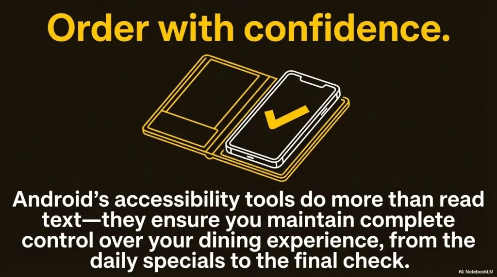
The practical win here is modest and valuable: fewer wrong turns, fewer missed conditions, less strain. That is often what good accessibility looks like in the wild. Not a cinematic transformation. Just a dinner that feels more manageable. And if menu reading is only one part of a larger low-vision routine, it often helps to think in systems, much like building a low-vision grocery list system or other small supports that reduce friction before you need them.
FAQ
How do I use Android Select to Speak on a printed restaurant menu?
Usually the smoothest method is to take a clear photo in better light, crop to the relevant section, zoom in, and then use your reading support on that image. For some printed menus, live camera reading also works, but still images are often easier to control.
Does Select to Speak work better on QR-code menus than on paper menus?
Often yes. QR menus usually let you zoom, replay, and isolate text more easily. But badly designed restaurant sites can still be frustrating. Choose the format that gives you the cleanest control over the exact text you need.
Can Android Select to Speak read small text in dim restaurant lighting?
It can help, but dim lighting and glare make everything harder. On printed menus, better lighting and a steadier image improve results. On digital menus, screen brightness and text size usually matter more than people expect.
What should I do if restaurant noise makes text-to-speech hard to hear?
Use shorter reading bursts, keep the phone closer, consider one earbud, and slow the speech rate slightly. Also reduce what you need to hear. Focus first on dish name, price, and one crucial detail.
Is Select to Speak enough by itself for low-vision menu reading?
Sometimes yes, sometimes no. It depends on the menu format, lighting, and your needs. For printed menus or hard-to-capture text, another tool such as Lookout may work better alongside it.
Can I use Select to Speak discreetly in a busy restaurant?
Yes. A simple routine helps: set it up before arrival, read short chunks, use one earbud if comfortable, and ask for a minute early. Discretion usually comes from preparation, not from rushing.
Why does Select to Speak miss prices, footnotes, or side options on menus?
Those details are often placed in smaller or visually messy text blocks. Replay only the high-risk lines, zoom in more, or crop the image so the tool focuses on the details beneath the dish name.
What is the fastest way to compare two dishes with Select to Speak?
Read only four things for each: dish name, base price, included side or modifier, and one specific concern such as spice or allergens. That keeps the comparison tight and useful.
Does Select to Speak work on food delivery or restaurant app menus too?
It often can, especially when app text is selectable and the layout is stable. Floating carts, banners, and collapsible options may interfere, so screenshots can still be a smart fallback.
What should I do when the menu layout is too confusing to read smoothly?
Switch tactics. Take a photo, crop to one section, use the QR version, or ask staff one precise question. The goal is not to force one tool to win every scenario. The goal is to order with less friction.
Conclusion
The quiet promise at the start of this guide was not that Android Select to Speak would turn every restaurant menu into a masterpiece of access. It will not. Some menus are still glossy little goblins. The promise was smaller and truer: you can build a routine that helps you understand more, miss less, and feel less rushed.
Start with one 5-minute practice at home. Turn on the shortcut. Open one restaurant page. Read headers first. Narrow to two choices. Recheck price and modifiers. Then save your fallback plan. That one small rehearsal can make your next meal out feel less like a scramble and more like what it should be: dinner.
Last reviewed: 2026-03.