

Beyond the Blank Spots: Finding Your Ideal Reading Contrast
You open a book, a bill, or a phone message, and one small part of the sentence simply refuses to arrive.
That is the quiet frustration behind preferred contrast settings for reading with scotoma: not “bad lighting,” not “just make the font bigger,” but a reading setup where contrast, glare, text weight, spacing, and page position all have to cooperate. Guessing can turn every screen into a tiny negotiation and every printed page into work.
This guide helps you test reading contrast more calmly, so you can find settings that reduce visual fatigue, improve line tracking, and make everyday reading less fragile without changing five things at once. You will compare warm backgrounds, dark mode, gray-on-black text, medium font weight, glare control, and simple positioning strategies that support usable vision.
The advice here is built around practical low-vision reading experiments, not miracle fixes or diagnosis-by-settings-menu. Start with the least annoying option. Give your eyes evidence, not chaos. And write down what works, before the device goblins rearrange everything again.
Table of Contents
Fast Answer
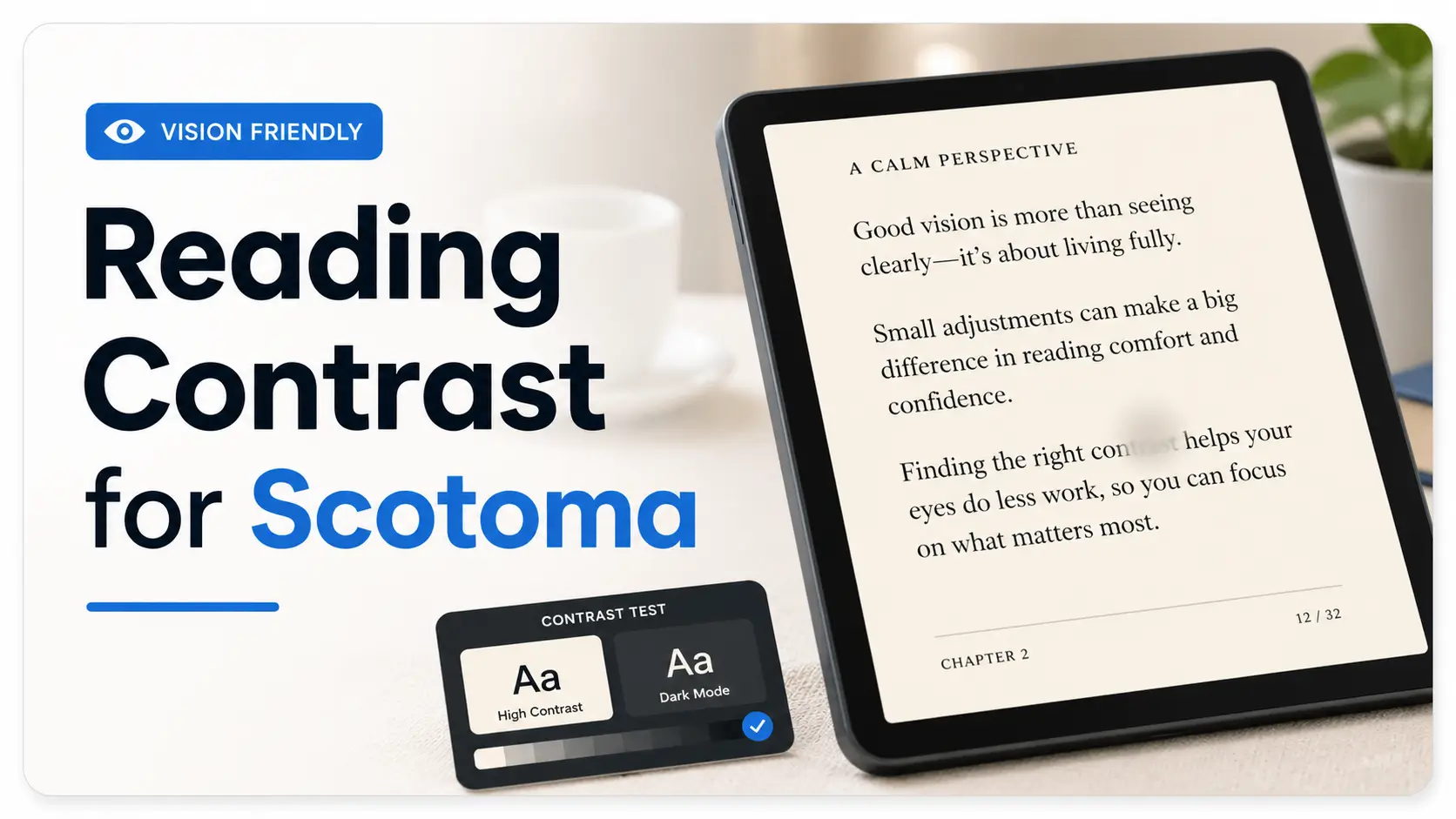
Preferred contrast settings for reading with scotoma are highly personal, but many people start by testing three options: black text on warm off-white, white or light-gray text on black, and medium-weight text with reduced glare. The best setting is not always the highest contrast. It is the one that lets your usable vision, eye movement, lighting, and fatigue work together without making the missing spot feel larger.
- Test warm light backgrounds before pure white.
- Try dark mode, but judge it by fatigue, not novelty.
- Change one setting at a time so your results mean something.
Apply in 60 seconds: Open one familiar paragraph and compare black text on warm white with light-gray text on black.
Safety / Disclaimer: Contrast Can Help Reading, But It Cannot Explain a Scotoma
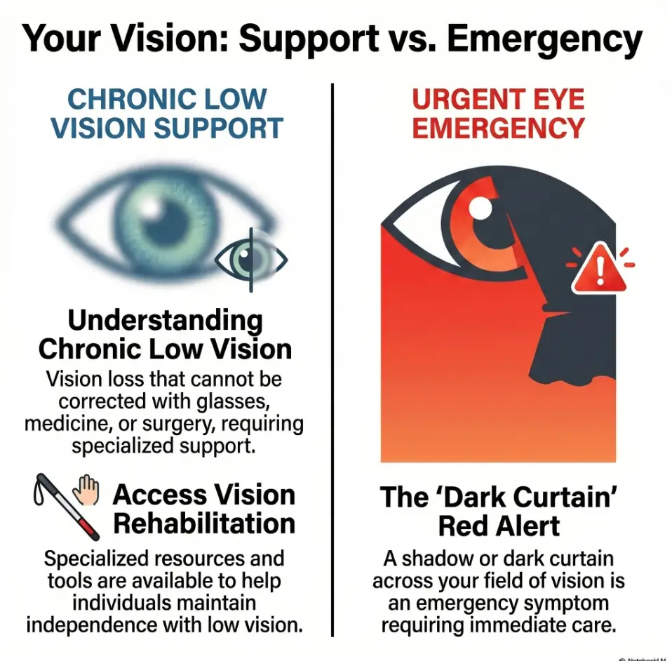
A better contrast setting can make reading less exhausting. It cannot tell you why a blind spot is there. That distinction matters. A scotoma can be connected to macular degeneration, diabetic eye disease, glaucoma, retinal problems, migraine phenomena, medication effects, neurologic issues, and other causes that deserve real evaluation.
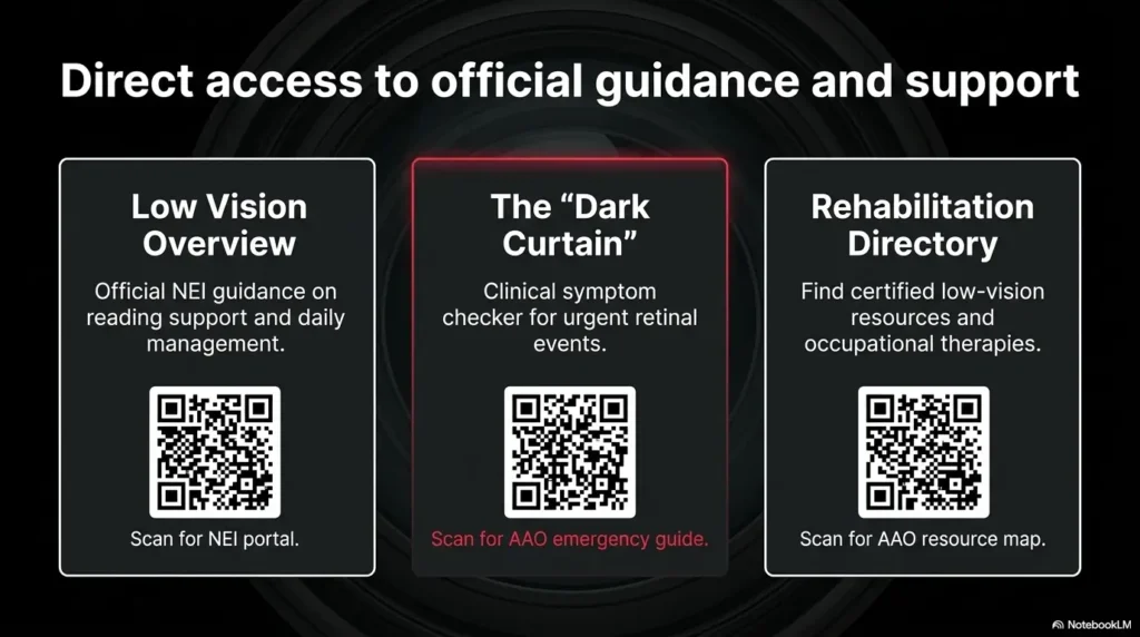
The National Eye Institute describes low vision as vision loss that makes everyday activities hard and cannot be fixed with ordinary glasses, contact lenses, medicine, or surgery. The American Academy of Ophthalmology also points people with scotomas, field loss, or contrast loss toward vision rehabilitation services. In plain kitchen-table language: settings help, but they are not the whole toolbox.
New Blind Spots Need an Eye Exam, Not Just Better Settings
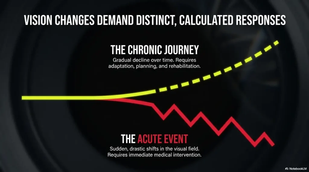
If a blind spot is new, bigger, darker, or suddenly more noticeable, do not treat it as a brightness problem. I have watched people spend 40 minutes changing phone settings when the real issue was that their vision had changed. That is not a character flaw. It is what humans do when a frightening problem appears inside a familiar object.
Practical rule: if the scotoma is new or worsening, contact an eye-care professional promptly. If the change is sudden, dramatic, or comes with other warning signs, treat it as urgent.
Sudden Changes Are Not a “Screen Problem”
Sudden flashes, a curtain-like shadow, rapid vision loss, new floaters, eye pain, or a dark area that appears suddenly should not be managed with reader mode and optimism. The AAO describes a dark curtain or shadow in vision as a potentially urgent symptom. That is not meant to scare you. It is meant to keep you from losing time when time matters.
Low-Vision Rehab Can Turn Trial-and-Error Into a Plan
Low-vision rehabilitation is not a last resort. It is more like a practical workshop for the eyes you actually have. A specialist may help you test eccentric viewing, lighting, magnification, contrast, device settings, reading guides, and task-specific strategies.
Many people wait until reading becomes miserable before asking. A better moment is earlier: when reading is still possible but starting to feel like carrying groceries through a rainstorm with one paper bag splitting.
Start Here: Your Scotoma Changes the Job of Contrast
Contrast usually sounds simple: make the letters darker and the background lighter. Done. But a scotoma changes the assignment. Now the question is not only, “Can I see the letters?” It is also, “Can I keep the letters in my usable vision long enough to understand the sentence?”
That is why two people can use the same tablet, same font, same brightness, same chair, and have completely different results. One person may love white text on black. Another may feel as if every word has turned into a tiny neon insect.
Why “High Contrast” May Help One Page and Hurt the Next
High contrast can sharpen letter edges, but it can also increase glare, halos, afterimages, or visual noise. Pure black on pure white may look “correct” in theory, yet feel harsh after 10 minutes. White text on black may feel soothing at first, then tiring when the letters bloom.
The goal is not maximum contrast. The goal is usable contrast. That means enough separation to identify letters, with low enough glare to keep reading comfortable.
The Missing Spot Is Not the Only Problem
Scotoma reading often involves several problems at once. You may lose a few letters in the middle of a word. You may miss the beginning of a line. You may reread the same sentence twice because your eyes land in the wrong place. You may see the words clearly for 90 seconds and then feel the page collapse into effort.
This is why contrast settings should be tested with real reading, not just a giant sample word. “Hamburger” in a display menu is not the same as a Medicare form, a recipe, or a message from your bank that has decided to use 11 tiny shades of gray for reasons known only to the stationery goblins.
Reading Comfort Depends on Text, Light, Glare, and Where You Look
Think of reading with a scotoma as a small orchestra. Contrast is the violin. Font size is the cello. Glare is the brass section that can ruin everything if it arrives too loudly. Page position is the conductor.
Scotoma Reading Comfort Map
Letter/background separation without visual sting.
Reflections and brightness that steal the page.
Medium strokes often hold shape better than thin ones.
Line and word spacing can help tracking.
Move words toward your better seeing area.
Who This Is For, and Who This Is Not For
This guide is for people who are trying to make reading more workable at home, on a phone, on a tablet, on an e-reader, or with printed pages. It is also for caregivers who have been handed a device and told, “Can you make this easier?” which is a small sentence with a large emotional suitcase.
For Readers Who Lose Letters, Words, or Line Starts While Reading
You may notice that letters disappear in the middle of a word. You may see the right side of a sentence better than the left. You may need to move your gaze slightly away from the word to read it. You may feel that reading is possible, but only if you bargain with the page.
Those are exactly the situations where contrast, spacing, and positioning experiments can help. Not cure. Help.
For Caregivers Setting Up Phones, Tablets, E-Readers, or Printed Pages
If you are helping someone else, resist the urge to “fix everything” in one heroic 12-setting spree. I have made that mistake. The device looked beautifully optimized to me, and completely alien to the person who had to use it.
Change one thing, test one paragraph, ask one grounded question: “Was that easier, harder, or just different?”
Not For Diagnosing the Cause of a Scotoma at Home
This article cannot diagnose macular degeneration, glaucoma, diabetic retinopathy, retinal detachment, stroke symptoms, migraine aura, or any other cause of vision change. It also cannot replace a low-vision evaluation.
What it can do is help you build a more organized experiment, so you bring better observations to your appointment instead of a tired shrug and the phrase, “I don’t know, reading is just bad now.”
- Letters disappear?
- Lines are hard to track?
- Glare makes the page feel washed out?
Apply in 60 seconds: Write one sentence: “Reading gets hardest when…” and complete it before changing settings.
The First Test: Find Your “Least Annoying” Contrast, Not the Brightest One
The phrase “least annoying” may sound unscientific, but it is often more useful than “best.” Reading with a scotoma is not only about seeing a single letter. It is about staying with a paragraph long enough for meaning to collect.
Start with three basic contrast setups. Give each one 2 minutes, not 20 seconds. A setting that looks impressive at first may become tiring once the eyes begin moving across lines.
Try Black on Warm White Before Pure White
Pure white backgrounds can be harsh, especially on bright screens or glossy paper. Warm off-white, cream, light beige, or pale gray may reduce glare while keeping dark text readable.
On phones and tablets, this may mean using reader mode, a sepia theme, a warmer display setting, or an e-reader app that allows background color changes. On paper, it may mean printing on matte ivory paper rather than bright white stock.
Try Light Text on Dark Background When Glare Steals the Page
Dark backgrounds can help when bright screens wash out the words. Some people with scotoma find that light text on black or very dark gray makes letter edges easier to locate.
But test stamina. Dark mode can feel calm at first and tiring later, especially if the text is pure white, the font is thin, or the screen brightness is too high. A softer light gray text on charcoal can be kinder than white text on absolute black.
Try Gray-on-Black When White Text Feels Like Sparks
If white text on black feels like little camera flashes, reduce the text brightness. Many reading apps let you choose light gray instead of white. This small adjustment can make a surprising difference.
Decision card:
Choose your first test setting:
| If this happens | Try this | Next step |
|---|---|---|
| White page feels glaring | Black text on warm off-white | Lower brightness slightly |
| Words wash out on screen | Light text on dark gray | Test for 2 minutes |
| White letters sparkle or bloom | Gray text on black | Increase font weight one step |
Neutral action line: Pick one row and test it before buying a new device or accessory.
The Hidden Variable: Glare Can Masquerade as Bad Contrast
Glare is sneaky. It dresses up as bad eyesight, bad contrast, bad glasses, bad lighting, bad mood, and occasionally bad character. It is none of those. It is unwanted light interfering with the task.
The American Foundation for the Blind often emphasizes practical home changes such as effective lighting, reduced glare, and stronger contrast for low-vision independence. That combination matters because contrast rarely works alone. A perfect font under terrible glare becomes a fancy unreadable thing.
Glossy Paper Can Make Good Text Unreadable
Glossy paper can reflect overhead light directly into your eyes. Menus, magazines, instruction booklets, medication inserts, and laminated sheets can all become tiny mirrors with paragraphs attached. If mail is one of your worst offenders, a separate routine for reading glossy mail without glare can make everyday paperwork less theatrical.
Try tilting the page, moving the lamp, or placing the paper on a darker matte surface. For printed materials you control, use matte paper. It is less glamorous, which is exactly its charm.
Screen Brightness Can Overpower the Letters
Many people raise screen brightness because reading feels hard. Sometimes that helps. Sometimes it floods the screen and makes the scotoma feel more disruptive. If letters seem to blur, bloom, or leave afterimages, brightness may be too high.
Try lowering brightness by 10 to 20 percent, then increase text weight before increasing text size. It sounds backwards until it works. For iPhone users, the difference between Reduce White Point and Night Shift can be especially useful when glare, warmth, and screen harshness all get tangled together.
Here’s What No One Tells You: Dimmer Is Sometimes Clearer
There is a quiet pleasure in discovering that less light can mean more reading. Not darkness. Not squinting in a cave. Just fewer reflections, softer background brightness, and a lamp placed where it helps the page instead of interrogating it.
Show me the nerdy details
Contrast sensitivity is different from visual acuity. Visual acuity is often measured with high-contrast letters in controlled conditions. Contrast sensitivity is closer to real life, where letters may be gray, lighting uneven, paper glossy, and backgrounds cluttered. A person may read a large black letter in the clinic but struggle with lower-contrast text at home.
Text Weight Matters More Than People Expect
Font size gets all the attention. Font weight does the quieter labor. A slightly thicker letter stroke can help the shape survive when part of the word falls near a scotoma or low-contrast area.
I once helped someone switch from a thin elegant font to a medium-weight plain font, and the room changed. Not dramatically. No violins. Just a soft, practical “Oh, that’s better.” Sometimes accessibility arrives wearing sensible shoes.
Regular Font May Disappear Inside the Scotoma
Thin strokes can vanish more easily, especially on gray backgrounds or in dim lighting. If the inside of letters seems to break apart, try a medium font weight before making everything enormous.
On many devices, this may be called bold text, text weight, accessibility text, or display size. In reading apps, look for font choices with sturdy letterforms.
Medium or Semi-Bold Can Hold Letter Shape Better Than Heavy Bold
Heavy bold is not always better. Very thick letters can crowd together and reduce the white space inside shapes. For some readers, medium or semi-bold gives the best balance: enough structure without turning every word into a small black fence.
Avoid Thin Fonts That Turn Into Smoke
Decorative fonts, condensed fonts, and delicate serif fonts may look refined on a wedding invitation. They are less charming when you are trying to read a pill instruction, a bank notice, or a recipe while the oven is beeping like a tiny bureaucrat.
- Try medium or semi-bold text.
- Avoid thin and decorative fonts for important notes.
- Judge the font by paragraph reading, not a single sample word.
Apply in 60 seconds: Turn on bold text or choose a medium-weight font, then reread the same paragraph.
Size Is Not the Whole Cure
Larger text can help. Larger text can also create new problems. With a scotoma, very large text may push more words outside your comfortable viewing area, reduce how much of a line you can take in, and make tracking feel clumsy.
This is one of the odd little betrayals of accessibility: the obvious fix is sometimes only half a fix.
Bigger Text Can Push Words Into the Blind Spot
If letters are too small, enlargement may be necessary. But if words become so large that only a few fit per line, your eyes may need to jump constantly. More jumps can mean more chances to lose your place.
Try increasing size in small steps. If your device uses a slider, move it one notch, not five. Let the page breathe before you redecorate the whole visual apartment.
Wider Spacing Can Help Tracking More Than Huge Letters
Line spacing and paragraph spacing can help the eyes return to the next line. This matters if you lose line starts, reread the same row, or skip lines when tired.
Try one of these before going much larger:
- Increase line spacing by one step.
- Use a wider margin or narrower reading column.
- Choose left-aligned text instead of centered text.
- Remove background images behind text.
- Use reader mode to simplify layout.
Let’s Be Honest: Giant Text Can Become a Maze
When text gets huge, reading can feel less like reading and more like navigating a shopping mall with only three storefront signs visible at once. You may identify each word, yet lose the sentence. For some readers with AMD, a broader approach to low-vision reading when central vision is limited can help connect size, contrast, lighting, and stamina instead of treating print size as the only dial.
Mini calculator:
Three-input comfort score
After reading one short paragraph, score each item from 1 to 5:
- Letter clarity
- Line tracking
- Eye fatigue
Output: Keep the setting only if clarity and tracking improve without fatigue getting worse.
Neutral action line: Write the three numbers beside each setting so memory does not have to do accounting.
Position the Words Around the Scotoma
Contrast helps the page. Positioning helps your usable vision meet the page. If you have a central or paracentral scotoma, you may already be using a slightly off-center viewing area without having a fancy name for it.
Some people naturally look a little above, below, left, or right of the word to see it better. Low-vision professionals may call this eccentric viewing or using a preferred retinal locus. At home, you can think of it as finding the best seat in the theater.
Use Your Better Seeing Area Instead of Fighting the Missing Spot
If staring directly at the word makes letters disappear, try looking slightly beside it. Do not force your eyes into one “correct” position. Instead, explore gently.
Try this with one word first, then one sentence. Look slightly above the word. Then below. Then to the left. Then to the right. Notice where the word becomes most complete.
Move the Page, Not Just Your Eyes
People often move their eyes harder when moving the page would be easier. Try shifting the paper, tablet, or phone a few inches left or right. Try raising it slightly. Try bringing it closer only after checking whether angle and position help.
I like to call this the “don’t wrestle the sentence” rule. The page is allowed to cooperate.
Test Left, Right, Above, and Below Center
Make a simple cross-shaped test. Put the paragraph in the center, then try reading with it slightly left, right, higher, and lower. Each test can take 30 seconds. You are not looking for perfection. You are looking for the least fragile arrangement. If central vision loss makes lamp angle part of the problem, a guide to reading lamp position for central vision loss can make this test feel less like guesswork.
- Try off-center viewing gently.
- Move the page or device, not only your eyes.
- Test position with the same paragraph each time.
Apply in 60 seconds: Move your phone slightly left, right, up, and down while reading one sentence aloud.
Screen Settings Worth Testing First
Screens are both wonderful and infuriating. They offer adjustable text, contrast, brightness, zoom, reader mode, and dark mode. They also offer pop-ups, tiny icons, pale gray labels, animations, transparency effects, and notification confetti no one asked for.
The trick is to test settings in a sane order. Do not change seven things and then wonder which one helped. That is not an experiment. That is visual soup.
Invert Colors Only If It Improves Stamina
Color inversion can be powerful, especially when apps do not offer good dark themes. But inversion can also distort images, icons, and meaning. It may make text easier while making buttons harder.
Use it for text-heavy reading first. Test whether you can read longer, not just whether the first screen looks bold.
Use Reader Mode to Remove Visual Noise
Reader mode is one of the most underrated accessibility tools. It can remove ads, sidebars, background clutter, tiny navigation links, and decorative chaos. It often lets you adjust font, size, and background color.
For scotoma reading, fewer distractions can matter as much as stronger contrast. The missing spot already asks your brain to work harder. The page does not need to host a carnival.
Adjust Brightness and Contrast Separately
Brightness changes how much light reaches your eyes. Contrast changes separation between elements. They are related, but not identical. Raising brightness may make text more visible or more glaring. Increasing contrast may sharpen letters or increase harshness.
Change one, test, then change the other. The boring method wins because it leaves evidence behind. When the screen itself feels too aggressive even at low brightness, knowing how to make an iPhone screen dimmer than the minimum setting may give you another gentle notch to test.
Reduce Transparency, Motion, and Background Clutter
Moving backgrounds, transparent menus, animated transitions, and busy wallpapers can make reading more tiring. Many phones and computers offer accessibility settings to reduce motion, increase contrast, reduce transparency, or simplify display effects.
Eligibility checklist:
Should you test screen accessibility settings today?
- Yes if you read mostly on a phone, tablet, or computer.
- Yes if glare or clutter makes words disappear faster.
- Yes if you keep zooming but still lose your place.
- No as a substitute for care if vision changes are sudden or worsening.
Neutral action line: Start with reader mode, brightness, text weight, and reduced motion before advanced settings.
Print Settings That Make Reading Less Fragile
Printed pages still matter. Medication instructions, mail, forms, recipes, appointment sheets, devotional books, hobby patterns, and handwritten notes do not always arrive with a convenient accessibility menu.
Print reading can become easier when you treat the page as a physical object. Paper texture, ink darkness, line spacing, lighting angle, and tracking guides all matter.
Choose Matte Paper Over Glossy Paper
Matte paper reduces reflections. If you print documents at home, try a soft white or ivory matte paper with dark ink. If you are preparing notes for someone with low vision, avoid pale ink, decorative backgrounds, and glossy lamination unless it is truly needed.
For important home notes, boring is beautiful. A clear black marker on matte white paper can beat a charming pastel label by a mile.
Use a Dark Reading Guide or Typoscope for Line Tracking
A typoscope is a simple reading guide, often a dark card or sheet with a cut-out window. It helps isolate one line of text and reduce surrounding clutter. You can buy one, but you can also make a basic version with dark cardstock.
For some readers, a dark strip under the line helps the eyes return to the right place. This is especially useful when line starts or endings vanish.
Print With More Line Spacing Before You Enlarge Everything
If you control the document, increase line spacing and margins before making the font huge. Try 14 to 18 point type with generous spacing rather than jumping straight to enormous print that breaks every sentence into fragments.
Quote-prep list:
Before comparing magnifiers, lamps, tablets, or reading aids, gather:
- Two examples of text that are hard to read.
- Your best current screen setting.
- Your preferred lighting location.
- Whether glare or small text is the bigger problem.
- How long you can read before fatigue starts.
Neutral action line: Bring this list to a low-vision appointment or product comparison so the recommendation fits your real tasks.
Common Mistakes That Make Scotoma Reading Harder
Most reading mistakes are understandable. People are not failing; they are guessing. The trouble is that guessing can become expensive, tiring, and strangely personal. Nobody wants a phone setting to feel like a moral judgment.
Don’t Assume Maximum Contrast Is Always Best
Maximum contrast can help with labels, signs, and short bursts of reading. But for longer reading, it may increase glare or visual fatigue. Think in terms of comfort over time, not drama at first glance.
Don’t Keep Changing Five Settings at Once
If you change background color, brightness, font, size, spacing, and room lighting in one sitting, you may accidentally help yourself and still learn nothing. Change one setting at a time. Keep notes. Your future self will be grateful and slightly less suspicious of the settings menu.
Don’t Read Under Mixed Lighting and Blame Your Eyes
Mixed lighting can create shadows, reflections, and uneven contrast. Try one good task light placed to reduce glare. Then test your contrast settings. The room is part of the reading system. If the whole room feels harsh, comparing 2700K vs 3000K for glare-sensitive eyes can help you choose a calmer starting point before changing the page itself.
Don’t Use Decorative Fonts for “Readable” Notes
Decorative fonts can be lovely for invitations and terrible for instructions. Use plain fonts, strong spacing, and clear alignment for notes that matter. For safety-related notes, function gets the crown.
- One setting change per test.
- One lighting condition per test.
- One familiar paragraph for comparison.
Apply in 60 seconds: Stop changing settings and write down the one you are testing now.
When to Seek Help
Home adjustments can be practical, dignifying, and surprisingly powerful. They can also hide a bigger problem if you use them to explain away new symptoms. This is the line worth drawing in permanent ink.
Seek Urgent Care for Sudden New Blind Spots, Flashes, Curtain-Like Shadow, or Rapid Vision Loss
Get urgent medical guidance if you notice sudden new blind spots, flashes of light, a curtain-like shadow, sudden floaters, rapid vision loss, eye pain, or a major change in one eye. These symptoms can be linked to urgent eye or neurologic conditions.
Do not wait to see whether dark mode improves it. Dark mode has many talents. Emergency triage is not one of them.
Ask About Low-Vision Rehabilitation if Reading Is Slower, Shorter, or More Exhausting
If you can still read but only in short bursts, or if reading leaves you unusually tired, ask about low-vision rehabilitation. You do not need to “fail enough” to deserve help.
A low-vision specialist may test magnification, contrast, lighting, filters, device settings, eccentric viewing, and reading aids. The goal is practical function: bills, books, labels, recipes, medication instructions, messages, and the ordinary paperwork confetti of modern life. A guide to finding a low-vision specialist for macular degeneration can also help families understand what this kind of appointment may cover.
Bring Your Device Settings to the Appointment
Do not just bring your glasses. Bring your phone, tablet, e-reader, magnifier, favorite reading app, and a sample of text that gives you trouble. If the clinic can see your real setup, the advice can become more specific.
Write down what helps and what fails. “White text on black is clear for 5 minutes but tiring after 15” is useful. “Reading is weird” is true, but harder to act on.
Build a 10-Minute Contrast Test Routine
This routine keeps testing small enough to do and structured enough to trust. You do not need a spreadsheet, though if you love spreadsheets, I respect your tiny kingdom.
Pick One Short Paragraph You Can Reuse
Choose a paragraph of 60 to 100 words. Use the same paragraph for every test. Familiarity helps you compare comfort and errors without making the content itself the variable.
Test Three Backgrounds and Two Font Weights
Try black on warm white, black on pale gray or cream, and light gray on dark background. Then test regular and medium-weight text. Keep font size stable at first.
That gives you 6 combinations. Spend about 1 minute on each, then record your reaction. If that is too much, test only 3 combinations today and 3 tomorrow.
Score Each Setting by Speed, Errors, Fatigue, and Frustration
Use a simple 1-to-5 score. Do not chase precision. You are looking for patterns.
10-Minute Contrast Test
| Minute | Action | What to note |
|---|---|---|
| 1 | Set lighting and paragraph | Room glare, screen brightness |
| 2–7 | Test contrast combinations | Clarity, tracking, fatigue |
| 8–9 | Retest the top two | Which one lasts better? |
| 10 | Save the winner | Name it clearly |
- Use the same paragraph.
- Keep lighting stable.
- Score fatigue, not just clarity.
Apply in 60 seconds: Create a note called “Reading settings” and write your first test result there.
FAQ
What contrast setting is usually best for reading with a central scotoma?
There is no single best contrast setting for everyone with a central scotoma. A good starting point is black text on warm off-white, followed by light-gray text on black or dark gray. The best choice is the one that improves letter recognition and line tracking without increasing glare or fatigue.
Is dark mode better for scotoma reading?
Dark mode is better for some people and worse for others. It can reduce screen glare, especially at night or in dim rooms. But white text on black may also bloom, sparkle, or feel tiring after several minutes. Try gray text on a dark background before deciding dark mode does not work.
Why does white text on black feel clearer at first but tiring later?
White text on black can make letters stand out sharply at first. Over time, the strong contrast may cause halos, afterimages, or visual fatigue for some readers. Lowering brightness, using light gray instead of pure white, or choosing a medium-weight font may help.
Should I use large print if I have a scotoma?
Large print can help, but it is not the only adjustment. If text becomes too large, tracking lines and understanding full sentences may become harder. Test moderate enlargement, medium font weight, wider line spacing, and better page position before assuming the largest size is best.
Can contrast settings help with macular degeneration reading problems?
Contrast settings may help some people with macular degeneration read more comfortably, especially when central vision, contrast sensitivity, or glare sensitivity is affected. They do not treat the disease itself. Ask an eye-care professional or low-vision rehabilitation specialist for a task-specific plan.
Why do I lose the beginning or end of lines when reading?
You may be losing line starts or endings because of field loss, scotoma position, tracking difficulty, fatigue, or page layout. A narrower reading column, more line spacing, a reading guide, or repositioning the page may help. If this is new or worsening, get professional advice.
Is a tablet better than paper for reading with low vision?
A tablet can be better because it allows adjustable font size, contrast, brightness, spacing, and reader mode. Paper can be better when glare is controlled and the layout is simple. The better choice depends on the task, lighting, fatigue, and whether the person can comfortably use the device.
What font is easiest to read with a blind spot?
Many readers do better with plain, sturdy fonts rather than thin or decorative ones. Medium-weight sans serif fonts often work well on screens, but personal testing matters. Choose the font that preserves letter shape in full paragraphs, not just in a sample word.
Can low-vision rehab teach me how to read around a scotoma?
Yes, low-vision rehabilitation may help people learn strategies such as eccentric viewing, better lighting, magnification, contrast adjustment, and device setup. The goal is not to pretend the scotoma is not there. The goal is to use remaining vision more effectively for real tasks.
Next Step: Make a Personal Contrast Card Today
The sentence from the beginning does not have to keep disappearing without a plan. You may not be able to control the scotoma at home, but you can control the reading environment around it: contrast, glare, text weight, spacing, page position, and the pace of testing.
Make a personal contrast card today. It can be a paper card, a phone note, or a small document saved on every device. The point is to stop starting from zero every time lighting changes, fatigue rises, or an app update rearranges the furniture. If daily organization is also becoming harder, a low-vision filing system can keep the same “don’t start from zero” principle working for mail, bills, and important papers.
Write Down Your Best Three Settings
Use simple labels. For example: “Day reading: black on warm white, medium font, brightness 45 percent.” Or: “Night reading: gray text on dark background, larger spacing, no motion.” Practical beats elegant.
Save Them on Every Device You Use
Put the note on your phone, tablet, e-reader, computer, or printed folder. Caregivers can keep a copy too. This helps avoid the classic household mystery: someone improved the settings, then no one remembers what they changed.
Recheck After Lighting, Eye Fatigue, or Vision Changes
Settings are not vows. They are tools. Recheck them when lighting changes, reading gets harder, fatigue shows up earlier, or your eye-care professional gives new guidance.
Coverage tier map:
From simple to more supported reading help
| Tier | What changes | Good first action |
|---|---|---|
| 1 | Contrast and brightness | Test warm background and dark mode |
| 2 | Font weight and spacing | Try medium text and wider lines |
| 3 | Position and reading guides | Move page and test a typoscope |
| 4 | Assistive devices | Compare magnifier, tablet, or lamp |
| 5 | Low-vision rehabilitation | Bring real reading samples to the visit |
Neutral action line: Start at the lowest tier that solves the repeated problem, then move up only when needed.
Preferred contrast settings for reading with scotoma are not a personality test, a willpower contest, or a loyalty oath to dark mode. They are a small set of practical choices that should make reading less fragile.
Within the next 15 minutes, choose one paragraph, test three contrast settings, and write down the least annoying winner. That tiny card may become the bridge between “I can’t read this today” and “I know what to try first.”
Last reviewed: 2026-04.