

Restoring Confidence to the Dotted Line
A signature guide frame sounds like a tiny thing—until a bank form, a shaky hand, and a waiting clerk turn one signature line into a pressure test. For many seniors, the challenge isn’t just “writing smaller”; it’s navigating the intersection of low vision, arthritis, tremors, and the anxiety of a postage-stamp-sized box.
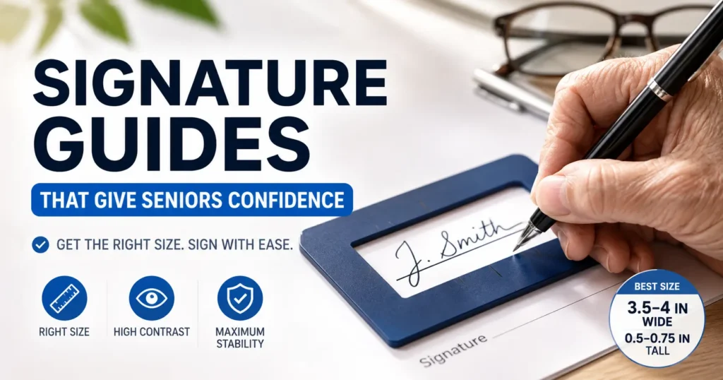
Most seniors find success with a guide frame opening of 3.5 to 4 inches wide and 0.5 to 0.75 inches tall. This provides the stability to find the line without forcing an unnatural signature.
Our method is simple: Start with the hand, not the product photo. Measure the natural signature, match the guide to the specific signing situation, and test it before the important document appears.
Table of Contents
- Use 3.5 to 4 inches wide for most everyday signatures.
- Use 0.75 inch height for tremor, arthritis, or larger handwriting.
- Choose high contrast before you choose a “nice-looking” color.
Apply in 60 seconds: Have the senior sign three times on plain paper, then measure the widest and tallest natural signature.
Best Size First: The “Not Too Tiny, Not Too Wild” Signature Window
Why 3.5–4 inches wide works for most everyday signatures
For most seniors, the most practical signature guide frame size is a rectangular opening around 3.5 to 4 inches wide. That size usually gives enough horizontal room for a natural signature, including the little launch and landing motions that happen before and after the name itself.
A 3-inch opening can work for small, compact handwriting. But many older adults do not write with the same tight motor control they had at 35. The hand may need a little runway. A cramped guide can make the writer slow down too much, press harder, or lift the pen in awkward places. The signature then looks less natural, which is exactly the opposite of the point.
I once watched a family member sign a birthday card with a tiny guide meant for checks. The name fit, technically. But the process looked like parking a minivan in a teacup. It worked, but nobody enjoyed the engineering.
When a 0.5-inch opening feels too cramped
A height of 0.5 inch can be useful for seniors who still write fairly neatly and mainly need help staying on the line. It gives a clear top and bottom boundary, which can reduce drifting.
But a 0.5-inch slot may feel too tight for someone with shaky hands, swollen fingers, arthritis pain, or low vision. If the pen bumps the top or bottom edge too often, the frame stops feeling helpful and starts feeling bossy. In that case, 0.75 inch tall is often the calmer choice.
When a wider frame prevents panic-signing at the bank counter
Signing at home is one thing. Signing at a bank counter, while someone waits and the document sits slightly crooked under fluorescent lights, is another beast entirely. A wider guide can reduce that “hurry up, hand” feeling.
For bank forms, medical forms, greeting cards, and checks, a 3.5 to 4-inch opening is a reliable default. For large handwriting or visible tremor, consider 4.5 inches wide. Bigger is not automatically better, but a little extra space can turn a tense moment into a normal one.
About: 3 in × 0.5 in
Best for compact signatures and steady hands.
About: 3.5–4 in × 0.5–0.75 in
Best starting point for most seniors.
About: 4.5 in × 0.75 in
Best for tremor, arthritis, or bigger handwriting.
The Real Problem: Seniors Are Not Just “Writing Bigger”
Vision, grip strength, tremor, and speed all change the ideal size
Choosing a signature guide for an older adult is not just about handwriting size. It is about the whole signing moment. Can the person see the line? Can they feel where the frame begins? Can they hold the pen without pain? Can they sign without feeling rushed?
The National Institute of Neurological Disorders and Stroke describes tremor as shaking or trembling movement that often affects the hands. That matters here because a tremor can turn a narrow slot into a tiny obstacle course. Meanwhile, low vision can make a pale or transparent frame disappear into the paper. Arthritis can make a hard grip painful, especially when the writer tries to stay inside a small window. For a deeper daily-life lens, it can also help to understand how low vision fatigue changes simple tasks before choosing a guide that looks fine online but feels exhausting in real life.
So the “best” size is not the tidiest size. It is the size that supports the person’s real hand on a real day.
Why a perfect-looking frame can still fail in real life
A guide can look perfect in a product photo and still fail at the kitchen table. Product photos are calm. They have obedient lighting. They do not include a caregiver looking for reading glasses, a pen that skips, or a form printed in mouse-gray ink.
Watch for these practical friction points:
- The frame slides on glossy paper.
- The opening is too short for the person’s last-name stroke.
- The color blends into the form.
- The edge is too flat to feel by touch.
- The guide covers nearby printed instructions.
Small truth: A signature guide is not helpful because it looks official. It is helpful because the hand trusts it.
Here’s what no one tells you: the hand needs room to hesitate
Many people think signing is one smooth motion. Often, for seniors, it is a series of tiny negotiations. Start here. Keep the wrist steady. Don’t drift. Finish the loop. Find the line again.
That hesitation needs space. A slightly taller or wider opening gives the hand room to recover from a wobble without making the signature look boxed-in or broken. A frame that punishes every small pause can create more stress than it solves.
Show me the nerdy details
When a person signs, the pen does not simply move left to right. It makes small preparatory motions, pressure changes, pauses, and corrective movements. A guide opening that is only large enough for the final visible signature may be too small for the motor process that creates it. That is why measuring only the finished name can underestimate the needed opening. Add a small buffer on both sides and above or below the tallest strokes.
Who This Is For, And Who Needs Something Else
Good fit: seniors who can sign but need boundary support
A signature guide is a good fit for a senior who can still sign their own name but needs help staying within a line or box. Think of it as a gentle fence, not a steering wheel. The person remains the signer. The guide simply makes the target easier to find.
It can help with low vision, mild tremor, slower writing, fatigue, and mild hand stiffness. It may also help seniors who write well at home but get flustered in formal settings. Bank counters have a strange talent for making everyone forget how pens work.
Good fit: caregivers preparing documents, checks, cards, or forms
Caregivers often use signature guides to reduce stress before appointments. If a senior needs to sign a check, holiday card, medical intake form, or everyday household document, a guide can make the process less fiddly. When paperwork tends to pile up, a simple low vision filing system for important documents can keep forms, IDs, and signing tools from playing hide-and-seek.
The key is preparation. Test the guide before the important form appears. Use the same pen style, similar paper, and similar table height. A tool tested only once in perfect conditions may not behave when the day is tired and the chair is too low.
Not enough: severe hand weakness, sudden signature changes, or confusion
A signature guide is not enough if the person cannot understand what they are signing, cannot control the pen safely, or has sudden major changes in handwriting. Those situations need more support. Sometimes that support is medical. Sometimes it is legal or financial. Sometimes it is simply slowing the moment down and asking better questions.
If there is sudden weakness, sudden confusion, or a new tremor, do not treat the signature guide as the fix. Treat it as a clue that something else may need attention.
Not for: documents that require special notary, bank, or legal formatting
Some documents have strict signing rules. A notary, bank officer, election worker, court clerk, or agency representative may need the signature placed in a specific way. In those cases, ask before using the guide.
The guide can still be useful, but the person overseeing the document may need to confirm that it does not cover required text, alter the signature area, or interfere with witnessing.
- Use it for boundary support, not decision support.
- Ask first for notarized, bank, voting, or agency documents.
- Pause if handwriting changes suddenly or confusion appears.
Apply in 60 seconds: Before an appointment, call and ask, “May the signer use a signature guide to locate the signature line?”
Width Matters Most: How Much Horizontal Space Is Enough?
Small signatures: when 3 inches may be enough
A 3-inch-wide guide can work for seniors with short names, compact handwriting, and fairly steady pen control. It is also useful when the document itself has a tight signature area, such as a small form, receipt, or check endorsement line.
But there is a catch. A person’s “careful” signature is often smaller than their natural signature. If you ask someone to squeeze into a 3-inch opening, they may produce a neat sample once, then struggle later when they are tired. The guide should fit the normal signature, not the performance version.
Average signatures: why 3.5–4 inches is the safer default
For most everyday signatures, 3.5 to 4 inches wide is the safer default. It gives room for first and last name, a middle initial, a final flourish, or a shaky landing. It also works across many common situations, including checks, cards, medical forms, and standard signature lines.
When I help someone choose between two sizes, I usually start with the wider one and watch the first three signatures. If the person writes naturally and stays inside the opening, good. If they float too much, reduce height or choose a more tactile edge. The frame should behave like a quiet handrail.
Large or shaky signatures: when 4.5 inches becomes less stressful
A 4.5-inch width can help seniors with larger handwriting, tremor, or limited wrist control. It gives more horizontal recovery space. That matters when the pen travels farther than intended or the writer needs a moment to reset mid-signature. If tremor is the main barrier, comparing guide size with a stand magnifier setup for shaky hands may also help caregivers think about stability, not just visibility.
The risk is that a very wide opening may give too much freedom. If the signature drifts upward, downward, or diagonally, a wider frame alone may not solve the problem. Pair it with stronger contrast, a raised edge, and a stable writing surface.
Money Block: Signature Width Decision Card
| Choose this width | Best when | Watch out for |
|---|---|---|
| 3 inches | Small, steady signature | Too cramped for larger names |
| 3.5–4 inches | Most everyday senior signatures | May still be tight for tremor |
| 4.5 inches | Large handwriting or shaky hands | May allow drifting if height is also large |
Neutral action line: Measure the natural signature width first, then add about 0.25 inch of comfort space on each side when the document allows.

Height Is the Quiet Dealbreaker
Why 0.5 inch can help neat writers stay aligned
Height gets less attention than width, but it can make or break the experience. A 0.5-inch-tall opening can help a senior who writes neatly but drifts above or below the line. It creates a firm visual boundary without making the signature area feel enormous.
This size often works well for checks, cards, and basic forms. It is also easier to align with printed signature lines because it does not cover too much of the surrounding text.
Why 0.75 inch may help seniors with tremor or arthritis
A 0.75-inch-tall opening gives more vertical breathing room. That can help someone with tremor, arthritis, swollen joints, or a pen grip that changes throughout the signature. It also helps when the senior writes larger because they need to see the pen movement more clearly.
Think of 0.75 inch as the comfort setting. It is not sloppy. It is humane. A hand with pain or tremor does not need a tiny slot pretending to be a finishing school.
Don’t do this: choosing a skinny slot because it “looks official”
A very skinny signature slot may look tidy, but it can force unnatural writing. That matters because many official documents rely on the signer’s usual signature. If the guide causes the person to write in a cramped, broken, or highly altered way, it may create more questions later.
For everyday use, avoid ultra-thin slots unless the senior has already tested them successfully. A guide should reduce error, not turn every signature into needle-threading with ink.
- Choose 0.5 inch for steady writers who need alignment.
- Choose 0.75 inch for tremor, arthritis, or larger handwriting.
- A slot that is too skinny can make signatures look less natural.
Apply in 60 seconds: Measure the tallest signature stroke, then choose a frame with a little vertical room above it.
Frame Material: Raised Edge, Flat Card, or Transparent Overlay?
Raised-edge guides help the pen find the border
A raised-edge signature guide is often the best choice for seniors who benefit from touch cues. The pen can lightly feel the boundary. The fingers can locate the frame. The edge says, “Here is the signing zone,” without requiring perfect vision.
Raised edges are especially helpful when vision is reduced, lighting is poor, or the paper has faint lines. They can also reduce anxiety because the border is physical, not just visual.
Transparent guides help align with printed signature lines
Transparent guides are useful when you need to see the exact printed signature line beneath the tool. They work well on forms where placement matters. But clear plastic can be hard to see, especially on glossy paper or under bright lighting.
If you choose clear plastic, look for a bold border or tinted edge. A completely invisible guide is a charming idea until someone has to actually use it. For a broader tool overview, see this guide to choosing a signature guide frame for low vision signing.
Dark plastic vs light plastic: contrast beats cuteness every time
For low vision, contrast matters more than style. A dark guide on white paper is often easier to see. A white or pale guide may disappear on light forms. A bright color may help, but only if it creates a strong boundary.
The ADA’s effective communication guidance recognizes that people with vision loss may need accessible formats or aids such as large print or qualified readers in certain settings. A signature guide is not the whole accessibility system, but the same principle applies: make the information easier to perceive and use.
Money Block: Material Comparison Table
| Material type | Best for | Trade-off |
|---|---|---|
| Raised-edge plastic | Touch guidance, low vision, tremor | Can be bulky on small forms |
| Flat card guide | Simple checks and cards | Less tactile feedback |
| Transparent overlay | Aligning with printed lines | May be hard to see without bold edges |
Neutral action line: If vision is limited, test the guide under the same lighting where signing usually happens.
Common Mistakes That Make Signing Harder
Mistake 1: buying a guide that is too narrow for real handwriting
The most common mistake is choosing the neatest-looking guide instead of the most usable one. A narrow frame can make a senior write smaller than normal. That may look tidy once, but it often becomes frustrating after two or three signatures.
Buy for the person’s natural movement. Not the product photo. Not the fantasy version where everyone is rested, the pen is perfect, and the table does not wobble like a nervous goat.
Mistake 2: choosing low-contrast colors for low-vision users
A pale guide on pale paper is almost useless for someone with low vision. The frame needs to announce itself politely. Black, navy, deep red, or another high-contrast color can help the user find the opening faster.
If the senior uses magnifiers, large-print materials, or bright task lighting, include those in the test. The best guide should work with their normal setup.
Mistake 3: using slippery plastic on glossy paper
Some guides slide around on glossy forms. That turns signing into a tiny wrestling match. If the guide moves while the person signs, the signature may drift anyway. The same glare and slick-surface problem often shows up with envelopes and forms, so these tips for how to read glossy mail without glare can be useful when testing paper type.
Look for a guide that can be held securely by a caregiver without covering important text. A non-slip backing can help, but be careful with adhesive or sticky surfaces on official documents.
Mistake 4: testing it only once, while everyone is calm
One test is not enough. A senior may sign well in the morning and struggle later. Fatigue, pain, medication timing, lighting, and stress all change handwriting.
Test at least three times. Better yet, test on two different days. It sounds fussy until it saves a bank visit from becoming a 40-minute paper opera.
- Test with the actual pen and paper type.
- Check contrast under real lighting.
- Repeat the test when the signer is mildly tired, not only at their best.
Apply in 60 seconds: Put the guide on a glossy envelope or form and see whether it slides before buying more than one.
The Paper Test: Measure the Signature Before Buying
Ask for three normal signatures on plain paper
The simplest way to choose the right signature guide frame size is the 3-signature test. Ask the senior to sign their name three times on plain paper. Do not coach too much. Do not say, “Make it neat.” That summons the ceremonial signature, not the real one.
Use the pen they normally use. If they sign checks with a ballpoint, test with a ballpoint. If they prefer a thicker gel pen, test with that. A pen can change handwriting more than people admit. Some pens glide. Some drag. Some behave like they have unresolved personal issues.
Measure width, height, and drift below the line
After three signatures, measure the widest one. Then measure the tallest one, including any loops, descenders, or final strokes. Finally, look at how much the signature drifts above or below an imaginary line.
Use this practical formula:
- Frame width: widest signature plus a small comfort margin.
- Frame height: tallest signature plus enough room for tremor or fatigue.
- Frame style: high contrast if vision is limited, raised edge if touch cues help.
Let’s be honest: the “best size” is the one that survives a tired Tuesday
The right guide works when the day is not perfect. It works when the appointment is at 8:30 a.m., the form is small, and someone forgot the good pen. That is why the best test is not a showroom test. It is a normal-life test.
If the senior can sign three times without frustration, without bumping the frame constantly, and without drifting outside the opening, you are close. If they tense up or change their signature dramatically, try a wider or taller guide.
Money Block: Mini Size Calculator
Use this simple no-storage calculator by hand. You only need two measurements.
| Input 1: widest natural signature | Example: 3.25 inches |
| Input 2: tallest natural signature | Example: 0.45 inch |
| Output: recommended starting opening | About 3.75–4 inches wide and 0.5–0.75 inch tall |
Neutral action line: If the hand trembles or the signature drifts, round up to the next larger height before increasing width.
Where Seniors Actually Use Signature Guides
Checks, greeting cards, medical forms, and bank documents
Signature guides are useful in ordinary places. Checks. Greeting cards. Medical intake forms. Assisted living paperwork. Insurance forms. Bank slips. Tax organizer pages. The daily paper trail of adulthood does not politely retire when the hand gets tired.
For checks, a smaller or standard guide may work. For greeting cards, a larger opening may feel more natural because the writing surface is less structured. For medical forms, contrast and placement matter because the signature line may be surrounded by dense text. If check-writing is becoming a repeated frustration, consider pairing the guide with large-print check register alternatives so the whole money-paper routine feels less cramped.
Notary appointments and why you should ask before placing the guide
For notarized documents, ask the notary before using the guide. Most of the time, a guide is simply an aid to help the signer locate the line. But the notary may need to observe the signing clearly and confirm that the signer is acting willingly and understands the document.
Never cover text that the signer needs to read. Never rush the explanation. A signature guide can help the hand, but it cannot replace comprehension.
Voting, legal forms, and documents where assistance rules may matter
Some official processes have rules about assistance. Voting, court documents, agency forms, and certain financial documents may have specific requirements. The safest move is to ask the responsible office what assistance is allowed.
Commercial entities and agencies where this may matter include banks, credit unions, county election offices, notary offices, medical clinics, the Social Security Administration, and state motor vehicle departments. Each setting may treat assistance differently.
Money Block: Quote-Prep List Before Buying or Bringing a Guide
- Measure the senior’s natural signature width and height.
- Note whether low vision, tremor, arthritis, or fatigue is the main issue.
- Check the document type: check, medical form, bank form, notary document, or card.
- Bring the preferred pen and a backup pen.
- Ask the office whether a signature guide is allowed before the appointment.
Neutral action line: Keep the guide, pen, ID, glasses, and document in one folder before leaving home.
Safety and Practical Disclaimer
A signature guide is an accessibility aid, not medical treatment
A signature guide can make signing easier, but it does not diagnose or treat tremor, arthritis, vision loss, stroke symptoms, Parkinson’s disease, or cognitive changes. It is a practical tool. Useful, yes. Magical, no.
If handwriting difficulty is long-standing and stable, a guide may simply be part of a helpful routine. But if the change is new, sudden, or paired with weakness, confusion, or other symptoms, the guide should not become a way to ignore the change. A low-vision occupational therapist can often help connect handwriting, lighting, contrast, and daily routines; this list of questions to ask a low vision OT can make that conversation more productive.
Sudden handwriting changes may need attention
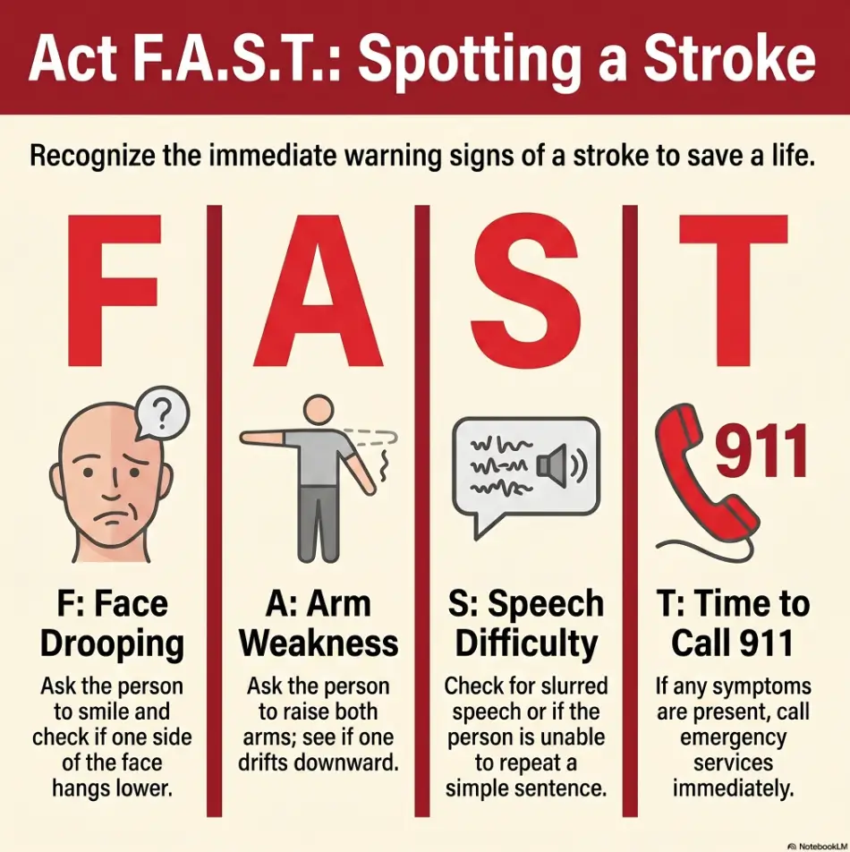
Sudden handwriting changes deserve respect. The National Institute on Aging lists sudden numbness or weakness, sudden confusion, and trouble speaking or understanding as possible stroke warning signs. If symptoms are sudden or severe, treat it as urgent.
New tremor, sudden weakness, or a dramatically smaller signature can also be worth discussing with a clinician, especially when it changes daily tasks. A signature guide may help with forms, but health changes deserve daylight.
Legal and financial documents may have signing rules
For legal and financial documents, the signature is more than ink. It may be tied to identity, consent, capacity, witnessing, notarization, or agency rules. A guide can help the person sign in the correct place, but it should not obscure the signer’s intent or the official process.
If there is pressure, confusion, family conflict, or uncertainty about what is being signed, pause. The cleanest signature in the world does not fix a bad signing situation.
- Medical symptoms need medical attention.
- Legal documents may need professional guidance.
- Consent matters more than neat penmanship.
Apply in 60 seconds: Before signing anything important, ask the senior to explain in their own words what the document does.
When to Seek Help Before Relying on a Signature Guide
New tremor, sudden weakness, or major handwriting change
Seek help before relying on a signature guide if the senior has a new tremor, sudden weakness, sudden numbness, or a major handwriting change. This is especially important if the change appears quickly or affects one side of the body. For related red flags, review these senior vision changes warning signs, especially when handwriting trouble arrives with new visual symptoms.
A guide may make the signature look more controlled, but it should not hide a new health concern. If something feels off, do not let the little plastic rectangle become a curtain.
Confusion about what is being signed
If the senior is confused about the document, stop. A signature guide does not solve understanding. Read the document aloud if appropriate. Use large print. Ask the office for accommodations. Slow the pace. A rushed signature can create problems that no frame size can rescue later. When medical visits are involved, a doctor appointment note-taking system can help families capture instructions before anyone is asked to sign another form.
For caregivers, this can feel awkward. I have been at counters where everyone wanted the paperwork finished yesterday. Still, one calm question can prevent a stack of trouble: “Can we take a minute to make sure this is understood?”
Repeated rejected signatures from banks, agencies, or notaries
If signatures are repeatedly rejected, ask the institution what alternatives exist. Some banks may have signature update procedures. Agencies may allow specific accommodations. Legal documents may require witnesses, notarization, or another signing method.
Do not keep buying different guides in the hope that plastic will solve a procedural issue. Sometimes the problem is not the opening size. Sometimes the problem is the process.
Money Block: Eligibility Checklist
- Yes/No: Can the senior understand what they are signing?
- Yes/No: Can they hold the pen safely without severe pain?
- Yes/No: Is the handwriting difficulty stable rather than sudden?
- Yes/No: Is the document type allowed to use a guide?
- Yes/No: Does the guide improve the signature without changing it dramatically?
Neutral action line: If any answer is “no,” pause and ask a clinician, notary, bank officer, attorney, or agency representative what support is appropriate.
FAQ
What size signature guide frame is best for seniors?
For most seniors, the best signature guide frame size is about 3.5 to 4 inches wide and 0.5 to 0.75 inch tall. Choose the smaller height for steady writers who need alignment. Choose the taller height for tremor, arthritis, larger handwriting, or low vision.
Is a bigger signature guide always better for older adults?
No. A bigger guide can help with shaky or large handwriting, but too much open space may allow the signature to drift. The best guide gives enough room for natural movement while still providing a clear boundary. Bigger should mean calmer, not wilder.
What is the best signature guide for seniors with shaky hands?
Seniors with shaky hands often do better with a guide around 4 to 4.5 inches wide and 0.75 inch tall, especially if it has a raised edge and strong contrast. The raised border can give touch feedback, while the larger opening gives the hand room to recover from small movements.
Should a signature guide be clear or dark colored?
A dark or high-contrast guide is usually easier for low-vision users to see. A clear guide can be useful when exact alignment with a printed line matters, but it should have a bold border or tinted edge. A completely clear frame may disappear on the page.
Can seniors use a signature guide for checks?
Yes, many seniors use signature guides for checks. A smaller or standard guide may work for the front signature line, while endorsements may require careful placement because the space is tighter. The guide should not cover important printed text or make the signature look unnatural.
Can a signature guide be used for legal documents?
Sometimes, but ask first. For notarized, witnessed, court, bank, or agency documents, the person overseeing the signing may need to confirm that a guide is allowed. The signer must still understand the document and sign voluntarily.
What size signature guide helps with low vision?
For low vision, size and contrast both matter. A 3.5 to 4-inch wide guide with a 0.75-inch tall opening and a dark, raised border is often easier to locate. Good lighting and a familiar pen can help too.
Are raised signature guides better than flat ones?
Raised guides are often better for seniors who need tactile feedback. Flat guides may work for steady writers who mainly need visual alignment. Transparent overlays are helpful for printed forms, but they should still be easy to see.

Next Step: Do the 3-Signature Test Before You Buy
Measure the natural signature, then choose the frame
Before buying anything, do the 3-signature test. Ask the senior to sign three times with the pen they normally use. Measure the widest and tallest signature. Then choose a guide that gives enough room without letting the signature roam.
If the signature is under 3 inches wide and steady, a 3-inch guide may work. If it is average, start with 3.5 to 4 inches. If it is large, shaky, or tense, consider 4.5 inches wide and 0.75 inch tall.
Pick contrast first, size second, material third
Contrast comes first because the signer must find the frame. Size comes second because the hand needs room. Material comes third because the guide must stay put and feel usable.
This order prevents the classic mistake: buying a nice-looking tool that fails the moment it touches a real form.
One concrete action: test with the exact pen and paper they use most
Use the exact pen and similar paper. If the senior signs checks, test on a check-like line. If they sign medical forms, test on a printed page. If they mostly sign cards, test on card stock.
Short Story: The Tuesday Bank Folder
My neighbor once kept a blue folder by the door for her father’s bank visits. Inside were his ID, reading glasses, favorite black pen, and a dark raised-edge signature guide. Nothing fancy. No gadget theater. The first time they used it, he signed slowly, then looked up and said, “That was less annoying.”
That sentence, in caregiver language, is practically a trumpet fanfare. The frame was not magic. The preparation was. They had tested the size at home, under ordinary kitchen light, after lunch when his hand was a little tired. By the time they reached the bank, the guide felt familiar. The lesson is wonderfully unglamorous: the best accessibility tool is often the one that has already been rehearsed before the important moment arrives.
- Measure before buying.
- Test under real lighting.
- Bring the same pen to important appointments.
Apply in 60 seconds: Create a small signing folder with the guide, preferred pen, glasses, and any required ID.
Conclusion: The Best Frame Is the One That Makes the Hand Feel Invited
The right signature guide frame does not make a senior write perfectly. It makes the signing space easier to find, easier to trust, and easier to finish without a tiny storm of frustration.
Start with the practical default: 3.5 to 4 inches wide and 0.5 to 0.75 inch tall. Move smaller only if the signature is compact and steady. Move larger if tremor, arthritis, low vision, or large handwriting makes the default feel cramped. Choose contrast, test the material, and ask first for legal, bank, notary, voting, or agency documents.
The hook was never really about a rectangle of plastic. It was about dignity in a small moment. A good guide gives the hand a boundary without taking away the person’s agency.
Your next step within 15 minutes: ask for three natural signatures, measure the widest and tallest one, then choose the closest guide size based on the real handwriting in front of you.
Last reviewed: 2026-05
Tags: signature guide, senior accessibility, low vision writing aid, arthritis writing help, caregiver tools
Meta description: Find the best signature guide frame size for seniors, including width, height, contrast, material, and safe signing tips.