

Vision-friendly home organization
Freezer Labeling Ideas for Older Adults with Presbyopia
So Dinner Stops Becoming a Frosty Guessing Game
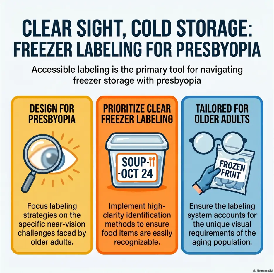
A freezer can be a tiny winter cave: cold air, white frost, stacked containers, shiny plastic, and labels that looked perfectly readable on the kitchen counter but turn into gray whispers once the door opens. For older adults with presbyopia, that small daily moment can become frustrating fast.
Good freezer labels are not decoration. They are a home-navigation tool. They help someone answer three practical questions before their fingers go numb: what is this, when was it frozen, and should it be used soon? That small clarity can reduce wasted food, duplicate grocery trips, and the quiet embarrassment of pulling out chili when you wanted chicken soup.
This guide gives you a simple, large-print freezer labeling system that works for older adults, caregivers, meal-preppers, and aging-in-place households. No craft-room perfection required. Just bolder words, smarter placement, calmer categories, and a freezer that finally speaks clearly.
Read faster
Use large, bold, high-contrast labels that can be read inside the freezer.
Waste less
Make older meals obvious with simple dates, “Use First” zones, and front-facing labels.
Help caregivers
Create a repeatable system that family members can maintain without decoding freezer hieroglyphics.
Small promise: one shelf, one marker, one better label can make tomorrow’s dinner easier. 🧊
Snapshot: This guide is for older adults with presbyopia, family caregivers, adult children, and meal-prep households that want freezer labels to be readable, consistent, and low-stress.
You will learn where to place labels, what size and contrast work best, how to date frozen food clearly, how to build freezer zones, and how to fix one shelf today without turning the kitchen into a weekend project.
Table of Contents
Safety and Scope: What Freezer Labels Can and Cannot Solve
Freezer labeling can make daily life easier, especially for older adults who can read large print but struggle with close-up labels, glare, frost, or tiny handwriting. It is a practical home-organization tool, not a medical test, not a food-safety guarantee, and not a substitute for care when vision changes suddenly.
Presbyopia is common with age, and it can make near tasks feel oddly difficult: reading a jar label, checking a prescription bottle, or identifying a frozen container in dim light. A better label system can reduce friction, but it cannot explain new blur, eye pain, sudden vision loss, double vision, or dramatic changes in reading ability.
Safety note
This article is for general home-organization and caregiver support. If an older adult has sudden or worsening vision symptoms, confusion, repeated unsafe food choices, or trouble managing meals independently, contact an eye-care professional, primary care clinician, occupational therapist, or other qualified professional. When food smells off, looks spoiled, has thawed for an unknown time, or cannot be identified, discard it.
The label is a support, not a diagnosis
A freezer label can make “CHICKEN SOUP” easier to see. It cannot tell you why a person suddenly cannot read the word “SOUP” at all. That distinction matters.
If labels that were once readable become impossible, the answer may not be a bigger marker. It may be a new glasses prescription, cataract glare, dry eye, medication effects, neurological changes, or another issue that deserves attention.
Food safety still needs common sense
Clear labeling helps prevent old leftovers from hiding in the icy back row. It also helps caregivers rotate meals before they become freezer fossils. But a readable label does not magically make food safe forever.
When in doubt, use a cautious rule: if the food is unlabeled, freezer-burned beyond recognition, smells wrong after thawing, or was involved in a power outage without a clear timeline, do not gamble. The cost of one tossed container is smaller than a night of foodborne misery.
A simple system beats a perfect one
The goal is not to build a magazine-worthy freezer with calligraphy labels and matching bins. The goal is to help real people find real food on real Tuesdays.
If a system requires ten label colors, three kinds of tape, and a family meeting to interpret it, it may look clever but fail by Friday. The best freezer label system for presbyopia is boring in the most beautiful way: large words, predictable placement, clear dates, and enough consistency that sleepy hands can follow it before the brain finishes complaining.
Why Freezer Labels Fail When Eyes Get Tired
Many freezer labels fail because they are designed for the person writing them, not the person trying to read them in cold air. A label can look crisp at the table and become nearly useless inside the freezer, where shadows, frost, glare, and awkward angles join forces like tiny kitchen gremlins.
For older adults with presbyopia, the problem is often not effort. It is distance. The eyes may need the label farther away to focus, but the freezer may require bending, reaching, or holding a container close. Add a lid covered with frost, and the label becomes a riddle written on a snowbank.
Presbyopia changes the freezer into a guessing game
Presbyopia affects near focus. In everyday terms, the small writing that used to behave politely now backs away and asks for better lighting. The freezer adds another layer: labels are often below eye level, behind other items, or on surfaces that are curved, foggy, or wet.
This is why an older adult may say, “I can read fine when I have my glasses,” yet still struggle with frozen leftovers. The issue is not only eyesight. It is the whole task: cold fingers, bending, time pressure, plastic glare, and a label written by someone who assumed future-us would remember what “S 6/4” meant.
Cold, glare, frost, and shadows make small labels worse
Freezers are not friendly reading rooms. Interior lights can be harsh or dim. Plastic bags wrinkle. Containers stack sideways. White frost can cover the one word that matters. Shiny tape can reflect light exactly where the eye needs contrast.
That is why “large print” alone is not enough. You need contrast, placement, surface choice, and repetition. A big word on the wrong side of the container is still a secret.
The hidden cost: wasted food, duplicate meals, and unsafe guessing
Poor labeling can slowly drain a household. Someone buys more ground beef because the frozen package was unreadable. A caregiver cooks another batch of soup because last month’s soup was buried behind peas. A tired older adult microwaves the wrong meal because the label looked like “turkey” but was actually “turnip mash.”
The cost is not only money. It is confidence. When the kitchen becomes a place where everyday tasks feel uncertain, people may cook less, eat less variety, or avoid the freezer entirely.
Key takeaway
A freezer label is successful only if it can be read in the place where it will be used: cold, shadowed, frosty, and usually in a hurry.
Neat labels can still be unreadable
This is the freezer-label trap: tidy does not always mean usable. Tiny black script on a pale kraft sticker may look charming on social media. Inside a freezer, it can become decorative fog.
For presbyopia-friendly labeling, beauty comes from function. The label should be blunt, calm, and visible. Think “airport sign,” not “wedding invitation.” The freezer is not auditioning for a lifestyle catalog. It is trying to tell you where the meatballs are.
The 3-Second Rule for Older-Adult Freezer Labels
The best test for any freezer label is simple: can the older adult identify the food in about three seconds, before removing the container from the freezer? Three seconds is not a scientific commandment. It is a practical line in the frost.
If the person must take out three containers, wipe frost, tilt each one under the light, and ask someone else, the label has failed. It may contain information, but it is not delivering clarity.
Put the food name first, not the date
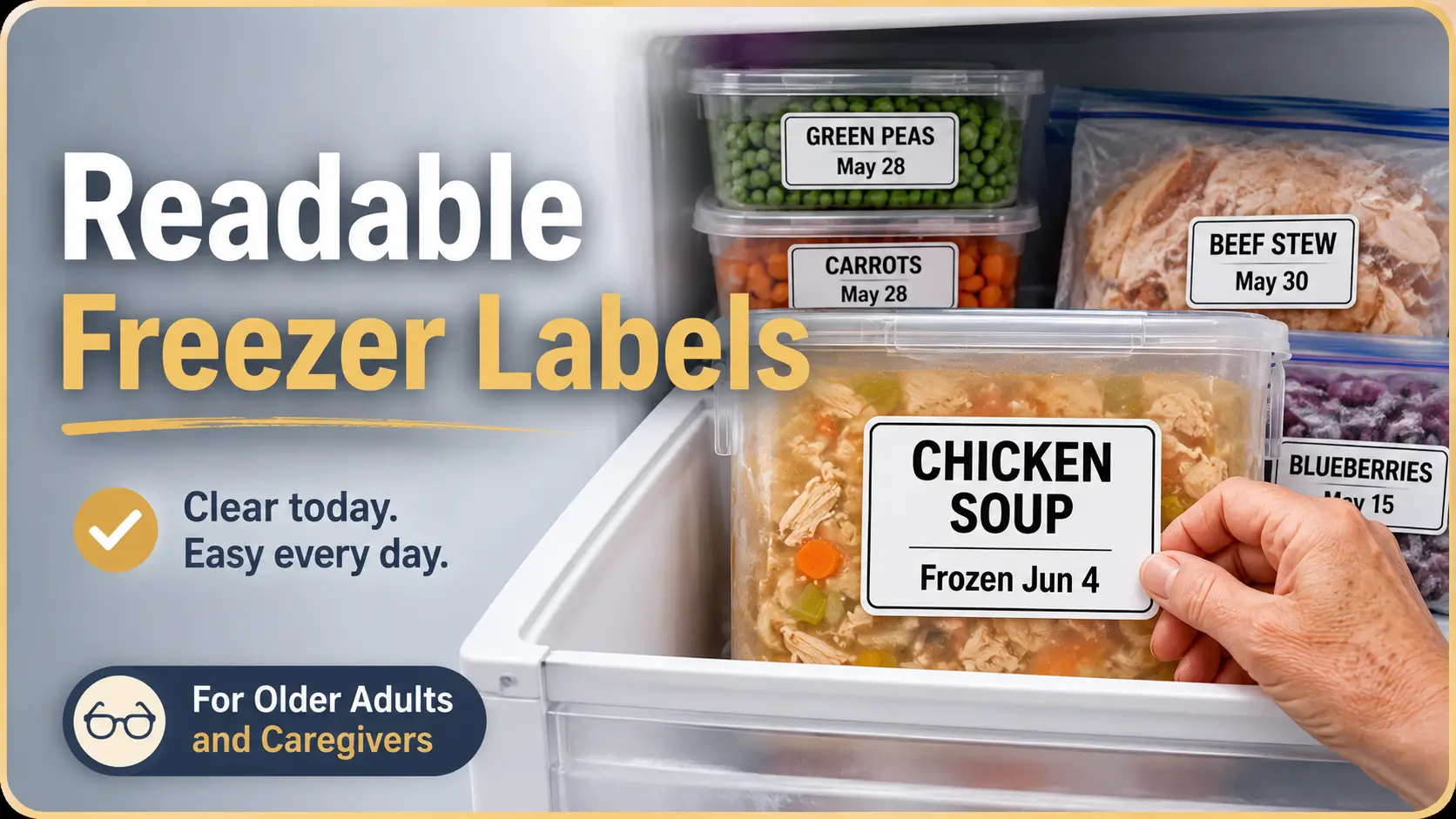
Dates matter, but the food name matters first. Most people open the freezer because they want dinner, not a calendar puzzle. “BEEF STEW” should be the largest text. The date can sit below it in smaller but still readable writing.
A good label hierarchy looks like this: food name first, frozen date second, special note third. For example, “TURKEY CHILI,” then “Frozen Jan 12,” then “Mild” or “Use First.”
| Poor label | Better label | Why it works |
|---|---|---|
| 6/4 soup | CHICKEN SOUP Frozen Jun 4, 2026 | The food name is obvious before the date. |
| Mom lunch | SALMON RICE BOWL Frozen May 22 Low sodium | The meal and diet note are clear. |
| Leftovers | BEEF STEW Frozen Feb 9 Use First | No guessing, no memory test. |
Use one label position every time
Consistency is a gift to tired eyes. Choose one label location for each container type and stick with it. For rectangular containers, use the front long side. For zip-top bags stored upright, label the top third. For bins, label the front face.
Do not make the reader hunt. A label on the lid works only if the container is stored flat and visible from above. If containers stack sideways, the lid label disappears, and the freezer becomes a library with all the book titles printed on the back cover.
Make the answer visible before the container leaves the freezer
The safest label is readable while the item is still in its storage position. This matters for older adults who may have weaker grip, arthritis, balance concerns, or limited stamina. Pulling out heavy containers just to identify them adds unnecessary risk.
Try this test: open the freezer, stand where the older adult normally stands, and read the labels without moving containers. If the label cannot be seen from that angle, it is in the wrong place.
Tiny test: can you read it without squinting?
Squinting is feedback. If someone has to squint, lean, lift, or guess, the label needs redesign. Do not argue with the freezer. It has already filed its complaint.
Ask the person who will actually use the system to test it. Caregivers often label food from their own visual comfort zone. The real standard is not whether the adult child can read it under bright kitchen lights. The standard is whether the older adult can read it during normal use.
Best Label Materials That Survive Frost, Moisture, and Reheating
Freezer labels live a hard little life. They face cold air, condensation, plastic flexing, damp fingers, reheating, and the occasional mystery spill. The best label material is not always the prettiest. It is the one that stays readable, sticks long enough, and comes off without leaving a gummy archaeological layer.
For older adults with presbyopia, materials must also support contrast. A label that survives the freezer but reflects glare like a tiny disco tile is not doing the job.
Freezer tape vs painter’s tape vs masking tape
Freezer tape is designed for cold storage and usually performs better than ordinary masking tape. It tends to stick more reliably in low temperatures, especially on wrapped foods and containers. Painter’s tape can work for short-term labeling, especially because it is often easy to remove, but some types loosen in the freezer.
Masking tape is the wild card. It may work for a few days, then curl like a dry leaf. It can also become brittle or leave residue. If masking tape is all you have today, use it as a temporary fix, not the family freezer constitution.
| Material | Best use | Watch out for |
|---|---|---|
| Freezer tape | Longer freezer storage, wrapped meats, batch meals | Some brands need a dry surface to stick well |
| Painter’s tape | Short-term leftovers, temporary “Use First” notes | May loosen with frost or moisture |
| Masking tape | Emergency labeling only | Curling, tearing, residue, poor cold hold |
| Large adhesive freezer labels | Flat containers and meal-prep boxes | Glossy finishes may create glare |
| Reusable clips | Bins, baskets, shelf zones | Can fall off if bumped or overloaded |
Large adhesive labels for flat containers
Large adhesive labels work well on flat plastic or glass containers, especially when the surface is dry before labeling. Choose matte labels when possible. Matte surfaces reduce glare and make black marker easier to read.
For meal-prep containers, the label should be large enough to hold the food name in bold letters. A tiny sticker forces tiny writing. The small container is not in charge. If the food name matters, give it space.
Waterproof marker rules for cold storage
A thick black marker with a chisel tip is usually easier to read than a thin pen. Thin strokes disappear in frost and blur under glare. Use bold uppercase letters for the food name, then smaller but still legible writing for the date.
Let ink dry before placing containers in the freezer. A label that smears on the way into storage becomes a tiny abstract painting titled “Probably Soup.”
Reusable label clips for bins, baskets, and freezer shelves
Reusable clips are useful when you organize the freezer by zones. Instead of labeling every single bag of vegetables with a giant category label, you can label the bin: “VEGETABLES,” “SOUPS,” “MEAT,” “READY MEALS,” or “USE FIRST.”
Clips work best when they are large, matte, and placed on the front edge. They should guide the hand before the eyes do all the work. This is especially helpful for older adults who know what they want but need the freezer to narrow the search.
Key takeaway
Choose matte, large, high-contrast label materials. The best label is not the one that looks cute on the roll; it is the one still readable after cold, moisture, and handling.
Large-Print Label Design That Actually Helps Presbyopia
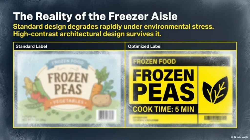
Large print is not only about font size. It is about the total reading experience: letter shape, spacing, contrast, word choice, and visual clutter. A freezer label for aging eyes should act like a street sign at night. Clear. Brief. Unfussy. Impossible to confuse with a poem.
The design rule is simple: make the most important word the easiest word to see. In most cases, that word is the main food: “LASAGNA,” “SALMON,” “BERRIES,” “SOUP,” “CHILI,” or “MEATLOAF.”
Use bold block letters instead of cursive or thin pen strokes
Cursive can be beautiful, but beauty is not the freezer’s first job. Thin strokes and connected letters are harder to read when the label is cold, wet, or partly obscured. Use block letters, preferably uppercase for the main food name.
Write slowly enough that letters stay open. “SOUP” should not become “S00P.” “BEEF” should not look like “BEE?” Give letters room to breathe. The freezer is already crowded; the words do not need to be.
Choose black-on-white or dark-on-light contrast
Black marker on white freezer tape is often the easiest low-cost combination. Dark blue or dark green on white can also work, but black is usually the safest default. Avoid pale ink, metallic pens, transparent labels, or brown kraft labels if the older adult struggles with contrast.
Contrast matters more than decoration. A beautiful low-contrast label is like a polite whisper during a fire drill. Technically present, practically useless.
Keep labels short: “CHICKEN SOUP” beats “homemade soup from Sunday”
Short labels reduce visual work. Instead of “homemade chicken noodle soup from Sunday dinner,” write “CHICKEN SOUP.” If you need extra detail, add it below: “no noodles,” “low salt,” or “2 cups.”
Caregivers may be tempted to write the whole backstory. Resist. The label is not a memoir. It is a decision tool.
Add spacing so letters do not blur together
Presbyopia can make crowded text feel messy. Add space between the food name and the date. Use two lines, not one cramped line. If possible, leave a small margin around the words so frost or tape edges do not cover them.
A readable large-print freezer label might look like this:
CHICKEN SOUP
Frozen Jan 12, 2026
Use First
Notice the hierarchy. Big food name. Clear date. Short note. No puzzle.
Show me the nerdy details
Readability improves when the eye can quickly separate figure from background. In a freezer, the “figure” is the label text and the “background” is everything else: tape, plastic, frost, shadows, packaging, and reflected light.
That is why black text on a matte white label usually beats pale marker on colored tape. It creates a stronger edge between letter and surface. For presbyopia, that edge is precious. It lets the reader recognize the word shape faster, with less squinting and less container-juggling.
For more background on age-related near vision, readers can review this plain-English resource from the National Eye Institute.
Color Coding Without Creating a Rainbow Problem
Color coding can help, but only when it reduces thinking. Too many colors create a freezer rainbow that requires a legend, a memory palace, and possibly a tiny committee. For older adults with presbyopia, color should support the words, not replace them.
The safest rule is this: use color for broad categories, then write the food name clearly. A yellow label might mean soup, but it should still say “TOMATO SOUP.” The word carries the meaning. The color helps the eye find the zone faster.
Use color for category, not every single meal
Do not assign one color to chicken, another to turkey, another to beef, another to pork, another to fish, and another to leftovers from Tuesdays. That system collapses under its own cleverness.
Instead, use broad groups. For example, one color for proteins, one for vegetables, one for soups, one for ready meals, and one for treats. Keep it simple enough that a guest caregiver could understand it in ten seconds.
Try five simple freezer zones: meat, soup, vegetables, leftovers, treats
Five zones are usually enough for a home freezer. A caregiver may choose “READY MEALS” instead of “leftovers” if the older adult eats prepared single-serving meals. A household with dietary needs may include “LOW SODIUM” or “SOFT FOODS” as a zone.
The exact categories matter less than consistency. If frozen vegetables are always in a clear bin labeled “VEGETABLES,” the reader stops searching the entire freezer. The system narrows the hunt before the eyes work too hard.
The Clear Freezer Framework
1
Name first
Write the food name in the largest, boldest text.
2
Date second
Use “Frozen Jan 12, 2026” instead of a cryptic number.
3
Zone third
Put items in labeled bins so the shelf guides the search.
Pair color with words so the system still works for low vision
Color alone can fail for several reasons: dim freezer light, color-vision differences, faded labels, similar tape shades, or the simple fact that people forget what colors mean. Pair every color with a word.
A blue bin tag that says “FISH” is better than a blue tag alone. A green shelf label that says “VEGETABLES” is better than expecting everyone to remember that green means broccoli, peas, spinach, and hope.
Avoid red-green-only systems for older households
Red and green can be hard for some people to distinguish. They can also look darker in dim light. If you use red and green, make sure the label text still carries the message.
For example, instead of relying on a red sticker to mean “Use First,” write “USE FIRST” in large black letters. The red border can add urgency, but the words should do the work.
Date Labels That Prevent Mystery Meals
Date labels prevent the freezer from becoming a museum of good intentions. They also help caregivers rotate meals, track batch cooking, and decide what should be eaten first. But date labels often fail because they are too short, too cryptic, or too separated from the food name.
The goal is not to write a legal document on every container. The goal is to make the date obvious enough that no one has to ask, “Was this June fourth, April sixth, or a message from another civilization?”
Use “Frozen On” instead of cryptic numbers
“Frozen On” gives context. It tells the reader what the date means. Without that phrase, a date can be confusing: cooked date, purchased date, opened date, use-by date, or frozen date?
A strong format is “Frozen Jan 12, 2026.” It is clear, compact, and easier to read than “1/12/26” for many older adults. When space allows, write the month name. Short month names like Jan, Feb, Mar, and Sep are friendly little anchors.
Add “Use First” labels for older items
Not every container needs a detailed expiration lecture. A simple “USE FIRST” label can guide everyday choices. Place older meals in one front-facing section so the freezer does not require a scavenger hunt.
For caregivers, “Use First” is a kindness. It helps a visiting family member choose dinner without calling three people and interrogating the frozen lasagna.
Put expiration logic on the bin, not every container
If you try to calculate storage guidance on every label, the system can become too much. Instead, use a bin card or freezer map with broad rules: “Use soups within 2 to 3 months for best quality,” “Use cooked meals first,” or “Newest items go to the back.”
Food safety guidance can vary by food type, freezer temperature, thawing method, and handling. For general food-storage information, use official guidance, then keep your household system simple enough that people actually follow it.
For a practical reference on storage timing and safe handling, use the FoodSafety.gov cold food storage information.
Don’t do this: writing only “6/4” with no year or food name
A date without a food name is not a label. It is a clue. The older adult still has to identify the food, remember the year, and decide whether the container is worth thawing.
Use the date as support, not the headline. “TURKEY MEATBALLS, Frozen Jun 4, 2026” beats “6/4” every time.
Key takeaway
The best freezer date label says what the date means. “Frozen Jan 12, 2026” is clearer than “1/12,” especially in shared households.
Freezer Zones That Make Labels Easier to Read
Labels work better when the freezer itself has a logic. Without zones, every item competes for attention. With zones, the older adult can go directly to the likely area and then read fewer labels. This reduces visual fatigue and shortens the door-open shuffle.
Freezer zones do not require a new appliance or expensive bins. You can create zones with clear containers, shelf labels, front-row rules, and a small freezer map taped nearby.
Front row for ready-to-eat meals
Ready-to-eat meals should be easy to find. Place single-serving containers, soups, stews, or cooked leftovers in the front row. This is especially useful for older adults who eat alone, caregivers preparing meals ahead, or households where lunch needs to be simple.
Do not bury the meals that are meant to solve the hardest moments. If a container is intended for a tired evening, it should not require excavation.
Left side for proteins, right side for vegetables
A left-right system can work well because it is easy to remember. For example, proteins on the left, vegetables on the right, ready meals in the front, and treats on the upper shelf. This gives the freezer a mental map.
If the older adult already has a strong habit, adapt to that habit instead of fighting it. A good system feels natural after a week. A bad system feels like a test every time the door opens.
Clear bins as “drawers” inside the freezer
Clear bins can turn a chaotic shelf into a set of small drawers. Label the front of each bin in large letters: “SOUPS,” “MEAT,” “VEG,” “FRUIT,” “USE FIRST.” The bin label should be bigger than individual container dates because it helps with the first decision.
For chest freezers, bins are even more important. Items can disappear into the deep cold like socks behind a dryer. Large bin labels and a freezer map can save time, food, and patience.
Freezer zone starter map
- Top shelf: ready-to-eat meals and single servings
- Middle left: proteins such as chicken, beef, fish, and turkey
- Middle right: vegetables, fruit, and smoothie packs
- Bottom shelf or drawer: bulk items and unopened packages
- Front bin: Use First items that should be eaten soon
The freezer map trick for caregivers
A freezer map is a simple note that shows what goes where. It can be taped to the side of the refrigerator, inside a nearby cabinet, or on a caregiver clipboard. It is especially helpful when several people help with meals.
The map does not need artwork. It can be a four-line list: “Ready meals front. Meat left. Veg right. Use First bin on top.” The point is to make the system repeatable when the regular caregiver is not there.
Caregiver-Friendly Label Templates
Caregivers need labels that communicate quickly, without creating clutter. A good freezer label template should be flexible enough for normal leftovers, batch meals, medical-diet notes, shared households, and emergency situations such as power outages or freezer cleanouts.
The best template is the one your household will actually use when everyone is tired. Keep a marker and tape near the freezer, not in a drawer across the kitchen. A system that requires a scavenger hunt for supplies will quietly disappear.
The simplest format: Food + Frozen Date + Use First note
For most households, this format is enough:
FOOD NAME
Frozen Month Day, Year
Use First / Mild / Low Sodium / 2 servings
Use the third line only when needed. Too many notes can make the label harder to scan. If every container has three warnings, none of them feels important.
Meal-prep format for single servings
Single-serving meals need portion clarity. Older adults living independently may not want to thaw a family-size container. Caregivers can label portions so the freezer supports independence instead of creating another decision.
| Meal-prep need | Label example | Why it helps |
|---|---|---|
| Single dinner | CHICKEN RICE 1 meal Frozen Feb 3 | Prevents thawing too much food. |
| Soft texture | LENTIL SOUP Soft Frozen Mar 8 | Supports chewing or swallowing preferences when clinically appropriate. |
| Breakfast | OATMEAL CUPS 2 servings Frozen Jan 29 | Makes morning choices easier. |
| Caregiver rotation | BEEF STEW Use First Frozen Dec 14 | Moves older meals forward. |
Medical-diet format for sodium, sugar, or texture needs
If an older adult follows a clinician-recommended diet, labels may need extra notes. Keep those notes short and consistent: “Low Sodium,” “No Added Sugar,” “Soft,” “Pureed,” “Renal Plan,” or “Diabetes Meal,” depending on the person’s actual care plan.
Do not invent diet labels casually. If a medical diet is involved, match the language used by the clinician, dietitian, or care plan. A label should reduce confusion, not become homegrown nutrition theater.
Shared-household format for names and portions
Shared households need ownership and portion information. This can prevent the classic freezer crime: someone eats the only low-sodium meal because it looked like regular casserole.
Use labels like “MOM: TURKEY SOUP, 1 meal, Frozen Apr 5” or “DAD: BEEF STEW, 2 servings, Use First.” Put the person’s name at the beginning only if ownership is the first decision. Otherwise, keep the food name first.
Key takeaway
Caregiver labels should answer the next practical question, not every possible question. Food, date, portion, and one critical note are usually enough.
Short Story: The Lasagna That Kept Coming Back
Marian’s daughter made lasagna every other Sunday and froze it in neat glass containers. The labels were tidy, written in blue pen on small white stickers. On the counter, they looked organized. In the freezer, Marian could not read them.
So she kept buying frozen dinners, even though six homemade meals were waiting. Her daughter thought Marian was being picky. Marian thought she was losing her grip on the kitchen.
One afternoon, they changed the system. Large freezer tape went on the front side of each container. The label said “LASAGNA,” “1 MEAL,” and “Frozen Apr 7” in thick black letters. They put all ready meals in a front bin labeled “DINNERS.”
The lasagna did not change. Marian’s confidence did. The lesson was small but sturdy: when the system respects the eyes, independence has more room to stay.
Low-Cost Tools, Checklists, and a Simple Freezer Map
You do not need a premium organizing kit to make a freezer easier to use. Most households can build a strong system with a thick marker, freezer tape, a few clear bins, and a repeatable placement rule. The trick is to buy tools that support readability, not tools that merely look organized.
Think of this section as the practical shopping list and setup guide. Start small. One shelf with good labels beats a full freezer makeover that exhausts everyone by lunchtime.
Thick black markers with chisel tips
A chisel-tip marker can make both thick and medium lines. Use the broad edge for the food name and the narrow edge for the date. Keep one marker near the freezer or meal-prep area so labeling happens before food disappears into storage.
Replace markers before they fade. A dry marker creates gray text, and gray text is where readability goes to nap.
Pre-cut freezer labels in large sizes
Pre-cut labels save time, especially for caregivers preparing several meals at once. Choose large rectangles. Small decorative stickers encourage tiny writing, and tiny writing is the villain of this story.
If you use printed labels, use a large, plain font. Avoid fancy fonts, narrow fonts, pale colors, and glossy finishes. A printed label should look more like a pharmacy sign than a party invitation.
Clear bins with front-facing label plates
Clear bins are especially useful for freezer shelves that become messy quickly. The front-facing label plate should be large enough to read without bending deeply. If the bin handle is low, consider placing the label higher on the front edge.
For older adults with glare sensitivity, choose bins that are clear but not overly shiny when possible. Frost and glossy plastic can create reflections that make labels harder to read.
Magnifier sheets or clip-on freezer lights for extra help
Some households benefit from extra tools: a handheld magnifier near the kitchen, a brighter but not harsh freezer-safe light, or a phone magnifier app. These tools should support the label system, not compensate for labels that are far too small.
If magnification is already part of daily life, consider reading related home-setup guides such as reading glasses vs magnifiers, nutrition labels for aging eyes, and how to read expiration dates with low vision. The same principle repeats across the home: bigger text helps, but placement and lighting finish the job.
Readiness checklist: build a better freezer label station
- One thick black chisel-tip marker
- One roll of freezer tape or large matte freezer labels
- Three to five clear bins or baskets, if space allows
- One “Use First” label for older meals
- One freezer map near the appliance
- One rule for label placement on each container type
Mistake checklist: remove these tiny troublemakers
- Labels written only on lids when containers are stacked sideways
- Abbreviations that only one person understands
- Glossy labels that reflect freezer light
- Dates without food names
- Multiple label styles in the same freezer
- Frost covering the only useful word
For broader ideas on home adjustments for vision changes, the American Foundation for the Blind offers practical information for people living with vision loss and their families.
When to Rethink the System or Seek Help
A freezer labeling system should make life easier within a week or two. If the older adult still pulls out the wrong foods, avoids the freezer, or cannot read large labels under normal conditions, the system may need more than a tweak.
Sometimes the answer is practical: bigger labels, better placement, fewer categories, a brighter light, or a “Use First” bin. Sometimes the pattern points to a broader concern, such as worsening vision, memory changes, balance problems, or difficulty managing meals independently.
Labels are readable in the kitchen but not inside the freezer
This usually means the testing environment is wrong. Labels should be tested inside the freezer, from the user’s normal standing position, with the usual lighting. Kitchen-counter readability is only the first round.
Try moving labels to the front side, using larger tape, reducing glare, and placing the most-used meals at chest or waist height when possible. Avoid requiring deep bending for daily foods.
The older adult keeps pulling out the wrong meal
Repeated wrong choices may mean the label is not distinct enough. “SOUP” may be too broad if there are six soups. Use “CHICKEN SOUP,” “TOMATO SOUP,” and “LENTIL SOUP.” Add a category bin only if it reduces the number of labels the person must compare.
If wrong choices continue even with very large labels and consistent zones, gently look beyond the freezer. Is the person rushing because the door is heavy? Are they avoiding glasses? Is the lighting poor? Are there memory or attention concerns? The freezer may be revealing a larger daily-living issue.
Frost, glare, or bending makes labels hard to see
Frost-covered labels need relocation. Put labels on surfaces less likely to frost over, or label the bin instead of relying only on each container. If the freezer has heavy frost buildup, it may need maintenance according to the appliance instructions.
If bending is the problem, store daily foods higher and less-used items lower. Accessibility is not only about vision. It is also about reach, grip, balance, and energy.
When vision changes need professional attention
Seek professional help if there is sudden blurry vision, eye pain, flashes, new floaters, a curtain-like shadow, sudden double vision, new severe headaches, or a rapid change in reading ability. Also consider an eye exam if an older adult consistently struggles with large, high-contrast labels that were designed around their needs.
For caregiver planning, it may also help to review senior vision changes warning signs and low vision freezer organization. Food labels are one part of a larger home-safety pattern.
Key takeaway
If bigger, clearer labels still do not help, do not blame the person. Recheck lighting, placement, freezer layout, glasses, and possible changes in vision or daily function.
The American Academy of Ophthalmology provides patient-friendly information on eye health and symptoms that may require medical attention.
FAQ
What size should freezer labels be for older adults?
Use labels large enough for the food name to be written in bold letters at least about an inch high when possible. The exact size depends on the person’s vision, freezer lighting, and storage position. Test the label inside the freezer, not only on the counter.
What is the easiest freezer label format for presbyopia?
The easiest format is “FOOD NAME” on the first line, “Frozen Month Day, Year” on the second line, and one short note if needed. Keep the food name largest and use dark writing on a light matte background.
Is black marker on white tape better than colored labels?
Often, yes. Black on white gives strong contrast and is usually easier to read in freezer lighting. Colored labels can help with categories, but they should not replace clear words.
Should freezer labels go on the lid or the side?
Put labels where they can be read while the item is stored. If containers are stacked flat and viewed from above, lid labels may work. If containers are stacked sideways or in bins, front-side labels are usually better.
How can caregivers label freezer meals for seniors?
Use large print, consistent placement, and short notes. Include the food name, frozen date, portion count, and any care-plan note such as “low sodium” only when it is truly needed. Place ready meals in a front-facing bin.
What is the best way to date frozen leftovers?
Write “Frozen” followed by the month name, day, and year. For example: “Frozen Jun 4, 2026.” Avoid writing only numbers because they can be misread or lose meaning later.
How do you organize a freezer for someone with aging eyes?
Create simple zones: ready meals in front, proteins on one side, vegetables on another, and a “Use First” section for older food. Add large bin labels so the person does not need to read every container.
Are reusable freezer labels worth it?
Reusable labels can be useful for bins, baskets, and shelf zones. For individual containers, removable freezer tape or large matte labels may be simpler because they can be replaced each time food changes.
Fix One Shelf Today
The best freezer labeling system begins with one shelf, not a grand kitchen revolution. Choose the shelf that causes the most daily confusion. Usually, that is the shelf with ready meals, leftovers, or small containers that all look suspiciously alike under frost.
Take out only that shelf’s items. Discard anything that is unlabeled, unsafe, badly freezer-burned, or impossible to identify. Do not spend twenty minutes debating an icy lump from a forgotten month. Mystery food has already made its argument, and it was not persuasive.
Relabel the foods you will realistically use. Put the food name first in bold letters, add the frozen date, and place older items in a front “Use First” section. Then create one rule for that shelf: ready meals in front, newer meals behind, labels facing out.
Your 15-minute freezer reset
- Pick one shelf or one bin.
- Remove anything unlabeled or clearly past usefulness.
- Write new labels with the food name first.
- Add “Frozen Month Day, Year.”
- Create one “Use First” spot at the front.
- Stand back and test readability before closing the door.
This small reset closes the loop. Freezer labels for older adults with presbyopia are not about perfection. They are about reducing one daily moment of uncertainty. When a label says “CHICKEN SOUP” clearly enough to be read in the cold, dinner becomes less of a search party and more of a promise kept.
Last reviewed: 2026-06