

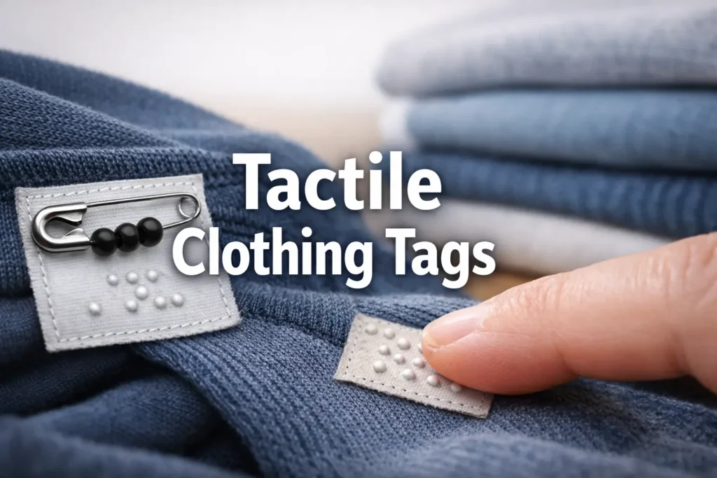
Mastering Your Morning: A Tactile Clothing Tag System
Navy and black can look like twins under bathroom bulbs, and that tiny mistake has a way of following you all day.
A low vision clothing tag system for color matching fixes that by moving the decision from unreliable lighting to reliable touch. It’s a simple, repeatable setup that uses tactile labels like safety pin codes (position plus a bead or texture) with a laundry-proof backup, so you’re not betting your morning on “pretty sure.”
Definition: A tactile method of labeling garments so you can identify color families by touch. Most systems use a consistent signal (pin placement, bead count, or texture) plus a second layer like a stitch code or iron-on label for durability.
Keep guessing and you lose time, confidence, and the quiet ease of grabbing clothes without negotiating with light. This system is built around real-world failure points: pin migration, snag zones, and the dryer drum.
The Strategy
- ✔ Start small: Build a 6–10 color families map that won’t collapse later.
- ✔ Make it tactile-first: Choose a pin code your fingers can read instantly.
- ✔ Test it before you trust it: Add a backup (stitch or iron-on) so one lost pin doesn’t break the whole system.
Fast Answer (Snippet-ready): A reliable low vision clothing tag system uses safety pin “codes” (position + bead count) plus laundry-proof backup labels. Assign each color family a simple, repeatable pattern (example: top pin = neutrals, side pin = blues, bottom pin = reds). Use stainless steel locking pins and heat-sealed or iron-on labels as a second layer so your code survives washers, dryers, and dark mornings.
Table of Contents
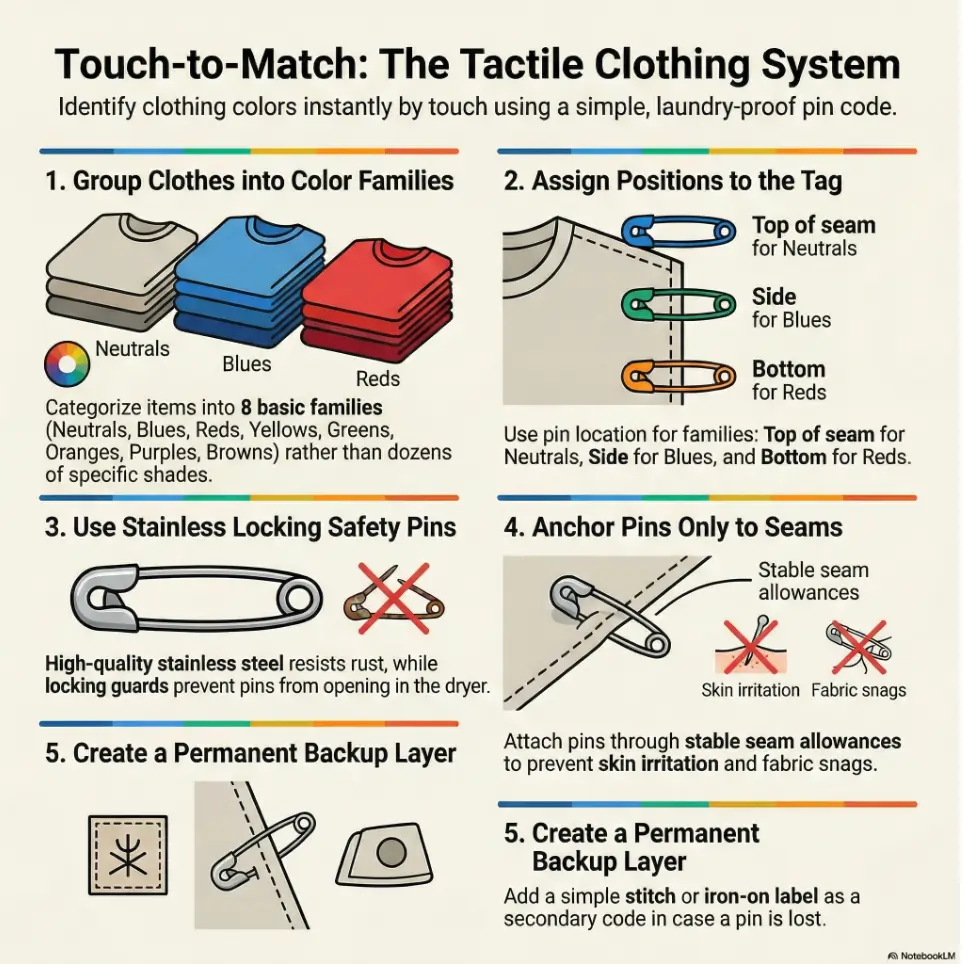
1) Start here: a “color families” map that won’t explode later
Pick 6–10 color families (not 30 shades)
The system lives or dies here. Not because you’re “doing it wrong” but because the human brain hates maintaining a tiny museum of micro-decisions at 7:12 a.m. Start with color families, not “teal vs turquoise vs that one shirt that lies under warm bulbs.”
A practical starter set (8 families):
- Neutrals: black, white, gray, beige
- Blues: light blue, denim, navy (we’ll split navy later if needed)
- Reds/Pinks: red, burgundy, coral, pink
- Greens: olive, forest, mint
- Yellows/Oranges: mustard, gold, orange
- Purples: lavender to deep purple
- Browns: tan to chocolate
- Patterns/Prints: stripes, checks, florals (dominant color later)
Tiny lived-experience note: I once tried a “12-color precision” system and it lasted exactly four laundry cycles. On cycle five, I stared at three nearly-identical pins and felt my soul gently leave my body.
Decide your “don’t-care” bucket (the relief category)
This is the secret weapon. Your “don’t-care” bucket is what you wear when you want zero drama. Think: black tees, dark jeans, gray hoodies, neutral socks. If something lands here, it should be easy to grab and safe to pair with most things.
- Start with 6–10 families, not shades.
- Create a “don’t-care” bucket for effortless outfits.
- Make patterns a separate family to reduce confusion.
Apply in 60 seconds: Pick your first 8 families and write them on one sticky note.
Open loop: The one family most people forget (and it causes half the mismatches)
People forget undertone neutrals, especially “warm beige” versus “cool gray,” and those undertones can fight certain colors. The fix isn’t to create more categories. The fix is to choose a default: if you can’t confidently tell, it goes into Neutrals and you pair it using one of your “safe formulas” (we’ll build those in Section 5).
A quick authority anchor: the National Eye Institute explains that low vision can make daily tasks harder, including telling colors apart, even when vision can’t be corrected by standard options. That’s exactly why a tactile system helps: it shifts the load from eyesight to repeatable touch.
2) Safety pin codes that are readable by touch, not memory
Code options: pin position, bead count, knot/loop texture
A real code works when you’re tired, distracted, and holding a coffee that is one mild bump away from becoming a shirt stain. The most reliable tactile codes use two signals:
- Where the pin sits (position)
- What it feels like (bead count or texture)
Three code styles that actually work:
- Position-only: fastest, lowest cost. Great for 6–8 families.
- Position + bead count: scalable to 10–12 families without feeling like homework.
- Position + texture: best for people who hate tiny beads (think: a small silicone “bump,” a loop of embroidery floss, or a short heat-shrink nub).
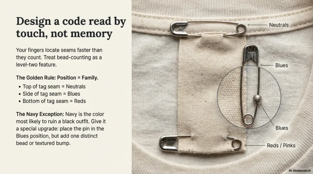
A tactile “syntax” that scales (so you don’t repaint the whole system later)
Here’s the scaling trick: position = family, and beads/texture = sub-family only if you need it.
Make this your default: one position per family. Only add beads if you truly need “navy vs denim” precision.
Show me the nerdy details
Why position-first works: your fingers locate seams faster than they count. Counting is reliable only when the beads are distinct, spaced, and you don’t need to squeeze through thick fabric. Treat bead counting as a “level 2 feature,” not the foundation.
Let’s be honest… if the code needs a legend every time, it’s not a code
If you have to check your phone note for “two beads on the left means…” every morning, your code is too complex. Your goal is a system your hands can run while your brain is still booting up.
3) The laundry-proof build: pins that don’t rust, stab, or vanish
Pin choice: stainless vs coated vs “locking” (what actually survives dryers)
Your real enemy isn’t the washer. It’s the dryer: heat + tumbling + friction. That’s why “random craft safety pins” often fail quietly, then reappear later inside a fitted sheet like a tiny metal jumpscare.
What to look for:
- Stainless steel: resists rust and staining better than cheap plated pins.
- Locking/guarded closure: less likely to open mid-cycle.
- Smooth profile: fewer snags on knits and delicates.
VisionAware (American Printing House for the Blind’s ConnectCenter) specifically mentions “no rust” laundry safety pins as one option for labeling clothing. That’s a good signal you’re not inventing a weird hack; you’re adapting a real daily-living technique. (If you’re already building tactile habits around the home, the same “durable touch points” idea shows up in tactile dots for microwave buttons and tactile thermostat labeling.)
Placement that avoids skin contact (and snagging on delicates)
Your pin should live where it does the least harm. Think like a bouncer: it should stand near the door, not on the dance floor.
- Best spots: inside tag seam, inside waistband seam, inside hem seam, inside collar seam (for tees)
- Avoid: underarms, bra band area, tight cuffs, thigh seams (friction city)
A small personal note: my “first draft” pin placement was near a side seam on a soft knit. It snagged once, I cursed, and I never trusted that shirt again. Place pins where fabric already has structure.
How to prevent the “pin migration” problem across loads
Pins migrate when they’re attached to thin, stretchy fabric and the garment twists during washing. You can reduce migration with three habits:
- Anchor through a seam allowance (thicker, more stable).
- Close the pin with the point facing inward (less snagging).
- Use a mesh laundry bag for delicates and anything with long loose knits.
- Choose stainless and, ideally, a locking closure.
- Anchor pins through seams, not stretchy fabric.
- Use mesh bags to reduce snagging and loss.
Apply in 60 seconds: Move one pin from a thin panel to a seam and feel the stability difference.
Decision Card: When pins vs when labels
- Choose pins if you want low cost, quick setup, and you change your wardrobe often.
- Choose sew-in/heat labels if you have pin safety concerns, sensitive skin, or kids’ clothing in the same laundry stream.
- Choose both (best) if you want a system that survives pin loss and still works while traveling.
Neutral next step: Pick one primary method and add the second only for your top 10 most-worn items.
4) Backup layer: tags that survive wash day even if the pin goes rogue
Iron-on / heat-seal labels: where they last longest (and where they peel)
Backups matter because pins are physical objects in a chaotic universe. A backup label means you still win even when a pin disappears into the sock dimension.
Where iron-ons tend to hold best:
- Inside waistband (flat, stable area)
- Inside collar (if not scratchy)
- Tag backing (if the tag is fabric, not slick plastic)
Where they fail faster:
- High-stretch knits (yoga pants, thin tees)
- High-friction areas (underarms, thigh seams)
- Slick synthetic tag surfaces
Fabric marker + clear heat film: the stealth method for sensitive skin
If labels itch, you can write a letter code (like “B” for blues, “N” for neutrals) on an inside seam allowance with a laundry-safe marker, then cover it with a small patch of clear heat film. The film protects the ink from abrasion and keeps the texture low-profile. (This same “mark + protect” logic is why household labeling guides like tactile labels for shampoo and conditioner tend to favor methods that survive water, friction, and hurried hands.)
This is especially helpful for underwear and soft tees where even “soft” labels become tiny sandpaper after a long day.
Open loop: The simplest backup that still works when you’re traveling
Travel is where systems go to die. The simplest backup is one small tactile stitch in a consistent place: one stitch on the tag seam for neutrals, two for blues, three for reds, and so on. No extra materials. No special kit. Just a quick needle-and-thread mark that survives everything short of the garment’s actual apocalypse. If you’re packing with low vision, you can pair this approach with low vision travel tips so your suitcase doesn’t become a mystery novel.
5) Closet workflow: how to match colors fast without perfect lighting
The 10-second match routine (top, bottom, outerwear)
You’re not building a fashion studio. You’re building a decision machine that runs when you’re half human. Here’s the 10-second routine:
- Top: Find the pin position (family) first.
- Bottom: Choose a “safe pair” family (neutrals or denim are the usual heroes).
- Outerwear: Default to a neutral layer unless you’re intentionally choosing color.
My personal hack: I keep one “emergency outfit” pre-approved for high-stakes days (appointments, interviews, anything with fluorescent lighting that makes colors behave badly). It’s boring. It’s perfect. It saves my brain about 20% of its daily energy.
Pairing rules that reduce choices (two “safe formulas” for daily outfits)
Safe Formula A (the almost-always works set): neutral top + colored bottom + neutral outerwear.
Safe Formula B (the “I want color but not chaos” set): one color family + two neutrals (example: blue + gray + black).
If you want a tiny dash of style without extra decision cost, make patterns obey one rule: patterns count as their dominant color family.
Mini Calculator: How much time does this save you?
Estimate three numbers, then do the math:
- Outfits per week: ___ (example: 7)
- Minutes spent guessing colors now: ___ (example: 3)
- Minutes with a tactile tag system: ___ (example: 1)
Result: (minutes now − minutes later) × outfits = minutes saved per week. Neutral next step: Track one week before and after, just to see what changes.
“Decision shelf” setup: pre-matched sets that save your mornings
This is where caregivers quietly cheer. Create a “decision shelf” or one closet section with 3–5 pre-matched sets. Each set can be a hanger combo (top + bottom) or a folded stack (top on top of bottom). If you’re building routines as a team, helping a spouse with vision loss often comes down to small, repeatable “no-drama defaults” like this.
If you share laundry with family, label the shelf too. Not in a fancy way. Just enough so everyone follows the same map instead of improvising a new universe every Sunday night. (For couples especially, systems like this can reduce friction in ways that feel bigger than closets; see coping with vision loss as a couple for the “shared workflow” mindset.)
Short Story: The “navy is black” morning (120–180 words)
I once had a morning where everything felt stacked: early appointment, rain outside, brain running at half-speed. I grabbed what I thought was my “safe black” outfit. In the bathroom mirror, it looked fine. Under daylight, it turned into the classic problem: black top, navy pants, and a jacket that was somehow neither, like it was auditioning for a different show.
Nobody said anything. That was almost worse. All day I felt slightly off, like my clothes were whispering a secret I couldn’t hear. That night I added one simple rule: navy gets its own tactile signal. Not a complicated code, just a small change my fingers could recognize instantly. The next week, I stopped thinking about navy altogether. The best systems don’t make you better at seeing. They make you better at living.
6) Real-world categories: different clothes need different tagging tactics
Dark denim, black tees, navy suits: separating “almost-black”
If your wardrobe has a lot of darks (many people do), you’ll want a special rule for the almost-black trio: black, navy, and dark charcoal. These are the colors most likely to “look identical” under indoor lighting. If your lighting setup tends to exaggerate the problem, consider pairing this system with glare-free under-cabinet lighting ideas so “checking” isn’t an optical trap.
Simple fix: make one of them “special.”
- Black: base neutral (no beads)
- Navy: same position as blues + one distinct bead or a small textured bump
- Charcoal: neutrals position + one bead
I’ve found it’s less tiring to make navy the “special” one, because it’s the most likely to be mistaken for black. If you do it the other way, you’ll constantly wonder whether something is navy when it’s simply black.
Patterns and prints: coding the dominant color vs “accent color”
Decide the rule once, then never renegotiate it. The most usable rule is:
Pattern family uses the dominant color as the code.
So a navy-and-white stripe is “blues,” not “patterns.” Patterns becomes a category only if you truly have hard-to-classify garments (multi-color florals, busy prints).
Socks and underwear: micro-tags that don’t itch or show
Socks are tiny chaos engines. Underwear is comfort-first. Pins can be annoying here, so consider:
- One stitch code on the inside seam (fast, travel-proof)
- Small iron-on dot label placed on the waistband interior
- Texture-only marker (a tiny silicone bump on the tag seam)
Show me the nerdy details
For socks, the “touch channel” is small and fast. Counting beads on a sock is like trying to read a street sign while jogging. A single stitch or a single raised dot usually wins on usability.
7) Who this is for / not for
For: low vision, color confusion, dim closets, shared laundry households
This is for anyone who can’t reliably trust lighting or quick visual checks. It’s also for households where clothes get mixed in the wash, and someone ends up asking, “Is this the blue one or the other blue one?”
For: caregivers who want a system that doesn’t require daily coaching
Caregivers need systems that don’t demand constant reminders. A tactile code puts the instructions on the garment itself, which is both practical and quietly dignifying. If caregiving is part of your household rhythm, a spouse-centered support approach can help keep tools like this from becoming “one more thing to manage.”
Not for: people who need exact shade matching (you’ll want tech help)
If your work requires very specific shades (brand uniforms, strict dress codes, color-critical jobs), tactile systems can still help, but you may want a secondary tool like a color identifier app or tagged wardrobe notes. This guide is optimized for fast, reliable family-level matching, not “perfect hue calibration.”
Not for: anyone with pin safety concerns (choose sew-in/heat labels only)
If pins are unsafe in your context, skip them completely. Use stitch codes, iron-on labels, or sew-in tactile tags. The goal is independence and safety, not “following the plan at all costs.”
8) Common mistakes: the outfit landmines that keep happening
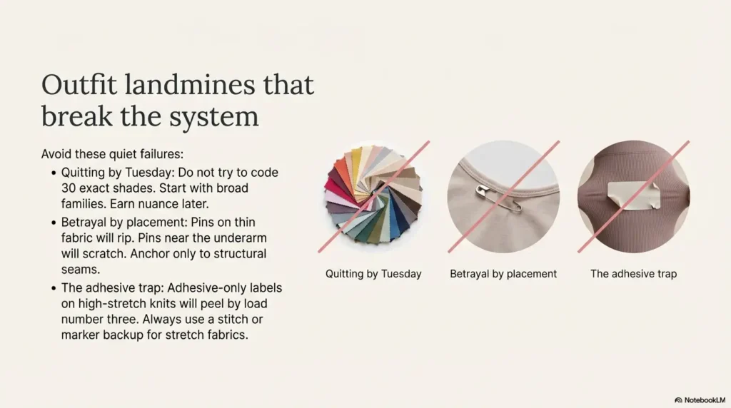
Mistake #1: coding every shade, then quitting by Tuesday
If your system requires you to remember 18 outcomes, it’s not a system. It’s a part-time job. Start with families. Earn nuance later.
Mistake #2: putting pins where they poke, snag, or fall out
Pins on thin fabric are a betrayal waiting to happen. Anchor to seams. Keep them away from skin. Treat comfort as a requirement, not a “nice-to-have.”
Mistake #3: forgetting “lighting rules” (bathroom light lies)
Bathroom lighting is a professional liar. So are warm bedside lamps. Your tag system exists precisely because light is inconsistent. If you want to reduce the “light lies” effect at the source, nighttime bathroom safety routines can make color checks less misleading and mornings less stressful.
Here’s what no one tells you… the washer isn’t the enemy, the dryer drum is
The dryer adds heat, tumbling, and friction. That’s why “it looked fine after the wash” can still become “why is this pin missing?” after drying. If you want maximum durability, air-dry delicates and anything with loosely attached tags.
9) Don’t do this: “laundry-proof” hacks that fail quietly
Cheap pins that rust and stain light fabrics
Rust stains are heartbreak because they feel unfair. If you’re tagging light fabrics, avoid unknown metal pins. Stainless (and ideally locking) reduces risk.
Adhesive-only labels on stretch knits (they peel on load #3)
Adhesives and stretch knits have a messy relationship. If you must use adhesive labels, treat them as temporary, and always add a backup (stitch or marker).
Overcomplicated bead systems that feel identical through fabric
Beads only work if they feel different. Tiny beads that compress into fabric become indistinguishable. Use fewer beads, larger texture contrast, or switch to position-first.
Eligibility Checklist: Is the safety pin code system a good fit?
- Yes if you want a low-cost system you can set up in under 30 minutes.
- Yes if you’re comfortable handling pins and can place them away from skin.
- Yes if you prefer touch-first methods without relying on a screen.
- No if pins are unsafe in your household (kids, cognitive risk, dexterity challenges).
- No if you require exact shade matching every day.
Neutral next step: If you hit one “No,” use sew-in/heat labels and keep the same family map.
10) The durability test: prove it in one weekend (before you tag everything)
Two-load test plan: hot/cold, dryer/no dryer
Before you tag your entire wardrobe like you’re inventorying a warehouse, run a weekend test. Pick 5 items you actually wear. Tag them with your new code. Then do:
- Load 1: your normal wash + your normal dry
- Load 2: gentle wash + air dry (or low heat) for comparison
Snag test: seams, waistbands, bra straps, backpacks
Wear the items in real life. Let the backpack strap rub the shoulder. Let the waistband flex. Your test should include the annoying parts of life, because those are the parts that destroy flimsy systems.
Keep/kill checklist: what passes, what gets replaced
- Keep if the pin stayed closed, didn’t snag, and remained easy to find by touch.
- Kill if it poked, migrated, rusted, or made you avoid the garment.
- Modify if it worked but needs a better placement (move to a seam).
- Run two loads before scaling.
- Wear the items during the test to catch snag risks.
- Keep what works, replace what doesn’t, no guilt.
Apply in 60 seconds: Choose your test five and put them in a “pilot” pile right now.
Show me the nerdy details
A good durability test isolates variables: same five items, same placements, two wash/dry conditions. If you change everything at once, you won’t know whether the failure came from the pin, the placement, or the fabric type.
FAQ
How do I label clothes for color matching if I’m low vision?
Start with 6–10 color families and assign each family a tactile signal you can feel quickly. A simple approach is safety pin position (top/side/bottom of the tag seam) plus an optional bead or texture for tricky categories like navy vs black. Add a backup layer (stitch code or iron-on label) so the system still works if a pin goes missing.
What safety pins won’t rust in the wash?
Look for stainless steel pins and, if possible, locking or guarded-closure pins that are less likely to open in the dryer. Avoid unknown plated pins on light fabrics, since rust or corrosion can stain. If you’re unsure, run the two-load durability test on a low-stakes item first.
Where should I attach pins so they don’t poke or snag?
Attach pins through stable seams: tag seams, waistband seams, collar seams, or hem seams. Keep the pin away from skin-contact zones like underarms and tight cuffs. Close the pin fully and orient the point inward to reduce snagging on knits.
How can I tell navy from black by touch using a tag system?
Give navy its own tactile “upgrade.” Keep black as the default neutral signal, and make navy a blues-position pin plus one distinct bead or a small textured bump. This way your fingers can identify navy instantly without counting multiple identical beads.
What’s the best backup if pins fall off during laundry?
The simplest travel-proof backup is a stitch code: one stitch for neutrals, two for blues, three for reds, and so on, placed in the same location on each garment (like the inside tag seam). You can also use an iron-on label or a laundry-safe marker protected by clear heat film for sensitive-skin items.
Can I use beads on pins without them breaking in the dryer?
Yes, but choose beads that are large enough to feel through fabric and durable enough to handle heat and tumbling. Keep bead counts low (1–3) and consider a texture marker instead if beads feel too similar. Always pilot-test before scaling to your whole wardrobe.
How many color categories should I start with?
Most people do best with 6–10 families. If you start with more than 10, you’ll spend too much time deciding which label to use, and the system will feel fragile. You can always add one more category later if a real problem keeps showing up (navy vs black is the common one).
Is there a no-pin option that’s still laundry-proof?
Yes. Use stitch codes, sew-in tactile tags, or heat-sealed/iron-on labels placed on stable seams (like waistbands). Many people also use tactile markers or distinct textures as identifiers on household items, and the same “texture map” idea can be adapted to clothing tags.
12) Next step: do one tiny thing today
Tag 5 “most worn” items (2 tops, 2 bottoms, 1 jacket) using one code rule and run the two-load durability test this weekend. That’s it. Don’t tag your whole closet. Don’t build a cathedral. Build a pilot, prove it, then scale with confidence.
If you want a clean starting template, use this:
- Neutrals: pin at top of tag seam
- Blues: pin at side of tag seam
- Reds: pin at bottom of tag seam
- Navy special case: add one bead or one texture bump
Conclusion
Remember the open loop from the beginning, the family most people forget? It’s not a missing color. It’s the quiet undertone problem and the way lighting turns neutrals into shape-shifters. The cure isn’t sharper eyes. It’s a system your hands can trust.
Build the map (families), choose a touch-first code (position first), and add a backup layer so one lost pin doesn’t take the whole system down. If you do one thing in the next 15 minutes, do the pilot: tag five items, write your code on one note, and put those five pieces in a single “test” zone.
And if you want a broader labeling toolkit mindset: VisionAware’s labeling and marking guidance for low vision and blindness includes a range of tactile strategies (rubber band counts, textures, and more), and the same principle applies here: make information readable by touch, then keep it simple enough to use daily. If you’re building this into a wider home system, it pairs naturally with tactile thermostat labeling and other “touch-first” routines that reduce daily guesswork.
Last reviewed: 2026-02-27