

Designing for Reality: The Low Vision Emergency Card
A wallet card emergency info template for low vision seniors can look beautifully “accessible” on a screen and still become useless once it is printed, trimmed, tucked behind plastic, and read in bad light. That is the quiet trap: most cards do not fail because families forget to care. They fail because the text is too small, the contrast is too soft, and the card tries to say too much in too little space.
For seniors with low vision, that is not a design flaw. It is a real-world safety problem. In a hurried hallway, a parking lot, or an ER waiting room, an unreadable card can delay the exact help it was meant to speed up.
This guide shows you how to build a template that stays legible where it matters: at actual wallet size, under uneven lighting, and in the hands of a stranger. The focus is practical and unsentimental:
“`- ✔ Readable beats pretty.
- ✔ Scannable beats complete.
- ✔ Never shrink the text for space.
Because a card like this should not merely fit in a wallet. It should survive contact with reality.
Table of Contents

Who this is for / not for
This is for you if you are creating a wallet card emergency info template for low vision seniors, helping a parent or spouse carry emergency details, or trying to choose font size, wording, contrast, and layout that still work when the world is not politely well lit. It is also for caregivers who are tired of “large print” templates that turn out to mean “slightly less microscopic.”
This is for you if you are
Creating a card for daily carry in a wallet, purse, phone case, ID sleeve, or travel pouch. A lot of seniors do not need a giant binder. They need one small, legible thing that can speak on a hard day.
I once watched a beautifully designed emergency card disappear into a patterned wallet pocket like a moth into curtains. It looked elegant. It also looked unreadable. Beauty, in this corner of life, has to survive contact with reality.
This is not for you if you need
A full legal advance directive, a complete medication log with every dose change, or a replacement for a medically appropriate alert bracelet. Ready.gov advises people with disabilities to organize prescriptions and wear medical alert tags or bracelets when needed, which is a helpful reminder that the wallet card is a companion tool, not a universal substitute. (ready.gov)
- Use the card for immediate action information
- Keep legal and detailed medical records elsewhere
- Pair with ID jewelry when medically appropriate
Apply in 60 seconds: Circle the details a stranger could act on in 10 seconds. Everything else is a candidate for removal.
Font size first: the card fails here before anywhere else
Minimum readable type for a wallet card
If the card is truly wallet-sized, start by respecting physics. A standard wallet card gives you very little acreage, which means readable type is expensive. APH’s research-based large-print guidance treats large print as a system involving font face, size, spacing, color, and formatting, not a magic label slapped onto a template. APH materials also note that a document is not actually “large print” unless it is 18-point type or larger, but a wallet card usually cannot hold full large-print standards without splitting content or using both sides. (aph.org)
That does not mean the project is doomed. It means you should design around constraints instead of pretending they do not exist. In practice, many wallet cards work best when labels and critical lines are kept as large as the format allows, often with the most urgent lines getting the biggest type and the least urgent details moved off-card. The same principle shows up in other accessibility tools, including large-print prescription labels that prioritize scannability over crowding.
Why “large print” on paper is not the same as “looks big on screen”
What looks roomy on a 13-inch monitor can shrink into ant-sized regret once printed, cut, folded, sleeved, and viewed at arm’s length. Screen zoom lies with a straight face. Paper does not. I learned this the annoying way after printing a “clean” sample that became unreadable as soon as it slipped behind cloudy plastic.
Older adults and readers with low vision often need more than nominally bigger text. They need cleaner letterforms, stronger contrast, and spacing that keeps lines from melting together. W3C’s contrast guidance explicitly notes that larger text can be read at lower contrast thresholds, but it also warns that thin or unusual fonts can still fail in practice. In plain English: big but wispy is not the same as readable. (w3.org)
When to split one crowded card into front-and-back instead of shrinking text
The moment you feel tempted to drop the type “just one point smaller,” pause. That is often the cliff edge. Splitting the card into front and back is usually smarter than cramming every detail onto one side. A crowded card does not become informative. It becomes evasive.
Use the front for immediate recognition. Use the back for backup details that matter but do not need to scream first.
Eligibility checklist: does this need two sides?
Answer yes or no:
- Do you need more than 2 emergency contacts?
- Do you need to include allergies and a medication summary?
- Do mobility, sensory, or communication notes matter in a crisis?
- Does the front become hard to scan at actual wallet size?
Neutral next action: If you answered yes to 2 or more, move secondary details to the back before shrinking font size.
Show me the nerdy details
Wallet-sized print design is a trade-off problem. A larger font improves character recognition, but only if line length, line spacing, and content density still allow quick scanning. Once you reduce type to protect layout, you often lose more in usability than you gain in completeness.
Contrast rules that rescue the card in dim restaurants, parking lots, and ER waiting rooms
Dark-on-light wins more often than clever color palettes
For a wallet card, black or very dark charcoal text on a plain white or off-white matte background wins more often than any tasteful designer palette. It may not look “soft.” It may not look “premium.” It will, however, still exist when read under bad light and poor patience.
WCAG contrast thresholds worth borrowing for print
WCAG is written for digital content, not printed wallet cards, but the contrast logic is incredibly useful. W3C’s Quick Reference sets 4.5:1 as the minimum contrast ratio for regular text and 3:1 for large text at Level AA, with 7:1 as enhanced contrast at Level AAA. For printed emergency cards, borrowing the stricter spirit of those thresholds is wise because the reader may be older, hurried, stressed, and dealing with glare. (w3.org)
Don’t trust pastel text just because it looks calm
Pastels are lovely in a stationery aisle. In emergency reading, they are diplomatic little traitors. Soft gray on cream, dusty blue on ivory, sage on beige, all of it may look serene and become mush at the exact moment someone needs certainty. W3C also warns against relying on color alone to convey meaning, which matters if you were planning to mark “urgent” content in red without also labeling it clearly. (w3.org)
And then there is glare. Research on older-adult design and visibility points toward matte rather than glossy reading surfaces to reduce glare-related problems. That squares with everyday experience: a glossy sleeve under overhead lighting can throw reflections across a card like a tiny disco ball of inconvenience. (ncbi.nlm.nih.gov)
- Use very dark text on a plain light background
- Avoid color-only urgency signals
- Choose matte stock or matte lamination when possible
Apply in 60 seconds: Print one sample in grayscale. If it loses meaning, the color strategy was doing too much work.

Template anatomy: what belongs on the card and what should stay off it
The quiet rule is simple: every line must earn its place. An emergency card is not a biography, not a charm bracelet of health trivia, and not a substitute for a portal login. It is a stress-reading tool.
Front side essentials
Full name
Emergency contact
Key conditions or risks
Critical allergies
Current medications summary
Preferred hospital or doctor, if relevant
Notice the word summary. Not all doses, not every supplement ever bought in a burst of optimism. A summary. For example: “Takes insulin” is urgent. “Vitamin D gummies, sporadic” is not steering the ship.
Back side essentials
Secondary contact
Insurance note, if truly necessary
Communication needs
Mobility or sensory notes
‘See phone’ or ‘see wallet sleeve’ for longer lists
Ready.gov’s preparedness guidance for people with disabilities emphasizes organizing prescriptions and important medical information. That supports the card as a fast-access summary while leaving longer records in a phone, document pouch, or caregiver folder. (ready.gov)
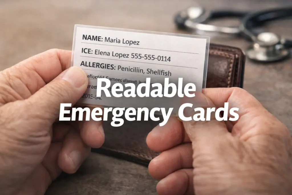
A practical template skeleton
NAME: Maria Lopez
ICE: Elena Lopez 555-555-0114
ALLERGIES: Penicillin, shellfish
KEY NEEDS: Low vision, hearing aids, uses cane
MEDS: Blood thinner, insulin
NOTE: Speaks slowly under stress. See phone for full medication list.
That is plain. It is not fancy. It is exactly the point.
Decision card: summary on card vs full list elsewhere
Choose A: Put a short medication summary on the card when the detail changes rarely and affects urgent care.
Choose B: Put “See phone for full list” when medications are numerous, frequently updated, or impossible to fit without shrinking text.
Time/cost trade-off: A short summary improves scan speed. A full list improves completeness but often destroys readability.
Neutral next action: Keep the card short and store the detailed list in one consistent backup location, whether that is a one-page medication list template or a simpler low-vision medication tracker printable.
Layout traps: where well-meaning cards become unreadable little bricks
One idea per line
Compressed sentences are where cards go to die. Each line should carry one idea. The eye does better when it can land, decode, and move. Not wrestle.
Left alignment over centered text
Centered text looks tidy and behaves badly. Left-aligned text gives the eye a dependable starting edge. Under stress, predictability matters more than symmetry.
White space is not wasted space
A bit of breathing room is not indulgent. It is what keeps names, numbers, and labels from sticking together. APH’s guidance explicitly includes spacing and formatting as part of large-print accessibility, which is why “same font, less crowding” often beats “slightly bigger font, zero air.” (aph.org)
Avoid all-caps blocks unless you enjoy visual static
All caps can work for a short label, but whole blocks of it create a texture more than a sentence. Most readers, especially tired or older readers, scan mixed-case words faster because the word shapes are easier to distinguish.
Let’s be honest… A wallet card is not a brochure. If it looks heavily “designed,” it may already be harder to read.
for name and urgent risks
on plain light stock
with one idea per line
before smaller type
before final print
Plain-language wording: the card should sound human under stress
Short labels helpers can scan in seconds
Use labels like Allergies, Meds, Needs, ICE, Call. Avoid decorative phrases such as “health considerations” or “personal support overview.” No one in a rushed hallway wants a brochure voice.
Common words over clinical flourish
Say “blood thinner” if that is what a helper will understand quickly. Say “uses walker” instead of “ambulatory aid dependent.” The card should speak in ordinary language because emergencies are not oral exams.
Why abbreviations should be used sparingly
Some abbreviations are fine if widely understood. ICE, DNR when legally relevant elsewhere, Rx in context. But a private alphabet of family shorthand can create delay. If you are unsure whether a stranger would know it, write the whole phrase.
How emergency wording changes when the reader is panicked, rushed, or unfamiliar with the person
Stress makes reading narrower. People skim. They jump to headings. They miss nuance. That is why plain-language emergency communication guidance consistently pushes clarity over style. I have seen families try to soften wording so it sounds gentler. Gentle is lovely. Clear is kinder. Ready.gov’s materials for people with disabilities emphasize practical preparedness and organized essential information, which fits this blunt, scannable approach. (ready.gov)
Good: “Low vision. Please speak clearly and identify yourself.”
Better than fancy: “Hard of hearing. Face me when speaking.”
Not great: “Sensory accommodation needs may be present.”
Don’t do this: the most common font and contrast mistakes
Most unreadable cards are not ruined by one dramatic choice. They are ruined by six tiny compromises dressed as sophistication.
Using thin decorative fonts
Thin strokes disappear first. High-contrast typography in the fashion-magazine sense is often low readability in the emergency-card sense. Choose sturdy sans serif fonts with open shapes. No hairlines. No ornamental quirks. No heroic italics trying to prove they went to design school.
Printing light gray text on cream stock
This is the classic “but it looked elegant” problem. Dark text on a plain light background is boring in the same way seat belts are boring. Admirably so.
Cramping too many diagnoses onto one side
If the card becomes a paragraph, it stops being a card and becomes a warning label nobody reads. Split it, trim it, or move detail elsewhere.
Relying on color alone to signal urgency
Red text for allergy notes is fine only if the label still says ALLERGY. W3C’s use-of-color guidance is clear: color should not be the only carrier of meaning. (w3.org)
Laminating glossy cards that bounce glare into the next county
That glossy finish can make a tiny card feel durable and look premium. It can also catch overhead light and reflect it like a grudge. Matte stock or matte lamination usually behaves better for readability. (ncbi.nlm.nih.gov)
- One weak font choice matters
- One weak contrast choice matters
- Together they make the card collapse fast
Apply in 60 seconds: Put your draft beside a utility bill or prescription label. If yours is harder to read, redesign it.
Template variations that fit real life, not just ideal checklists
Minimal version for independent seniors
Name, primary emergency contact, one or two critical allergies, one key condition, and a note like “See phone for full list.” This version works beautifully when simplicity is the goal and health details are stable.
Caregiver-assisted version with added contact structure
Add a second contact, caregiver role, and a brief communication note. Example: “Daughter manages medications.” This can reduce confusion when a helpful stranger is trying to figure out whom to call first. It also pairs well with broader caregiver planning like helping a spouse with vision loss or coping with vision loss as a couple.
Medical-alert companion version for people who already wear ID jewelry
If a bracelet handles the biggest medical alert, the card can focus on contacts, sensory needs, and backup information. Think of it as a duet, not a duplicate.
Travel version for seniors who split time across states
Add city/state and a travel-specific note such as “Winter residence in AZ.” This matters when a contact or preferred clinic is not local. I have seen traveling retirees carry a home card that made perfect sense in one state and absolute soup in another. For families building a fuller away-from-home system, it can help to combine this with practical low-vision travel tips.
Short Story: A friend once made two cards for her father, one for everyday life and one for long road trips between North Carolina and Florida. The everyday card was spare: name, daughter’s number, blood thinner, peanut allergy, low vision, uses cane. The travel card added a second contact, state location, and “full meds in phone notes.” The first version looked almost too simple. The second looked almost too plain.
But when he slipped in a restaurant parking lot during a winter stopover, the travel card did its job in under a minute. Nobody needed a health autobiography. They needed a phone number, one medication clue, and a sentence that said he had low vision and might not recognize them immediately. It was one of those humbling moments where design stopped being aesthetic and became mercy.
The print test: how to know your template works before an emergency does
Here’s what no one tells you: a card that looks readable at your desk can fall apart the moment you fold it, sleeve it, or glance at it in motion. Testing is not fussy. It is the project.
The wallet-distance test
Hold the printed card at the distance it will actually be read, not nose-to-paper in ideal lighting. If key lines blur, the design is not done.
The low-light test
Read it in a hallway, car, restaurant corner, or evening lamp light. Emergency reading is almost never staged under a sunbeam of justice.
The stranger-scan test
Hand it to someone unfamiliar and ask them to find three details in 10 seconds: name, emergency contact, allergy. If they hunt or hesitate, simplify.
The fold-and-glare test
Insert it into the actual wallet slot or sleeve. Then tilt it under overhead light. If reflections or cloudy plastic erase the text, change material, placement, or finish.
The update-date check
A beautifully readable wrong card is still wrong. Add a tiny “Updated: MM/YYYY” line so stale information has a visible expiration scent.
Quote-prep list: what to gather before finalizing the card
- Current emergency contacts and backup numbers
- One-line medication summary or backup location
- Critical allergies only
- Mobility, hearing, vision, or speech notes that affect real interaction
- Last updated month and year
Neutral next action: Gather the details first, then design. Editing content after layout usually causes the tiny-font spiral. For medication-heavy households, it is often easier to prepare the backup document first with a one-page medication list or a more detailed guide to low-vision medication management.
Show me the nerdy details
Usability testing for a wallet card is gloriously low-tech. You are measuring scan speed, error rate, and visibility under realistic conditions. If a new version takes longer to interpret than an older, plainer one, the redesign was not an improvement.
Card placement matters: the best template still fails if nobody finds it
Wallet slot versus clear sleeve versus phone case insert
A visible slot wins over a buried pocket. A clear sleeve can help discoverability but harm contrast if scratched or glossy. A phone case insert is convenient, but only if the phone is consistently carried and accessible.
Why duplicate copies reduce single-point failure
One card in the wallet, one in the bag, one near the home exit, or one with a caregiver. Redundancy is not paranoia. It is good systems thinking wearing sensible shoes.
How to cue family members, neighbors, or aides that the card exists
Tell them. Put a small note in the wallet sleeve. Add “Emergency card in left pocket” to a phone lock screen only if privacy settings and comfort allow. A hidden masterpiece is still hidden.
Ready.gov’s older-adult and disability preparedness pages emphasize individualized planning and critical information access. That same logic applies here: the card must be easy to find, not just easy to read. (ready.gov)
Safety and privacy: enough information to help, not enough to overexpose
What to include for urgent recognition
Include the details a helper or clinician can act on immediately: name, emergency contacts, critical allergies, major risks, one-line medication summary, sensory or mobility notes, and perhaps a preferred language or communication cue.
What to avoid printing in full
Avoid dumping full insurance IDs, every medication dose, your complete address if you are uneasy about it, or conditions that do not help immediate response. More exposure does not automatically buy more safety.
When a separate medication list makes more sense than shrinking the card
If the medication list changes often, keep the wallet card short and store the detailed list elsewhere. A changing medication stack is one of the fastest ways a card goes stale. That is especially true for households already juggling polypharmacy and vision problems or trying to manage multiple bottles, labels, and updates.
I have seen families treat the card like a tiny legal archive because they feared leaving something out. But emergency tools work best when they do one job well. The wallet card is for recognition and first contact. The full record can live in a secondary document. That backup system is often stronger when paired with practical tools like better pill-bottle tactile label placement and a low-vision medication tracker printable.
- Include what helps immediate action
- Exclude what mainly adds exposure or clutter
- Use a backup document for fast-changing detail
Apply in 60 seconds: Ask of every line: would a stranger knowing this improve care in the next few minutes?

FAQ
What is the best font size for a wallet card emergency info template for low vision seniors?
There is no single perfect number because wallet size is brutally small, but the practical rule is to make the most urgent lines as large as the format allows and split content across both sides before shrinking type. APH’s large-print guidance treats readability as a system of size, spacing, font face, and formatting, and APH materials describe large print as 18-point or larger. A true wallet card often cannot carry that standard everywhere, so prioritization matters. (aph.org)
Should emergency wallet cards use black text on white background?
Usually, yes. Very dark text on a plain light background is the safest default for readability. W3C contrast guidance supports strong contrast, with 4.5:1 minimum for regular text and 3:1 for large text at Level AA, and stronger contrast is usually even better for real-world emergency reading. (w3.org)
Is laminated or matte paper better for low vision readability?
Matte usually behaves better than glossy because it reduces glare and reflections. If you laminate for durability, choose matte when possible. A glossy finish can look polished and still make the card harder to read under overhead light. (ncbi.nlm.nih.gov)
How much medical information should fit on a wallet card?
Only what someone could use immediately: name, emergency contacts, critical allergies, a medication summary if essential, and key mobility, sensory, or communication notes. Save full lists and fast-changing details for a backup document.
Should I use icons or just text on an emergency card?
Text should do the heavy lifting. Small icons can be helpful, but they should never carry meaning alone. W3C guidance warns against depending on color or non-text cues without clear text support. (w3.org)
Can I print emergency contact numbers on both sides?
Yes, especially if one number is truly critical. Duplication can improve resilience. Just do not let repetition crowd out more urgent information.
What font styles are easiest for seniors with low vision?
Clean sans serif fonts with open shapes and solid strokes are usually the safest choice. The key is not fashion but clarity: avoid thin, decorative, overly condensed, or quirky fonts that lose shape at small sizes.
Should the card match WCAG contrast rules even though it is printed?
WCAG is for digital content, but its contrast thresholds are an excellent borrowing point for print decisions. The logic travels well because the human eye does not suddenly become less human on paper. (w3.org)
Is a wallet card enough without a medical alert bracelet?
Not always. For some conditions, a bracelet or other alert ID may still be the better first-line signal. Ready.gov specifically recommends medical alert tags or bracelets when needed. Think of the card as one layer in a preparedness system.
How often should I update an emergency info card?
Any time medications, contacts, allergies, or major conditions change. Even without changes, review it every few months and print the update month on the card so drift is visible.
Next step
Print one draft at actual wallet size today. Not tomorrow, not after a heroic Canva session, not once you have found the “perfect” font. Today. Use a sans serif font, dark text on a plain light background, and only the information a stranger could act on immediately. Then test it in low light, at arm’s length, and inside the exact sleeve or wallet slot where it will live.
The hook at the beginning was simple: a card can look perfect on screen and fail in the world. By now, the reason should feel clear. The real enemy is not lack of effort. It is the quiet drift toward tiny text, low contrast, pretty colors, and too much information. Readability is not the finishing touch. It is the structure holding the whole thing up.
If you only do one thing in the next 15 minutes, do this: make a front-only pilot version with name, emergency contact, critical allergies, one urgent condition or medication note, and one communication or mobility line. Print it. Test it. Then earn every additional line from there. Once the card itself works, you can support it with adjacent systems such as a low-vision calendar system for appointments, a low-vision key identification system, or other everyday accessibility tools that reduce friction before emergencies ever start.
Last reviewed: 2026-03.