


The Truth Comes Out in the Evening
A bulb swap can cost under ten dollars and still waste weeks if you test the wrong thing. With the best bulb color temperature for glare-sensitive eyes 2700K vs 3000K, the real fight is rarely one Kelvin number versus another. It is the quiet pileup of brightness, exposed bulbs, glossy surfaces, and tired evening eyes.
That is why so many homes feel fine at noon and strangely hostile after dinner. A “warm white” bulb can still feel sharp. A “cleaner” bulb can make reading, grooming, or label-checking easier while also making the room feel more visually loud.
“Most bulb advice cheats. It compares boxes, not evenings. This guide helps you sort out comfort where your eyes actually live.”
The method here is practical, not decorative: match lumens, test at night, and judge comfort from your favorite seat. Stop the guessing game and avoid turning your whole house into a lighting experiment.
Table of Contents
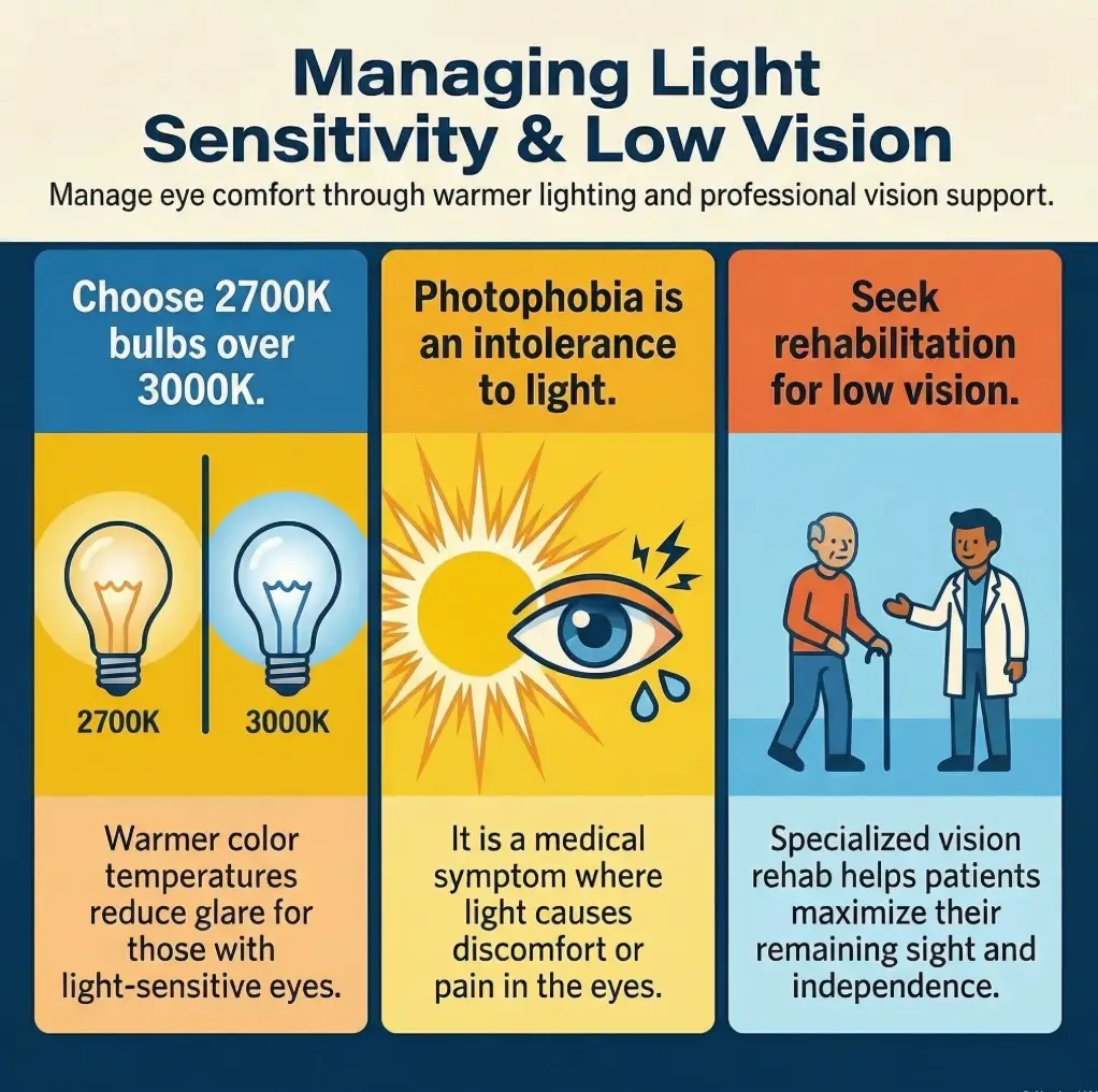
Fast Answer: For many glare-sensitive people, 2700K feels softer and easier at night than 3000K, especially in bedrooms, living rooms, and lamps you can see directly. But Kelvin is not the whole orchestra. Brightness, bulb exposure, shade design, dimming, and reflective surfaces often decide whether a room feels calm or punishing. In real homes, the best result is often a 2700K frosted bulb in a shaded or indirect fixture, tested at the same brightness as your current bulb.
Start here first: 2700K vs 3000K is not really a brightness question
Why “warmer” and “dimmer-looking” get confused so easily
People often talk about 2700K as though it is automatically dimmer. It is not. Kelvin measures color appearance, not light output. Lumens tell you how much light the bulb puts out. That distinction sounds technical until you buy a “warmer” bulb, screw it in, and discover your room still feels like an interrogation scene staged by a home-improvement goblin.
I learned this the irritating way. I once swapped a crisp 3000K bulb for a 2700K bulb in a reading lamp and waited for the room to exhale. It did not. The lamp still blasted straight into my line of sight because the problem was not only color temperature. The problem was that the bulb was naked, bright, and smug about it.
2700K often feels gentler, but that does not automatically mean the room is better lit
Warmer light can feel calmer because it tends to look less stark in the evening. For people with glare sensitivity, that matters. But “calmer” and “more usable” are not always the same. A room can feel cozy and still be annoying to read in. A bathroom can feel soft and still be terrible for grooming if shadows pile up around the mirror.
That is why the right question is not, “Which Kelvin number is best?” The better question is, “Which setup lets my eyes relax and lets me function?” Those two things sometimes point to the same answer. Sometimes they do not. Homes are full of tiny compromises pretending to be design choices.
Here’s the trap: a softer color can still hurt if the bulb itself is glaring at you
If a bulb is exposed, clear, too bright, or reflected in glossy surfaces, even 2700K can feel harsh. Warmth does not magically sand down a bad fixture. Think of color temperature as tone and fixture design as manners. A warm bulb with bad manners still interrupts the evening.
- Kelvin = color appearance
- Lumens = brightness output
- Glare = what your eye has to fight
- Comfort = the sum of bulb, fixture, angle, surface reflectivity, and your eyes that day
- Compare bulbs at the same lumen level
- Check whether the bulb is visible from your usual seat
- Treat glare as a room problem, not just a bulb problem
Apply in 60 seconds: Sit where you normally read or relax and see whether you can look directly at the bulb without squinting.
Decision card
Choose 2700K first when evening comfort matters most, the bulb stays in view, or your eyes feel reactive after sunset.
Choose 3000K first when the room is task-heavy, the bulb is well-shielded, and you need slightly cleaner contrast.
Neutral next step: Test both at the same brightness before buying for the whole room.
Who this is for / not for
This is for readers choosing bulbs for evening comfort, low-vision usability, or light-sensitive eyes
This article is for the person who dreads the moment a ceiling light comes on. It is for the reader who wants a living room that stops buzzing at their face by 8 p.m. It is for caregivers trying to set up gentler lamps, for renters who cannot rewire the apartment, and for anyone comparing 2700K and 3000K with actual purchase intent instead of abstract design enthusiasm.
This is for renters, homeowners, and caregivers trying to reduce visual fatigue without rebuilding the room
You do not need a full renovation. Most people can improve comfort by changing three things: bulb temperature, bulb shielding, and brightness level. That is refreshingly ordinary. No dramatic intervention. No sacred geometry of Scandinavian lamps. Just better choices stacked in the right order.
A small anecdote here, because this matters: one of the most effective changes I have ever seen was not expensive. It was replacing a clear exposed bulb with a frosted 2700K bulb inside a shaded floor lamp and dimming it slightly. Cost: modest. Relief: immediate. The room stopped feeling like it had opinions.
This is not for diagnosing eye pain, sudden light sensitivity, or new vision changes
There is a boundary here, and it matters. If light sensitivity is sudden, severe, worsening, or tied to eye pain, headaches, vision changes, concussion history, or other new symptoms, a bulb article should not try to impersonate medical care. Lighting changes can reduce environmental strain, but they cannot diagnose why light suddenly feels unbearable.
Major eye-health and medical references note that light sensitivity can show up alongside dry eye, migraine-related symptoms, inflammation, injury, medication effects, or other conditions. That is one reason this topic sits in the medium-risk zone: the room may be the problem, but the room may not be the whole problem. If part of the pattern sounds familiar, articles on medication-related dry eye, dry eyes from reading, or why eyes start burning later in the day can help you sort the environment from the symptom.
Show me the nerdy details
2700K and 3000K both sit in the warm-white range, but the shift toward 3000K usually adds a slightly whiter, cleaner appearance. Whether that feels better depends on visual sensitivity, adaptation state, surface reflectivity, task contrast, and intensity distribution from the fixture. The same Kelvin value can feel completely different in different luminaires.

The calmer pick first: when 2700K usually wins
Bedrooms, bedside lamps, and living rooms where the bulb stays in view
If you want the shortest practical answer, here it is: 2700K is usually the safer first try for glare-sensitive eyes in evening spaces. Bedrooms and living rooms are where people notice the emotional texture of light most. You are not merely seeing the room. You are resting inside it. That changes the standard.
In these spaces, bulbs are often visible from sofas, beds, and reading chairs. That matters more than many product pages admit. A slightly warmer tone tends to feel less insistent, especially when paired with a fabric shade, frosted bulb, or indirect lamp. This is one of those household truths that sounds too simple until you experience it. Then it feels obvious.
Evening spaces where visual tension matters more than “crisp” color rendering
At night, many people do not need museum-grade color distinction from a table lamp. They need lower tension. They need to stop blinking at the room. They need their eyes to stop negotiating with the lamp every fifteen seconds.
For glare-sensitive readers, the emotional win of 2700K is real. It can make a room feel less exposed. Less clinical. Less like an appliance showroom. That does not mean everyone will love it. Some people feel 2700K is a little too amber, especially if walls are cream, floors are warm wood, and everything starts looking dipped in toasted vanilla. But for direct-view comfort, it often wins.
Let’s be honest… most people feel the bulb before they evaluate the room
We like to imagine ourselves as rational household scientists. In practice, many lighting decisions happen in one second: “Does this make me want to stay here?” That instinct is not trivial. For glare-sensitive eyes, comfort often appears before analysis.
I have seen this with bedside lamps more than anywhere else. Two bulbs, same lamp, same watt-equivalent, one at 3000K and one at 2700K. On paper, the difference looks mild. In a tired body at 10:30 p.m., it can feel like one lamp whispers and the other clears its throat repeatedly.
- Best fit for bedside lamps and living room lamps
- Works especially well when the bulb is directly visible
- Feels calmer when paired with dimming or indirect light
Apply in 60 seconds: Identify the one lamp you see most often after sunset and make that your first 2700K test.
Eligibility checklist
Use 2700K as your first experiment if most of these are true:
- Yes / No: Your discomfort is worse in the evening
- Yes / No: The bulb is visible from your bed, sofa, or chair
- Yes / No: You want a room that feels softer, not sharper
- Yes / No: You can use a frosted bulb or a lamp shade
Neutral next step: If you checked at least three “Yes” boxes, start with one 2700K bulb before changing the whole room.
The cleaner look case: when 3000K may still work
Kitchens, bathrooms, and task zones where slightly clearer contrast can help
Now for the part people skip too quickly: 3000K is not the villain. In kitchens, bathrooms, hobby tables, and grooming zones, a slightly whiter warm light can improve the sense of clarity. That can matter for medication sorting, shaving, makeup, label reading, or checking whether the counter is actually clean and not merely pretending under warm light.
For some low-vision users, the issue is not only glare. It is also contrast and edge clarity. A room that is too warm and too dim can get muddy. Objects stop separating cleanly. White labels blur into beige packaging. The onion becomes a philosopher’s thought experiment.
Why some readers prefer 3000K even if they dislike aggressively cool light
Many people dislike daylight or cool-white bulbs at night but still feel that 2700K is too yellow for practical work. That is where 3000K enters as a compromise. It usually looks cleaner than 2700K without jumping into the brisk territory that so often feels harsh after sunset.
In my experience, 3000K works best when you are not staring into the source. Under-cabinet lighting, shaded vanity fixtures, and well-diffused ceiling lights can all make 3000K feel quite civilized. The bulb does its job quietly. Nobody starts a feud with the medicine cabinet.
The hidden condition: 3000K usually needs better shielding and lower glare control to feel comfortable
This is the catch. 3000K often asks more from the fixture. If the bulb is exposed or reflected in shiny surfaces, that extra crispness can tip into tension faster than 2700K. So if you want 3000K for task clarity, support it properly: frosted cover, diffuser, fabric shade, indirect bounce, dimmer, or better aiming.
A well-managed 3000K setup can be excellent. A sloppy one can feel worse than a thoughtfully installed 2700K bulb. That is not a moral lesson. It is just lighting being lighting, forever punishing our shortcuts.
Comparison table
| Item | Typical range | Notes |
|---|---|---|
| Single LED bulb | Low single digits to low teens USD | Varies by dimmability, brand, and smart features |
| Frosted vs clear | Usually modest difference | Often worth it for glare control alone |
| Dimmer-compatible upgrade | Moderate added cost | Can matter more than Kelvin in real comfort |
Neutral next step: Buy one test bulb, not a twelve-pack, until you verify comfort in your actual room.
Glare lives elsewhere too: the fixture may matter more than the Kelvin number
Exposed bulbs, clear glass shades, and glossy surfaces that turn any bulb into a problem
Here is the unglamorous truth that saves money: many “bad bulb” experiences are really bad fixture experiences. Exposed bulbs create point-source glare. Clear glass shades preserve that glare instead of taming it. Glossy countertops, polished tables, mirrors, and even bright white walls can bounce light back into your eyes from angles you did not anticipate.
People blame Kelvin because Kelvin is printed on the box. But the room is a whole ecosystem. The bulb, the shade, the angle, the reflectivity, the seating position, the time of day, even screen brightness nearby, all pile into the final feeling. A lamp is never alone. It has accomplices.
Frosted bulbs, shaded lamps, and indirect light that can rescue an otherwise “wrong” bulb
If you are stuck between 2700K and 3000K, start by reducing direct glare. Frosted bulbs scatter light more gently than clear bulbs. Shades block the eye from direct contact with the source. Indirect lamps throw light upward or against a wall, which often feels far less aggressive. These changes can turn a disappointing bulb into a usable one.
I once tested two nearly identical floor lamps. The exposed one felt tiring within minutes. The shaded one, with nearly the same output, felt easy. Same room. Same evening. Same human face attached to the same annoyed head. The fixture won the argument.
Here’s what no one tells you… people blame color temperature for fixture mistakes
Retail pages love the 2700K vs 3000K binary because it is simple. Real comfort is messier. If a room has white quartz counters, glossy tile, mirror reflections, and bare bulbs, neither Kelvin choice will feel magical. Reduce the violence first. Then fine-tune the tone. That is especially true in kitchens, where under-cabinet lighting can glare off glossy surfaces and where choosing glare-free under-cabinet lighting can matter as much as bulb temperature. Even wall finish can tilt the mood of a room, which is why matte vs glossy paint is not a trivial décor debate when sensitive eyes are involved.
One of the most practical sequences is this:
- Shield the bulb
- Match the lumens
- Choose 2700K or 3000K based on room use
- Test at night from your normal position
Infographic: What actually changes comfort at night
1. Fixture shielding
Bare bulb = highest irritation risk
2. Brightness match
Unequal lumens create fake comparisons
3. Color temperature
2700K softer, 3000K cleaner
4. Reflective surfaces
Glossy rooms amplify every mistake
Rule of thumb: Fix exposure first, then fine-tune warmth.
Don’t do this: chasing softness while keeping the same harsh setup
Swapping 3000K for 2700K without changing lumen output
One of the easiest ways to reach the wrong conclusion is to compare unlike brightness levels. If your old bulb is brighter than your new bulb, you may think 2700K feels calmer when what actually changed was intensity. Or the reverse. A true test keeps the lumens as close as possible.
This is not romantic advice, but it is useful. Write down the lumens on the box. Match them. Your future self will feel oddly grateful and slightly suspicious that household peace can hinge on such humble paperwork.
Keeping bare bulbs at eye level and expecting warmth alone to fix discomfort
A bulb that shines straight into your eyes is a bad negotiating partner. Warmth may soften the argument, but it will not end it. Table lamps with visible bulbs, vanity fixtures with exposed filaments, and pendant lights at eye level all make direct-view comfort harder.
People sometimes keep the harsh fixture because it looks beautiful in daytime photos. By night, however, the room behaves like a tiny theater spotlighting your corneas. Beauty should not require grit.
Ignoring reflective counters, white walls, and screen contrast in the same room
Sometimes the lamp is not even the strongest source of strain. It is the combined contrast between lamp, screen, wall, and glossy surface. A kitchen with bright under-cabinet lights, reflective counters, and a tablet screen propped nearby can turn an ordinary bulb choice into a sensory relay race.
Reduce one reflective offender and the whole room may calm down. That is why switching a bulb and declaring victory or failure too quickly can be misleading. Your room may be sabotaging the experiment. When screens are part of the problem, tricks like making an iPhone screen dimmer than the normal minimum can sometimes lower the overall contrast burden too.
- Match lumens before judging Kelvin
- Do not evaluate a bare bulb like a shaded lamp
- Notice reflections from mirrors, counters, and screens
Apply in 60 seconds: Cover or turn away one major reflective surface and see whether the room feels easier immediately.
Contrast counts too: glare-sensitive eyes do not always want the warmest possible room
Why “less sharp” can sometimes become its own usability problem
There is a temptation, especially when your eyes are feeling tender, to assume warmer is always better. Not always. Some people need just a bit more neutrality to separate edges clearly. Labels, cords, pill organizers, cutting boards, and grooming details can become harder to parse if the room is too warm and too dim.
This is particularly true when visual sensitivity overlaps with low vision. Comfort matters, yes. But so does seeing what you are doing. A room that feels lovely and functions badly is still a problem, just a prettier one.
The tradeoff between visual comfort and task clarity in cooking, grooming, and reading spaces
Kitchens and bathrooms expose the tradeoff quickly. In a kitchen, a too-warm setup can reduce perceived clarity when you are reading packaging or checking food texture. In a bathroom, a very soft bulb may feel gentler but create shadows that make routine tasks more frustrating.
Reading is its own odd little kingdom. Some people read beautifully under 2700K with a focused lamp. Others prefer 3000K because the page edges feel clearer. The answer often depends on shade design, light angle, and whether the page is matte or glossy. Books, bless them, are not neutral witnesses.
When a mixed-lighting setup beats a whole-home single-temperature rule
Many homes work best with a split strategy. Use 2700K in bedrooms, living rooms, and evening lamps. Use 3000K in task-heavy areas where clarity matters, but only with decent shielding. This mixed approach is less aesthetically pure and more biologically honest. Humans are not open-concept showrooms.
I am fond of this strategy because it respects how different rooms are used. We do not need the bathroom to feel like the reading nook. We do not need the kitchen to behave like a lullaby. A little inconsistency can be a mark of intelligence. In practice, a kitchen already tuned for better cutting-board contrast for low vision or easier measurement with low-vision-friendly measuring cups often benefits from that same room-by-room honesty.
Coverage tier map
- Tier 1: Single lamp change in the evening room you use most
- Tier 2: Match bulb shielding and lumens in that room
- Tier 3: Split strategy for bedroom/living room vs kitchen/bathroom
- Tier 4: Add dimming and reduce glossy reflections
- Tier 5: Fine-tune task lighting separately from ambient lighting
Neutral next step: Upgrade only one tier at a time so you can tell what actually helped.
Common mistakes
Choosing by Kelvin only and forgetting lumens, dimming, and shade design
This is the headline mistake. Kelvin gets all the attention because it is easy to compare and easy to market. But a room lives or dies by distribution. A dimmable frosted bulb in a good shade often beats a theoretically “better” color temperature in a poor fixture.
Buying daylight or cool white bulbs after sunset because they looked good in the store
Store lighting lies with a straight face. Those bright aisles are not your living room at 9 p.m. Bulbs that look clean and modern under retail conditions can feel much harsher when your body expects darkness and rest. What flatters a package display is not necessarily what flatters your nervous system.
Treating one bad bulb experience as proof that all 3000K lighting is wrong
A single bad 3000K bulb in a clear glass sconce is not a verdict on all 3000K lighting. Likewise, one muddy 2700K lamp is not a verdict on all warm lighting. Try not to turn one failed setup into a universal law. Home lighting already has enough drama.
Using one bulb type for every room even though glare tolerance changes by task and time of day
Your tolerance changes with fatigue, screens, dryness, weather, migraine patterns, and the room’s purpose. A bulb that feels acceptable at 8 a.m. may feel rude at 10 p.m. Design the house for lived hours, not catalog logic.
Bold truth: The “best bulb” is often the one that disappears from your attention.
Room by room: where 2700K and 3000K tend to make the most sense
Bedroom and nursery: comfort first, stimulation second
Bedrooms are usually the easiest verdict. Start with 2700K. If the goal is decompression, sleep preparation, or reduced visual agitation, warmer lighting makes sense. Use shaded lamps, frosted bulbs, and avoid bare overhead light whenever possible. In nurseries or caregiving spaces used at night, this gentler tone often feels more humane.
Living room and hallway: softer ambient light with fewer hot spots
Living rooms and hallways tend to reward 2700K too, especially when layered through floor lamps, table lamps, or wall sconces. The trick is avoiding hot spots. One glaring bulb in the corner can dominate the entire mood of a room, much like a single squeaky chair can dominate a symphony of otherwise decent furniture.
Kitchen and bathroom: task visibility without drifting into harshness
This is where 3000K may earn its keep. In kitchens and bathrooms, many people prefer 3000K because it supports a slightly clearer sense of task visibility. Still, use caution: under-cabinet lighting, vanity mirrors, and reflective tile can amplify glare quickly. Diffusion and aiming matter enormously here. In bathrooms used overnight, the answer may also overlap with broader nighttime bathroom safety for low vision rather than bulb temperature alone.
Reading corner and desk: layered light instead of a single overhead verdict
For reading corners and desks, avoid deciding the whole matter with one overhead bulb. Use layered light. Ambient light can stay warm and gentle, while a focused task lamp handles the page or workspace. Some readers love 2700K for books. Others read more comfortably under 3000K. Either can work if the page is lit without blasting the eyes.
Short Story: A friend once complained that every lamp in her apartment felt wrong. Too yellow, too white, too bright, too dim. It sounded impossible until we walked room by room instead of arguing in generalities. In the bedroom, a 2700K bulb in a linen-shaded lamp was instantly calmer. In the kitchen, that same bulb made labels and measuring marks annoyingly soft.
We switched only the task area to a well-diffused 3000K light and kept the rest warm. The apartment stopped feeling like one bad decision repeated in every socket. What changed was not just brightness. It was permission. Permission for different rooms to want different things. She laughed at how long she had tried to solve the whole house with one answer. Homes, like people, rarely improve under a single commandment.
- Use 2700K for rest-oriented spaces
- Use 3000K for task-heavy zones with good diffusion
- Layer task light instead of over-brightening the room
Apply in 60 seconds: Label each room as either “comfort first” or “task first” before choosing bulbs.
Test it like a real person: the five-minute comparison that reveals more than specs
Compare at the same brightness, not with random bulbs
The cleanest home test is simple. Get one 2700K bulb and one 3000K bulb with similar lumens, ideally from the same brand line. Use the same lamp or fixture. Test in the evening, not midday, because adaptation state matters. What feels fine at 2 p.m. may feel awful at 9 p.m.
Test seated, standing, and screen-adjacent positions before deciding
Do not test only while standing under the fixture. Sit in your usual chair. Lie in bed if that is where the lamp matters. Look toward the TV or tablet. Walk into the room from a darker hallway. Lighting changes as you move, and glare often appears in transitions.
Watch for squinting, facial tension, and “I want to leave this room” fatigue
The best metric is not whether the room looks stylish. It is whether your body relaxes. Notice blinking, forehead tension, shoulder tightening, and the subtle urge to leave. Those are useful data points. Your nervous system is a better reviewer than the packaging copy.
Use this simple test grid:
- Minute 1: Sit and look around normally
- Minute 2: Read for one minute
- Minute 3: Look at a screen briefly, then back to the room
- Minute 4: Stand up and change angle
- Minute 5: Ask which setup makes you breathe easier
Mini calculator
Use three quick inputs:
- Bulb visible directly: Yes or No
- Room use after 7 p.m.: Mostly comfort or mostly tasks
- Surface reflectivity: Low, medium, or high
Output: If you answered “Yes,” “comfort,” and “medium/high,” start with 2700K plus better shielding. If you answered “No,” “tasks,” and “low,” a well-diffused 3000K setup may work well.
Neutral next step: Write your three answers before shopping so the aisle does not scramble your judgment.
Show me the nerdy details
A valid home comparison tries to control for at least three variables: lumen output, fixture geometry, and viewing angle. Human perception is highly context-dependent, so cross-room comparisons are much less useful than same-fixture tests conducted at the same time of day.
When the bulb is not the whole story
Dry eye, migraine, concussion history, and other reasons light can feel harsher than it looks
Sometimes the room is truly the problem. Sometimes it is only revealing the problem. Dry eye can make ordinary light feel sharp. Migraine-adjacent sensitivity can make contrast and brightness feel more dramatic. Post-concussion symptoms can change tolerance in ways that do not match what others perceive. Low vision can complicate the comfort-versus-clarity tradeoff further.
This is why people in the same room can have completely different reactions to the same lamp. One person says, “Looks cozy.” Another says, “Please turn that thing off before it starts a war.” Both are telling the truth from inside different eyes.
Why sudden or severe light sensitivity deserves more caution than a decor decision
If your sensitivity is new, intense, or attached to pain, redness, severe headache, nausea, or changes in vision, take that seriously. Home lighting changes are useful environmental tweaks, not a substitute for appropriate evaluation. Medical resources such as MedlinePlus and major ophthalmology organizations describe light sensitivity as a symptom with multiple possible causes, not just a preference issue.
A lighting fix can help the room, but it cannot explain every symptom
This is the honest edge of the article. A better bulb may improve your room tonight. It may reduce stress, make reading easier, and help you stay in the space longer. That is valuable. But if symptoms keep escalating, the smartest next step may not live in the lighting aisle.
I think readers deserve that sentence plainly. The internet too often turns all discomfort into a shopping puzzle. Sometimes a lamp is the answer. Sometimes a lamp is only the messenger. In homes where visual stress overlaps with daily management friction, it may also help to rethink medication routines with guides on low-vision medication management, large-print prescription labels, or a one-page medication list template.
- Dry eye and migraine can amplify glare
- Sudden severe symptoms deserve more caution
- Use bulbs to improve the room, not explain every symptom
Apply in 60 seconds: If your symptoms are new or worsening, note when they began and whether pain or vision changes came with them.

Next step
Replace one evening lamp with a 2700K frosted bulb in a shaded or indirect fixture, then compare it against your current setup at the same brightness for three nights before changing the whole room
If you have read this far, the curiosity loop from the beginning should now be closed: the calmer answer for many glare-sensitive readers is 2700K, but the deeper answer is that glare control beats Kelvin alone. That is why the smartest next step is small, controlled, and unromantic. Replace one evening lamp. Use a frosted bulb. Shield it properly. Match the brightness. Test for three nights.
Do not let the whole house vote at once. One lamp is enough to tell the truth. In fifteen minutes, you can set up a better experiment than most online bulb comparisons ever offer. And once you feel the difference in a real room, at a real hour, with your real eyes, the decision usually becomes much less theatrical.
- Pick the lamp you use most after sunset
- Use 2700K first if comfort is your main complaint
- Use 3000K only if the room is task-heavy and the fixture is well diffused
- Keep the lumens as close as possible in both tests
Last reviewed: 2026-03.
FAQ
Is 2700K better than 3000K for glare-sensitive eyes?
Often, yes. In bedrooms, living rooms, and evening lamp use, 2700K usually feels softer and less insistent. But comfort also depends on brightness, shielding, fixture design, and room reflectivity. A badly exposed 2700K bulb can still feel harsh.
Does warmer light reduce eye strain, or just feel cozier?
Sometimes both. Warmer light can feel less stark at night, which may reduce perceived tension for some people. But “eye strain” is broader than color temperature. Dryness, screen contrast, brightness, poor aiming, and task demands all matter too.
Can 3000K be comfortable if the fixture has a shade?
Yes. A shaded, diffused, or indirect 3000K fixture can be very comfortable, especially in task areas such as kitchens, bathrooms, and desks. The cleaner look of 3000K is often easier to tolerate when the bulb itself is not directly visible.
Is bulb brightness more important than color temperature for glare?
In many real rooms, yes. Excessive brightness, exposed bulbs, and reflective surfaces often create more discomfort than the small shift between 2700K and 3000K. The ideal setup usually balances both brightness and color temperature.
Should I use the same color temperature in every room?
Not necessarily. Many homes feel and function better with mixed lighting: 2700K for bedrooms and living areas, 3000K for task-heavy spaces. A single-temperature rule is tidy on paper but often clumsy in real life.
Is 2700K too yellow for reading?
It depends on the reader, the lamp, and the page. Some people read beautifully under 2700K, especially with focused task lighting. Others prefer 3000K because it gives slightly cleaner contrast. A layered setup often solves this better than brighter overhead light.
What bulb color temperature is best for migraines or photophobia?
There is no universal bulb temperature that fixes all migraine-related or photophobia-related sensitivity. Many people prefer warmer, lower-glare setups, but symptom patterns vary widely. If symptoms are significant or changing, environmental adjustments and clinical guidance may both matter.
Are frosted bulbs better than clear bulbs for light sensitivity?
Often yes. Frosted bulbs tend to reduce the harsh point-source effect of clear bulbs and can feel gentler when the bulb is visible. They are especially helpful in bedside lamps, exposed fixtures, and small rooms where glare bounces easily.
One final honest note: the best answer is rarely “2700K forever” or “3000K always.” It is usually more personal and more ordinary than that. If your evenings feel visually loud, start with 2700K. If your task areas feel muddy, consider 3000K with better diffusion. Above all, build the room your eyes can live with, not the room a product page thinks you should admire from a distance. The right bulb is not the most impressive one. It is the one that lets the room stop performing and simply become livable.