
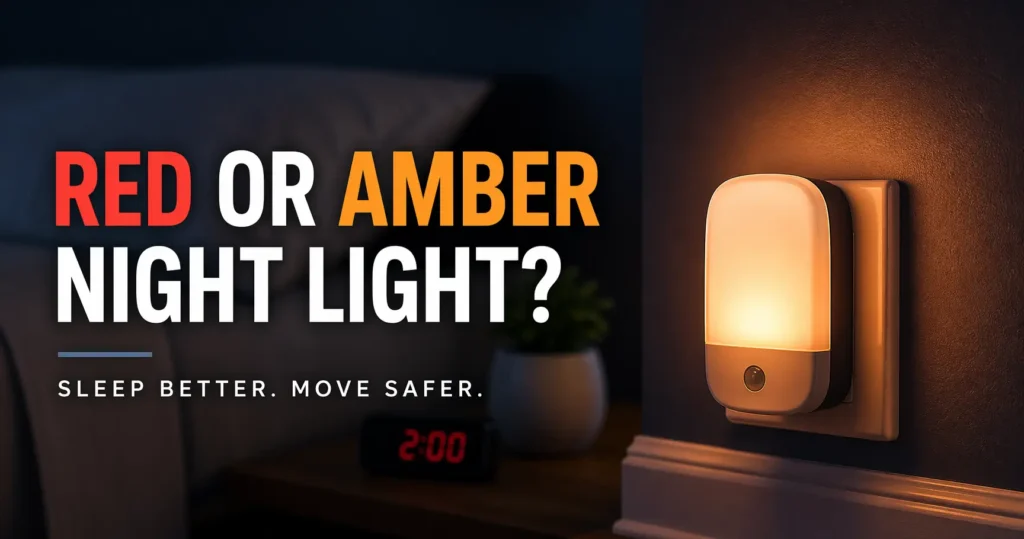
The 2 A.M. Verdict: Red vs. Amber Night Lights
A bad night light does two annoying things at once: wakes your brain up and makes your eyes work harder. This isn’t about décor; it’s about moving safely without turning a brief wake-up into a full shift.
Most people shop by “warm” or “soft glow” labels, only to end up with a bulb that stings in the mirror or reflects harshly off tiles. If you keep guessing, you lose twice: worse sleep and a more irritating home.
This guide helps you choose based on sleep impact, placement, and real-room function, not internet folklore.
The useful twist? Color matters, but a dim, shielded, low-placed light often beats a badly placed “perfect” color.
Fast Answer: Red night lights are usually the safer pick when your top priority is staying sleepy and reducing nighttime stimulation. Amber night lights often work better when you need slightly better visibility and a softer, more familiar look. But color alone does not solve glare. A dim, shielded, low-placed light usually beats a bright exposed bulb, whether it is red or amber.
Table of Contents
Start With the Real Tradeoff: Sleep Protection or Easier Seeing?
The red-versus-amber debate gets flattened into a beauty contest. Red is “better.” Amber is “warmer.” The internet loves a crown. Real life is less theatrical. The real choice is between two different nighttime priorities: protecting sleep as much as possible, or making it easier to see what you are doing without flipping on a brighter light.
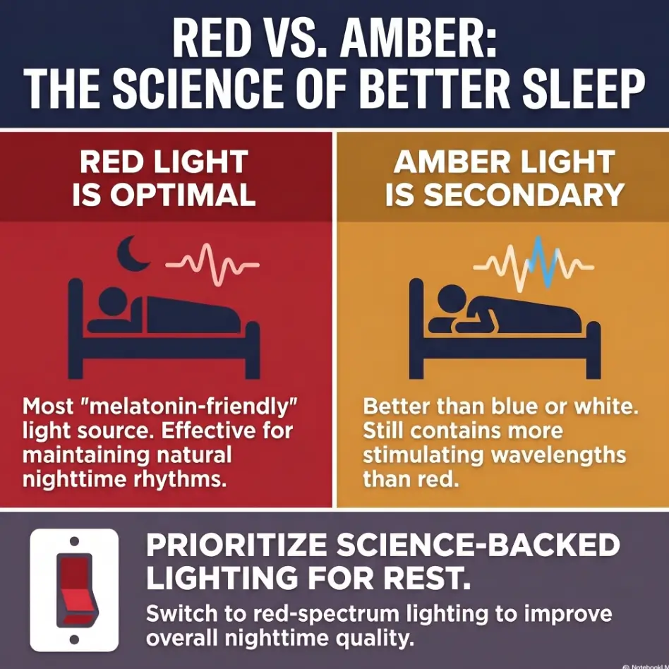
Red light is usually chosen when “less stimulation” matters most
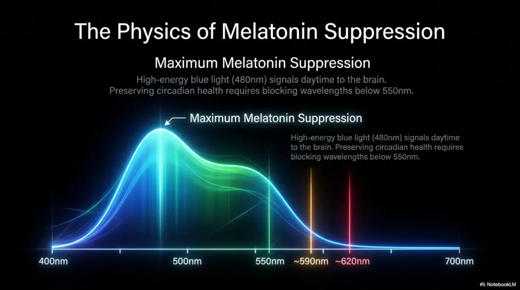
Red earns its reputation because shorter blue-heavy wavelengths tend to be more alerting at night, while red light is commonly treated as the lower-stimulation option. Harvard Health says dim red light is less likely to shift circadian rhythm and suppress melatonin than blue-rich light. That does not make red magical. It makes it useful. In a bedroom, that distinction matters. You are not trying to admire paint swatches. You are trying to avoid turning a short wake-up into a 90-minute staring contest with the ceiling.
Amber often wins when you need a little more visual usability
Amber is frequently easier to live with for quick tasks. It can feel more natural when you need to spot the sink, find the hallway edge, or avoid stepping on a toy that has somehow migrated into a strategic ankle-biting position. Many people simply see better under amber than under red because amber gives more familiar color rendering and contrast. At 2 a.m., “slightly more usable” can matter.
The wrong question is “Which color is best?” The better one is “Best for what, exactly?”
If your main complaint is that nighttime light wakes you up too much, start with red. If your main complaint is that you cannot navigate safely with very dim red light, amber may be the better compromise. The choice is not philosophical. It is operational. What matters is whether the light helps you return to sleep and move safely through the room.
- Red usually favors sleep protection
- Amber usually favors easier short-task visibility
- Neither one works well if brightness and placement are wrong
Apply in 60 seconds: Write down your main complaint in five words, such as “too awake after bathroom trips” or “hallway feels harsh and glary.”
Glare First, Color Second: Why Many People Solve the Wrong Problem
Here is the part many shopping guides skip: glare is often the real villain. You can buy the “right” color and still hate it because the bulb is too bright, too exposed, too high, or pointed straight at your face like a stage spotlight. Hue matters, yes. Beam shape and exposure matter just as much.
Brightness, bulb design, and placement can matter more than hue alone
A dim shielded amber light can feel gentler than a bright exposed red light. That is not a contradiction. That is physics and anatomy shaking hands. Your eyes respond to intensity, contrast, reflection, and where the source sits in your visual field. The NHLBI notes that even small amounts of light at night can be disruptive, and it specifically recommends a small warm-colored nightlight, such as red or amber, for safety when needed. In other words, the goal is not “light, but fashionable.” It is “just enough light, in the least annoying form.”
A good color can still feel harsh when the light source is exposed
I once tested two night lights that were both labeled warm. One felt calm. The other felt like a tiny glowing accusation plugged into the wall. The difference was not the marketing copy. It was that one had a shield and downward glow, while the other had a clear exposed LED. Same idea, totally different nighttime experience.
Here’s what no one tells you: a badly placed amber light can feel worse than a dim red one
Placement is where sensible people lose to avoidable friction. If the light is at eye level from the bed, mirrors it off tile, or bounces off glossy floors, the color stops mattering quite so much. You are fighting reflected brightness, not just hue. For glare-sensitive readers, moving the light lower and out of the direct line of sight is often the first win. If this sounds familiar, articles on bathroom mirror glare, white tile floor glare, and window film for glare can help you track whether the room itself is amplifying the problem.
Decision Card: Color problem or glare problem?
When it is mostly a color problem
You feel more awake after exposure, but the light is already dim and shielded. In that case, switching from amber to red may help.
When it is mostly a glare problem
The light stings, reflects, or makes you squint. In that case, lower brightness, better shielding, and lower placement matter before color changes do.
Neutral action: fix beam exposure before you spend money replacing every bulb.
Show me the nerdy details
At night, the human visual system is juggling low ambient light, contrast detection, and circadian signaling at the same time. A night light can feel uncomfortable because of its spectral content, its luminance, its angle relative to your eyes, or reflective surfaces nearby. This is why two bulbs with similar color labels can produce very different real-world comfort.
Red Night Light for Sleep: Where It Helps, and Where It Can Frustrate You
Red is the color people reach for when they want the least mental shove from a light. That instinct is reasonable. The appeal of red is not that it turns your bedroom into a laboratory of perfect sleep. It is that it tends to feel less intrusive when your brain is supposed to be off duty.
Why red light is popular in bedrooms, hallways, and overnight bathroom trips
When you wake briefly, the best-case scenario is simple: you handle the task, keep your bearings, and drift back to sleep without fully surfacing. Red can help because it usually feels less stimulating than brighter warm white or blue-leaning light. Harvard Health explicitly advises dim red lights for night lights because they are less likely to shift circadian rhythm and suppress melatonin. For many adults, that is enough reason to start there.
Where red can reduce the “fully awake in 30 seconds” problem
Red often works best when the task is minimal. Think bathroom route, checking the time, locating a water bottle, or making sure the dog has not decided to sleep exactly where your foot wants to land. It is especially helpful in bedrooms where you do not need to distinguish colors precisely. The less your brain has to interpret, the better red tends to perform.
When red becomes annoying: poor contrast, odd color rendering, and missed details
Red has limits, and people do not always admit them because red has acquired a kind of sleep halo online. Under very red light, details can be harder to judge. Edges may feel muddy. Some objects look flatter. If you wear glasses, have aging eyes, or already struggle with nighttime contrast, red can become less “calming” and more “why is the toothbrush impossible to find?” That is not failure. It is a mismatch between task and lighting.
A small confession from the domestic theater of night: I once tried a deeply red plug-in light in a bathroom and immediately understood why submarines and romance novels both love the color. Everything looked dramatic. Almost nothing looked legible. For sleep, lovely. For locating the right bottle at the sink, less so.
- Best for bedroom-adjacent movement and short wake-ups
- Less ideal for grooming, reading labels, or seeing color clearly
- Works better when kept very dim and indirect
Apply in 60 seconds: Test whether your nighttime task is “move safely” or “see details.” That single distinction clarifies whether red is practical.
Amber for Nighttime Use: Softer in Theory, Brighter in Practice
Amber is often the compromise people land on after red feels too dim, too strange, or too impractical. It usually looks friendlier to the eye in ordinary home settings. But friendlier is not always sleep-friendlier. Amber can slide from “gentle” to “too much” faster than many shoppers expect.
Why amber often feels more natural for quick nighttime navigation
Amber light tends to offer more usable visibility. Hall edges, door frames, and bathroom fixtures are easier to read. If you are caring for a child, helping an older family member, or navigating a hallway with stairs, amber often feels less awkward than red. Cleveland Clinic noted in a 2025 piece on children’s nightlights that if red feels unsettling for some kids, orange or amber can be a reasonable alternative, with brightness and placement still doing heavy lifting.
Where amber can be the better compromise for shared spaces
Shared bedrooms, hallways, nurseries, and bathrooms are classic amber territory. One person may want near darkness while another needs enough light to avoid bumping into furniture. Amber can be the diplomatic candidate in the room. Not thrilling, perhaps, but then the best home systems are often a little boring. Boring is underrated. Boring means no one is cursing at a baseboard at 2:13 a.m.
Let’s be honest… “warmer” does not always mean “sleep-friendlier”
Warmth in color temperature is not the same as gentleness in experience. A bright amber bulb, especially one that is unshielded, can still wake you up too much. People sometimes confuse “not blue” with “automatically harmless.” Nighttime light does not work that way. The amount, direction, and timing still matter. Amber earns its keep when it is modest. If you are also weighing bulb warmth in other parts of the home, a deeper look at 2700K vs 3000K for glare-sensitive eyes can save you from buying the wrong kind of “warm.”
Eligibility checklist: Is amber probably the better starting point?
- Yes, if you need to see room layout clearly without turning on an overhead light
- Yes, if more than one person uses the space and red feels too dim or odd
- Yes, if your task involves basic navigation rather than pure sleep protection
- No, if your main complaint is “I cannot fall back asleep after light exposure”
Neutral action: if you checked mostly yes, test a dim shielded amber light before buying a multi-pack.
Who This Is For, and Who It Is Not For
Not every nighttime problem is a bulb problem. Sometimes a night light question is really a sleep disorder question, a migraine question, or an eye-health question wearing a polite little lampshade.
This is for you if bright white or blue-tinted light makes nighttime feel sharper than it should
If ordinary night lighting leaves you more alert than you want to be, or if you keep making the same mistake of using brighter light than the task requires, this comparison is for you. It is also for you if you are building a calmer bedroom routine and want fewer unnecessary wakefulness cues.
This is for you if glare, eye strain, or light sensitivity changes how safe your home feels at night
Some people do not mind dim light but hate hot spots, reflections, and bright points in the visual field. That is a different problem from pure circadian disruption, though the two often overlap. If glossy floors, bathroom mirrors, or exposed bulbs feel harsher than their wattage suggests, you are in the right conversation.
This is not for you if the real issue is untreated insomnia, pain, migraines, or significant vision loss that needs clinical guidance
If you have persistent insomnia, frequent headaches with light sensitivity, sudden worsening night vision, halos around lights, or major glare problems that go beyond ordinary annoyance, a lamp swap is not enough. The Mayo Clinic and the American Academy of Ophthalmology both note that glare, halos, or major light sensitivity can accompany eye or medical issues that deserve proper evaluation. A red bulb is not a replacement for care.
Think of night lights as stagehands, not lead actors. They can help a scene run smoothly. They should not be expected to rewrite the entire play.
The Use-Case Test: Bedroom, Bathroom, Nursery, or Hallway?
Color choice gets easier when you stop thinking in abstract terms and start thinking room by room. Homes are a patchwork of different nighttime jobs. One light does not have to do them all.
Bedroom use: when the goal is staying sleepy, not seeing every detail
Bedrooms favor red more often than amber, especially for adults who wake easily and struggle to fall back asleep. You are trying to preserve drowsiness. In that setting, red often feels less like an event. Keep it low, dim, and indirect. If it looks like you are landing airplanes, it is too much.
Bathroom use: when safe navigation may matter more than pure sleep protection
Bathrooms are tricky because they combine movement, hard surfaces, mirrors, and just enough task demand to make very red light feel frustrating. Amber often performs well here, especially if the goal is not grooming but basic orientation. A low amber path light near the floor can be a sweet spot. The mirror should not light up like a late-night performance review. If the room still feels hostile, pair this article with ideas for low-vision nighttime bathroom safety and reducing bathroom mirror glare.
Nursery and caregiving: when color must balance calm, visibility, and repeated wake-ups
Nurseries and caregiving spaces are where ideology goes to get humbled. You may need to check breathing, find a pacifier, read a label, or navigate while half asleep. Cleveland Clinic’s guidance for children emphasizes not only color but keeping the light low to the ground and avoiding ceiling illumination. In caregiving spaces, amber often becomes the practical winner if red makes basic care too clumsy.
Hallway and stairs: when glare control and placement may outrank color preference
For stairs and transition zones, safety becomes louder than theory. A dim low-placed light that defines edges is more useful than a beautiful color choice that leaves depth cues muddy. On stairs, I care less about an elegant internet opinion and more about ankles remaining on speaking terms with the rest of the body. In homes where vision changes are already affecting confidence, this overlaps with broader fall-prevention at home for aging vision.
Coverage tier map: What matters most by room?
| Room | Top Priority | Usually Better Starting Color |
|---|---|---|
| Bedroom | Stay sleepy | Red |
| Bathroom | Basic visibility + low glare | Amber |
| Nursery | Calm + repeated caregiving | Amber or dim red |
| Hallway/Stairs | Safe edge detection | Either, but shielding and placement first |
Neutral action: assign each room a priority before you choose a bulb color.
Short Story: A friend once replaced every hallway bulb in her home with red lights after reading that red was the sleep hero. The first night felt peaceful, almost theatrical. The second night, less so. Her husband missed the edge of the laundry basket. Her child hated the “spaceship hallway.”
By the third night, they had learned the useful adult lesson that one internet principle can become ridiculous when applied to every room with missionary zeal. They kept red in the bedroom path, switched the bathroom to a dim amber glow, and placed a shielded plug-in light low near the stairs. Nobody became a sleep monk. But everyone stopped waking up irritated, which in a household is its own small miracle.
Common Mistakes People Make With Red and Amber Night Lights
Most disappointing night lights are not disappointing because red or amber “doesn’t work.” They fail because of preventable setup mistakes. The color gets blamed. The install is the culprit, standing in the corner pretending innocence.
Choosing by color name instead of actual brightness output
“Amber” and “red” on packaging tell you less than you think. One amber bulb may be pleasantly dim. Another may be a tiny orange sun. If the brightness is too high, even a good hue will feel intrusive. Never let a poetic product name do the work of actual specifications and real-world testing.
Buying clear, exposed bulbs that create hotspot glare at eye level
Exposed LED points are notorious for discomfort. A frosted cover, shield, or downward-facing design usually feels better. If you notice immediate squinting, harsh reflections, or a sense that the light is punching above its weight, look at the fixture before you blame the color.
Putting the light too high, too close, or directly in the line of sight
Cleveland Clinic’s advice about nightlights for children is quietly excellent for adults too: keep them low to the ground and avoid lighting the ceiling. That principle reduces direct exposure and bounce. High placement often creates the exact “glare cloud” you were trying to avoid.
Mistaking “dim” for “gentle” when the beam is still visually sharp
A light can be low in output and still feel visually sharp if its beam is concentrated or exposed. Gentle is a combination of low intensity, diffusion, direction, and environment. Not all dim lights are kind. Some are just smaller nuisances.
- Brightness can sabotage both red and amber
- Exposed LEDs often create needless hotspot glare
- Lower placement usually improves comfort and function
Apply in 60 seconds: Stand where the light bothers you most and check whether you can see the source directly. If yes, fix that first.
Do Not Copy Hotel Lighting: What Feels Stylish Can Fail at 2 A.M.
Hotels and mood boards have seduced many sensible adults into thinking atmospheric lighting and useful nighttime lighting are the same thing. They are not. A room can look expensive and still be terrible at three in the morning.
Decorative warm lighting is not the same as functional low-glare lighting
Warm sconces, exposed Edison bulbs, and chic bedside globes often look lovely in photos because nobody in the photo is stumbling toward the bathroom half asleep. Decorative warmth is optimized for ambiance. Night lights are optimized for not ruining your night. Different jobs, different standards. In the same way, finishes around the room matter too. Even choices like matte vs glossy paint can quietly change how harsh a nighttime light feels.
Color-changing smart bulbs can introduce more friction than comfort
In theory, smart bulbs are elegant. In practice, many people end up with too many steps, too much brightness range, or the familiar tragedy of an app update arriving exactly when one would rather not think. At midnight, “frictionless” matters. The best night light is usually the one that requires no tiny digital negotiations. The same household principle applies to screens too. If your phone becomes your backup flashlight or clock, guides on making an iPhone screen dimmer than minimum or deciding between Reduce White Point vs Night Shift can be unexpectedly helpful.
The best night light is often the boring one you barely notice
There is a household wisdom here. Good nighttime lighting should be forgettable. Not ugly, not grand, not theatrical. Just reliably there when you need it and invisible when you do not. A plug-in path light with a shield and modest output will never go viral on design Instagram. It may, however, save your sleep and your mood.
Compare-prep list: What to gather before you shop
- Your most annoying room and the exact nighttime task there
- Whether the problem is “too awake,” “too glary,” or “cannot see enough”
- Whether nearby mirrors, tile, glossy paint, or stairs amplify the issue
- Whether more than one person uses the space
Neutral action: shop after you define the job, not before.
Mistakes to Avoid If You Have Light Sensitivity or Nighttime Eye Strain
For glare-sensitive readers, the conversation shifts slightly. The question is not only “Which color helps sleep?” but also “Which setup makes my eyes stop protesting?” These are related, but not identical, questions.
Do not test color without also lowering intensity
A bright amber light and a dim amber light can feel like two different species. The same is true of red. If you compare colors without keeping brightness modest, you are not really comparing the colors. You are comparing a flashlight to a whisper.
Do not judge a light in daylight and expect the same result at midnight
Daytime tests lie. What looks charming at noon can feel harsh after dark because your eyes are adapting to a different environment. Cleveland Clinic and other sleep experts keep returning to the same practical truth: nighttime light has to be evaluated at night, in the actual room, doing the actual task.
Do not ignore surrounding surfaces, mirrors, and glossy floors that bounce glare back at you
Glare is social. It rarely travels alone. It recruits mirrors, polished tile, shiny paint, appliance fronts, and even white walls into the operation. If your bathroom feels harsher than your hallway, the culprit may be reflection rather than the bulb itself. The fix could be as simple as rotating the light, shielding it, or moving it lower. If you use your phone as a temporary light source during those experiments, you may also want to make the iPhone flashlight less harsh so your testing does not turn into its own glare event.
There is also a point where “light sensitivity” stops being a home-lighting puzzle and becomes a medical issue. If ordinary indoor light feels painful, or if nighttime glare has become much worse, get it checked. A more flattering lamp is not a diagnostic plan.
Show me the nerdy details
Discomfort glare is not always proportional to how useful a light is for seeing. A source can be bright enough to create visual discomfort without improving contrast or navigation meaningfully. That is why indirect low-level illumination often outperforms brighter direct illumination in nighttime environments.
Red vs Amber by Goal: A Smarter Way to Choose
By now, the pattern is clear. There is no universal winner. There is a better choice for a specific nighttime job. Once you frame it that way, the decision gets much less sentimental and much more useful.
Choose red when your top priority is minimal nighttime stimulation
Red is usually the better bet if you wake easily, struggle to fall back asleep, or want the quietest possible cue light in a bedroom. If the task is brief and simple, red is often enough. It stays in its lane when configured well.
Choose amber when your top priority is basic visibility with a softer feel than white light
Amber often wins when you need a practical compromise. It is especially useful in bathrooms, hallways, nurseries, and caregiving spaces where movement and visibility matter. If red makes tasks clumsy or unsafe, amber is not a defeat. It is the better tool.
Choose either one only after fixing placement, shielding, and brightness
This is the part worth underlining twice. The best color will not rescue a bad setup. If your night light is bright, direct, and high, changing hue may produce only a modest improvement. Fix the hardware behavior first. Then fine-tune the color.
Mini calculator: Which choice is likelier to work for you?
Give yourself 1 point for each statement that feels true:
- I get too awake after any nighttime light exposure
- I only need enough light to move safely, not see details
- My light is already dim and shielded
2 to 3 points: start with red. 0 to 1 point: start with amber, then tune brightness and placement.
Neutral action: use the score only as a starting point, then test in one room for several nights.

Next Step: Test One Room Before Replacing Every Bulb
The smartest households do not solve this by declaring a winner in theory. They test one problem room first. That keeps money, annoyance, and expectation inflation under control. It also prevents the classic home-improvement opera in which one modest question becomes six mismatched purchases and a drawer full of regrets.
Pick the room where nighttime irritation happens most often
Start where the problem is loudest. For some people that is the bathroom mirror. For others it is the path from bed to hallway. The worst room teaches you the most.
Compare one dim, shielded red light against one dim, shielded amber light for three nights each
Three nights is enough to notice patterns without turning the experiment into a doctoral thesis. Keep the design similar, the placement similar, and the task similar. Do not compare a soft shielded amber light with a naked red LED and then blame the color. That is not science. That is chaos wearing a name tag.
Keep notes on glare, comfort, visibility, and how quickly you fall back asleep
Use four simple categories: glare, visibility, how awake you felt, and whether anyone in the household complained. Nothing elaborate. A tiny note on your phone or a scrap of paper will do. Homes improve through observation more than heroics.
Infographic: Red vs Amber at a Glance
Red
Best when: staying sleepy matters most
Strength: lower-feeling stimulation
Weakness: can make detail tasks harder
Best rooms: bedroom path, simple overnight trips
Amber
Best when: visibility matters a bit more
Strength: easier navigation and more natural rendering
Weakness: can still feel too bright if exposed
Best rooms: bathroom, nursery, hallway
Rule that beats both columns: dim, shielded, low-placed light usually wins.
Harvard Health gives you the sleep logic. The NHLBI reminds us that even small nighttime light exposure matters, while also acknowledging that warm-colored nightlights can support safety. Cleveland Clinic adds a piece many households need: placement low to the ground and away from the ceiling glow. Put those together and the answer becomes pleasantly unglamorous. The best night light is not the most hyped color. It is the one that solves your exact problem with the least nighttime fuss.
FAQ
Is red or amber better for sleep?
Red is usually the better starting point if your top goal is minimizing nighttime stimulation and protecting the ability to fall back asleep. Amber may still work well if it is dim and shielded, but it often feels a little more visually active.
Does amber light still affect sleep?
Yes, any nighttime light can affect sleep depending on brightness, timing, and exposure. Amber is often gentler than white or blue-rich light, but it is not invisible to your brain. That is why dimness and placement matter so much.
Why does a red night light feel dimmer than an amber one?
Red often provides less familiar detail and color rendering, so it can feel less usable even when the brightness is similar. That is part of why people sometimes prefer amber for bathrooms or hallways.
Which night light color is best for glare-sensitive eyes?
There is no one answer. For glare-sensitive eyes, a shielded low-brightness light placed low to the ground usually matters more than the color alone. Many people find amber easier to navigate with, while others prefer dim red if sleep preservation is the main goal.
Is a red night light good for the bathroom?
It can be, but only if the bathroom task is simple and the red light still lets you move safely. If you need better detail or the room has lots of reflective surfaces, amber may be more practical.
Is amber better than warm white at night?
Often yes, especially if your aim is to reduce nighttime harshness. Amber generally feels softer than ordinary warm white, but a dim shielded warm white light may still beat a poorly designed amber bulb. Setup still rules the kingdom.
Can a dim amber light be better than a bright red one?
Absolutely. A dim shielded amber light can feel gentler and more useful than a bright exposed red light. Color helps, but brightness and glare control often decide comfort.
What night light color is best for a child’s room?
Red is often suggested for sleep friendliness, but Cleveland Clinic notes that some children may prefer orange or amber if red feels unsettling. The best choice is the dimmest low-placed light that helps without flooding the room.
Does bulb shape matter as much as color?
Sometimes more. A frosted shielded downward-facing bulb usually creates less discomfort glare than an exposed point-source bulb, even if both are the same color family.
Can night lights make insomnia worse?
They can contribute if they are too bright, poorly placed, or used as a substitute for addressing a larger sleep problem. If you already have persistent insomnia, night-light optimization may help a bit, but it is not the whole answer.
The hook at the beginning was simple: which one actually helps at night? Now the curtain lifts on the honest answer. Red usually helps more when the goal is protecting sleep. Amber usually helps more when the goal is usable visibility without the shove of white light. But the bigger secret, the one that saves both money and irritation, is that color is only half the story. The winning setup is usually dim, shielded, and low.
Within the next 15 minutes, do one practical thing: choose your most annoying nighttime room and test it like a grown-up detective, not an online absolutist. Start with one dim shielded light, placed low. If staying sleepy is the priority, try red first. If navigation is the priority, try amber first. Keep notes for three nights. The answer will usually reveal itself with far less drama than the internet promised.
Last reviewed: 2026-04.