

Mastering the Self-Checkout Map
Grocery self-checkout for low vision starts working the moment you stop treating the kiosk like a reading exam and start treating it like a map.
The friction isn’t just tapping a button. It’s the glare, screen drift, and the “unexpected item” alerts that drain your energy. Instead of winging it, build a repeatable routine using:
- 📍 Button Mapping: Know where the layout lives before you touch it.
- ⚓ Anchor Buttons: Identify fixed points to navigate the UI.
- 🛡️ Calm Recovery: Fix errors before the machine gets theatrical.
“The goal is not perfect screen reading. It is a safer, steadier method that works in the real world.”
Start with the two anchors that matter most.
Make the machine smaller in your mind before it starts acting bigger on the screen.
Table of Contents
Fast Answer: Grocery self-checkout can become more manageable for shoppers with low vision when the goal shifts from “seeing everything clearly” to building a repeatable button map. Instead of reading the whole screen each time, it helps to learn the layout in zones, notice anchor buttons, and use the same sequence on every visit. The safest strategy is not speed. It is consistency, orientation, and knowing when to ask for help early.
Button Mapping First, Speed Later
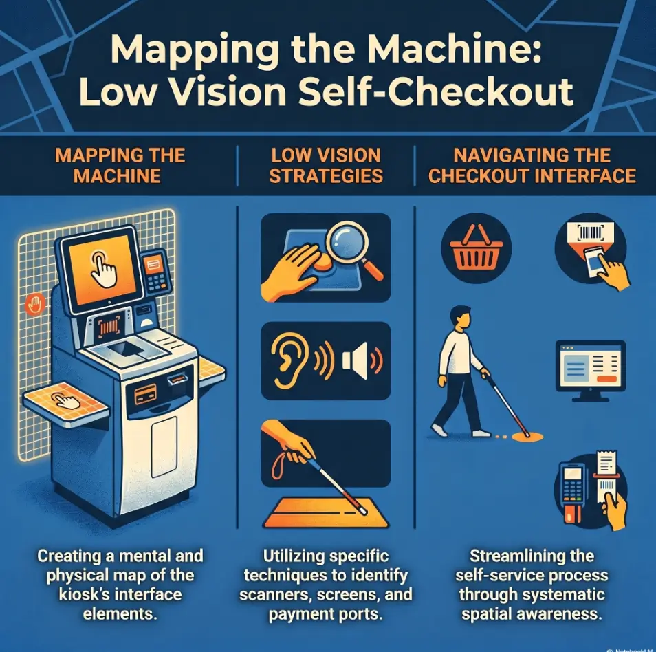
Why low-vision self-checkout works better as a layout memory task
Many people approach self-checkout as if success depends on reading every prompt, every item, every flashing option, every time. That sounds logical. It also collapses fast in real life. Screens are glossy. Fonts are small. Prompts change. A child nearby is singing into a shopping cart. The machine, meanwhile, has the emotional range of a smoke detector.
A better frame is this: self-checkout is partly a layout memory task. The more you can remember where important controls usually live, the less you need to visually search the screen from scratch. That is the quiet magic of button mapping. It turns a chaotic visual task into a simpler sequence problem.
I have seen this pattern in plenty of everyday tech. A microwave, a ticket kiosk, a hotel thermostat. Once you know the two or three controls that matter, the device becomes less mysterious and more mechanical. Self-checkout is no different. You are not trying to admire the whole interface. You are trying to get through the ritual with fewer wrong turns.
The real win is reducing visual search, not forcing perfect screen reading
Visual search is expensive. It burns time, energy, patience, and confidence. For a shopper with low vision, the biggest drain often is not the tap itself. It is the hunting. Where is the produce key? Did the screen change? Is that a coupon prompt or the payment button? That constant searching can turn one small mistake into five.
Button mapping reduces that drain. It gives your brain a shortlist. Instead of reading the whole screen, you ask smaller questions: top right or bottom right? center or corner? touch screen or card reader? Those are easier decisions under strain.
How one familiar machine can become your “home base” at the store
One familiar machine can become a kind of home base. Not perfect. Not always available. But familiar enough that you stop starting from zero. That matters more than people think. In accessibility work, the best solution is often not the most advanced one. It is the one that remains usable when you are tired, late, carrying milk, and thinking about three other things.
That is why this article keeps returning to repetition. A familiar lane, a familiar sequence, and a familiar pair of anchor buttons can do more for confidence than another round of well-meant advice to “just take your time.” Time helps, yes. A map helps more.
- Learn the layout by zones, not by every label
- Memorize two or three high-value controls first
- Aim for consistency before speed
Apply in 60 seconds: On your next visit, locate the help button and pay button before you scan the first item.
Who This Is For, and Who It Is Not For
Best for shoppers who can use touchscreens with partial vision, memory, or routine
This approach works best for shoppers who can interact with a touchscreen using some combination of partial vision, spatial memory, hand placement, and routine. You do not need to read every line. You do need enough usable information to find your anchors and notice when the machine has clearly changed state.
That includes shoppers who can identify large buttons, shoppers who rely on contrast more than detail, and shoppers who do better when they repeat the same store pattern each week. It can also help people whose vision varies by day. A button map gives you something stable even when the screen does not feel kind.
Helpful for caregivers teaching a repeatable checkout method
Caregivers often get trapped in a noble but exhausting pattern: explaining everything live, in the middle of a noisy store, while the machine beeps like a small impatient submarine. A button-mapping method is easier to teach because it is concrete. You can say, “First find the lower-right payment area,” or “Look for the help anchor before the produce menu.” That is teachable. “Try to read the screen better” is not.
If you are helping a parent, spouse, or adult child, routine matters. Use the same store. Use a short basket. Practice one part at a time. That is how confidence grows without turning a grocery trip into a three-act drama.
Not ideal when glare, fatigue, crowds, or small text make the screen unusable
There is also a line worth naming clearly. This method is not ideal when the screen is effectively unusable. If glare wipes out the buttons, fatigue makes orientation shaky, or the kiosk changes layouts every visit, self-checkout may not be the smarter choice that day. That is not failure. That is judgment.
The Americans with Disabilities Act shapes how public accommodations think about accessibility, but in day-to-day shopping the most important question is still practical: Can you complete this safely and without a confidence collapse? If the answer is no, staffed checkout or early assistance may protect both privacy and energy better than trying to force independence past its useful limit.
Eligibility checklist
- Yes: You can identify large zones or corners on a touchscreen.
- Yes: You usually shop at the same store or can choose the same lane.
- Yes: A short routine feels easier than reading every prompt.
- No: Glare or tiny text makes the screen disappear entirely.
- No: Crowded conditions make it too stressful to pause and reorient.
Neutral next step: If you checked more “yes” than “no,” try a low-pressure practice run with 5 to 8 items.
Start Here: Build a Mental Map Before You Scan Anything
Top, middle, bottom: dividing the screen into simple working zones
The easiest way to begin is not with labels. It is with zones. Divide the screen into three broad regions: top, middle, and bottom. Some people also like left, center, and right, making a loose grid. You do not need a museum-quality diagram in your head. You need a rough sense of where certain categories of choices tend to appear.
The top area often holds instructions, running totals, or a banner that changes as you move through the transaction. The middle may hold item lists or menu choices. The bottom often contains bigger action buttons, especially navigation and payment controls. Not always. But often enough that the pattern becomes useful.
I once watched a shopper do something surprisingly smart. Before scanning anything, she stood still for maybe 10 seconds and traced the screen with her eyes without touching it. No panic. No rush. She was not wasting time. She was building the room in her head before stepping into it.
Which buttons usually matter most in a grocery self-checkout flow
Not every button deserves your attention. A standard grocery self-checkout trip usually depends on a small cluster of high-value actions:
- Help or attendant assistance
- Pay now or finish and pay
- Produce or look up item
- Quantity or multiple items
- Back or cancel, when available
If you can reliably find those, the rest becomes less frightening. Think of them as the door handles of the experience. You do not need to memorize the wallpaper.
Why “find the pay button” is often a better first anchor than reading every prompt
Many shoppers assume they should learn the scanning part first. In practice, the payment button is often the strongest first anchor. Why? Because it gives you a clear destination. Even if the screen changes, you know that one key task near the end of the process is to find that control again. Having an endpoint makes the whole flow feel less shapeless.
It is also psychologically useful. When you know where the exit lives, the machine stops feeling like a maze. It becomes a sequence with an ending. For low-vision shoppers, that change in feeling matters. Calm is not decorative. Calm improves accuracy.
Show me the nerdy details
Interface designers often cluster primary actions in larger, high-contrast buttons near the lower part of a screen because those controls are easier to target quickly. That design habit is not universal, but it is common enough that learning the “action zone” first can reduce search time, especially under visual fatigue.
The Anchor Buttons That Quietly Control the Whole Experience
Pay now, look up item, quantity, produce, help: the usual power cluster
If self-checkout has a control center, it is this cluster: pay now, look up item, quantity, produce, and help. Different stores use different words, but the function is similar. These are the buttons that rescue the transaction when the simple scan-and-drop rhythm breaks.
Notice what these buttons have in common. They do not exist for perfect trips. They exist for reality. Bananas with no barcode. Four yogurts instead of one. A bagging-area warning. A tired moment when your place on the screen floats away. That is why anchor buttons matter so much. They are the recovery tools.
Why the corner buttons matter more than the center when vision is strained
When vision is strained, corners often beat the center. The center of a self-checkout screen can become a swamp of item lists, changing prompts, ad-like boxes, or menus that appear only when needed. Corners, by contrast, often hold stable actions. Not always, but often enough to be worth testing on your regular machine.
Corner-based orientation also works well with body memory. Your hand can learn, over time, that “help tends to live here” or “payment is often down there.” That kind of hand-memory is underrated. Plenty of people use it every day without naming it. We all know the spot on our phone where a favorite app lives. A self-checkout anchor can become just as familiar.
Here’s what no one tells you: one confirmed anchor can calm the whole transaction
One confirmed anchor changes the tone of the whole interaction. The moment you locate one reliable control, your brain stops trying to solve the entire machine at once. It starts chunking the problem. That is a big deal.
In one store, I watched a shopper tap the wrong menu twice while trying to find produce. The turning point was not reading better. It was finding the help button, then realizing the produce key was just above it on that lane’s screen. Suddenly the screen had a neighborhood. The machine was no longer a flat wall of choices. It had geography.
- Start with help and pay
- Add produce and quantity after that
- Treat corners as likely search zones
Apply in 60 seconds: Write down the names of your first four anchors on your phone before your next store visit.
Screen Drift Happens Fast When Every Visit Uses a New Machine
Why switching kiosks increases errors even when the store looks familiar
One of the sneakiest problems in self-checkout is what I call screen drift. The store feels familiar, but the kiosk is not. The payment prompt appears in a slightly different place. The produce menu uses a different label. The help button is smaller. The card reader sits to the side instead of directly below the screen. None of those changes look dramatic to a fully sighted shopper. To a low-vision shopper building a routine, they can feel like the floor shifted by three inches.
That is why stores that seem “the same” do not always feel the same. Familiar branding is not the same as familiar interface placement.
The value of choosing the same lane, same store, same flow
If you can choose the same lane, do it. Same store, same approximate time, same self-checkout bank. Repetition matters because it lets your body and attention do less work. This is true in driving, cooking, and keyboard shortcuts. It is especially true in environments where visual search is costly.
The National Eye Institute describes low vision as a functional condition that cannot be fully corrected with standard glasses, medicine, or surgery alone. That definition matters here because function, not perfection, is the goal. A repeated lane improves function. It does not cure the screen. It just makes the job more stable.
Small routines beat heroic effort
There is a kind of shopping heroism that looks admirable and works terribly: trying a new machine every time, pushing through the busiest hours, and telling yourself this round will be smoother by force of character. Usually it is not. Small routines are much more powerful. They are also less glamorous, which may be why people underestimate them.
Use the same bagging sequence. Put produce together. Keep your wallet or phone in the same pocket. Scan barcodes first. Save the weird items for the end. That is not overplanning. That is reducing the number of things that can surprise you at once. If planning the trip itself tends to fray before you even reach the store, a low-vision grocery list system can make the checkout routine feel less like the final boss of an already chaotic errand.
Decision card
When A: Use the same lane and the same sequence if you want less search and fewer last-minute mistakes.
When B: Use staffed checkout if every available kiosk is unfamiliar, crowded, or badly glared.
Time/cost trade-off: Repeating one familiar lane may take an extra minute to wait for, but it can save several minutes of correction later.
Neutral next step: Decide before entering the checkout area whether today is a “repeat lane” day or a “staffed lane” day.
Don’t Start With Produce if You Are Still Learning the Layout
Why loose items create the most menu hunting and visual overload
Produce is where good intentions go to wobble. A box of crackers scans. A carton of eggs scans. A lemon often demands a lookup, a code, a visual confirmation, a quantity choice, and sometimes an argument with the bagging scale. Loose items are not impossible. They are just screen-heavy.
If you are still learning the layout, produce adds too many branches to the decision tree. More menus. More small type. More chances to leave the main flow and lose your place.
Barcodes first, exceptions later: a lower-friction way to practice
A calmer practice method is simple: do your barcode items first. Let yourself build rhythm. Scan. Place. Pause. Scan. Place. Once the machine and your body settle into that loop, then handle the exceptions. This sequence protects your attention when it is freshest.
I have done versions of this with other unfamiliar systems. The first task should be the easiest possible one, not the most complicated. Starting with produce is like learning to ride a bike by aiming at a hill.
How to separate “easy scans” from “screen-heavy items” before checkout begins
Before you reach the kiosk, quickly sort your basket mentally or physically into two groups:
- Easy scans: clear barcodes, standard packages, obvious quantity
- Screen-heavy items: produce, bakery goods, weighed items, multiples, coupons, or unlabeled goods
This tiny separation changes the whole trip. You stop being surprised by the complicated items because you already know they belong to the second phase. Surprise is often what turns difficulty into panic.
Short Story: A shopper I know used to stall out at self-checkout over the same two things every week: apples and bulk rolls. She thought the problem was her vision alone. It was partly that, of course, but it was also sequence. She was loading the hardest items first because they sat on top of the basket. One quiet Tuesday she changed only one thing. She scanned all barcode items first, then stopped, found the help anchor, and handled produce last. The trip was not magically perfect.
The apples still asked for attention. But the machine no longer felt like it had trapped her in the opening minute. By moving the screen-heavy choices to the end, she arrived there with more calm, more orientation, and a running total already visible. That small shift did not look impressive from the outside. Inside the moment, it changed everything.
Common Mistakes That Turn a Manageable Trip Into a Stress Spiral
Tapping too quickly before the machine finishes talking or updating
Self-checkout rewards timing more than speed. Tapping too quickly is one of the most common mistakes because it feels like momentum. In reality, it often creates double inputs, missed state changes, or prompts you never actually saw because the screen had not settled yet.
Machines do not appreciate enthusiasm. They appreciate rhythm.
If the kiosk speaks, let it finish. If the total changes, wait a beat. If a menu opens, pause before you aim. One second of patience can save three minutes of correction.
Reaching for every on-screen option instead of staying with known anchors
Another common trap is the “just try everything” approach. This usually appears after one small error. A shopper misses the produce key, then starts tapping around the screen in widening circles, hoping the right path will reveal itself. It rarely does. The screen becomes a slot machine of wrong guesses.
A better recovery method is to return to a known anchor. Help. Back. Pay. Quantity. Whatever part of the map you trust. Known anchors restore orientation. Random exploration usually multiplies confusion.
Let’s be honest: most checkout errors begin with rushing after one small mistake
The first mistake is usually not the real problem. The rush that follows is. You hear the warning tone, feel observed, and suddenly try to fix everything at once. That is the stress spiral. It turns a minor correction into a transaction-wide fog.
The American Foundation for the Blind has long emphasized practical technology habits over fantasy-level independence, and that spirit fits here. The goal is not to look flawless. The goal is to complete the task without burning extra energy for no reason. The same principle shows up when people use QR code scanning strategies for low vision or practice using Select to Speak on Android menus: the win is not reading every element perfectly, but building a calmer method for the parts that matter most.
- Wait for the machine to finish updating
- Return to a known anchor instead of tapping widely
- Treat one error as a pause point, not a race trigger
Apply in 60 seconds: Decide on one recovery phrase now: “Pause, find help or pay, then continue.”
Do Not Treat Brightness as the Same Thing as Visibility
Glare, reflections, and glossy screens can hide buttons in plain sight
Brightness is not the same as visibility. This is one of those truths that feels obvious once you have suffered under supermarket lighting for five minutes. A brighter screen can still be unreadable if glare washes the surface, reflections mirror overhead fixtures, or a shiny protective layer turns buttons into pale ghosts.
That is why “just turn up the brightness” is such incomplete advice. Sometimes more brightness simply means brighter glare. Like adding more water to a puddle and expecting the road to get easier.
Why screen angle, body position, and overhead lighting matter so much
Small changes in angle matter. Shift half a step left. Lean slightly. Turn your cart so your body blocks a reflection. These are not fussy details. They are often more effective than any setting on the machine itself.
Many low-vision readers already know this from trying to read glossy mail, pharmacy labels, or a phone screen near a window. The eye is not just reading text. It is negotiating light. Grocery self-checkout has the same bargain built into it. If glare is a recurring villain in daily tasks, the habits that help you read glossy mail without glare often echo here too.
When moving half a step changes more than turning up brightness ever will
The best adjustment is sometimes almost comically small. Half a step. A slight turn. One hand shading the edge of the display. That tiny body shift can reveal a button that was there the whole time. This is why self-checkout training should include positioning, not just button names.
I have seen people blame themselves for “missing” a menu that was practically invisible from where they were standing. The machine did not become hard because they were careless. The light changed the usable screen. On especially sensitive days, people who already tweak their phones with Reduce White Point versus Night Shift or make an iPhone screen dimmer than the usual minimum often recognize the pattern immediately: the problem is not always the text, but the light wrapped around it.
Show me the nerdy details
Glare reduces apparent contrast, which matters because many kiosk interfaces already use modest contrast differences between inactive and active controls. When the environment adds reflections, the visual distinction between a button and its background can shrink dramatically even if the text itself has not changed.
Mini calculator
Rate your current kiosk on three points: screen glare, crowd pressure, and layout familiarity.
- 0 = no problem
- 1 = manageable
- 2 = difficult
Output: If your total is 4 or more, you are probably better off using staffed checkout or asking for help early.
Neutral next step: Use the score before you start scanning, not after you feel trapped.
The Bagging Area Is Often the Real Trouble Spot
Why the scale prompt can break concentration after a good scanning rhythm
Many shoppers think the screen is the hard part. Often it is the bagging area. The scale system can interrupt a perfectly good rhythm with warnings about unexpected items, unrecognized movement, or objects placed too early. The problem is not only the warning itself. It is the interruption. Once the flow breaks, you must split attention between the screen, the item in your hand, and the place where the machine expects that item to land.
That is a lot of choreography for anyone. With low vision, it can feel like tap dancing inside a receipt printer.
How to pause, re-center, and return to the button map after a bagging warning
When the bagging warning appears, pause physically first. Put the next item down. Look back to your known screen anchor. Do not try to keep scanning while resolving the warning. That is how one prompt breeds a family of prompts.
A good recovery sequence is simple:
- Stop moving items.
- Check whether the machine is asking you to wait, remove, or replace something.
- Find help if the instruction is unclear.
- Resume only after the screen clearly returns to the scan state.
What to do when the machine insists something is in the wrong place
Sometimes the machine is correct. Sometimes it is just temperamental. Either way, argument rarely works. A practical response is to remove your hands, let the scale settle, and wait 1 to 2 seconds before trying the placement again. If that fails, use help early.
I have watched shoppers lose more energy trying to out-stubborn the bagging area than they would have spent by calling an attendant immediately. Dignity matters, yes. So does preserving your bandwidth for the rest of the trip.
- Stop item movement before fixing the warning
- Wait for the screen to return to scan mode
- Use help early when scale prompts repeat
Apply in 60 seconds: Tell yourself before checkout: “If bagging interrupts me, I stop first and recover second.”
Payment Is Where Familiarity Pays Off
Card reader placement versus touchscreen placement: two maps, not one
One of the biggest end-of-transaction surprises is that payment often involves two different maps. The touchscreen has one layout. The card reader has another. If you treat them as one combined interface, the transition can feel messy. Suddenly you are searching again, even after scanning went well.
The card reader may sit below, to the side, or at an angle. Contactless symbols, chip slots, debit prompts, and confirmation buttons may all live in different places from the main screen. That means payment deserves its own little routine.
Why it helps to learn the payment transition as its own mini-routine
Think of payment as a handoff, not a final blur. Finish scanning. Confirm the pay anchor on the touchscreen. Then physically reorient to the card reader. Find the tap spot or chip slot. Pause for the prompt. Confirm once. This mini-routine is especially useful when fatigue is highest, because the last 10% of a transaction is where tired shoppers often make avoidable mistakes.
In one store, I noticed that the touchscreen stayed politely still while the real action had already moved to the reader. That gap can confuse anyone. With low vision, it can feel like the process split in two.
The final-screen trap that catches tired shoppers at the very end
The final-screen trap is simple: after payment, the machine may still ask one more thing. Receipt? Donate? Confirm? Loyalty question? Remove card? Because shoppers mentally classify payment as “done,” they stop orienting right when one last choice appears.
This is where familiarity pays off most. If you know your store usually asks for a receipt decision after payment, you can expect it instead of being ambushed by it. Later, if you need to double-check what you were charged, it also helps to know iPhone receipt reading settings for low vision so the paper slip does not become a second little maze after the first one.
Quote-prep list
Before comparing your usual store’s lanes, gather:
- Where the card reader sits in relation to the screen
- Whether tap-to-pay is easy to locate by touch or contrast
- Whether the machine asks extra questions after payment
- Whether attendant help is visible and nearby
Neutral next step: Make a short note after checkout so you can choose the better lane next time.
When to Ask for Help Sooner, Not Later
Why early help protects privacy and confidence better than late-stage panic
Many shoppers wait too long to ask for help because they want to preserve independence. That impulse is understandable. But late-stage panic usually draws more attention than early, matter-of-fact assistance. Early help can actually protect privacy better because the situation stays small.
There is a world of difference between saying, “Could you stay nearby while I do produce?” and calling for rescue after three stacked prompts, a frozen bagging scale, and a line that has started to breathe heavily behind you.
Scripts that make assistance easier without explaining your whole condition
You do not owe strangers your full medical history to buy cereal. A few brief scripts can make help easier:
- “Could you point me to the produce button?”
- “Could you stay close in case the screen changes?”
- “I use a routine on these machines. Can you help with the bagging alert?”
- “This screen is hard for me to read. Can you confirm the next step?”
These scripts are direct, practical, and limited. They solve the task without inviting a whole biography.
The smartest shoppers are not the ones who never ask
The smartest shoppers are usually the ones who know the difference between a challenge and a trap. If you can recover with one anchor, great. If the machine layout is unfamiliar, the glare is severe, or the prompts are looping, asking early is not giving up. It is resource management.
The best accessibility habits are rarely dramatic. They are ordinary, repeatable, and slightly boring in the best way. Early help belongs in that category.
One Calm Practice Method That Makes the Next Trip Easier
Visit during a quiet hour and use a short basket, not a full cart
If you want practice that actually teaches, lower the pressure. Go at a quieter hour. Use a short basket, not a full cart. Five to eight items is plenty. This is not the day to test your courage against a week’s worth of groceries plus a watermelon with identity issues.
Smaller practice trips reduce fatigue and keep the lesson focused. You are training orientation, not proving toughness.
Repeat the same lane until the button zones feel predictable
Pick one lane and repeat it until the screen zones feel predictable. Not perfectly memorized. Predictable. That is the threshold that matters. Once the screen starts to feel like a place rather than a puzzle, your error rate often drops without any grand breakthrough.
I like this kind of learning because it is honest. It does not ask the brain to become superhuman. It asks the environment to become familiar.
Practice one goal at a time: scan flow, produce flow, then payment flow
Do not try to master the whole process at once. Break it into three goals:
- Scan flow: barcode items only
- Produce flow: one or two loose items
- Payment flow: screen-to-reader transition
This staged method works because each stage trains a different kind of attention. Scan flow teaches rhythm. Produce flow teaches menu recovery. Payment flow teaches transition between two devices. Separating them lowers the chance of overload.
- Choose a calm hour
- Use a short basket
- Train one part of the sequence at a time
Apply in 60 seconds: Put a low-pressure grocery practice trip on your calendar with no more than 8 items.
FAQ
How can a person with low vision use grocery self-checkout more safely?
The safest approach is to use a repeatable routine instead of trying to read the entire screen each time. Learn the layout in zones, identify two anchor buttons first, and use the same store or lane when possible. Also choose quieter times, start with easy barcode items, and ask for help early if the machine stops being clear.
What buttons should I learn first on a self-checkout screen?
Start with the help button and the pay or finish-and-pay button. Those two controls matter because they either recover the transaction or move it forward. After that, add produce or look-up-item and quantity. This small set usually covers the moments when the simple scan flow breaks.
Is self-checkout a good idea if glare makes screens hard to read?
Sometimes yes, sometimes no. If a small change in body position or screen angle solves the problem, self-checkout may still be workable. If glare hides key buttons or causes repeated disorientation, staffed checkout may be the better option that day. Brightness alone is not a reliable fix for glare.
What should I do when the machine says there is an unexpected item in the bagging area?
Stop moving items, let the scale settle, and wait for the prompt to finish. Then follow the instruction shown, such as removing or replacing the item. If the prompt repeats or the screen becomes unclear, use help sooner rather than stacking more actions on top of the warning.
Are some grocery items harder to check out with low vision than others?
Yes. Loose produce, bakery items, weighed goods, and anything without a clean barcode usually require more screen interaction. Those items are often harder than standard packaged goods because they involve menus, lookups, and quantity choices. A good strategy is to scan barcode items first and save screen-heavy items for later. It can also help to label your home workflow around food handling afterward, especially if you already use a system for reading expiration dates with low vision or keep items organized with low-vision freezer organization.
Should I ask for help at the start or wait until I get stuck?
Ask early when you can already see that the kiosk is unfamiliar, badly glared, or likely to require screen-heavy choices such as produce. Early help is often calmer and more private than waiting until several prompts stack up at once. You do not need to wait for a full meltdown to justify assistance.
Is it better to use the same store and same lane every time?
Usually yes. Repetition reduces visual search and helps your body remember where important controls live. Even small layout differences between lanes can increase errors, so a familiar machine often matters more than people expect. Same lane, same flow, same order can turn a stressful task into a more predictable one.
How do I handle payment screens if the card reader is separate from the touchscreen?
Treat payment as its own mini-routine. Confirm the pay button on the touchscreen first, then physically reorient to the card reader and locate the tap area or chip slot. Expect that the final prompts may appear on the reader rather than the main screen. Thinking of them as two separate maps makes the transition easier.
Next Step: Build Your First Two-Anchor Routine
On your next trip, choose one store and identify just two anchors: the help button and the pay button
This is the part where the hook closes. The machine does not become easier because you suddenly see everything. It becomes easier because you stop asking yourself to see everything. Two anchors are enough to begin changing the experience. Help and pay. Recovery and exit. Those two points turn a wall of options into a route.
Repeat that same lane on a low-pressure visit until those anchors feel automatic
Make the next trip small on purpose. Quiet hour. Short basket. Same lane if possible. Locate the two anchors before you scan anything. Repeat the sequence until your hand and attention know where to go without negotiating every inch of the interface. That is how confidence is built in ordinary life. Not through a cinematic breakthrough. Through repetition that becomes almost boring.
Once those are stable, add one more zone instead of trying to master the whole screen at once
After the two anchors feel stable, add one more zone. Maybe produce. Maybe quantity. Maybe the payment reader. Just one. Layering works better than flooding. It respects how attention actually behaves under strain.
There is a gentle dignity in building systems that fit the body you have and the day you are living. Grocery self-checkout does not have to become your favorite invention. It only needs to become manageable enough that the machine stops stealing more energy than the groceries are worth.
Coverage tier map
- Tier 1: You know where help is.
- Tier 2: You know where pay is.
- Tier 3: You can scan easy items in rhythm.
- Tier 4: You can recover from produce or quantity screens.
- Tier 5: You can manage the payment transition with minimal search.
Neutral next step: Aim to move up just one tier on your next visit, not all five.
Last reviewed: 2026-04.