

Navigating Worship with Low Vision
Church bulletin reading with low vision rarely falls apart in one dramatic moment. It usually slips sideways through smaller failures: a missed hymn number, a glossy fold catching the light, or a “large-print” bulletin that remains exhausting to use.
The frustration isn’t just about eyesight; it’s the combination of glare, crowded layouts, and “page hunting.” Even a phone workflow can quickly turn into a distraction rather than a tool. Without a plan, Sunday worship can feel less like participation and more like quiet damage control.
A better setup doesn’t need to be expensive. This guide helps you build a practical workflow, blending paper for orientation and phone tools for “rescue moments,” to ensure you follow hymns and scripture with less strain.
The Reality of Real-World Use:
- • Bigger print is not always the real fix.
- • Glare can do more damage than font size.
- • The best solution often looks almost boring, which is excellent news.
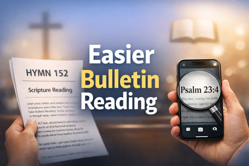
Fast Answer: A practical low-vision church bulletin setup usually works best when it combines two things: a readable large-print paper option and a simple phone workflow for magnification, brightness control, or text-to-speech. The goal is not to build a perfect system. It is to reduce glare, shrink the amount of scrolling, and make hymns, announcements, and scripture references easier to follow without adding stress during the service.
Table of Contents
Church Bulletin Reading Low Vision Starts With One Quiet Question
Before anyone buys a stand, downloads three apps, or requests a reprinted bulletin, there is one question worth asking first: what is actually making the bulletin hard to use? Many people say, “I just need bigger print,” when the real problem is a tangle of smaller causes. Sometimes it is text size. Sometimes it is glare. Sometimes it is dense layout. Sometimes it is speed, especially when the congregation moves from opening prayer to hymn to announcements in what feels like twelve seconds and a sigh.
Is the problem text size, glare, layout, or pace?
These problems feel similar in the moment, but they behave differently. Text size makes letters hard to identify. Glare makes readable letters disappear. Layout density makes the eye work too hard even when the words are technically visible. Pace turns a manageable page into a stressful chase. I once watched someone hold a bulletin at three different angles during the opening hymn, not because the print was too small, but because the overhead lighting kept washing out the boldest lines first.
Why “I can read some of it” is often the real trap
Partial readability can be more exhausting than total unreadability. When you can catch 60 percent of the page, your brain spends the rest of the service trying to patch the missing 40 percent. That patchwork costs energy. It also increases the temptation to keep rechecking the page, the phone, the screen, and the order of worship all at once. The result is not just visual strain. It is cognitive strain dressed in church clothes.
The best setup solves strain, not just visibility
A better setup should reduce effort across the whole service. That means less squinting, less reorienting, fewer bright-screen rescues, and fewer moments when you lose your place. This is why the most useful question is not “Can I technically read this?” but “Can I follow this for 45 to 90 minutes without tiring out?” Those are very different tests.
- Text size problems need enlargement
- Glare problems need angle or lighting changes
- Pace problems need a simpler tracking system
Apply in 60 seconds: Before next service, circle one main problem on the bulletin: size, glare, layout, or pace.
Who This Is For, and Who It Is Not For
This guide is designed for people who still use print for at least part of the service, use a phone as a backup, or are helping a parent, spouse, or church member create a smoother worship routine. It is especially helpful when the problem is not absolute unreadability but unreliable readability. That strange middle ground is where many low-vision workarounds either become quietly effective or hilariously overengineered.
Best for readers who can use print, a phone, or both during worship
If large print helps but not enough, or if a phone helps only in bursts, this hybrid approach fits well. It works for readers who want the calm of paper with the rescue power of magnification or read-aloud support. It also works for churches where digital access exists but is awkward to open quickly, which is more common than people admit. “We emailed the PDF” is not the same thing as “it is easy to use when the organ starts.”
Helpful for family members setting up a simpler Sunday routine
Caregivers often do the invisible labor here. They check whether the bulletin is available in advance, enlarge a PDF, save brightness presets, or choose a seat with cleaner light. Those small acts matter. A family member once told me the biggest improvement came not from a new device, but from arriving eight minutes earlier and folding the bulletin so only the current page showed. Not glamorous. Extremely effective. For households doing that quiet support work week after week, helping a spouse with vision loss in practical daily routines often follows the same logic: simpler systems, fewer moving parts, more repeatable relief.
Not a full substitute when vision changes suddenly or reading drops sharply
If reading ability changes quickly, drops sharply, or suddenly becomes much worse than usual, a bulletin workaround is not enough. The National Eye Institute explains that low vision affects everyday tasks like reading and often benefits from professional evaluation and rehabilitation support. A Sunday setup can lower friction, but it cannot answer every medical question. It is a tool, not a diagnosis in sensible shoes.
Eligibility checklist:
- Yes: You can read some print but tire quickly
- Yes: A phone helps for short moments but not the whole service
- Yes: Lighting or crowded layout seems to matter
- No: Vision changed suddenly and dramatically
- No: Reading has become unreliable across many settings, not just church
Neutral next step: If you checked mostly “Yes,” test the hybrid workflow below before adding more tools.
Large Print First: Why Paper Still Wins More Often Than People Expect
In a world that loves apps, paper still wins surprising battles. It does not buzz. It does not dim at the wrong moment. It does not make you unlock anything with a thumb that suddenly forgets it belongs to you. For many readers with low vision, a good paper bulletin is easier to track than a bright screen because it supports orientation. You can feel the fold, see the shape of the page, and glance back without reopening menus like a trapped squirrel.
Bigger text reduces decision fatigue during hymns and responsive readings
Large print helps not only because letters are larger, but because it reduces the number of micro-decisions required to stay on track. If hymn numbers, headings, and transitions stand out clearly, the reader does less searching. That matters when the service moves quickly. The calmer the visual field, the less the brain has to “hunt.”
Wide spacing and cleaner contrast matter as much as font size
A bulletin enlarged on a copier can still fail if line spacing stays tight or if contrast is weak. Big text packed into a crowded page is like moving into a bigger apartment and filling it with boxes. Technically larger, still impossible to navigate. Often, readers benefit more from cleaner spacing, bold section labels, and fewer items per page than from font inflation alone. The same principle shows up in other everyday reading tasks, whether you are trying to read restaurant menus with low vision or make sense of small, cluttered printed materials at home.
When a printed bulletin feels calmer than a bright screen
Bright screens can create a strange double burden during worship. They improve detail while increasing glare, contrast fatigue, and social self-consciousness. Paper often feels quieter. It lets the reader stay with the service rather than managing a device every few minutes. I have seen people choose the paper copy even when a PDF was available simply because the paper felt less mentally “loud.” That instinct is worth respecting.
Show me the nerdy details
On paper, legibility is shaped by more than font size. Line length, line spacing, contrast, paper finish, and heading hierarchy all affect how efficiently the eye can locate and return to the correct place. In low-vision use, navigation quality matters almost as much as raw character size.
Phone Workflow Next: The Small Digital Moves That Save the Morning
A phone can be wonderfully helpful when it is treated like a backup instrument, not the entire orchestra. The best phone workflow is usually small, fast, and repeatable. Think magnify this line, brighten for this moment, read this reference aloud. Not “open six accessibility layers while everyone stands for the second verse.” The phone is there to rescue specific pain points, not replace the whole printed experience unless print has already failed.
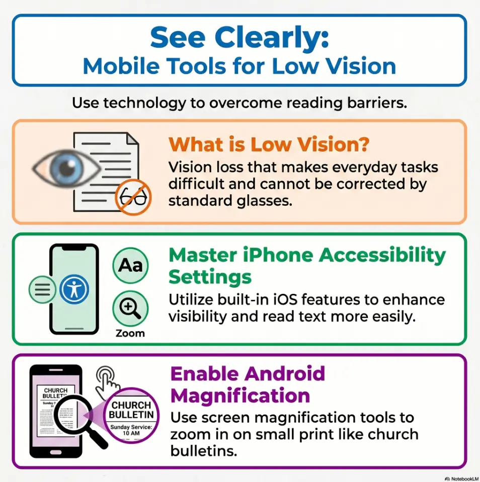
Magnification, brightness, and zoom are the real starting trio
For many people, the first useful phone features are the simplest: screen zoom, display brightness adjustment, and camera magnification. Apple’s accessibility materials highlight built-in tools like Magnifier, Zoom, and spoken content features for vision support. Android accessibility guidance similarly includes magnification and display-size tools. The lesson is simple: start with what the phone already does well before chasing specialty apps. On iPhone, this often becomes even easier if you set up Back Tap for Magnifier so a rescue tool appears with less ceremony.
Using a phone camera for tiny sections instead of the whole page
Trying to read an entire bulletin through a live camera view is tiring. The camera is best for small rescue jobs: a hymn number, a responsive line, a scripture verse, a one-sentence announcement. Using it for the full page usually creates constant panning, shifting focus, and hand fatigue. It turns worship into a documentary about your wrist. Use the camera in short bursts. Let paper do the rest when possible. If you are scanning printed materials frequently outside church too, a tuned-up iPhone scan setup for low vision can help you decide which tasks are worth digitizing and which are better left on paper.
A simple read-aloud backup for announcements and scripture references
Read-aloud features can help when the task is detail retrieval rather than continuous reading. A quick spoken check of a scripture reference or a small block of announcements can be enough to restore orientation. Apple provides built-in read-and-speak options, and Android offers Select to Speak and related accessibility tools. That backup matters most when the service includes unfamiliar page jumps. Android users who want a cleaner way to handle those short spoken checks may find Select to Speak for tricky menu and text situations especially useful.
Decision card:
When paper is better: full service tracking, hymn flow, page memory, lower distraction.
When phone is better: tiny print, fast rescue moments, glare workaround, short read-aloud check.
Time/cost trade-off: paper asks for prep before service; phone asks for more attention during service.
Neutral next step: Use paper as the base layer and the phone only for moments that break the flow.
Don’t Start Fancy: Build the Setup in This Order
Low-vision setups often fail because they begin at the wrong end. People start with apps, mounts, filters, or new cases, when the first three fixes are usually more ordinary: seat location, page format, and pre-service preparation. A good setup is built like a quiet staircase. If step one is unstable, step four does not become impressive. It becomes expensive.
Start with lighting and seat choice before changing apps
Seat position can decide half the experience. Some locations catch harsh overhead light, some collect backlight from windows, and some force constant turning between bulletin and screen. Try a seat where the bulletin can be angled slightly without catching direct glare. In one church, moving two pews to the side changed everything because the page stopped flashing like a stubborn fish scale under the lights.
Then test print size, page contrast, and spacing
Once the seat improves, test the print itself. If the church can provide a large-print copy, inspect more than font size. Are headings easy to find? Are scripture references separated clearly? Is there enough white space between sections? A clean, slightly shorter bulletin can outperform a larger but crowded one.
Only after that should the phone become step two, not step one
When the physical environment is working better, the phone becomes more effective because it is no longer solving every problem at once. That is the sweet spot. The phone should extend the paper system, not rescue a chaotic one. Simpler workflows survive real Sundays better than clever ones.
- Seat choice changes glare immediately
- Print quality changes navigation quality
- Phone tools work best after the environment is calmer
Apply in 60 seconds: Decide your next test in order: seat first, print second, phone third.
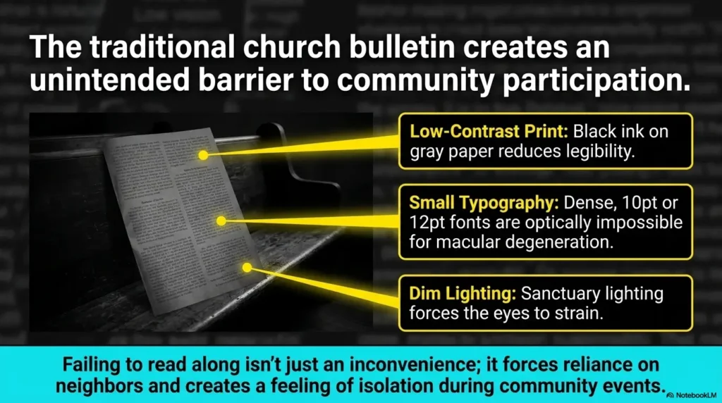
Glare Is the Thief: Why Good Print Still Fails Under Bad Light
If text size is the obvious villain, glare is the elegant pickpocket. It steals legibility without announcing itself. People blame the font when the real issue is reflection. This is especially common with glossy inserts, folded bulletins, coated paper, or lights positioned directly above the reading angle. The result is maddening because the page looks fine until you actually try to use it.
Overhead lighting can wash out even large text
Strong overhead lighting can flatten contrast and reduce the clarity of even bold, enlarged text. The effect is worse when the bulletin is held flat. A small tilt often helps more than a brighter light source. Brighter is not always clearer. Sometimes brighter simply gives the glare a louder microphone.
Glossy paper, folds, and shadows create avoidable friction
Glossy paper reflects. Folds create tiny ridges of shadow and shine. Even a hand placed near the page can interrupt an already difficult reading angle. That is why some of the best practical changes are humble ones: refold the bulletin, separate inserts, flatten the page on your lap, or hold it at a slight slant rather than fully upright. If glossy surfaces are a recurring enemy in daily life, the habits that help you read glossy mail without glare transfer surprisingly well to church bulletins too.
Here’s what no one tells you: brighter is not always clearer
This is the sentence many people need. They assume more light equals more readability. But with low vision, comfort and contrast often matter more than raw brightness. A page under calmer light with less reflection can outperform a brightly lit page that keeps flashing back at the reader. There is nothing wrong with your eyes for noticing this. Light behaves like a drama queen sometimes. In some cases, the same logic that helps people compare Reduce White Point versus Night Shift for glare-sensitive eyes on a phone also clarifies why lowering visual harshness matters more than simply adding more brightness.
Mini calculator: Rate your bulletin strain from 1 to 5 in three areas: glare, page hunting, and text effort.
If glare is the highest score, change seat angle first. If page hunting is highest, simplify layout or pre-mark sections. If text effort is highest, enlarge or use targeted phone magnification.
Neutral next step: Change the highest-scoring problem first instead of replacing the whole workflow.
During the Service: How to Keep Up Without Constant Page Hunting
The real test is not whether the setup looks tidy before the service. It is whether it helps once the room is moving. That is when page hunting begins. A good low-vision routine should reduce sudden transitions, limit device switching, and make it easy to rejoin the flow after a missed line. Think less “perfect tracking” and more “easy recovery.”
Mark the order of worship before the service begins
Use a finger, fold, sticky tab, or light pencil mark to show the main transitions before the service starts. Opening hymn. Prayer. Scripture. Offering. Closing hymn. Pre-marking creates a map. That map lowers the panic of “Where are we?” when the congregation moves faster than expected. It is one of those boring tricks that works far better than its wardrobe suggests.
Use the phone for short rescue moments, not nonstop tracking
Phone use is most effective when it is brief and intentional. Catch the hymn number. Zoom the verse reference. Listen to one line if needed. Then return to the paper. Constant screen juggling drains attention and often creates more delay than it solves. The goal is to stay with the service, not manage a tiny production booth in your hands.
Let’s be honest: too much screen juggling breaks concentration
Many readers do not need a more advanced system. They need a less demanding one. I once tested a beautifully organized phone workflow with saved screenshots, brightness shortcuts, and read-aloud options. It worked brilliantly at the kitchen table and felt ridiculous by the second reading on Sunday. A folded bulletin and one quick magnifier check turned out to be the winner. That kind of humility saves time. If even a flashlight or magnifier view feels harsh, it may help to review ways to make an iPhone flashlight less harsh or even dim an iPhone screen below the usual minimum so the rescue tool stays useful instead of becoming its own source of strain.
Quick rhythm that often works:
- Use paper for the overall order
- Use the phone only for one small unreadable block at a time
- Return to paper as soon as orientation is restored
- Ignore the fantasy of flawless tracking
Common Mistakes That Make Church Bulletins Harder to Read
Most failed setups do not fail because the person did something foolish. They fail because a handful of reasonable choices interact badly in a real room. The bulletin is enlarged but still crowded. The phone is bright but too bright. The seat is close enough to see the front but angled badly for reading. None of these choices sounds terrible alone. Together, they form a little committee of annoyance.
Choosing the largest text without checking line spacing
Very large text can become harder to track if line spacing is tight or if each line stretches too far across the page. Bigger is not always kinder. Sometimes moderate enlargement with cleaner spacing wins because the eye can return to the next line more reliably.
Relying on live camera view for every page
Continuous camera reading is tiring, shaky, and slow to navigate. It often helps in short bursts, but as a full-service method it can become physically and mentally exhausting. If you find yourself re-aiming the camera every minute, the system is asking too much.
Sitting where backlight and shadows do the most damage
Some seats create constant trouble, especially near bright windows, under direct ceiling light, or where you need to keep turning between page and platform. Even a small shift left or right can improve contrast dramatically. Seat choice is a practical tool, not an afterthought.
Waiting until the first hymn to test the setup
This is the classic ambush. The service begins, the bulletin suddenly feels difficult, the phone brightness is wrong, and now every adjustment happens under time pressure. Testing even two minutes early changes the mood of the entire morning.
- Spacing can matter as much as font size
- Camera use should stay brief
- Early testing prevents avoidable stress
Apply in 60 seconds: Arrive early enough to test one hymn line, one announcement block, and one brightness level.
Do Not Overcomplicate It: The Workflow That Usually Works Best
The most sustainable setup is usually almost boring. That is good news. You do not need twelve features. You need one paper path, one phone tool, and one backup habit. When a workflow is too clever, it becomes fragile. When it is simple, it can survive real life, sleepy mornings, and the mysterious chaos of bulletin inserts that appear from nowhere like liturgical confetti.
One paper copy, one phone tool, one backup habit
This formula works because each part has a clear job. The paper copy gives orientation. The phone tool handles magnification or short read-aloud support. The backup habit covers the moment you lose your place, such as checking the order of worship before each transition or folding the current page to create a visible marker.
Why fewer steps help more than more features
Every additional step increases the chance of delay. During worship, delay feels bigger than it is because the service keeps moving. A five-step accessibility sequence might look efficient on paper and still be too slow in a live setting. The quieter victory is a setup you can use without thinking much.
The most sustainable setup is the one you can repeat every week
Repeatability matters more than novelty. A system that works 80 percent well every week is better than an elaborate system that works perfectly once and then lives forever in screenshots. Sustainable help often feels modest. That is not failure. That is engineering with manners.
Quote-prep list: If you are asking a church office for a better bulletin option, gather these first.
- What parts are hardest to read: hymns, announcements, scripture references, or order changes
- Whether spacing or contrast is a bigger issue than font size
- Whether a digital file is useful only if sent before service
- Whether matte paper or fewer items per page would help more
Neutral next step: Share one specific problem and one specific fix instead of asking for “better accessibility” in general.
When Large Print Is Not Enough, What Usually Needs to Change
There comes a point when a large-print bulletin is still not doing enough, and that does not automatically mean you need more tech. Often, the issue is structural. The layout is too dense. The service order is too jumpy. The PDF arrives too late. The phone helps for one task but undermines another. When that happens, the answer is often to change the rhythm between paper and digital rather than choosing one side forever.
The issue may be layout density, not only font size
A bulletin can be enlarged and still feel crowded if too much information remains on each page. Dense announcements, multiple columns, or frequent abbreviations create a navigation problem more than a visibility problem. Readers may need fewer items per page, stronger headings, or a simplified version of the order of worship.
Phone zoom may help for readings but fail for page navigation
This is a common split. Zoom can make a small paragraph readable while making it harder to understand where that paragraph sits in the service. That is why some readers do better with paper for global navigation and digital tools for local detail. Whole-page orientation on paper, micro-detail on the phone. It is a duet, not a custody battle.
When alternating between paper and digital becomes the smarter rhythm
The smartest rhythm often looks like this: use large print for hymns and the service order, use the phone for announcements or dense scripture references, then return to paper. Alternating is not a compromise. It is a strategy. Many successful low-vision systems are mixed systems because human life rarely fits neatly inside one tool.
Show me the nerdy details
Hybrid reading works because it separates orientation from detail retrieval. Paper is strong for spatial memory and page mapping. Phones are strong for targeted enlargement, contrast adjustment, and occasional speech support. When those strengths are assigned intentionally, the workflow becomes lighter.
Mistakes Churches Accidentally Make When They Try to Help
Churches often mean well and still miss the practical target. Accessibility efforts sometimes stop at enlargement, but enlargement alone does not guarantee usability. A large-print bulletin can remain crowded, reflective, late, or hard to open. A PDF can exist and still be almost impossible to access quickly during a service. Good intentions need workflow, not just generosity.
Enlarging text but keeping crowded formatting
This is the most common kindness-that-still-fails. The font grows, but nothing else changes. Paragraphs stay long. Section breaks stay subtle. Important references still hide in dense blocks. The result is technically larger and functionally tiring.
Offering digital files that are awkward to open quickly
If the file arrives late, has a confusing filename, or requires several taps to find, it is not truly accessible in the moment. Speed matters. A useful digital bulletin should be easy to open, ideally before the service starts. If possible, it should also be formatted so the order of worship is easy to scan without endless pinching and scrolling. Churches that serve older members well often discover that the same principles used for a low-vision-friendly filing system matter here too: clear labels, predictable placement, and fewer retrieval steps.
Assuming accessibility ends once a large-print version exists
Accessibility is not a single object. It is a chain. The copy has to be available, readable, timely, and workable in the real room. The National Eye Institute also points readers toward low-vision services and rehabilitation because daily reading challenges often benefit from task-specific strategies, not one generic fix. Churches do not need perfection here. They do need curiosity and a willingness to test what actually works.
Real entities that may matter in conversation: the National Eye Institute, Apple Accessibility, Android Accessibility, and local low-vision rehabilitation providers. You do not need to mention all of them to the church office. But knowing such resources exist can make the conversation clearer and more grounded.
The Best Real-World Setup Often Looks Less Perfect Than You Imagined
This is the quiet ending many people need to hear. The best setup may not look impressive. It may be a folded bulletin, a saved brightness setting, and a seat with cleaner light. That can be enough. In fact, it often is. Effective accessibility sometimes looks less like innovation and more like removing three little stones from a shoe.
A folded bulletin, saved brightness setting, and one seated angle can be enough
Small adjustments stack. A fold reduces page clutter. A brightness preset avoids fiddling. A better angle cuts glare. None of these changes is dramatic alone. Together, they can turn a difficult service into a manageable one. I once saw someone abandon a complicated digital plan and go back to a single folded paper copy with the current hymn section exposed. The relief on their face was the entire review.
Why consistency beats constant tweaking
When something works, keep it for a few weeks before changing it again. Constant tweaking creates its own fatigue. Consistency builds familiarity, and familiarity lowers effort. Worship should not feel like a new product trial every Sunday.
Small Sunday adjustments can quietly restore confidence
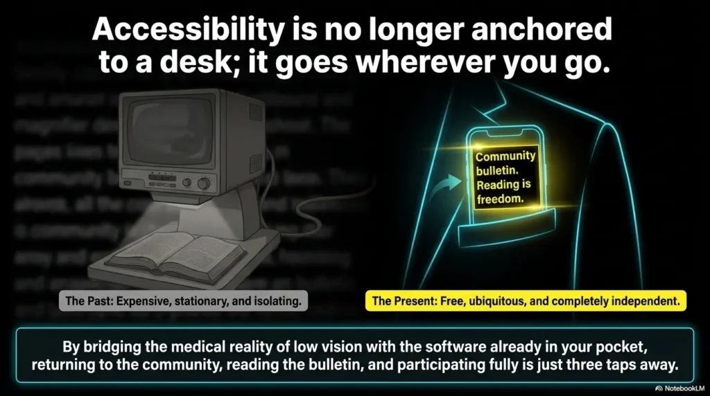
Confidence matters because reading difficulty often carries social friction. People worry about falling behind, drawing attention, or missing cues. A repeatable setup reduces not only visual effort but emotional pressure. That is not a small thing. It can make returning to church feel easier, calmer, and more participatory. For some readers, that emotional layer is inseparable from faith itself, which is why reflections on faith-based coping for low vision can sit beside practical setup advice without competing with it.
Infographic: The 3-part Sunday setup
1. Paper base
Use large print or the cleanest print version available. Mark the order before service.
2. Phone rescue
Use one feature only: magnify, brighten, or read aloud for short sections.
3. Recovery habit
When lost, check the current section marker first, then use the phone if needed.
Short Story: A woman in one congregation kept saying the large-print bulletin “should” work, yet every service left her tired. Her daughter assumed the font was still too small and started testing more digital options at home. Those tools helped, but only a little. One Sunday they arrived early, sat two pews farther to the side, flattened the folded insert, and marked the hymn numbers with a pen before the prelude ended.
She used her phone only twice, once for a scripture reference and once for a crowded announcement block. Afterward she said something wonderfully ordinary: “I actually followed today.” That sentence matters because accessibility success often sounds less like triumph and more like relief. The page did not become perfect. The routine became usable.
FAQ
What font size is usually easiest to read in a church bulletin for low vision?
There is no one perfect font size for every reader. Many people do better when the bulletin combines larger text with wider spacing, strong headings, and less crowding. A slightly smaller but cleaner layout can be easier to use than very large text packed tightly together. If paper remains tiring even after those changes, a stand magnifier that stays stable for shaky hands may be more helpful than simply enlarging the page again.
Is a phone better than a large-print church bulletin?
Usually not by itself. Paper is often better for following the overall order of worship, while a phone is better for short rescue moments like magnifying one hymn number or hearing a small text block read aloud. The most practical setup is often both, with paper first and phone second.
How can I reduce glare on a church bulletin during service?
Try changing your seat, tilting the page slightly, flattening folds, and avoiding direct overhead light if possible. Brighter light is not always better. Often the clearer setup comes from a calmer angle with less reflection. If the room itself is consistently part of the problem, broader glare strategies like window film for glare or choosing softer bulb temperatures such as 2700K versus 3000K for glare-sensitive eyes can help you think more clearly about what kind of lighting your eyes actually tolerate.
What is the easiest phone feature to use for reading bulletins?
For many people, built-in magnification or zoom is the easiest starting point. It requires the least setup and works well for short, specific tasks. Read-aloud can also help, but it is usually best as a backup rather than the main reading method during the service.
Should I use text-to-speech during church services?
It can be useful for announcements or scripture references if done discreetly and comfortably, especially with headphones or low-volume private listening when appropriate. It is usually less practical for constant, full-service tracking than for short support moments.
Where should I sit if I have trouble reading the bulletin?
Choose a seat with cleaner light and less glare, even if it is not the closest seat. Side angles sometimes work better than seats directly under bright overhead lighting. The best seat is the one that makes the page calmer, not the one that seems best in theory.
What makes a large-print bulletin still hard to use?
Common causes include tight line spacing, glossy paper, crowded formatting, weak contrast, too many page jumps, or lighting that creates reflection. Large print helps, but layout and environment still matter.
Can a caregiver or family member set up a better bulletin workflow ahead of time?
Yes. They can request the bulletin early, check whether a large-print version exists, pre-mark the order of worship, save a phone brightness setting, and choose a better seat. Those small preparations often make the biggest difference.
Next Step: Test One Sunday Setup Before Changing Everything
The hook at the start of this article was simple: sometimes the problem is not your effort, but the friction built into the page, the room, and the pace. By now the loop should be closed. A better experience usually does not require a dramatic overhaul. It requires one thoughtful test.
Pick one service and try this three-part check
For one Sunday only, test a single repeatable setup. Use the cleanest print option you can get. Sit where the page catches less glare. Choose one phone feature only. That is enough for a proper trial.
Bring one large-print copy, preset phone brightness, and a backup read-aloud option
Keep the workflow small. Paper for orientation. Phone for one rescue move. Backup speech only if needed. This prevents the service from turning into a troubleshooting session with hymns in the background.
Notice what caused the most strain, then adjust only that first
After service, ask one question: what tired you out most? If it was glare, change the angle or seat. If it was page hunting, pre-mark transitions. If it was dense text, ask whether a simpler large-print layout is possible. Improve the biggest friction first and let the rest wait.
- Choose one service as your trial run
- Use paper as the base and phone as the backup
- Change only the biggest source of strain first
Apply in 60 seconds: Write down your next Sunday plan in one line: seat, paper, and one phone feature.
That is the honest next step for the next 15 minutes: decide your one-service experiment now. Ask for the large-print copy, save the phone setting, or choose the better seat in advance. Accessibility often returns through modest doors. You do not need a perfect system. You need one that lets you follow, participate, and breathe a little easier.
Last reviewed: 2026-04.