

Caregiver-safe labeling guide
How to Label Eye Drops for Seniors with Poor Near Vision
Without Creating New Confusion
Eye-drop bottles are tiny, slippery little troublemakers. They hide their names in curved pharmacy labels, borrow each other’s white caps, and wait until the room is dim, the hand is tired, and the schedule is already late. For a senior with poor near vision, that is not a minor inconvenience. It can be the difference between a smooth routine and a medication mix-up.
This guide shows you how to build a safer labeling system using large print, high contrast, tactile markers, color cues, dosing-time labels, and a storage setup that makes the right bottle easier to choose before the cap comes off. The goal is not to make the medicine cabinet look charming. The goal is to make the next dose boringly obvious.
Whether you are helping a parent after cataract surgery, organizing glaucoma drops for a spouse, or trying to keep artificial tears separate from prescription drops, the system below is designed for real homes: imperfect lighting, busy mornings, multiple caregivers, and bottles that change shape after refills.
Fewer mix-ups
Use clear bottle identities instead of relying on tiny print or memory.
Better routines
Match labels, charts, trays, and timing cues into one calm system.
Safer caregiving
Keep instructions visible while making daily use easier for aging eyes.
Small bottle, big stakes: the safest label is the one a tired person can understand in three seconds. 👁️
Snapshot
This article is for seniors, caregivers, spouses, adult children, and home health aides who need a safer way to identify eye drops at home. You will learn how to label bottles without covering official pharmacy information, how to combine large print with color and texture, and how to build a simple eye-drop station that reduces missed doses, double doses, and look-alike bottle confusion.
Table of Contents
Safety First: Before You Touch a Label
Labeling eye drops for seniors with poor near vision can make home care safer, but the label is only a helper. It is not the prescription. It is not the doctor’s instruction. It is not a memory test in sticker form.
The first rule is plain: never cover the official pharmacy label. The drug name, strength, dosing directions, expiration date, pharmacy phone number, prescribing doctor, lot details, and warning stickers may all matter. A homemade label should sit beside that information, not on top of it.
If the bottle is a prescription drop, especially after eye surgery or for glaucoma, infection, inflammation, or pressure control, check with the pharmacist before changing how it is labeled or stored. Many pharmacies can help with large-print labels, auxiliary labels, bottle notes, medication lists, or accessibility options.
Copy confirmed directions, not memory
Caregivers often try to be helpful by rewriting instructions in simpler words. The intention is kind. The risk is that one tiny change can become a wrong dose.
Instead of rewriting “one drop in the right eye every night,” copy it only from the prescription label, discharge sheet, printed medication list, or care plan. If the wording conflicts, pause. Call the pharmacist or eye doctor before the label becomes household law.
Do not solve urgent symptoms with organization
A neat tray does not treat sudden vision changes. It does not explain severe eye pain, new discharge, spreading redness, swelling, a chemical splash, injury, fever, or sudden light sensitivity.
If something feels medically urgent, the next step is care, not a better sticker. Organization is for routine safety. Symptoms are for clinicians.
Key takeaway:
A homemade eye-drop label should make the correct bottle easier to identify, while the official pharmacy label remains readable and untouched. When instructions are unclear, the safest label is no label until a pharmacist confirms the plan.
Use labels to support independence
Good labeling is not about taking control away from an older adult. It is about reducing the tiny frictions that make independence exhausting.
A person who cannot read a curved bottle label under bathroom lighting may still understand their routine perfectly when the label says “BEDTIME, BOTH EYES” in bold letters. That is the quiet dignity of accessible design: less guessing, less hovering, fewer family debates beside the sink.
Why Eye-Drop Bottles Confuse Aging Eyes
Eye-drop bottles seem simple until you place four of them on a counter. Then the comedy turns into a little white-bottle opera: same shape, similar caps, tiny text, glossy labels, and instructions wrapped around plastic curves.
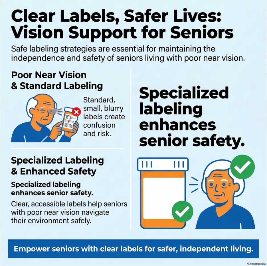
For seniors with poor near vision, the problem is not just “small print.” Aging eyes may also struggle with glare, contrast, color differences, shadows, peripheral awareness, and the fatigue that comes from reading small objects repeatedly.
Near vision is not the only issue
Poor near vision makes small labels hard to read, but it often travels with other problems. A senior may have cataract glare, macular degeneration, diabetic eye disease, dry eye, glaucoma field loss, tremor, arthritis, or memory changes. The result is a routine that demands too much precision from both eyes and hands.
That is why a good labeling system uses more than bigger words. It gives the bottle a visual identity, a tactile identity, and a home.
Look-alike bottles create look-alike decisions
Many medicated eye drops are dispensed in bottles that are nearly identical at first glance. A glaucoma drop, a steroid drop, an antibiotic drop, and an artificial tear may all look innocent on the same tray.
The person using them may know the routine in broad terms but still hesitate at the exact moment of use. “Is this the right one?” becomes a daily question. Daily questions become daily fatigue. Fatigue is where mistakes sneak in wearing slippers.
The worst time to read is dosing time
Dosing often happens when conditions are least friendly: early morning, bedtime, after surgery, during pain, in a rush, or while a caregiver is managing several tasks at once.
A safe label should not require perfect concentration. It should answer the main question fast: “Which bottle is this, when do I use it, and which eye gets it?”
Quick reality check:
- Can the label be read at arm’s length?
- Can the bottle be identified without reading tiny curved print?
- Can a second caregiver understand the system in under one minute?
- Can the senior still use it on a tired, blurry, low-light day?
For more home-safety context around vision and medication routines, see this related guide on low vision medication safety. It pairs well with this eye-drop-specific system.
Make a Drop Inventory Before Labeling Anything
Before you print one label or peel one sticker, gather every eye-drop bottle in the home. Check the bathroom cabinet, bedside table, purse, kitchen counter, refrigerator if drops are stored there, travel bag, and the mysterious drawer where old medical things go to retire.
This inventory step prevents the most common early mistake: making a beautiful label for the wrong bottle, an expired bottle, or a discontinued drop.
Write down the seven things that matter
Use a plain sheet of paper, a medication list, or a large-print chart. For each bottle, record the medication name, purpose, which eye, dose, time of day, start date, and stop date if there is one.
If the senior has multiple eye doctors or recently had surgery, add the prescriber’s name. This matters when instructions change. It also helps the pharmacist or clinic sort out contradictions faster.
| Inventory item | What to write | Why it matters |
|---|---|---|
| Name | Drug name or product name | Prevents look-alike bottle confusion |
| Purpose | Glaucoma, dry eye, antibiotic, steroid, allergy, comfort | Helps caregivers understand the role |
| Eye | Right, left, or both | Reduces wrong-eye dosing |
| Timing | Morning, lunch, dinner, bedtime, or exact schedule | Supports routine labels and charts |
| Stop date | Date to discontinue, if temporary | Important after surgery or infection treatment |
| Prescriber | Doctor, clinic, or surgeon | Useful when instructions conflict |
| Refill change | New shape, cap, color, or manufacturer | Flags changes that can confuse the system |
Separate prescription, OTC, and comfort drops
Over-the-counter artificial tears can feel harmless because they are used for comfort. Still, they can confuse a schedule when placed beside prescription drops.
If a senior uses both artificial tears and medicated drops, give them different zones. For example, prescription drops can sit in a labeled “DAILY MEDICINE” tray, while artificial tears sit in a separate “COMFORT TEARS” cup. The words matter. “Medicine” and “comfort” are clearer than “important” and “extra.”
Remove old and unclear bottles from the routine area
Do not keep discontinued drops beside active drops “just in case.” That phrase sounds practical until someone accidentally uses an old steroid drop two weeks after the stop date.
Place expired, discontinued, unlabeled, or unclear bottles in a separate bag marked “ASK PHARMACIST.” Do not throw away prescription medications blindly if you need to confirm what they are. But do remove them from the daily station.
Key takeaway:
Labeling begins with sorting. If a bottle’s name, purpose, dose, eye, or stop date is uncertain, do not guess. Set it aside and ask the pharmacist or eye clinic before it returns to the routine.
Large-Print Labels That Work in Real Kitchens
A large-print label should be readable in the place where the drop is actually used. Not under perfect office lighting. Not while holding the bottle two inches from the nose. Real life has warm kitchen bulbs, bathroom glare, shaky hands, and someone calling from the other room.
The best label is short, bold, and boring. Boring is a compliment here. Boring means the label does not ask the brain to do gymnastics before breakfast.
Use short words that answer the first question
Start with the decision the senior must make. Is this for the left eye, right eye, or both eyes? Is it used in the morning or at bedtime? Is it the glaucoma drop, post-surgery drop, antibiotic drop, or comfort tear?
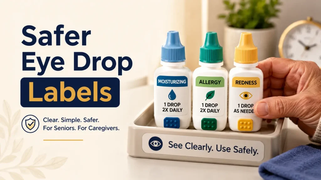
Short labels work best: “LEFT EYE,” “BOTH EYES,” “MORNING,” “BEDTIME,” “DRY EYE,” “PRESSURE,” or “STOP JUNE 18.” Avoid squeezing full instructions onto a tiny sticker. The official label already carries the formal directions.
Choose contrast before style
High contrast helps aging eyes more than decorative design. Black text on white, black text on bright yellow, or dark navy text on white often works better than pale blue, lavender, gray, or glossy labels.
Avoid script fonts, narrow letters, transparent tape over handwriting, and labels that shine under direct light. If the label is pretty but hard to read, it is just wallpaper with ambition.
Place labels where the bottle is held
The bottle body is usually safer than the cap because caps can be switched. Place the large label on the body in a way that does not cover the original pharmacy label, expiration date, or dosing instructions.
For very small bottles, consider a bottle sleeve, tag, small flag label, or a labeled storage compartment instead of wrapping the whole bottle. If the bottle becomes harder to squeeze or the dropper tip is affected, the label has become a new problem.
Large-print label recipe:
- Use one main word or phrase, such as “BEDTIME” or “LEFT EYE.”
- Print or write in bold uppercase letters.
- Choose high contrast, not pastel colors.
- Keep the official pharmacy label visible.
- Test the label at the actual dosing location.
If the main struggle is pharmacy print size across medications, this guide on medication labels that are too small for seniors may help you build a broader system beyond eye drops.
Color and Texture Cues That Do Not Turn Into a Puzzle
Color coding can be useful, but color alone is not safe enough for many seniors. Cataracts, low contrast sensitivity, poor lighting, color vision changes, and memory fatigue can make colors less reliable than caregivers expect.
Texture adds another channel. When eyes struggle, fingers can help. A raised dot, rubber band, textured tape, or bottle sleeve can turn a look-alike bottle into a bottle with a physical signature.
Assign color by time, not by mood
A simple option is to assign colors by dosing time. Morning might be yellow, dinner might be green, bedtime might be blue. The same color should appear on the bottle, the chart, and the storage tray.
Do not create a rainbow parliament where every bottle has a color but no one remembers what the color means. A color system should reduce thinking, not require a legend hidden behind the cereal boxes.
Pair every color with words
A bedtime drop should not be “the blue one.” It should be a blue label that also says “BEDTIME.” A right-eye drop should not be “the green one.” It should say “RIGHT EYE.”
This protects the system when lighting changes, a new caregiver visits, or the senior cannot distinguish the color confidently that day.
Give each bottle one tactile signature
Texture works best when it is simple. One raised dot can mean morning. Two raised dots can mean evening. A rubber band can mean bedtime. A rough-textured label can mark the bottle that must not be skipped.
Be careful not to overload the bottle with bumps, bands, stickers, and tape. The hand needs one clear cue, not a miniature obstacle course.
Key takeaway:
Color helps most when it is paired with large words. Texture helps most when each bottle has one easy-to-remember tactile cue. If the system needs a long explanation, simplify it before using it.
For more detail on choosing between raised dots and textured tape, you may find this guide on bump dots vs tactile tape useful.
Build a Dosing-Time System Before the Cap Comes Off
The safest eye-drop routine does not begin with the bottle in the hand. It begins before the cap comes off, when the person can still check the chart, confirm the time, and identify the correct bottle calmly.
Timing labels are powerful because many seniors do not think in drug names. They think in routines: breakfast, lunch, dinner, bedtime, after surgery, before the ride to church, after the evening news.
Label time in plain language
Use words the person naturally uses. “MORNING” may be clearer than “once daily.” “BEDTIME” may be clearer than “nightly.” “DINNER” may be easier than “evening dose.”
If exact spacing matters, ask the pharmacist or doctor how to phrase it. Some drops need separation from other drops. Some post-surgery schedules change week by week. The label should not flatten important instructions into something too vague.
Use a large-print chart near the station
A daily eye-drop chart gives the system a brain outside the body. It can list the bottle, eye, time, and a checkbox for each dose. It also helps caregivers avoid the dreaded question: “Did we already do the noon drop?”
Place the chart where the routine happens. A chart in a folder is a wish. A chart taped near the tray is a tool.
Add stop dates for temporary drops
Temporary drops deserve special attention. Antibiotic, steroid, anti-inflammatory, or post-surgery drops may have a stop date or a tapering schedule. A bottle that was essential last week may be wrong next week.
Use a large label that says “STOP AFTER JUNE 18” or “ASK BEFORE USING AFTER FRIDAY.” Put the same stop date on the chart. When the stop date arrives, move the bottle out of the active station unless a clinician says otherwise.
Simple eye-drop chart template:
| Time | Bottle label | Eye | Check after use | Notes |
|---|---|---|---|---|
| Morning | Yellow label | Both eyes | ☐ | Use after washing hands |
| Dinner | Green label | Right eye | ☐ | Confirm with pharmacy if schedule changes |
| Bedtime | Blue label plus rubber band | Left eye | ☐ | Keep separate from artificial tears |
Storage Design Is Half the Label
A label tells the bottle who it is. Storage tells the bottle where it belongs. You need both.
If all bottles live in one crowded pouch, the senior still has to search. Searching is where look-alike mistakes happen. A good storage system puts the right bottle in the right place before the person has to choose.
Create one eye-drop station
Choose one primary place for active drops: a tray, basket, divided organizer, drawer insert, or small box. Keep it clean, dry, well lit, and easy to reach.
Avoid storing active drops in several places unless the routine truly requires it. When bottles roam between purse, bathroom, nightstand, and kitchen, the system becomes a migration pattern with a prescription label.
Match compartments to time of day
If there are several drops, use divided compartments labeled “MORNING,” “DINNER,” and “BEDTIME.” The bottle label, chart, and compartment should agree.
For a senior who does better with routines than reading, placement can be a major safety cue. The morning bottle lives in the morning space. The bedtime bottle lives in the bedtime space. The system whispers before anyone has to think.
Separate current from old
Expired and discontinued drops should not live in the same tray as active drops. Even if the senior “knows not to use them,” a tired day can turn knowledge into guesswork.
Use a clear rule: active drops only in the active station. Questionable drops go into a separate bag for pharmacy review. Empty bottles leave the station quickly so they do not become decoys.
The eye-drop safety loop
1
Inventory
Confirm name, eye, timing, purpose, and stop date before labeling.
2
Label
Use large words, strong contrast, and one tactile cue per bottle.
3
Separate
Keep current drops apart from old, unclear, or comfort-only drops.
4
Audit
Re-check after refills, doctor visits, surgery instructions, or confusion.
Short Story: The Blue Band That Saved Bedtime
Marion used three eye drops after cataract surgery. Her daughter, Elise, wrote the instructions neatly on a card, placed all three bottles in a pretty dish, and felt briefly victorious.
By the third night, Marion was anxious. The bottles looked alike, the card felt crowded, and bedtime had become a small exam she did not want to fail.
Elise changed the system. She moved the daytime drops to one side of the tray and put a blue rubber band around the bedtime bottle. The chart said “BEDTIME: BLUE BAND.” Nothing fancy. No tiny codes.
The lesson was simple: Marion did not need more information. She needed the right information at the right moment, in a form her eyes and hands could recognize.
Caregiver Checks That Take Two Minutes
A labeling system is not finished when the sticker dries. It needs small checks, especially when prescriptions change, bottles are refilled, or more than one caregiver helps.
Think of the check as a friendly smoke alarm test. It is not dramatic. It just keeps the house from trusting a silent failure.
Compare bottle, chart, and prescription
Every so often, compare the bottle label, the homemade label, and the chart. Confirm the medication name, eye, dose timing, and stop date.
If the doctor changed directions by phone, update the chart only after confirming the new instruction. Write the date of the update so everyone knows when the change happened.
Watch one real dose without hovering
Occasionally watching a senior use the system can reveal problems no chart can show. Maybe the label faces the wrong way. Maybe the cap is hard to open. Maybe the bottle is hard to squeeze. Maybe the person cannot tell whether the drop went in.
The tone matters. This is not surveillance. It is troubleshooting. Ask, “What part of this is annoying?” The annoying part is often where the next error is waiting.
Re-check after every refill
Refills can change the whole visual identity of a drop. The bottle shape may be different. The cap color may change. The label may sit in a new place. A generic manufacturer may look nothing like the old one.
After each refill, treat the bottle as new until it is added to the system. Transfer the large-print label if appropriate, update the chart, and remove the empty or old bottle from the station.
Two-minute caregiver audit:
- Are only active drops in the station?
- Can the senior identify each bottle without squinting?
- Does the homemade label match the pharmacy label?
- Are stop dates still current?
- Did any refill change the bottle shape, cap, or label position?
- Do all caregivers use the same words for the same bottle?
Show me the nerdy details
A strong eye-drop labeling system works because it reduces cognitive load. Instead of asking the senior to read small print, remember the bottle shape, recall the timing, and verify the eye all at once, the system breaks the task into cues: visual, tactile, spatial, and routine-based.
Large print supports recognition. High contrast supports visibility. Texture supports touch. Storage supports location memory. A chart supports sequence and confirmation. The safest system is not one cue doing all the work. It is several simple cues agreeing with one another.
Common Labeling Mistakes That Increase Risk
Some labeling ideas look helpful at first and become risky later. The danger is usually not dramatic. It is quiet, practical, and easy to miss.
The test is simple: will this label still make sense to the senior, a visiting caregiver, and a pharmacist after a refill or schedule change?
Mistake one: covering the official label
A big sticker that hides the drug name or directions is not an accessibility fix. It is a fog machine.
Place homemade labels on clear areas of the bottle, on a sleeve, on a tag, or on the storage compartment. The pharmacy label should remain readable.
Mistake two: using clinical abbreviations
Abbreviations such as OD, OS, OU, BID, QHS, or PRN may be familiar to clinicians, but they are not friendly to most households. Even simple initials like R and L can be misread under stress.
Use full words: “RIGHT EYE,” “LEFT EYE,” “BOTH EYES,” “BEDTIME,” “MORNING,” and “AS DIRECTED.” Plain words are not childish. They are safer.
Mistake three: labeling only the cap
Caps can be swapped. This is especially easy when several bottles are opened during the same routine. A cap-only label may confidently identify the wrong bottle.
Label the bottle body, sleeve, or storage space. If you also label the cap, treat it as a backup cue, not the main identity.
Mistake four: keeping discontinued drops near active drops
Old drops are tiny gremlins. They look useful, take up space, and wait for a rushed morning.
If a drop is stopped, expired, unclear, or replaced, remove it from the daily station. Ask the pharmacist how to dispose of it safely or whether it should be brought in for review.
| Shortcut | Why it can fail | Safer replacement |
|---|---|---|
| “The blue one” | Color may be hard to see or remember | Blue label plus “BEDTIME” text |
| Cap label only | Caps can be switched | Label bottle body or sleeve |
| R / L only | May be misread or forgotten | RIGHT EYE / LEFT EYE |
| One bag for all drops | Creates rummaging and mix-ups | Divided tray by time or purpose |
| Old drops kept nearby | Invites accidental reuse | Separate bag marked “ASK PHARMACIST” |
If similar-looking medication containers are a broader household issue, this article on similar-looking pills can help you apply the same safety thinking beyond eye drops.
When to Seek Help or Stop Relabeling
Sometimes the problem is not the label. It is unclear instructions, a changed prescription, a symptom that needs medical attention, or a routine that has become too complicated for home fixes.
Knowing when to stop relabeling is part of safety. The sticker drawer has limits.
Call the pharmacist when anything does not match
Call the pharmacist if the bottle directions conflict with the doctor’s note, if a refill looks different, if two bottles seem similar, if the dose changed, or if you are not sure whether a bottle is still active.
Pharmacists can often explain medication names, timing language, storage requirements, and labeling options. They may also help you avoid unsafe assumptions about generic substitutions or old prescriptions.
Contact the eye doctor for new or worse symptoms
Get medical guidance for sudden vision changes, severe eye pain, worsening redness, discharge, swelling, injury, new light sensitivity, or symptoms that feel unusual after surgery.
Do not wait for the next scheduled refill if symptoms are changing. Labels help with the routine. Clinicians help with the eye.
Ask about accessibility tools
Some seniors need more than homemade labels. Ask the pharmacy, eye clinic, low-vision specialist, occupational therapist, or rehabilitation service about large-print medication lists, talking prescription labels, magnifiers, better task lighting, medication organizers, or caregiver dosing charts.
If reading is difficult in many parts of daily life, not just eye drops, a broader low-vision setup may help. Related resources on reading glasses vs magnifiers and reading glasses setup for seniors can support that next layer.
Key takeaway:
If the system still feels confusing after large print, color, texture, a chart, and separated storage, do not keep redesigning in circles. Ask a pharmacist, eye doctor, or low-vision professional to help simplify the routine.

FAQ
How big should eye-drop labels be for seniors?
They should be large enough to read at normal handling distance without squinting. Use bold, plain letters, strong contrast, and short wording such as “BEDTIME,” “LEFT EYE,” or “BOTH EYES.” Test the label where the drops are actually used.
Can I put my own sticker on a prescription eye-drop bottle?
Yes, but do not cover the official pharmacy label, drug name, directions, expiration date, warning stickers, or pharmacy phone number. If the bottle is too small, use a sleeve, tag, storage label, or ask the pharmacist for large-print options.
Is color coding safe for senior eye drops?
Color coding can help, but it should not be the only cue. Pair each color with large text and, when useful, a tactile marker. This protects the routine when lighting is poor or color differences are hard to see.
Should I label the cap or the bottle?
Label the bottle body, sleeve, or storage compartment. Caps can be switched between bottles, especially when several drops are used together. A cap label can be a backup cue, but it should not be the only label.
How do I label drops for left eye vs right eye?
Use full words: “LEFT EYE,” “RIGHT EYE,” or “BOTH EYES.” Avoid abbreviations unless the senior already understands them and the care team agrees. Full words reduce wrong-eye dosing confusion.
What should I do with old eye drops?
Remove them from the active eye-drop station. Put them in a separate bag marked “ASK PHARMACIST,” especially if you are unsure whether they are expired, discontinued, or still needed. Ask your pharmacist about safe disposal.
Are talking labels useful for eye drops?
They can be very useful for seniors with severe near-vision difficulty, low vision, or trouble reading small curved labels. Ask the pharmacy whether talking labels, large-print labels, or accessible medication tools are available.
What if two eye-drop bottles look almost identical?
Give each bottle a different large-print label, a different storage compartment, and, if needed, a different tactile cue. Confirm both bottles with the pharmacist before relabeling if the names or instructions are unclear.
Make One Safe Eye-Drop Station Today
The safest next step is small enough to do in 15 minutes: make one eye-drop station.
Gather all active eye drops. Remove expired, old, or unclear bottles from the routine area. Choose one tray or organizer. Add large-print labels for time of day and eye without covering the pharmacy label. Put a simple chart beside the station. Then ask the pharmacist to review the setup at the next refill or sooner if anything is uncertain.
Do not aim for a perfect system on the first attempt. Aim for a safer morning, a calmer bedtime, and fewer tiny bottle mysteries. That is enough for today. Tomorrow’s routine can stand on that little piece of order.
Your 15-minute setup:
- Collect every eye-drop bottle in the home.
- Separate active, old, unclear, and comfort-only drops.
- Write a simple chart with name, eye, time, and stop date.
- Add large-print labels that do not cover official instructions.
- Place active drops in one labeled tray or divided organizer.
- Ask the pharmacist to review anything uncertain.
Last reviewed: 2026-06