
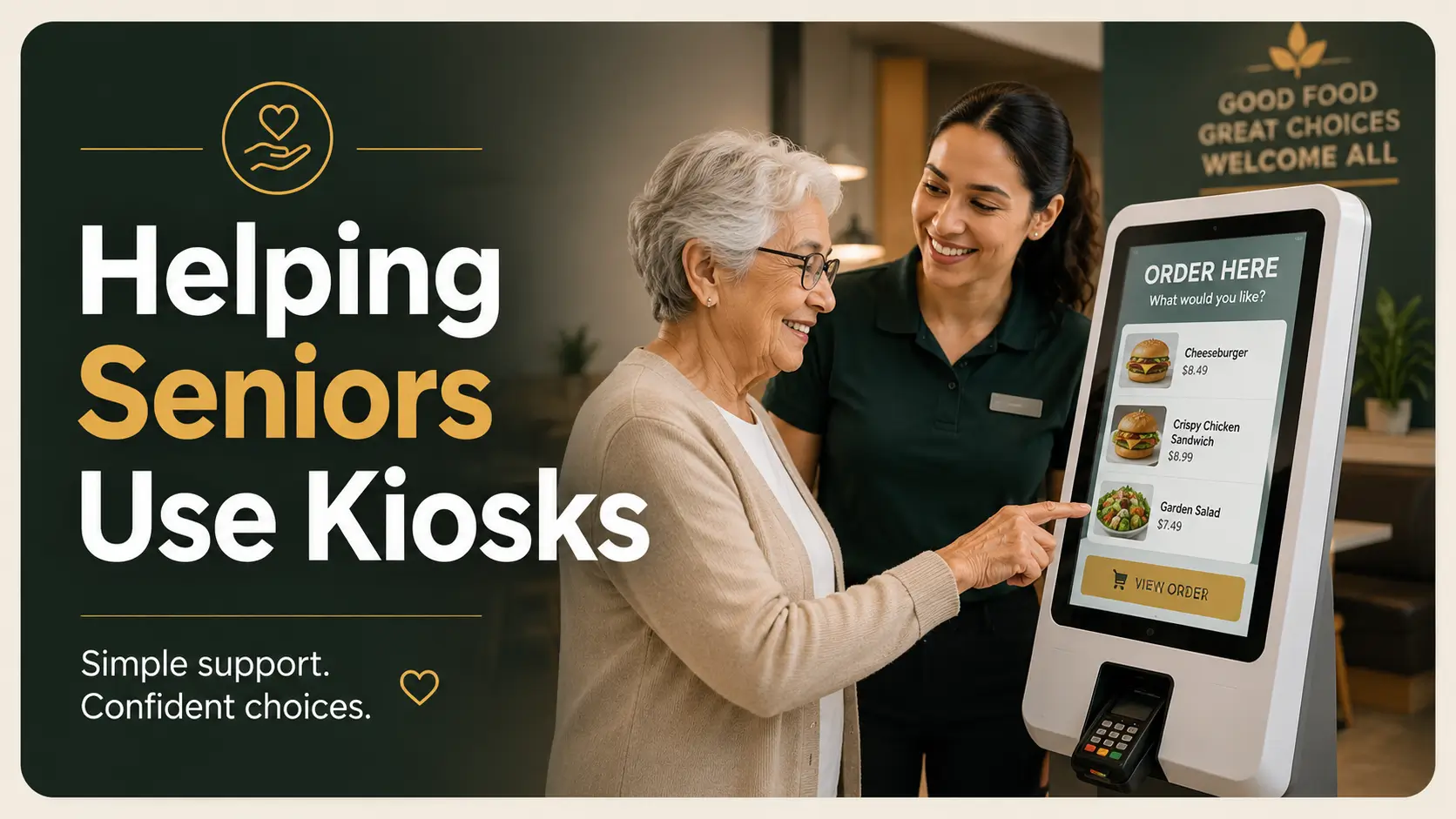
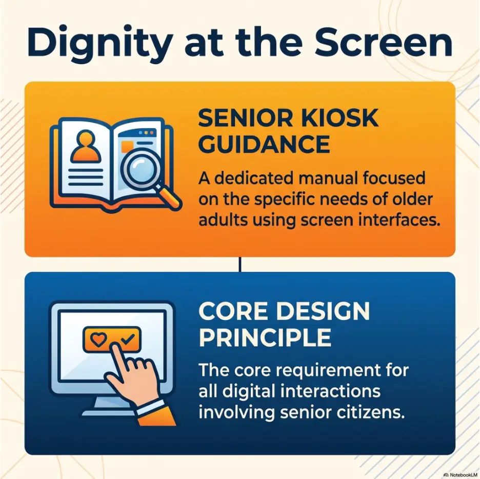
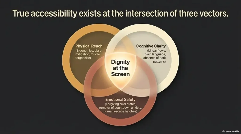
A calm, dignity-first guide for caregivers and restaurant teams
How to Help Seniors Use Self-Order Kiosks
When Near Vision Makes Every Button a Guess
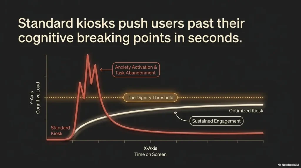
A self-order kiosk can turn an ordinary lunch into a tiny obstacle course. The menu glows under harsh ceiling lights, the lettering seems designed for sparrows, and a countdown clock quietly suggests that everyone should have decided three screens ago. For an older adult with poor near vision, the difficulty is not necessarily technology. It may be glare, focus distance, low contrast, visual fatigue, unfamiliar icons, or an interface that rewards speed over comprehension.
Good assistance does not mean taking over the screen. It means making the next decision visible, understandable, and reversible. A helpful companion or employee can reduce reflections, locate accessibility controls, read options neutrally, protect payment privacy, and confirm the order without making the customer feel like a passenger in their own meal.
This guide gives family caregivers, restaurant staff, senior-living teams, volunteers, and older customers a repeatable method for getting through the kiosk with fewer errors and less pressure. It also explains when to stop wrestling with the machine and request a human alternative, because no cheeseburger deserves a test of endurance.
See the real barrier
Separate small-text problems from glare, distance, fatigue, and confusing design.
Help without taking over
Use permission, neutral reading, and one-screen-at-a-time guidance.
Catch expensive mistakes
Check quantities, add-ons, tips, payment choices, and receipt delivery.
🧭 The goal is not to finish fastest. It is to help the customer finish confidently.
Article snapshot
This guide is for older adults with poor near vision and anyone assisting them at a restaurant kiosk. You will learn how to identify the visual barrier, adjust the setup, guide each decision respectfully, prevent ordering and payment errors, and recognize when staff-assisted service or eye care is the better next step.
Table of Contents
Who This Helps and When the Kiosk Is the Wrong Tool
A self-order kiosk is useful only when it helps a customer place the order they actually want. That sounds obvious, yet the machine often becomes the mission. Family members keep tapping because they do not want to “give up,” employees restart the order because the line is growing, and the older adult may quietly agree to choices that were never clearly visible.
The better question is not, “Can we complete this kiosk order?” It is, “Can this person understand, choose, review, and pay without unreasonable strain?” That distinction protects independence without turning independence into a performance.
The best fit for kiosk assistance
This approach works well for a senior who understands the ordering process, knows what they would like, and can make decisions but has trouble reading nearby text. The person may describe the letters as blurry, complain that the screen is too shiny, hold printed material farther away, or need extra time to move between menu categories.
The same method can help someone with contrast sensitivity, mild central vision difficulty, glare sensitivity, visual fatigue, or an unfamiliarity with touchscreen conventions. A person may see the words yet still miss a pale “Continue” button, a gray modifier, or a small quantity indicator hiding in a corner.
- The customer can express preferences and approve selections.
- The difficulty is mainly seeing, locating, or reading screen elements.
- The person can tolerate standing or sitting at the kiosk long enough to order.
- Simple verbal guidance improves performance rather than increasing confusion.
- The customer wants to use the kiosk, at least for this order.
When staff-assisted ordering is the more respectful option
A kiosk is the wrong tool when the customer cannot reliably review what has been selected, becomes increasingly tired or distressed, has difficulty controlling hand movements, cannot stand safely, or is being rushed by a short timeout. It is also unsuitable when the screen cannot be made readable enough for meaningful consent.
Switching to a cashier is not a failure. It is the restaurant equivalent of taking the ramp instead of insisting that everyone use the stairs. The outcome is the meal, not a ceremonial victory over a touchscreen.
A customer may also prefer direct staff assistance from the beginning. Ask rather than assume: “Would you like help with this screen, or would you prefer that we ask someone to take the order?” That sentence gives two legitimate options and leaves control where it belongs.
Key takeaway
Independence does not require completing every task without adaptation. Real independence includes choosing assistance, changing methods, and asking for an accessible alternative.
A quick kiosk-readiness checklist
Before beginning, use this short check. It prevents the common situation in which everyone discovers halfway through payment that the process was never workable.
| Question | Continue with assistance | Choose staff service instead |
|---|---|---|
| Can the customer identify the general menu categories? | Yes, with reading or pointing help | No, even after basic adjustments |
| Can the customer state and confirm choices? | Yes | No, or responses are inconsistent |
| Is standing or reaching safe? | Yes, or a seated position is available | No, balance or fatigue is a concern |
| Does verbal guidance reduce confusion? | Yes | No, it adds overload or distress |
| Can the order be reviewed before payment? | Yes | No accessible review is possible |
Safety and scope note
This article offers general accessibility and communication guidance. It cannot identify the cause of blurred or reduced vision. Sudden vision changes, severe eye pain, new flashes, a sudden increase in floaters, or a curtain-like shadow require prompt professional assessment. Follow the customer’s existing medical guidance and local emergency procedures.
Start Before Touching the Screen: The 20-Second Vision Check
Many failed kiosk attempts begin with a heroic amount of tapping and almost no diagnosis of the actual problem. Before selecting a language, meal, or loyalty program, spend twenty seconds discovering what the customer cannot see comfortably.
This is not an eye examination. It is a practical environmental check. You are looking for a useful adjustment, not naming a condition between the soda fountain and the napkin dispenser.
Ask what is difficult, not whether the person can see
“Can you see it?” invites a yes-or-no answer that may hide the real issue. A customer might technically see the screen while being unable to read prices, distinguish selected items, or locate the next button.
Use specific, low-pressure questions instead:
- “Is the text too small, or is the reflection the bigger problem?”
- “Does it become clearer when you stand a little farther back?”
- “Can you see the pictures but not the words?”
- “Are the pale buttons harder to find than the dark ones?”
- “Would you like me to read the choices, point to them, or both?”
These questions turn a vague struggle into a manageable task. They also signal that the interface may be the problem, which can reduce embarrassment.
Move the person before moving through the menu
Near vision often changes with distance. A customer may lean toward the screen by instinct, only to make the text less clear. Suggest a small step backward or a slight shift to one side, then ask whether the words improve.
Check posture as well. A tall kiosk can force a shorter customer to tilt their head upward, placing bright ceiling lights directly in the viewing path. A wheelchair user may be looking through a reflection that is nearly invisible from standing height. The screen has not changed, but the visual experience has.
Do not pull or reposition the person without permission. Offer your arm or describe the movement: “There is clear space behind you. Would stepping back six inches help?” Small courtesies prevent a helpful adjustment from becoming startling.
Check reading glasses without assuming they solve everything
If the customer uses reading glasses, ask whether they have them and whether they are clean. Fingerprints, steam, drizzle, and pocket lint can turn an ordinary lens into a soft-focus filter worthy of an old film romance.
Reading glasses are designed for a particular working distance. A pair that works beautifully for a paperback may feel wrong for a large screen mounted farther away. Stronger magnification is not automatically better, and borrowing someone else’s glasses may create distortion or discomfort.
For a fuller explanation of viewing distance, lens strength, and practical setup, see this guide to setting up reading glasses for seniors. It can help families troubleshoot everyday reading without turning the kitchen drawer into an archaeological site of mystery spectacles.
Key takeaway
A kiosk problem may begin with glare, posture, distance, or dirty lenses rather than an inability to understand technology. Adjust the viewing conditions before explaining the interface.
The 20-second script
- Ask, “What is hardest to see: the words, the contrast, or the reflection?”
- Try one small distance or angle change.
- Look for reading glasses and clean them if the customer agrees.
- Ask what kind of assistance the person wants.
- Decide whether the kiosk remains practical before starting the order.
Make the Screen Easier to See Before Making Decisions
Once you know the main difficulty, improve the screen conditions before reading the menu. This sequence matters. If you start listing fourteen sandwiches while the customer is still fighting a reflection, even excellent verbal help becomes more noise.
Find the hidden accessibility controls first
Accessibility controls may appear on the welcome screen, in a top corner, along the bottom edge, or behind an icon showing a person, an ear, an eye, a speaker, a gear, or a contrasting circle. Some kiosks offer larger text, higher contrast, audio output, screen repositioning, language choices, or extra time.
Look before beginning the order. Some systems make accessibility options harder to reach after the menu session starts. Others return to default settings when the order times out, which is particularly charming in the way a revolving door is charming when you are carrying soup.
- Scan all four corners of the welcome screen.
- Check the footer for accessibility or language text.
- Look for a physical headphone jack, keypad, or control panel.
- Ask staff whether the kiosk has a large-text or accessible mode.
- Confirm that a setting remains active after moving to the next screen.
Built-in settings are usually preferable to improvised magnification because they enlarge the actual controls, preserve touch accuracy, and reduce privacy concerns. Not every kiosk offers them, and not every symbol is obvious, so staff training still matters.
Reduce glare with a small angle change
Glare can erase text that is technically large enough. Bright ceiling fixtures, windows, glossy menu panels, and light-colored clothing may create reflections across the screen. Increasing brightness may help in one setting and worsen the problem in another.
Try moving slightly left or right rather than directly closer. The customer may benefit from standing off-center while the helper remains beside them. If your body blocks a ceiling reflection, make sure it does not also block the controls or force the customer into an awkward position.
A hand held above the screen may briefly test whether overhead glare is the issue, but do not keep a hand hovering over buttons. It can obscure the interface, trigger accidental touches, or make the customer feel fenced in.
Glare problems also appear on phones, televisions, counters, and printed menus. The principles in this guide to anti-glare screen protectors and visual comfort can help families understand why angle, surface finish, and lighting sometimes matter more than raw brightness.
Use phone magnification carefully, not automatically
A phone magnifier or camera zoom can occasionally help with static text, especially when the customer already knows how to use it. It can also introduce reflections, rolling bands, focus hunting, hand shake, and a narrower field of view. Enlarging one label may hide the button beside it.
Never photograph a screen that shows names, loyalty information, card details, confirmation codes, phone numbers, email addresses, or payment prompts. Ask permission before using a camera in any public setting, and follow restaurant policies.
If magnification requires one person to hold the phone, another to touch the kiosk, and a third to remember where the “No onions” option went, the workaround has become its own small administrative department. Ask for staff assistance instead.
The Clear-Screen Assistance Flow
1. Ask
Identify whether text, glare, distance, contrast, or fatigue is causing trouble.
2. Adjust
Change angle, distance, posture, or accessibility settings before ordering.
3. Point
Anchor attention near the current choice without blocking or touching it.
4. Read
Read relevant options neutrally and in manageable groups.
5. Confirm
Repeat the selection, price, and next action before moving on.
Guide Without Grabbing: A Dignity-Preserving Method
The mechanics of kiosk help are simple. The human part is more delicate. A helper can be technically correct and still leave the customer feeling hurried, exposed, or displaced.
Dignity-preserving assistance begins with permission and continues through pacing, language, position, and privacy. It treats the older adult as the decision-maker rather than a parcel being routed through lunch.
Ask before reading, pointing, or tapping
Start with a specific offer: “Would it help if I read the choices aloud?” or “Would you like me to point while you tap?” A specific offer is easier to accept or decline than the broad and slightly ominous, “Do you need help?”
If the customer says no, remain available without hovering. They may need time to adapt to the screen, or they may prefer assistance only at the review stage. Respecting a first “no” builds trust if they later ask for support.
Restaurant employees should speak to the customer, not only to the companion. Ask, “Which size would you like?” rather than turning toward the daughter, spouse, aide, or friend and asking, “What does she want?”
Stand beside the customer, not in front
Standing beside the customer supports shared attention and leaves the screen accessible. Standing directly in front suggests that the helper has taken control and may also block the best viewing angle.
Keep enough space for comfortable movement. Do not guide a hand toward the screen unless the person requests physical assistance. If tactile guidance is needed, describe it first and use the least intrusive method.
For broader guidance on offering respectful assistance, this article on helping someone with low vision without taking over explains permission, positioning, and choice in everyday situations.
Read choices neutrally rather than steering
A helper often edits the menu without noticing. “You do not want that spicy thing, do you?” is not neutral assistance. Neither is reading one preferred option in detail and summarizing the rest as “some other sandwiches.”
Read the category, the relevant options, and the prices in a consistent tone. When the list is long, ask a narrowing question based on the customer’s preference: “Would you like me to read chicken choices, vegetarian choices, or the full list?”
Neutral reading does not require reciting every ingredient on every item. It means the customer decides how to narrow the field. The helper organizes information without quietly becoming the menu editor.
Short Story: Mara, Her Father, and the Coffee Screen
Mara’s father knew exactly what he wanted: a small coffee with milk and no sweetener. At the kiosk, however, he could not find the size buttons beneath a wash of window glare.
Mara began tapping for him. He stepped back and said, quietly, “I was still looking.” She stopped, moved beside him, and asked whether the reflection or the lettering was worse.
They shifted one step to the left. Mara pointed near each size without touching the screen, read the prices, and waited. Her father selected “small,” reviewed the milk choice, and approved the total.
The order took less than a minute longer than Mara’s first approach. The important difference was invisible on the receipt: her father remained the customer, not the task. From then on, they used three words at every unfamiliar screen: point, read, confirm.
Key takeaway
Helping faster is not always helping better. Pause long enough for the customer to see, decide, and approve before the screen changes.
Use One Screen, One Decision to Prevent Visual Overload
Modern kiosks rarely ask one question at a time in a visually quiet way. A single screen may show food photographs, prices, banners, loyalty prompts, scrolling categories, nutritional text, modifier badges, and an impatient button glowing in the corner.
For someone already working hard to focus nearby, the screen can become a bright collage. The “one screen, one decision” rule converts that collage into a sequence.
Break the order into five manageable parts
- Item: What food or drink does the customer want?
- Size: Which size and price are acceptable?
- Options: What ingredients, sides, cooking preferences, or substitutions apply?
- Quantity: How many of each item are in the cart?
- Confirmation: Does the final order match the customer’s intent?
Say where you are in the sequence. “We have chosen the sandwich. This screen is only asking about the side.” That sentence lowers the amount of information the customer must hold in working memory.
After each choice, repeat it briefly: “Medium tea, unsweetened. Next is ice amount.” The repetition creates an audible trail through an interface that may otherwise feel slippery.
Use a visual anchor without touching the wrong button
Point beside the relevant choice rather than placing a fingertip directly on the touchscreen. Hold your finger steady and say, “The regular size is the middle option.” Give the customer time to locate it.
A moving finger can be harder to follow than no finger at all. Avoid circling, waving, or rapidly jumping between options. Use a single anchor, then remove your hand when the customer is ready to tap.
If the customer has a tremor, accidental selections may occur. Do not scold, gasp, or immediately seize control. Use the back button if available, confirm what changed, and continue. A mistaken tap is a design and motor-control problem, not a character review.
Read only the options needed now
Reading the entire screen may sound thorough, but it can bury the decision. Begin with the question the screen is asking, then read the choices relevant to the customer.
For example: “This page asks whether you want the sandwich alone or as a meal. The sandwich is $8.50. The meal is $11.75 and includes fries and a drink.” That is easier to process than reading promotional text, calories, limited-time offers, and every side substitution in one breath.
When prices matter, include them at the same time as the option. Do not let cost appear as a surprise several screens later. Budget-conscious customers may choose differently once an upgrade price is clear.
The Point, Read, Confirm script
| Step | What the helper does | Helpful wording |
|---|---|---|
| Point | Indicate the current choice without touching it | “The two size choices are in the center.” |
| Read | Read the relevant labels and prices neutrally | “Small is $2.40. Large is $3.10.” |
| Confirm | Repeat the selection and explain the next screen | “Small coffee selected. Next it asks about milk.” |
Show me the nerdy details
The method works because it reduces three kinds of demand at once. Pointing reduces visual search. Reading reduces the need to resolve small or low-contrast text. Confirming reduces memory demand and catches accidental selections before they accumulate.
It also creates predictable pacing. Instead of reacting to every new screen, the customer knows the same three-step rhythm will repeat. Predictability can lower pressure, especially when a timer or waiting line makes the interaction feel public.
Common Kiosk-Helping Mistakes That Create More Trouble
Most kiosk mistakes come from good intentions paired with urgency. The helper sees a simple solution, taps quickly, and accidentally removes the customer from the decision loop. Recognizing these patterns makes them easier to interrupt.
Tapping ahead before the customer understands
A helper may read “medium” aloud while already pressing it. The customer has technically heard the choice but has not approved it. Over several screens, this produces an order assembled from assumptions.
Use a two-beat pause. Read the option, wait for an answer, then tap or invite the customer to tap. This tiny pause is especially important for premium add-ons, substitutions, quantities, tips, and charitable donations.
Speaking louder when the barrier is visual
Poor near vision does not imply hearing loss, reduced comprehension, or a need for simplified adult speech. Raising your volume may attract unwanted attention while doing nothing to improve the screen.
Speak clearly at a normal conversational level. If the restaurant is noisy, ask whether the person would like you closer or would prefer to move to a quieter ordering point.
Letting the timer turn assistance into a race
Countdowns and inactivity warnings create false urgency. The helper may start making choices merely to keep the session alive. Once that happens, the machine is ordering through the customer rather than for the customer.
If a timeout warning appears, say what is happening and ask whether to continue, restart, or switch to staff service. Do not conceal the timer and accelerate without explanation.
The mistake checklist
- Do not place glasses, bags, cups, or menus against the touchscreen.
- Do not press through introductory screens before checking accessibility settings.
- Do not read sensitive information loudly.
- Do not photograph payment or loyalty screens.
- Do not assume a larger picture means the related button is easier to locate.
- Do not criticize slow responses or accidental taps.
- Do not restart repeatedly when staff can complete the order another way.
- Do not choose add-ons because they seem minor or inexpensive.
- Do not announce the customer’s visual difficulty to the line behind them.
- Do not treat the companion as the customer unless the customer requests it.
Key takeaway
When the helper starts choosing, rushing, or exposing private information, assistance has crossed into control. Slow the interaction down or change the ordering method.
Catch Errors on Confirmation and Payment Screens
The review screen is not administrative clutter. It is the moment when small visual errors become real charges. A duplicate tap, automatic meal upgrade, premium topping, or incorrect pickup setting can hide in a dense list.
Payment adds another layer: privacy. The helper’s role shifts from reading and navigation to verification followed by respectful distance.
Review the order line by line
Read each item, quantity, size, and paid modifier. Do not summarize the screen as “Everything looks right” unless the customer has independently reviewed it.
- Item name and quantity
- Size and meal status
- Removed ingredients and added ingredients
- Premium substitutions or extras
- Dine-in, takeout, curbside, or pickup setting
- Table number or pickup location
- Subtotal, tax, fees, tip, donation, and final total
Pay particular attention to quantity controls. A small “2” beside an item may be less visually prominent than the food photograph. Also check whether returning to edit one item changed another selection or removed a discount.
Explain tips, donations, and loyalty prompts plainly
Optional prompts may use large positive buttons and subdued decline choices. Read all available options without commentary. “This asks whether you want to add a tip. The choices are 15%, 20%, custom, or no tip.”
Do not tell the customer that one choice is customary unless they ask for context. Do not tap “No thanks” automatically because the screen is inconvenient. The decision may be small, but it is still theirs.
Loyalty prompts deserve similar care. Entering a phone number or email can affect privacy and marketing preferences. Ask whether the person wants to participate rather than assuming they do or do not.
Use a slower, more private payment approach
Read the final total before the card or phone is presented. Then explain the available payment methods: tap, insert, swipe, mobile wallet, gift card, or cash at the counter, depending on the machine.
When a PIN, password, wallet approval, ZIP code, or security code is required, step back and turn your gaze away. If the customer requests help, explain the location of the keypad or prompt without repeating private numbers aloud.
Never take possession of a customer’s card or phone unless your workplace procedures allow it and the customer explicitly requests that form of help. Even then, narrate what you are doing and return the item promptly.
Confirm the receipt and pickup instructions
An order is not complete merely because payment succeeded. Confirm whether the receipt printed, was sent by text or email, or was declined. Read the order number and explain where it will appear or be called.
If the customer cannot easily read the printed receipt, offer to mark or read the order number. Do not discard the receipt without asking. It may be needed for corrections, refunds, dietary questions, or reimbursement.
| Checkpoint | What to verify | Common hidden error |
|---|---|---|
| Cart | Items, sizes, quantities | Duplicate item or wrong size |
| Modifiers | Additions, removals, substitutions | Paid topping or missing allergy-related change |
| Service type | Dine-in, takeout, pickup point | Order routed to the wrong location |
| Optional prompts | Tip, donation, loyalty enrollment | Unintended selection |
| Payment | Total and method | Card inserted before total is understood |
| Receipt | Order number and delivery method | No usable proof of purchase |
Key takeaway
Read the total before payment, protect private credentials during payment, and confirm the receipt after payment. These are three separate steps, not one hurried blur.
When to Stop, Seek Staff Help, or Arrange Eye Care
Persistence is useful until it starts producing errors, fatigue, or distress. A clear stopping rule protects the customer from repeated failure and helps staff respond consistently.
Know when a second failed attempt is enough
If the kiosk times out, freezes, rejects touches, or returns to the beginning, ask staff whether the order can be recovered. Do not automatically rebuild the entire cart.
After a second unsuccessful attempt, switch methods unless the customer strongly prefers to continue and the problem has a clear fix. Repeating the same sequence under more pressure rarely creates better vision or a kinder interface.
- Stop when the customer cannot confirm what is in the cart.
- Stop when fatigue, dizziness, pain, or frustration is increasing.
- Stop when payment privacy cannot be maintained.
- Stop when the timer prevents informed choices.
- Stop when accidental taps cannot be reliably corrected.
- Stop when the customer asks to use another method.
Ask for an accessible ordering alternative
A simple request is usually enough: “The screen is not readable for this customer. Could someone take the order directly?” Other useful alternatives may include a staffed register, verbal menu assistance, a printed large-text menu, table service, an accessible app, or staff completion of the kiosk process with customer approval.
Businesses open to the public have responsibilities related to effective communication and access for customers with disabilities, although the appropriate solution can vary by situation. Staff should know whom to call and how to offer an alternative without making the customer argue for lunch.
Treat repeated near-vision difficulty as useful information
Difficulty reading one kiosk does not prove that a person’s eyesight has changed. The screen may simply be badly designed. However, repeated trouble with menus, labels, receipts, medication instructions, messages, or familiar reading tasks deserves attention.
Encourage a routine eye examination when close-up vision is gradually becoming harder, glasses no longer work as expected, one eye seems different from the other, or visual fatigue is interfering with daily activities. Aging itself does not explain every visual problem, and low vision may be associated with several eye conditions that deserve professional assessment.
Families can prepare by writing down when the difficulty occurs, whether it affects one or both eyes, whether glare makes it worse, and which everyday tasks have changed. This creates a clearer conversation than, “The restaurant screen was impossible.”
Seek prompt care for sudden or alarming symptoms
Sudden vision loss, a curtain or shadow across vision, a sudden increase in floaters, new flashes of light, severe eye pain, eye injury, or vision changes accompanied by neurological symptoms should not be treated as a kiosk-accessibility issue. Stop the activity and seek prompt professional advice or emergency care appropriate to the symptoms.
Do not diagnose the cause at the restaurant. Do not suggest that the person merely needs stronger readers. Sudden changes belong in the hands of qualified clinicians, not in a group debate beside the condiment station.
Key takeaway
A kiosk should never become a test the customer must keep failing. Change the method after repeated trouble, and treat sudden vision symptoms as a health concern rather than a technology problem.
FAQ
How can I make kiosk text easier for a senior to see?
Look for text-size, contrast, audio, or accessibility controls before starting the order. Reduce reflections by changing the viewing angle, try a slightly greater distance, and clean reading glasses if the person uses them. If the screen remains unreadable, request employee-assisted ordering rather than repeatedly restarting.
Should I complete the kiosk order for the senior?
Only when the person asks you to or cannot safely operate the screen and approves that arrangement. Whenever possible, let the customer choose the items and confirm each step while you provide reading, pointing, or navigation support.
Can a phone magnifier help with a self-order kiosk?
It may help with static text, but glare, camera shake, focus problems, screen flicker, privacy concerns, and restaurant policies can make it awkward. Built-in kiosk accessibility settings are usually better. Never photograph payment or personal-information screens.
What should I do if the kiosk has no accessibility button?
Ask an employee for another ordering method, such as counter service, verbal menu assistance, a large-print menu, or staff completion of the order. State the practical barrier clearly: “The screen text is not readable for this customer.”
Why do some seniors stand farther away to read a kiosk?
Some age-related focusing changes make very close text harder to see. A slightly greater viewing distance may improve clarity, especially when reading glasses are not matched to the kiosk’s distance. Individual needs vary, so ask what position feels clearest.
How can restaurant staff help without embarrassing the customer?
Ask permission, speak directly to the customer, stand beside rather than in front, and describe one screen at a time. Keep your voice conversational and avoid announcing the person’s visual difficulty to other guests.
What if the kiosk keeps timing out before the senior finishes?
Ask whether staff can extend the session, recover the cart, or complete the order at a register. After a second failed attempt, changing methods is usually more respectful and accurate than repeatedly starting over.
Is difficulty reading a kiosk always caused by poor eyesight?
No. Glare, dirty screens, low contrast, small touch targets, confusing icons, cognitive overload, language differences, fatigue, and poor interface design can affect many users. Identify the barrier before assuming the cause.
Practice the Point, Read, Confirm Routine in 15 Minutes
The best time to learn kiosk assistance is not during the Saturday lunch surge with six people waiting and a milkshake machine conducting industrial percussion nearby. Practice once in a low-pressure setting.
A simple 15-minute practice plan
- Minutes 1–3: Ask the senior which screen features are hardest to see: small text, glare, pale buttons, pictures, or prices.
- Minutes 4–6: Test one distance adjustment and one angle adjustment. Locate accessibility controls without starting an order.
- Minutes 7–10: Practice pointing beside a choice, reading two options neutrally, and waiting for approval.
- Minutes 11–13: Review a sample cart for size, quantity, add-ons, and total.
- Minutes 14–15: Agree on a stopping rule, such as switching to staff service after two failed attempts or whenever the customer cannot verify the cart.
The helper’s pocket card
POINT • READ • CONFIRM
Point: Indicate the current choice without covering or activating it.
Read: Give the relevant options and prices in a neutral tone.
Confirm: Repeat the selection and say what the next screen will ask.
Stopping rule: If the customer cannot review the cart, privacy cannot be protected, or the kiosk fails twice, request staff-assisted ordering.
A five-question drill for restaurant teams
- Where are the kiosk’s accessibility controls?
- Can the timeout be extended or the cart recovered?
- What accessible ordering alternative can staff offer immediately?
- How should an employee protect customer privacy during payment?
- Who handles a complaint when the kiosk is not usable?
Staff should be able to answer those questions without improvising in front of the customer. A polished accessibility response is not a grand speech. It is a calm transition from “This screen is not working for you” to “Here is another way we can take your order.”
Your next step today
Choose one quiet restaurant or café and practice the routine with a low-cost, uncomplicated order. Do not aim for speed. Notice the screen angle, locate the accessibility controls, and use the same three-step rhythm from the first choice to the receipt.
Point to what matters. Read without steering. Confirm before moving on. Those three actions are small enough to remember in a noisy room, yet strong enough to return clarity, privacy, and ownership to the person standing beside you.
When the kiosk cooperates, the method makes ordering easier. When it does not, the same method reveals that quickly and gives everyone permission to choose a human route. That may be the most useful accessibility skill of all: knowing that the screen is only one doorway.
<div style="background:#f6f9f8;border:1px solid #d5dfdc;border-radius:14px;padding:20px 22px;margin:30px 0 0 0;"> <p style="margin:0 0 8px 0;"><strong>Last reviewed:</strong> 2026-07</p></div>