

Low-Vision Spice Labeling: Built for the Heat of the Kitchen
Spice labels don’t usually fail on the shelf. They fail at the sink, mid-refill, when three wet lids are auditioning for the wrong jar.
If you have low vision, the “cute label” approach turns into sticker clutter, tiny fonts, and a slow-motion scavenger hunt that peaks exactly when dinner needs to happen. One bad grab can quietly wreck a dish.
The Lid-First System:
- Bold 2–4 Letter Codes in high-contrast large print.
- Low-Profile Tactile Markers (bump dots or thin bands).
- A Simple Master Key you never have to memorize.
- The Rotation Rule: The lid follows the spice to prevent label drift.
Set it up once. Test it in 3 seconds. Let the shelf stay calm while you cook.
Table of Contents
Top-only codes: the “clean counter” method
Lid-only placement standard (no side labels, no wraparounds)
Pick one rule and stop negotiating with your future self: identify on the lid only. No wrap labels. No tiny side text. Your hand naturally brings the lid toward you, and your eyes scan the top fastest. I realized this after I kept “finding” oregano by picking up three jars and squinting at their sides like they owed me money.
- Write in the same spot on every lid (center is easiest).
- Keep letters bold and simple (blocky beats fancy).
- Don’t cram extra info onto the lid. That’s what the key is for.
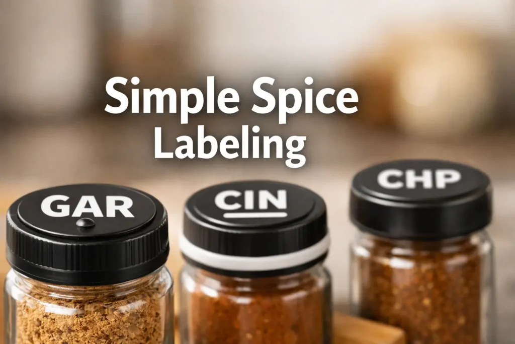
Code format that reads fast: 2–4 letters + one cue
Use 2–4 letters plus one tactile cue. Letters are for reading. The cue is for confirming when your eyes are tired.
- Examples: CIN, GAR, PAP, CUM, ORE.
- One cue only: dot or thin band (binary is durable).
The master key that makes codes usable (without memorizing)
Codes without a key become a riddle. Keep a master key as a printed card (drawer) and a phone note (backup). Two locations, one truth. If you like having a single-page reference you can grab in one glance, borrow the same “one sheet, one truth” idea from a one-page medication list template and repurpose it as a spice-code key.
Mini key example
- CIN → Cinnamon
- CHP → Chili powder
- SMK → Smoked paprika
Curiosity gap: the one code length that feels “too short”… but works
Two-letter codes feel risky, but they work when they mean “family first.” PP can mean “pepper family,” then the tactile cue or a third letter splits BLK vs CAY vs CHP. Speed comes from recognition, not spelling.
- Use 2–4 letter codes.
- Add one tactile cue for confirmation.
- Keep a master key so you don’t memorize.
Apply in 60 seconds: Label your top 5 spices with bold lid codes.
Rotation rule: how labels stay true after refills
Rule #1: Lid follows spice, jar is disposable
This is the heart of it: the lid belongs to the spice. When you refill or swap jars, the coded lid moves with the spice. This single rule prevents the quiet failure where everything looks labeled but nothing is trustworthy. If you want a similar “placement standard” mindset for tactile labels (what goes where, so it stays consistent), see how the logic applies in pill bottle tactile label placement and steal the consistency rules for your kitchen lids.
Rule #2: Refill flow (so you never “orphan” a lid)
- Set the coded jar down, lid face-up in the same spot every time.
- Refill, close, then touch the cue as your “done” check.
- Return the jar to its cluster before starting the next.
Rule #3: The “swap-day” protocol for washing/decanting
Wash day is where systems drift. Work one spice at a time and use a tray so lids don’t roam. I learned this after I created two “PAP” lids on a Sunday and spent the week playing “which one is the liar?”
Here’s what no one tells you… most systems fail at the sink, not the shelf
Shelves are predictable. Sinks add water, towels, and distraction. Protect the system with the rotation rule, not heroic memory.
Eligibility checklist
- Yes if you want fast scanning with minimal visual noise.
- Yes if you refill often and hate “label drift.”
- Maybe not if you need full ingredient/allergen info on every container.
Neutral next step: Test on 10 jars for one week.
The 3-second grab test: can you identify it one-handed?
The test (grab, read, confirm, return) in under 10 seconds
- Grab a jar with one hand.
- Read the lid code at arm’s length.
- Confirm with one touch of the tactile cue.
- Return it to the same spot.
If you keep drifting past 10 seconds, the system needs bigger letters or cleaner collisions. It’s not you. It’s the setup.
Shelf height + lighting: where the lid is easiest to read
- Best zone: chest to eye height.
- Avoid deep shadows (deep shelves, dark corners).
- Angle lights to hit lids, not your eyes. If glare is the villain in your kitchen story, you’ll want a practical setup like glare-free under-cabinet lighting so the lid surface stays readable without turning your eyes into a squint marathon.
Open loop: why your “best label” fails when you’re hungry
Hunger makes everyone a speed-reader. That’s why the label has to be bold and confirmable by touch. Design for the tired version of you.
Operator truth: If your system requires perfect lighting and calm, it won’t survive Tuesday.
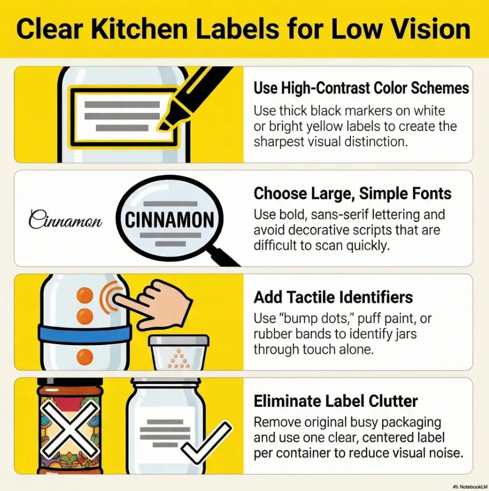
Tactile cues without chaos: dots, bands, and edges
Organizations like the American Foundation for the Blind often point to simple tactile markers (dots, bands) for everyday identification, and Hadley frequently recommends raised-dot style markers as an easy, low-drama way to “feel” settings and items in the kitchen. If you want a concrete feel for what “low-profile, confirmable by touch” actually means in daily life, the same logic shows up in tactile dots for microwave buttons, where placement and snag-resistance matter more than perfection.
One tactile cue per lid (keep it binary, not artistic)
Keep it simple. A single dot or a single band is enough. Too many shapes becomes tactile clutter. (This “one cue, one meaning” rule also plays beautifully with other systems, like a low-vision clothing tag system, because your hands learn faster than your eyes some days.)
Options that don’t snag: raised dot, thin ring, edge notch
- Raised dot (low-profile “bump dot” style): fast confirmation.
- Thin silicone band: great for category signals like “heat.”
- Edge notch: permanent, but only if smooth and safe.
Tactile hierarchy (when you have similar codes: CIN vs CIL)
Use the third letter as the tiebreaker, and the tactile cue as the final confirmation. Example: CIN (dot) vs CIL (band). It’s overkill until the first mis-grab. Then it’s genius.
Let’s be honest… if it catches on a towel, you’ll stop using it
Choose low-profile cues that wipe clean. Annoying labels get removed. Reliable labels get used.
Show me the nerdy details
Finger-readability comes from a clean height change you can detect with light touch. Too tall snags. Too soft disappears. Aim for “one fingertip confirms in one second.”
- National Eye Institute (NEI): Low Vision overview and practical guidance
- American Foundation for the Blind (AFB): Accessible identification systems for daily items
- Hadley: Low-vision tips for the home and kitchen
Big-print clarity: making lids readable at arm’s length
Font + contrast rules for US kitchens (glare, stainless, under-cab lights)
- Block letters beat thin scripts.
- High contrast (black/white) beats pastel.
- Matte lids beat glossy lids.
The National Eye Institute notes that low vision can make everyday tasks hard even with standard correction, which is why your label needs to carry more clarity than a typical “cute” jar.
Permanent marker vs label tape vs printable circles
Marker (Sharpie-style) is fastest. Label tape (Brother P-touch, DYMO) is consistent for shared kitchens. Printable circles (Avery-style) look tidy if you like batch prep. I started with marker because I wanted dinner, not a craft weekend. If you’re the type who prefers a ready-to-print reference you can keep near where you work, you may also like the idea of a low-vision medication tracker printable, and using that same print-and-place habit for a spice master key.
“High-signal abbreviations” that don’t collide (GAR vs GRA)
Choose distinctive letters, not just the first letters. If “GAR” collides with “garam masala,” use GMS. If two codes look similar in your handwriting, change one now.
Curiosity gap: the most common spice pair that causes mis-grabs
In many kitchens it’s paprika vs chili powder. Both are red. Both live near each other. The fix is a second discriminator, not better squinting.
- Write larger than you think.
- Reduce glare where possible.
- Fix collisions early.
Apply in 60 seconds: Rewrite your smallest lid code two sizes larger and retest from arm’s length.
Similar-spice defense: preventing “paprika vs chili powder” mistakes
Confession: I once dusted cumin onto cinnamon toast and spent two bites trying to decide whether I hated it or had invented a new genre of breakfast. Similar-looking jars are where labeling stops being “organization” and becomes mistake-prevention.
Collision-proof coding: add a second discriminator (one extra letter or cue)
Use an extra letter (PAP vs CHP) or a different cue (dot vs band). Make “band means heat” a house rule if you use it. If you want a parallel example of how “one rule prevents chaos” scales in other rooms, see the same approach used in tactile thermostat labeling, where consistency beats complexity.
Family clusters: alliums, warm spices, herbs, peppers
Cluster by family so you’re not searching the whole shelf:
- Alliums: GAR, ONI
- Warm: CIN, NUT, CLV
- Herbs: ORE, THY, BAS
- Peppers: BLK, CHP, CAY, PAP/SMK
The “heat warning” cue for spicy blends (without labeling everything)
Use one cue (thin band) only on the jars that can ruin a dish if mistaken. You don’t need to warn yourself about parsley. You do need to warn yourself about cayenne.
Decision card: how much labeling is enough?
- A: Code only (fastest).
- B: Code + one tactile cue (best balance for most homes).
- C: Braille + large print (best if someone reads Braille and you’ll maintain it).
Neutral next step: Use one option for your top 10 spices first.
Container choice: lids that support low-vision reading
Best lid shapes for top-only codes (flat, matte, non-glare)
Flat and matte is your friend. Tiny domed shiny lids are the enemy. I tried them once and every code turned into reflective “modern art.”
When to standardize jars (and when it’s not worth it)
Standardize if lids vary wildly or glare is constant. Otherwise, fix the rule first and upgrade containers later.
Avoiding the “cute jar trap” that kills readability
If the set is optimized for photos, check whether it’s optimized for reading. Ornate fonts and glossy lids look sleek, then punish you at dinner time.
Who this is for / not for
For: low-vision cooks, aging eyes, ADHD-friendly kitchens, shared households
For anyone who wants a shelf that works in real life: rushed meals, imperfect lighting, shared hands putting things back “almost” correctly.
Not for: households needing full ingredient lists on-container (allergens/diet needs)
If you need full ingredient or allergen info on each container, keep lid codes for identity but add a minimal side note on the few high-stakes blends.
If you share the kitchen: how to keep it readable for everyone
- Use big print that sighted users can read instantly.
- Keep the master key visible (drawer or inside cabinet door).
- Teach the rotation rule once, then post it for a week.
Common mistakes: the label graveyard (and how to avoid it)
Mistake #1: Writing full names everywhere (clutter that stops working)
Full names create tiny letters and visual noise. Codes let you write bigger.
Mistake #2: Inconsistent abbreviations (CIN vs CN vs CINN)
Pick one code and lock it in the key. If you change it, change lid and key the same day.
Mistake #3: Codes without a key (you’ve built a riddle, not a system)
No key means you’re relying on memory. Memory is not a storage plan.
Mistake #4: “Temporary” labels that become permanent lies
If a label is faded or questionable, replace it or remove it until it’s correct. Trust is the whole point.
Mini calculator: label sprint time
Estimated time: 23 minutes.
Neutral next step: Label in one batch so abbreviations stay consistent.
Don’t do this: failure modes that look organized (until they don’t)
Don’t mix lid styles across brands (glare + tiny type = invisibility)
Different finishes create different glare patterns. If you standardize one thing, standardize lid finish.
Don’t store by “vibes” (you’ll create a spice scavenger hunt)
“Vibes” storage looks nice and wastes time. Cluster by family and return jars to the same zone.
Don’t rotate spices without rotating lids (how drift begins)
Drift begins when lids and spices stop traveling together. Repeat the rule: lid follows spice.
Open loop: the one exception where a side label is worth breaking the rule
Exception: critical safety info. If a blend needs ingredient or allergen notes, add one short side line in big print on those few items only. The lid still carries the main identity.
Short Story: The night the “CAY” jar saved dinner (120–180 words)
My friend’s dad cooked fast, but his vision had been fading. One evening he reached for “cinnamon” and the room filled with that peppery sting. He froze, then did the quiet thing proud people do: pretended it was on purpose. We didn’t argue. We just built a lid-only setup the next morning: big codes, one low-profile bump dot, and a three-line master key taped inside the cabinet door.
A week later on taco night, he grabbed CAY and paused. Thumb found the rim band, the heat cue. He nodded like a pilot confirming switches, then seasoned the skillet. When he put the jar back, the lid stayed with the spice through the refill. No drift. “This is cheating,” he said, smiling like he’d gotten away with something. Dinner tasted like confidence, which is a flavor you can’t buy in a jar.
Next step: a 15-minute setup you can do today
Pick 10 most-used spices, assign 2–4 letter lid codes, and create the master key
- Choose your top 10 (the ones you touch weekly).
- Write bold lid codes (marker or label tape).
- Make the master key (paper + phone).
Apply one tactile cue per lid, then run the 3-second grab test
Add one dot or band, then test in your actual cooking spot. Fix collisions immediately (PAP vs CHP is a classic).
Lock in the rotation rule: “lid follows spice” from this day forward
Post the rule inside the cabinet for a week. It’s a small nudge that prevents drift. If you want a reminder of how much systems live or die by consistent “where the label goes” rules, revisit tactile label placement on pill bottles and copy the same discipline into your spice workflow.
- Big lid codes + one tactile cue is enough for most kitchens.
- Use the grab test to find weak spots.
- Rotation rule prevents drift after refills.
Apply in 60 seconds: Draft your first 10 codes on paper before writing any lids.
FAQ
How do you label spices for low vision?
Use lid-only identifiers: a bold 2–4 letter code plus one tactile cue, backed by a master key. Keep lids traveling with spices during refills.
What is the best way to label spice jar lids?
Big, high-contrast block letters in a consistent spot on the lid. If you share the kitchen, label tape from a maker like Brother P-touch or DYMO keeps print consistent.
Are Braille spice labels worth it for beginners?
If someone reads Braille, yes. If not, large print plus one tactile cue is usually faster to maintain and still very reliable.
How do you keep spice labels from smudging or peeling?
Use matte lids, let marker ink dry fully, and wipe gently. For frequent handling, label tape often stays crisp. Replace questionable labels immediately.
How do you label spices if you constantly refill and reuse jars?
Follow the rotation rule: lid follows spice. Refill one spice at a time so lids never get orphaned, and update the master key when you add new codes.
How do you prevent mixing up paprika and chili powder?
Add a second discriminator: PAP vs CHP, plus a heat cue (band) on the spicier jar. Store both in a pepper cluster so you expect them together.
Conclusion
Short codes work because you’re building a shelf you can trust, not writing a dictionary. Lid-only codes give you a clean scan surface, the tactile cue gives you a quick confirmation, and the rotation rule keeps everything true through refills and wash days.
Infographic: The system in one view
1) Code: 2–4 letters (CIN, GAR, PAP)
2) Confirm: one tactile cue (dot or band)
3) Protect: lid follows spice (no drift)
Run the 3-second grab test and adjust only what fails.
15-minute CTA: Label your top 10 spices, run the grab test once, then cook a normal meal and note the first moment you hesitate. Fix that single friction point. Repeat next week.
Last reviewed: 2026-03.