
Senior-friendly pantry setup
How to Label Pantry Items for Seniors Who Cannot Read Small Print
without turning the pantry into a puzzle box
A pantry can look calm from the doorway and still feel like a cabinet full of whispers. The cereal box has tiny print. The soup can has a date hiding near a crimped edge. The flour and powdered sugar sit in matching jars like identical cousins at a family reunion. For a senior with aging eyes, that small daily uncertainty can become exhausting.
Good pantry labels are not about creating a magazine-perfect shelf. They are about making the next meal easier to choose, safer to prepare, and less embarrassing to ask about. A strong label says, plainly and kindly, “This is oatmeal. Use it first. It is safe for breakfast.” That little sentence can carry more dignity than a dozen decorative baskets.
This guide shows you how to build a readable, repeatable labeling system for seniors who cannot read small print. You will learn how to choose label size, color, placement, dates, icons, shelf zones, and caregiver notes so the pantry works during real life, not just during a tidy Saturday afternoon.
Read faster
Use large, high-contrast words that work from a normal standing distance.
Prevent mix-ups
Separate look-alike foods, mark allergens, and make dates impossible to miss.
Keep it alive
Create a grocery-day reset so labels do not fade into good intentions.
🍽️ The goal is simple: one glance, one clear choice, one safer meal.
Snapshot: This article is for adult children, caregivers, senior living aides, and older adults who want pantry labels that are easier to read and safer to use. It solves the common problem of tiny dates, confusing containers, look-alike foods, glare, and cluttered storage. By the end, you will be able to set up one senior-friendly pantry shelf today and keep the system working after each grocery trip.
Table of Contents
Safety Disclaimer for Senior Pantry Labeling
Pantry labeling can support independence, reduce frustration, and lower the chance of everyday food mistakes. It does not replace medical advice, nutrition guidance, occupational therapy, vision care, or caregiver supervision when those are needed.
If a senior has dementia, severe vision loss, swallowing concerns, diabetes, kidney disease, food allergies, frequent falls, sudden confusion, or repeated mistakes around meals, treat pantry labels as one part of a broader safety plan. A label can help someone find oatmeal. It cannot decide whether a food is medically appropriate.
For serious allergies, swallowing restrictions, or medical diets, ask a clinician, dietitian, pharmacist, or occupational therapist how the pantry should be organized. In higher-risk homes, the safest label may be paired with separate storage, caregiver review, and clear “ask first” instructions.
Key takeaway
A senior-friendly pantry label is not just a neatness tool. It is a small safety sign. It should make the right food easier to choose and the wrong food harder to grab by accident.
Why Small Print Fails Before the Food Does
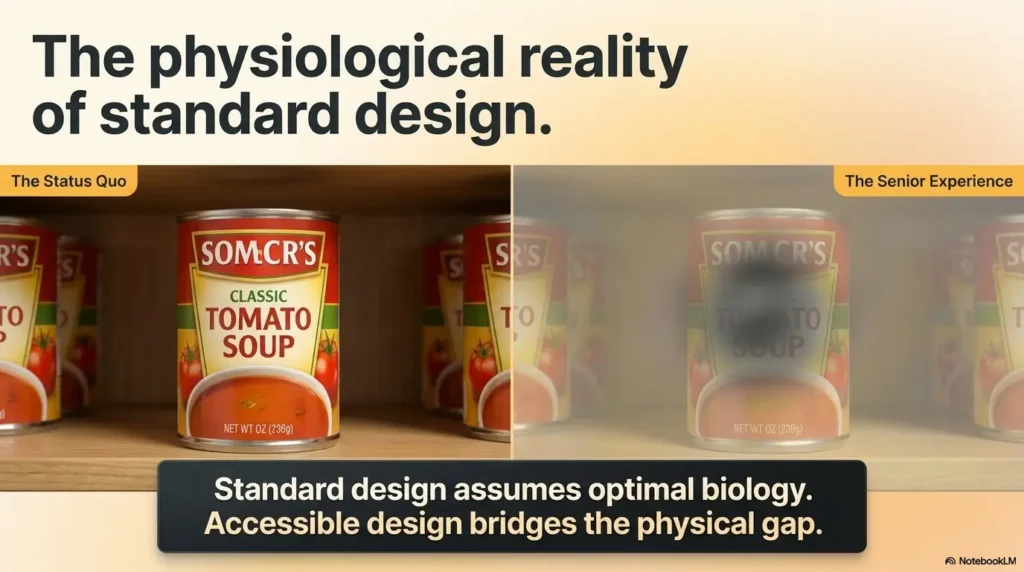
Small print fails because it asks older eyes to do too much work at the worst possible moment. Pantry decisions often happen while someone is hungry, tired, standing under uneven light, or trying to cook before a pot boils over. That is not the time to decode pale gray text on a shiny plastic pouch.
Many seniors can still read books, mail, or phone screens with the right glasses. Yet the pantry is a different reading environment. Labels curve around cans. Dates are stamped on seams. Packages use low-contrast colors because they were designed for branding, not for aging vision.
The Real Problem Is Not “Messiness”
A cluttered pantry can be difficult, but a tidy pantry can be difficult too. The issue is not whether everything lines up in pretty rows. The issue is whether the senior can identify, choose, and use the right item without stress.
Imagine six clear containers on a shelf: flour, sugar, powdered sugar, pancake mix, protein powder, and cornstarch. To a camera, it looks serene. To tired eyes at 7 p.m., it can look like a small powdered ambush.
That is why pantry labeling for seniors must begin with function. Beauty is welcome, but it does not get to sit in the driver’s seat.
Tiny Labels Turn Simple Choices Into Daily Friction
Small print creates hesitation. Hesitation creates second-guessing. Second-guessing can lead to skipped meals, repeated questions, or the quiet embarrassment of feeling dependent over something as ordinary as soup.
For a caregiver, the pantry may feel like a small issue compared with appointments, medications, bills, and transportation. For the person using it every day, the pantry is a daily stage. If the labels are confusing, the performance becomes harder every time the door opens.
Lighting, Contrast, and Memory All Compete
Aging eyes often need more light, but more light is not always better if it creates glare. Glossy labels can bounce light back like a tiny mirror. Deep shelves can cast shadows over the very words someone needs to read.
Memory can also complicate the pantry. A senior may remember where rice used to be, not where it was moved last week. A label system should respect habit instead of constantly rearranging the kitchen like a tiny domestic revolution.
Mini-check: Is the pantry asking too much?
- The senior brings items to a brighter room to read them.
- Food dates are checked only by a caregiver.
- Similar containers are often confused.
- The senior avoids cooking because finding items feels tiring.
- Expired items sit beside fresh items with no clear “use first” cue.
Who This System Helps, and When Labels Are Not Enough
This labeling system is best for seniors who can make safe food choices when the information is easier to see. It is also helpful for adult children setting up a parent’s kitchen, home aides who rotate through shared routines, and spouses who want fewer pantry detective missions.
The system is not meant to diagnose vision problems or memory changes. It is a practical home setup. Think of it as adding street signs inside the pantry. Street signs help people navigate, but they do not replace good roads, working brakes, or a driver who knows where they are going.
Best for Mild Vision Changes
Many older adults struggle mainly with small print, low contrast, glare, or crowded packaging. For them, large pantry labels can make a dramatic difference. The right label turns “I can’t tell what this is” into “That’s my oatmeal.”
This is especially useful for seniors who use reading glasses, magnifiers, better lighting, or phone zoom features but still want the pantry to be easier at a glance.
Helpful for Caregivers Managing Shared Kitchens
Shared kitchens can get messy in a social way. One person buys low-sodium soup. Another buys regular soup. A caregiver opens broth and puts it back. A grandchild visits and snacks migrate like cheerful little squirrels.
Labels give everyone the same map. When the system is simple, different helpers can maintain it without needing a tour, a binder, or a secret handshake.
Not Enough for Major Confusion or Unsafe Eating
If a senior repeatedly eats spoiled food, confuses food with cleaning supplies, ignores medical diet restrictions, or cannot remember whether they have eaten, pantry labels alone are not enough. That is not a failure of the label. It is a sign the situation has outgrown a simple home organization fix.
In that case, the next step may be caregiver oversight, meal planning support, medical evaluation, or occupational therapy. The pantry should become simpler, not just more labeled.
Short Story: The Pasta Jar That Taught the Whole System
Mara labeled her father’s pantry on a Sunday afternoon. She bought matching jars, printed tasteful labels, and stepped back feeling proud. The shelf looked like a calm little boutique.
On Tuesday, her father called to ask whether the jar in his hand was pasta or rice. The label was beautiful, but it was small, tan, and placed low on the glass. In the evening light, it had practically vanished.
Mara replaced the label with a white card, thick black marker, and one word: PASTA. She put it at eye level on the front. Then she added “Use First” to the older box beside it.
The pantry became less elegant. It also became kinder. Her father did not need a prettier shelf. He needed a shelf that answered before he had to ask.
Key takeaway
A label system should be judged from the senior’s viewpoint, under the senior’s lighting, at the senior’s normal distance. Pretty is optional. Clear is not.
The Arm-Length Label Rule
The simplest rule is this: the label should be readable from arm’s length while standing in front of the pantry. Not squinting. Not leaning. Not picking up the container and hunting for a stamp. Arm’s length is the pantry’s truth serum.
If a label fails at that distance, make it larger, darker, simpler, or better placed. Do not ask the senior to adapt to the label. Make the label adapt to the senior.
Use Large Type, Not “Large Enough”
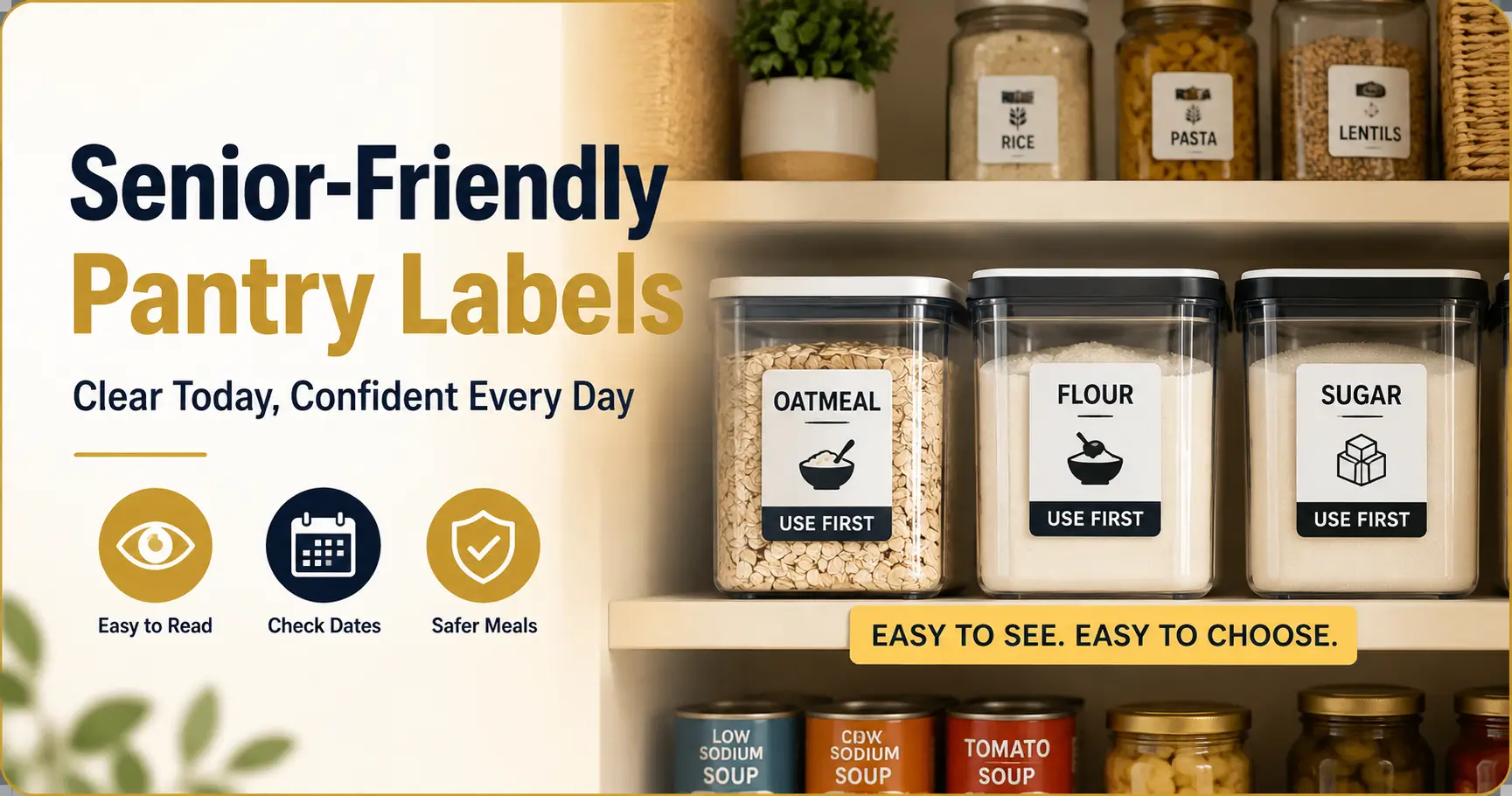
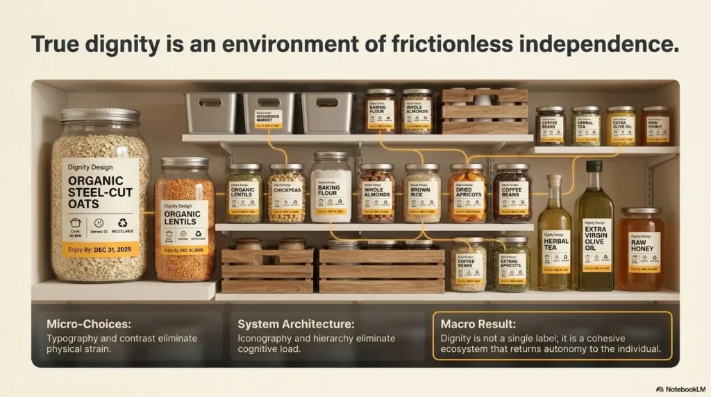
For home pantry labels, larger is usually better than elegant. Use bold, simple lettering. A thick black marker on a white label often beats fancy printed labels because it has muscle. It does not apologize for taking up space.
For frequently used items, make the item name the biggest text. If you add details, place them below in smaller but still readable writing. The label should have a clear hierarchy: what it is first, what matters next, and decoration never.
Choose Black-on-White or Dark-on-Light Contrast
High contrast is the pantry’s best friend. Black text on a white or very light background is usually easier to read than pale gray, gold foil, transparent stickers, chalkboard labels, or pastel-on-pastel designs.
Avoid glossy labels when glare is a problem. Matte paper, matte tape, or non-shiny label stock can be easier on older eyes. If the pantry has under-cabinet lighting or a nearby window, test the label during the time of day when the senior actually uses it.
Put the Item Name First, Not the Brand
Brands are not always helpful. A senior may not care whether the oats are “Old-Fashioned Country Morning Reserve” or some other cheerful grocery poetry. They need to know: OATS.
Use plain names first: RICE, PASTA, TEA, LOW-SODIUM SOUP, DOG TREATS, BAKING SUGAR. If the brand matters, add it below. The eye should land on the useful word before it meets the marketing parade.
Test It Like a Real Pantry Moment
Testing is where good intentions become useful. Open the pantry. Stand where the senior stands. Turn on the usual light. Look at the shelf for three seconds. Can you identify the item without touching it?
Then ask the senior to try. Do not ask, “Can you read this?” Many people will say yes to be polite. Ask, “Which one is the oatmeal?” or “Which soup would you use first?” The answer tells you whether the system works.
Arm-length label checklist
- Can the item name be read without lifting the container?
- Is the label on the front, not the lid or side?
- Is the most important word the largest?
- Is the date easy to find?
- Does glare make the label disappear?
- Would a new caregiver understand the label without explanation?
Color Coding That Helps Instead of Confuses
Color coding can be wonderful when it behaves. It can also become a second language nobody asked to learn. The trick is to use color as a backup cue, not as the whole message.
A good color system helps the eye find a category quickly. It does not require the senior to remember that lavender means “baking except sweeteners unless opened.” That way lies pantry opera.
Use Color for Categories, Not Decoration
Color should answer a practical question. Where are breakfast foods? Which items are low sodium? Which shelf contains snacks? Which basket should be used first?
Use color strips, label borders, or shelf tags. Keep the words large and dark. The color is there to guide, not to carry the entire meaning.
Keep the Palette Small
Four to six colors is usually enough. More than that can create visual noise, especially if the pantry already contains colorful packaging. A restrained color system works like a quiet usher. Too many colors work like a marching band in a hallway.
A simple system might use blue for breakfast, green for heart-friendly or low-sodium items, yellow for baking, orange for snacks, and red only for warnings or “ask first” foods.
Match Color Zones to Real Habits
Do not build a color system around categories the senior does not use. If they never bake, a perfect baking zone is less important than a clear breakfast zone. Start with the foods touched most often.
For example, a senior who eats oatmeal every morning may benefit from a breakfast basket labeled “Breakfast: Oats, Tea, Prunes.” A person managing blood pressure may need a low-sodium zone with large labels and fewer tempting look-alikes nearby.
| Color cue | Best use | What to write | What to avoid |
|---|---|---|---|
| Blue | Breakfast staples | BREAKFAST | Several shades of blue for different subcategories |
| Green | Regular safe foods | EVERYDAY | Using green to mean both “healthy” and “use first” |
| Yellow | Baking shelf | BAKING | Pale yellow text on white labels |
| Orange | Snacks | SNACKS | Letting snacks crowd medical diet items |
| Red | Warnings | ASK FIRST or ALLERGY | Using red for decoration so warnings lose power |
The Quiet Trap: Too Many Colors
If a color system needs a legend taped to the pantry door, it may already be too complicated. A senior-friendly label system should reduce thinking, not add homework.
When in doubt, simplify. Use fewer colors, bigger words, and more consistent placement. The best system may feel almost boring. Boring can be beautifully safe.
Key takeaway
Color should support the words, not replace them. Pair every color cue with a large plain-language label so the system still works when lighting, memory, or color vision gets in the way.
Big Date Labels That Prevent Food Spoilage
Dates deserve their own spotlight. Many pantry mistakes happen not because someone cannot identify the food, but because the date is too small, hidden, coded, or printed in a place no human should have to inspect before breakfast.
Large date labels help seniors use older food first, avoid opened items lingering too long, and reduce the “Is this still okay?” guessing game. The goal is not panic. The goal is clarity.
Write “Use By” in Bold, Plain Words
Use simple phrases: “Use By,” “Opened,” “Use First,” and “Ask Before Using.” Avoid tiny numeric-only dates when confusion is possible. “Use By: March 12” is clearer than “03/12,” especially in homes where people may interpret month and day differently.
For pantry items that are not urgent, “Best By” may be accurate on the package, but “Use First” can be more useful on the shelf. It tells the senior what to do, not just what the manufacturer printed.
Place Dates on the Front
Dates on lids, bottoms, backs, and folded corners are easy to miss. Put the date on the front-facing label. If the container is round, place the date where the hand naturally turns it back to the shelf.
For jars and bottles, put the item name high and the date directly below. For boxes, use a large white label on the front panel. For cans, use a wide strip label around the can with the item name and use-by date facing forward.
Add “Opened On” for Sauces, Broths, and Nut Butters
Some items become confusing after opening. Broth, pasta sauce, salsa, nut butter, shelf-stable milk, and certain condiments may move between pantry and refrigerator. Once opened, they need a clear date cue.
Use a thick marker and write “Opened: April 3” on the front. If the item moves to the refrigerator, the label should move with it or stay visible. For refrigerated overflow, use the same label style so the senior does not have to learn a second system.
Use a “Use First” Basket
A “Use First” basket is one of the easiest upgrades. It collects older but still usable items in one visible place. This prevents older food from hiding behind newer food like a shy little can of beans with a deadline.
Place the basket at waist to eye level. Label it clearly: USE FIRST THIS WEEK. Keep it small. If the basket becomes a pantry swamp, it stops helping.
Date label template
OATMEAL
Use By: March 12
Opened: February 28
The Pretty Pantry Problem
The pretty pantry problem begins with good intentions. Matching containers. Delicate labels. Clear bins. Everything aligned. The result may photograph beautifully, but a pantry is not a museum exhibit. It has to survive hunger, tired eyes, arthritis, tremor, memory lapses, and a caregiver rushing before work.
For seniors who cannot read small print, a minimalist pantry can become strangely hostile. The less visual information a shelf provides, the more the brain has to guess.
Clear Containers Can Erase Important Instructions
Clear containers can be helpful when they show what is inside. They can also remove cooking directions, nutrition information, allergen warnings, and original expiration dates. If you decant food, the new label must carry the important information forward.
For simple staples like rice or pasta, a large item name and use-by date may be enough. For foods with instructions, allergens, or diet details, clip or tape the important part of the package to the back of the container. Then put the large label on the front.
Matching Jars Can Make Foods Look Dangerously Similar
Matching jars create visual calm for people who can read the label easily. For older eyes, matching jars can erase useful differences. Flour and powdered sugar look similar. Couscous and quinoa may look similar. Decaf and regular coffee can look similar if both are placed in identical canisters.
Use large labels, different shelf zones, and tactile cues when needed. A rubber band around the decaf jar or a raised dot on the low-sodium container can provide an extra clue without making the shelf chaotic.
Minimalist Labels Often Fail Older Eyes
Small beige labels with thin lettering can feel tasteful. They can also vanish. Low-contrast labels are especially hard in pantries with warm bulbs, shadows, or glossy shelves.
A senior-friendly pantry can still look good, but clarity has to shape the design. Use clean white labels, bold black text, generous spacing, and consistent placement. It will look calm because it works.
What to Keep From Aesthetic Organizing
Not every pretty pantry idea is bad. Clear bins can group categories. Turntables can make small bottles easier to reach. Matching baskets can reduce visual clutter if the labels are large. The problem is not order. The problem is order that hides information.
Keep the parts that support independence. Lose the parts that require perfect lighting, young eyes, or a memory palace.
| Pretty pantry feature | Possible risk for seniors | Senior-friendly fix |
|---|---|---|
| Small script labels | Hard to read quickly | Use bold plain lettering |
| Matching clear jars | Look-alike foods blend together | Add large front labels and shelf zones |
| Labels on lids | Invisible when items are on shelves | Move labels to the front |
| Pastel color scheme | Low contrast in dim light | Use dark text on light matte labels |
| Decanted foods | Original instructions disappear | Transfer dates, warnings, and cooking notes |
Show me the nerdy details
Readable pantry labels depend on visual hierarchy, contrast, recognition, and task load. Visual hierarchy means the eye knows what to read first. Contrast helps letters stand apart from the background. Recognition reduces memory demand because the senior does not have to recall a hidden system. Task load matters because pantry reading usually happens while cooking, carrying, reaching, or deciding what to eat. A good label lowers all four demands at once: big item name, high contrast, consistent location, and one clear action cue such as “Use First.”
Icons, Shelf Placement, and Caregiver Notes
Words do most of the work, but they do not have to work alone. Simple icons, smart shelf placement, and caregiver notes can make the pantry easier for seniors who read slowly, tire easily, or need extra cues for special diets.
Think of the pantry as a small room with traffic patterns. The label tells what the item is. The shelf tells how often it is used. The icon gives a quick nudge. The caregiver note protects against mistakes that deserve more than a polite hint.
Pair Icons With Words, Never Icons Alone
Icons can help when they are simple and familiar: a bowl for oatmeal, a cup for tea, a fish symbol for tuna, or a peanut symbol for allergen warning. But icons alone can be misunderstood. A little wheat stalk might mean bread to one person and gluten warning to another.
Always pair the icon with a large word. The icon speeds recognition. The word confirms meaning. Together, they are a duet. Alone, an icon can hum the wrong tune.
Put Everyday Foods Between Waist and Eye Level
Shelf placement is part of the label. A perfect label on a top shelf may still fail if the senior cannot see it, reach it, or bring it down safely. Put the most-used foods between waist and eye level whenever possible.
Place heavier items lower, but not so low that the senior has to bend deeply. Store rarely used items on higher or lower shelves, and label those zones clearly for caregivers.
Keep Risky Mix-Ups Far Apart
Some foods should not be neighbors. Regular soup and low-sodium soup. Sugar and salt. Decaf and regular coffee. Dog treats and human snacks. Allergy-safe foods and allergen-containing foods.
Distance is a safety tool. When two items look similar or carry different health consequences, store them apart and label them differently. Do not make the label do all the work when shelf placement can help.
Write Caregiver Notes Without Shaming Language
Caregiver notes should be clear, calm, and respectful. Use “Ask First,” “Low Sodium,” “Heart-Friendly,” “For Breakfast,” or “Use With Help.” Avoid labels that sound like punishment, scolding, or surveillance.
A senior is more likely to accept a label that protects dignity. “Ask First” works better than “Do Not Eat.” “Heart-Friendly” feels better than “Bad for blood pressure.” Language can either close a door or hold it open gently.
The 5-Part Senior Pantry Label Framework
1
Name
Plain item word first.
2
Contrast
Dark text, light matte label.
3
Date
Use By and Opened front-facing.
4
Zone
Everyday foods in easy reach.
5
Reset
Update labels after groceries.
Key takeaway
A pantry label works better when the shelf helps it. Put the safest, most-used foods where they are easiest to see and reach, then use icons and notes only where they add clarity.
Grocery-Day Reset for Labels That Last
Pantry labels do not fail all at once. They fade slowly. A new box gets tucked behind an old box. A decanted food loses its date. A caregiver uses a thin pen because the thick marker wandered into another room. A month later, the pantry is once again asking riddles.
The fix is a small reset routine after each grocery trip. Not a giant reorganization. Not a full pantry excavation. Just a repeatable ritual that keeps the system alive.
Check Dates Before New Items Go In
Before putting groceries away, check the old items on the shelf. Move older items forward. Put newer duplicates behind them. If an item is close to its use-by date, move it to the “Use First” basket.
This is the pantry version of letting the oldest choir member sing the first solo. It prevents food from aging quietly in the back row.
Re-Label Decanted Foods Immediately
If you pour food into a container, label it before the container goes on the shelf. Do not plan to come back later. Later is where labels go to nap indefinitely.
Keep blank labels, thick markers, tape, and scissors inside or near the pantry. The easier the tools are to reach, the more likely the system will survive real life.
Keep a Pantry Label Kit
A simple kit prevents the “where is the marker?” problem. Use a small box, pouch, or drawer bin. Label the kit itself in large type so everyone can find it.
- Thick black marker
- White matte labels
- Painter’s tape or removable label tape
- Small scissors
- Colored dots or strips for categories
- Index cards for large temporary labels
- Rubber bands for tactile cues
Use One Small Ritual
The best maintenance system is almost laughably small. After groceries come in, spend five minutes doing three things: move older items forward, label anything new, and refresh the “Use First” basket.
Do it every time. A small ritual beats one grand reorganization because it respects the truth of kitchens: they are living rooms for food, not storage warehouses frozen in time.
Grocery-day reset checklist
- Remove items from the main high-use shelf.
- Check dates on older foods first.
- Move older safe foods to the front.
- Put almost-due foods in the “Use First” basket.
- Label new items before they go in.
- Add “Opened On” dates when needed.
- Return everyday foods to waist-to-eye-level space.
For related kitchen safety improvements, you may also find it helpful to review kitchen appliance safety for seniors, especially if pantry confusion happens alongside cooking concerns.
When to Seek Help or Stop
Sometimes pantry labeling reveals a bigger problem. That does not mean anyone failed. It means the pantry told the truth before a more serious incident did.
If a senior still struggles after labels are large, consistent, and well placed, slow down. Do not keep adding more labels, colors, arrows, and notes until the pantry looks like a tiny airport terminal. More information is not always more help.
Repeated Expired Food Use
If expired food is used repeatedly, the issue may be more than small print. The senior may not be checking dates, may not understand the system, or may be overwhelmed by too many choices.
Try reducing the number of items on the high-use shelf. Keep only current, safe, frequently used foods there. Store backup items separately for a caregiver to rotate in.
Confusion Between Food and Non-Food Items
Food and non-food items should never be stored together when confusion is possible. Cleaning products, pet supplies, medications, and household chemicals need separate, clearly marked storage.
If a senior confuses these items, seek support. This is a meaningful safety concern, not a labeling inconvenience.
Eating Foods That Conflict With Medical Instructions
For diabetes, kidney disease, heart failure, severe allergies, swallowing concerns, or other medical conditions, food choices may carry real risk. Labels can help mark “low sodium,” “sugar-free,” “soft food,” or “ask first,” but they should match professional guidance.
When in doubt, simplify the pantry so safer foods are easier to reach and restricted foods are separated or removed. Do not rely on a warning label if the mistake could cause serious harm.
Sudden Vision Changes or New Reading Difficulty
Sudden vision changes, new difficulty reading familiar labels, new double vision, severe eye pain, or a sudden dark area in vision should be treated seriously. Pantry changes can wait. Medical evaluation should not.
If the concern is ongoing low vision rather than a sudden change, a low vision specialist or occupational therapist may suggest lighting, contrast, magnification, and home safety strategies that go beyond pantry labels.
Key takeaway
If labels do not reduce confusion, do not keep making the system more complicated. Reduce choices, separate risks, and involve the right caregiver or professional support.
FAQ
What Is the Best Font Size for Senior Pantry Labels?
Use lettering large enough to read from a normal standing distance in front of the pantry. For most home labels, bold hand lettering or large printed text works better than small decorative labels. Test from arm’s length, not from a desk.
Should Pantry Labels Use All Caps?
Short all-caps labels can work well for simple words like RICE, TEA, OATS, or PASTA. For longer phrases, title case is often easier to scan. The key is large, bold, plain lettering with enough spacing.
Are Clear Containers Good for Seniors?
Clear containers can help when they show the food clearly and include large front-facing labels. They can cause problems when similar foods look alike or when important instructions and dates from the original package are lost.
What Color Labels Are Easiest for Seniors to Read?
High-contrast labels are usually easiest. Black text on white or very light matte labels often works better than pastel, transparent, patterned, glossy, or low-contrast labels.
How Should I Label Expiration Dates for Older Adults?
Use plain language such as “Use By: March 12,” “Opened: April 3,” or “Use First This Week.” Place the date on the front of the item, not the bottom, lid, or back.
Should I Use Pictures on Pantry Labels?
Pictures or icons can help, especially when paired with large words. Do not rely on icons alone unless the senior already understands the system and the icons are unmistakable.
How Do I Label Food for a Senior With Allergies?
Use bold warning labels on the front of the container and store allergen-containing foods separately when possible. For serious allergies, follow medical guidance and avoid cross-contact. A label is helpful, but separation is often safer.
How Often Should Pantry Labels Be Updated?
Check labels during each grocery trip or at least once a month. Update dates, opened items, decanted foods, and anything in the “Use First” basket first because those change most often.
Fix One High-Use Shelf in 15 Minutes
The best next step is not to reorganize the entire pantry. That can become a long afternoon with crumbs, decisions, and one mysterious bag of lentils from another era. Start with one shelf the senior uses every day.
Choose breakfast foods, soups, snacks, or medically important items. Remove everything from that shelf. Throw away clearly spoiled items. Move older safe foods forward. Put the most-used items between waist and eye level. Add large labels to the front. Write dates in plain words. Place one small “Use First” basket where it can be seen.
Then test it. Open the pantry and ask one practical question: “Can this shelf answer quickly?” If the senior can find the oatmeal, choose the right soup, or avoid the allergen without a search party, the shelf is already better.
15-minute shelf plan
- Pick the shelf used most often.
- Remove expired or questionable items.
- Group similar foods together.
- Move everyday foods to easy reach.
- Add large front-facing labels.
- Write plain-language dates.
- Create one small “Use First” basket.
- Ask the senior to find three common items.
If pantry labels are part of a broader low-vision home update, consider pairing this project with nutrition labels for aging eyes, reading expiration dates with low vision, and low-vision spice jar labels. Small fixes work best when they speak the same visual language across the kitchen.
Final practical promise
One better label can prevent one daily frustration. One safer shelf can make the next meal feel less like a test and more like home.
Last reviewed: 2026-06