
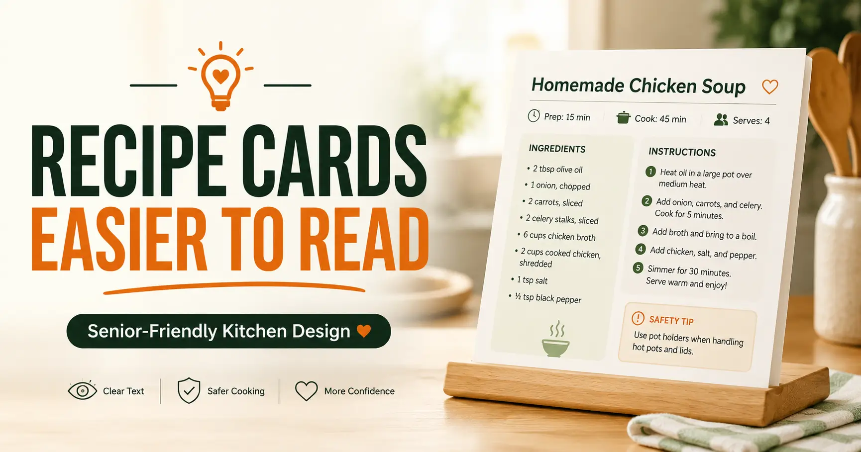
Senior-friendly kitchen design
How to Make Recipe Cards Easier for Seniors to Read
Without Turning the Kitchen Into a Clinic
A recipe card looks simple until someone has to use it while the oven is hot, the counter is crowded, the glasses are missing, and the timer is making its tiny metallic complaint. For older adults, readability is not decoration. It is independence, confidence, and safety printed on paper.
The best senior-friendly recipe cards do not merely make text bigger. They reduce visual work. They separate decisions. They move warnings before the risky step. They keep measurements from disguising themselves as dust specks. In other words, they respect the real kitchen, where steam, glare, memory, tremor, fatigue, and time all take turns at the stove.
This guide is for caregivers, food bloggers, senior centers, adult children, and anyone turning treasured family recipes into readable, usable, low-friction cards. You will learn how to redesign one recipe so it feels calm in the hand and clear from the counter.
Read faster
Use type size, spacing, and contrast that survive real kitchen lighting.
Cook safer
Place heat, knife, allergen, and timing notes where mistakes actually happen.
Waste less
Know when a free redesign is enough and when paid printing or design help may be worth it.
Small design choices can become kitchen handrails. 🍲
Snapshot
This article is for adult children, caregivers, senior living teams, food bloggers, and home cooks who want recipes that are easier for older adults to read and follow. You will learn how to improve font size, contrast, layout, safety notes, measurements, digital recipe cards, and printing choices so one recipe can be tested and improved within 15 minutes.
Table of Contents
Before You Redesign a Recipe Card
Making recipe cards easier for seniors to read starts with a quiet truth: older adults are not one identical group. One person may have excellent memory but reduced contrast sensitivity. Another may read clearly with glasses but tire quickly while standing. Someone else may be recovering from cataract surgery, managing tremor, cooking with arthritis, or using a tablet because printed cards keep disappearing into a drawer kingdom.
The goal is not to make recipes childish. The goal is to make them respectful. A good recipe card removes unnecessary friction so the cook can spend attention on the food, not on decoding a cramped paragraph while garlic threatens to burn.
Who Needs This Most
Adult children often start with a familiar family recipe. They want Mom or Dad to keep cooking independently, but the old handwritten card is too faint, too small, or too crowded. Food bloggers may be creating senior-friendly printables for readers who still prefer paper. Senior centers and care homes may need recipes that multiple people can follow with less staff intervention.
Each setting is different, but the design principles are the same: large readable text, strong contrast, predictable structure, clear timing, visible safety notes, and fewer hidden steps.
Before You Act: Safety Note
This guide can help you improve recipe readability, kitchen workflow, and general safety cues. It cannot replace medical, nutrition, occupational therapy, or dietitian guidance. If a recipe must follow kidney, diabetes, swallowing, sodium, allergy, heart, medication-related, or post-surgery restrictions, confirm the final version with a qualified professional.
Also remember that recipe clarity can affect real safety. A misplaced warning about raw meat, hot oil, allergens, or cooling time can lead to more than a disappointing dinner. For broader home safety planning, it may help to pair recipe redesign with a practical guide such as this senior home safety checklist.
Key takeaway:
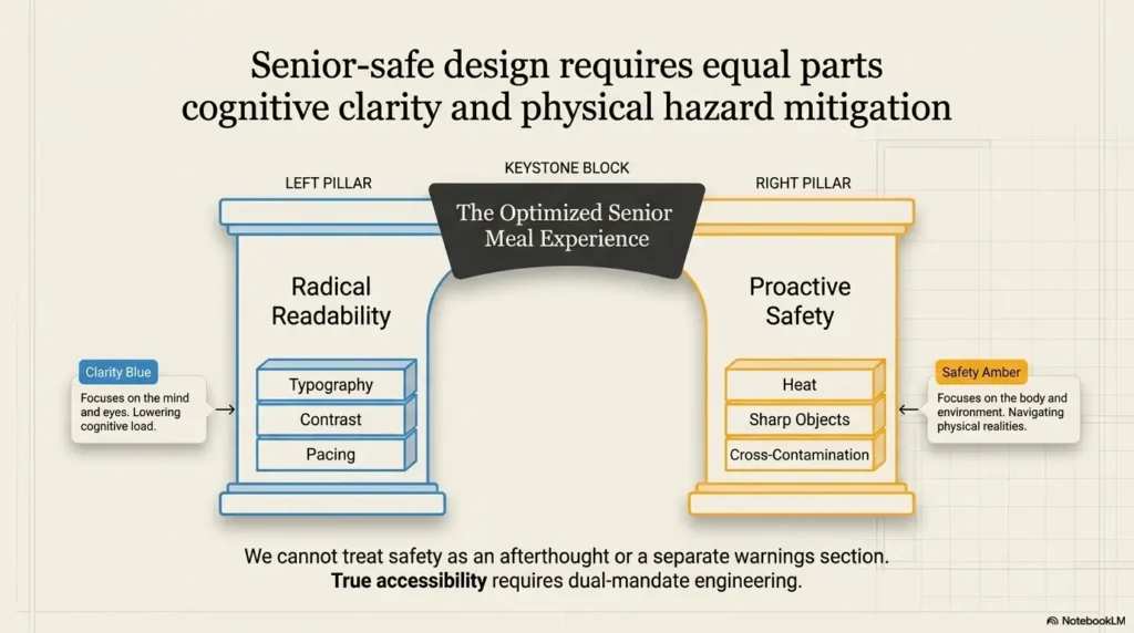
A senior-friendly recipe card should make the safe action the easiest action. If the reader must hunt, guess, squint, or remember missing information, the card is still asking too much.
Start With Readable Type, Not Pretty Type
Typography is where many recipe cards quietly fail. The card may look charming on a laptop screen, but the real test happens at arm’s length, under warm kitchen light, with steam in the air and a spoon in one hand.
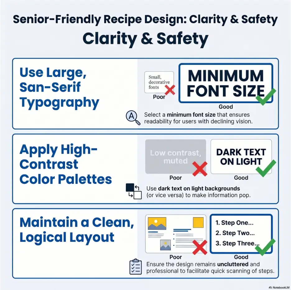
For printed recipe cards for seniors, body text usually needs to start around 16 to 18 points. Headings, recipe titles, safety labels, and time markers should be larger. If the recipe is used by someone with low vision, even larger print may be necessary.
Choose Fonts That Do Not Play Hide-and-Seek
Use plain fonts with clear letter shapes. Simple sans-serif fonts often work well because they have less visual clutter. A decorative script can be lovely on a jar label, but it becomes less delightful when someone is trying to tell whether the oven says 350°F or 375°F.
For ingredient lists and instructions, avoid thin, condensed, or overly stylish fonts. A recipe card is a working tool. Let the birthday cards have the flourishes.
Make Line Length Kind to the Eye
Long lines are hard to track, especially when the reader looks away to stir, chop, rinse, or answer a timer. Keep instruction lines short enough that the eye can return easily to the right place.
A good rule: if one step wraps into a dense block, split it. White space is not wasted. It is the handrail of the page.
Use Bold With Discipline
Bold text is useful for amounts, temperatures, warnings, and step labels. But if half the card is bold, nothing is. Use emphasis only for information the cook must notice quickly.
| Text Element | Safer Readability Choice | Why It Helps |
|---|---|---|
| Recipe title | Large, plain, high contrast | The cook knows the dish immediately |
| Ingredients | 16 to 18 point minimum, aligned amounts | Measurements are easier to compare |
| Steps | Numbered, short lines, generous spacing | The reader can return after looking away |
| Warnings | Bold label plus plain words | Safety does not rely on color alone |
Contrast, Spacing, and Glare Do More Than You Think
Contrast is the quiet hero of senior-friendly recipe design. A beautiful pale gray card may look calm in a design preview, then vanish under cabinet lighting. Warm bulbs, glossy paper, patterned backgrounds, and countertop shadows can turn a recipe into fog.
Use very dark text on a plain light background. Black on white is often the simplest choice. Dark charcoal on cream can also work if the contrast remains strong. Avoid putting text over photos, wood textures, watercolor washes, or busy decorative borders.
Test the Card Where It Will Be Used
A recipe card that looks readable at a desk may be harder to read beside a stove. Place the card on the actual counter. Turn on the usual kitchen light. Stand where the cook normally stands. Then read one step without leaning in.
If the reader has to bring the card closer, tilt it away from glare, or reread the same line twice, the design needs another pass.
Avoid Color-Only Instructions
Color can support meaning, but it should not carry meaning by itself. A red warning label may be missed by someone with reduced color discrimination or poor lighting. Add clear words such as “Hot,” “Check first,” “Do not skip,” or “Contains nuts.”
For digital accessibility basics, the Web Content Accessibility Guidelines are a useful reference point, even when you are designing printed recipe cards.
Countertop readability test:
- Print the card at actual size.
- Place it on the kitchen counter, not under office lighting.
- Read it from normal cooking distance.
- Look away, then try to find the same step again.
- Check whether measurements, temperatures, and warnings stand out instantly.
Build the Card Around One Task at a Time
A recipe can be simple and still be visually hard. Five ingredients can cause confusion if the steps are packed together, the ingredients are not grouped, or the timing is hidden in the middle of a sentence.
The senior-friendly approach is the one-recipe, one-task rule. Each part of the card should answer one question at a time: What do I need? What should I do first? What is hot? How long do I wait? When do I stop?
Put Ingredients Before Instructions
A reader should not reach step four and discover that butter needed to be softened thirty minutes ago. Ingredients belong before instructions, and “Before you start” notes belong even earlier.
For recipes with stages, group ingredients by stage: sauce, filling, topping, marinade, vegetables, or final garnish. This prevents the cook from scanning one long list while a pan is heating.
Keep Each Step to One Main Action
“Chop the onion, heat the pan, add oil, sauté until soft, season, reduce heat, and cover” is not one step. It is a little obstacle course wearing an apron.
Better: split actions into shorter steps. This helps readers who move more slowly, use mobility aids, manage fatigue, or simply prefer calm instructions.
Short Story: A Casserole Card That Needed Glasses Too
Marian kept her mother’s broccoli casserole recipe in a tin box with a loose hinge. The card was soft at the corners, freckled with butter, and written in a narrow blue script that had survived three kitchens.
Her father loved the casserole, but after his cataract surgery he stopped making it. He said it was too much trouble. Marian thought he meant the cooking.
Then she watched him read the card. He leaned over the counter, lost his place twice, and nearly added the topping before the sauce.
She typed a large-print copy, grouped the ingredients, added “Preheat first,” and placed the original scan at the bottom. The next week he made it alone. The recipe had not changed. The doorway back into it had.
Make Measurements, Timing, and Warnings Impossible to Miss
Measurements, timing, and warnings are the load-bearing beams of a recipe card. They should never be buried like spare keys under a flowerpot.
For older adults, especially those with low vision or cognitive fatigue, tiny differences matter. One teaspoon and one tablespoon are neighbors with very different personalities. Ten minutes and thirty minutes can change dinner from tender to tragic.
Separate Measurements From Ingredient Names
Use a two-column ingredient list when possible. Put the amount on the left and the ingredient on the right. This makes quantities easier to compare and reduces the chance of skipping a line.
If fractions are used, give them enough space. Avoid cramped type where 1/4, 1/2, and 3/4 begin to look like distant cousins at a family reunion.
Make Time Visible Before the Step Begins
Cooking time, resting time, cooling time, and thawing time should stand out. Place them at the start of the step or in a clear timing box. This helps seniors plan around energy levels, medication schedules, caregiver visits, appointments, or simply the desire to sit down before the kettle whistles again.
Put Warnings Before the Risk
A warning after the risky action is a smoke alarm after dessert. Place safety notes before the step that needs caution.
Examples include “Pan will be hot,” “Use oven mitts,” “Raw chicken touched this bowl,” “Contains walnuts,” “Let cool before cutting,” and “Stop if oil smokes.” For kitchen appliance safety, readers may also find this guide to kitchen appliance safety for seniors helpful.
| Common Problem | Risk | Safer Alternative |
|---|---|---|
| “Bake until done” | Guessing, overcooking, undercooking | “Bake 22 to 25 minutes. Check center at 22 minutes.” |
| Warning after step | Burns, spills, missed caution | Place “Hot pan” before the instruction |
| Allergens in small notes | Missed ingredient risk | Put allergen warning near title and ingredient |
| Fractions squeezed into tiny text | Measurement mistakes | Use larger type and aligned columns |
Key takeaway:
If a recipe detail can change safety or the final result, it deserves visual priority. Temperatures, timing, allergens, and heat warnings should never hide inside long sentences.
Printable vs Digital Recipe Cards for Seniors
Some seniors prefer printed cards because they are familiar, steady, and do not fall asleep mid-recipe. Others prefer tablets or phones because text can be enlarged, saved, read aloud, or searched. The best option depends on vision, dexterity, kitchen setup, and comfort with technology.
For food bloggers, this matters because a recipe that looks lovely on a desktop page may become frustrating on a phone. For caregivers, it matters because the simplest format is usually the one that gets used.
When Printed Cards Work Best
Printed cards work well when the recipe is used often, the cook dislikes screen scrolling, or the kitchen has glare problems. A laminated or wipeable copy can survive splashes, flour dust, and the mysterious sticky dot that appears near every family cookie recipe.
Printed cards also let caregivers place one recipe in one physical location. That can be helpful for routines, especially when paired with large-print labels, organized spices, or a low-vision grocery list system.
When Digital Cards Make Sense
Digital recipe cards work well when the reader needs adjustable text size, audio support, easy search, or serving-size scaling. They can also help food bloggers reach readers who want printable and mobile versions of the same recipe.
But digital cards need large tap targets. Print, save, jump-to-recipe, serving-size controls, and close icons should be easy to tap. Pop-ups, sticky ads, and tiny control links can make a recipe feel like a carnival booth with soup simmering in the background.
Screen Settings Can Help, But Layout Still Matters
A larger phone font can help many older adults, but it cannot fix a confusing recipe structure. Use clear headings, short steps, grouped ingredients, and minimal distractions. Readers who need help adjusting phone text may benefit from this guide to phone font size for seniors.
| Format | Best For | Watch Out For | Good Upgrade |
|---|---|---|---|
| Printed card | Common household recipes | Small type, glare, stains | Large print on matte paper |
| Laminated sheet | Messy or frequent recipes | Glare from glossy surfaces | Matte lamination or sleeve |
| Tablet recipe | Adjustable text and search | Scrolling, screen timeout | Large text and simple layout |
| Phone recipe | Quick access anywhere | Tiny buttons, pop-ups | Jump links and clean controls |
Tools, Services, and Budget Choices That Actually Matter
You do not need expensive software to make a recipe card easier for seniors to read. Many effective improvements can be done with a word processor, free design template, or plain document. The paid options become useful when you need consistency, durability, brand polish, or multiple cards redesigned at once.
Think in terms of the reader’s actual use. A premium design is not premium if it makes the cook squint. A free plain document may be excellent if it is clear, large, and easy to wipe clean.
Good, Better, Best Recipe Card Setup
| Setup | What It Includes | Best For | Budget Note |
|---|---|---|---|
| Good | Large-print document, plain font, high contrast, printed at home | One or two household recipes | Lowest cost and often enough |
| Better | Consistent template, grouped ingredients, safety callouts, matte paper | Family recipe binders or senior center handouts | Small printing cost, better durability |
| Best | Professionally designed template, accessibility review, laminated or bound set | Food bloggers, care homes, community kitchens | Worth comparing if many people will use it |
When Free Tools Are Enough
A free DIY approach is enough when you are redesigning a small number of recipes for one person and can test them in the kitchen. Use a simple document layout, large type, bold headings, and a clean one-page structure.
Do not spend money before testing. Print one recipe first. If it works, turn it into a repeatable template.
When Paid Help May Be Worth Considering
Paid design, printing, or accessibility help may be worth considering if the cards will be used by many seniors, distributed by a care community, sold as printables, or included in a professional nutrition program. In those cases, consistency and readability can save time later.
Before paying, ask whether the provider can design for large print, strong contrast, plain language, logical reading order, printable formats, and mobile readability. Ask to see a sample at actual size. A screenshot is not enough.
Show me the nerdy details
Recipe card readability is affected by more than font size. Older eyes may need stronger contrast, better spacing, reduced glare, and clearer separation between similar shapes. Cognitive load matters too. When a step contains several actions, the reader must hold too much information at once while also managing heat, tools, timing, and movement.
Good recipe design lowers three kinds of load: visual load, decision load, and memory load. Visual load is reduced by contrast and type size. Decision load is reduced by grouping ingredients and using direct instructions. Memory load is reduced by putting prep, tools, and timing on the page instead of expecting the cook to remember them.
Senior-Friendly Recipe Card Template
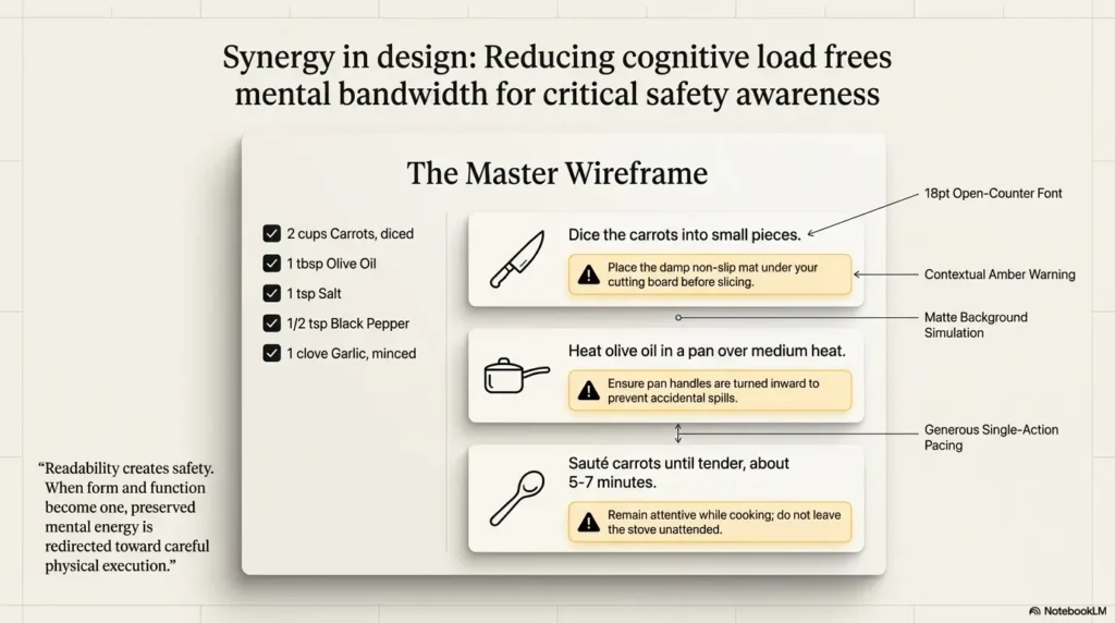
A strong template helps every recipe feel familiar. Once the reader learns where to find time, servings, tools, ingredients, steps, and warnings, each new card becomes easier to use.
Keep the layout predictable. Predictability is a kindness. It means the cook does not have to solve a new visual puzzle every time they make soup.
The Basic Card Order
- Recipe title: plain and clear, such as “Chicken Noodle Soup,” not a clever name that hides the dish.
- Top box: prep time, cook time, total time, servings, difficulty, and main safety note.
- Before you start: thawing, preheating, washing produce, softening butter, or setting out tools.
- Tools needed: pan, bowl, knife, thermometer, measuring cups, oven mitts.
- Ingredients by stage: sauce, filling, topping, garnish, or main mixture.
- Numbered steps: one main action per step, with visible timing and warnings.
- Stop point: what to do if something looks wrong, too hot, undercooked, or unsafe.
Recipe Card Decision Flow
The Senior-Friendly Recipe Card Framework
1. Enlarge
Use readable type and short lines.
2. Separate
Group ingredients, tools, and steps.
3. Highlight
Make time, heat, and allergens visible.
4. Test
Read from the real cooking distance.
5. Repeat
Turn the best version into a template.
Simple Template You Can Copy
Recipe Name
Time: Prep __ minutes | Cook __ minutes | Total __ minutes
Serves: __ | Difficulty: Easy / Moderate | Safety: Watch for hot pan
Before You Start
- Preheat oven to __°F.
- Set out tools: __.
- Wash and dry produce.
Ingredients
- 1 cup ingredient
- 2 tablespoons ingredient
Steps
- Check first: Make sure the pan is stable.
- Add ingredient and stir for __ minutes.
- Let cool: Wait __ minutes before serving.
Key takeaway:
A template is not about making every recipe look identical. It is about putting important information in the same place every time so the reader can relax.
FAQ
What font size is best for recipe cards for seniors?
A practical starting point is 16 to 18 point body text for printed recipe cards, with larger headings, strong contrast, and generous spacing. Some readers may need larger print, especially if they have low vision or read from farther away.
Are printed or digital recipe cards better for seniors?
Printed cards are often easier in the kitchen because they do not require scrolling or tapping. Digital cards can work well when they offer large text, simple navigation, audio support, and minimal pop-ups.
What is the easiest recipe card format for older adults?
The easiest format is usually a one-page layout with a clear title, prep and cook time at the top, grouped ingredients, a tools list, numbered steps, and visible safety notes.
Should recipe cards for seniors include photos?
Photos can help, especially when they show texture, doneness, or final appearance. Keep photos separate from the instructions. Do not place text over images, because it often reduces readability.
How can I make handwritten family recipes easier to read?
Transcribe the recipe into a larger, cleaner format. Keep a scan or photo of the original on the back or bottom of the page if it has sentimental value. That way, the memory stays, but the squinting does not.
What colors are best for senior-friendly recipe cards?
High-contrast colors work best. Dark text on a plain light background is usually safest. Avoid pale gray text, low-contrast pastels, busy backgrounds, and glossy paper that creates glare.
How do I make recipe cards safer for seniors?
Add clear notes for hot pans, sharp knives, raw meat, allergens, cooling time, stable surfaces, and steps that should not be skipped. Put warnings before the risky step, not after it.
Should I simplify the recipe or just the layout?
Start with the layout. Many recipes become easier once the text is larger, the steps are shorter, and the ingredients are grouped. After that, simplify wording and remove unnecessary choices if they still cause confusion.
Redesign One Recipe in 15 Minutes
The best next step is not to redesign the whole recipe binder tonight. That is how good intentions become a stack of paper and a cold cup of tea.
Choose one recipe that an older adult already uses. A soup, casserole, breakfast routine, or simple dessert is ideal. Then make one clearer version and test it in the real kitchen.
Your 15-Minute Redesign Checklist
- Increase body text to at least 16 to 18 points.
- Use dark text on a plain light background.
- Move prep time, cook time, servings, and safety note to the top.
- Add a “Before you start” box.
- Group ingredients by stage.
- Split long instructions into numbered steps.
- Bold key measurements, temperatures, and timing.
- Place warnings before the risky action.
- Print one copy and test it from normal cooking distance.
If the cook can read it without leaning in, find the next step after looking away, and spot the warnings quickly, you have made a real improvement. Not dramatic. Not flashy. Useful. The kind of usefulness that sits quietly on the counter and helps dinner happen.
Key takeaway:
Start with one recipe, one printout, and one countertop test. A readable recipe card is not a design trophy. It is a small daily tool that helps someone keep cooking with less strain.
Last reviewed: 2026-07