

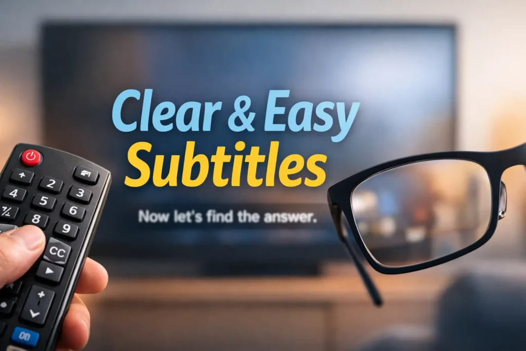
Smart TV Subtitle Settings for Seniors with Macular Degeneration (AMD)
The real pain isn’t the menu—it’s the chaos: sports tickers, white shirts, flashing cuts, and apps like Netflix or YouTube quietly ignoring the TV settings you just fixed.
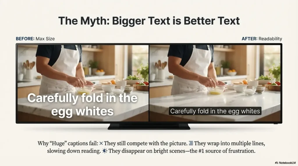
Keep guessing, and the cost is steady: more squinting, more pausing, and more “what did they say?” until the show stops being relaxing. “Huge” captions can still vanish the second a bright kitchen scene hits the screen.
This setup gets you to one calm, repeatable preset—fast. I’m using the exact “three-clip test” that finally stopped our nightly troubleshooting.
- 1. Size
- 2. Background/Opacity
- 3. Text Edge
- 4. App Overrides
CC reduces mental load because it fills in what the ears—and the picture—don’t reliably deliver. While subtitles usually show dialogue only, CC includes dialogue plus cues like music or sound effects.
Table of Contents
1) Subtitle clarity first: the 30-second baseline setup
If you’re a caregiver, you’re probably doing this between dinner and someone asking where the remote went. So here’s the fastest baseline that works on most TVs and streaming boxes: get captions on, then get them stable.
Pick your “readable minimum” (size, contrast, spacing)
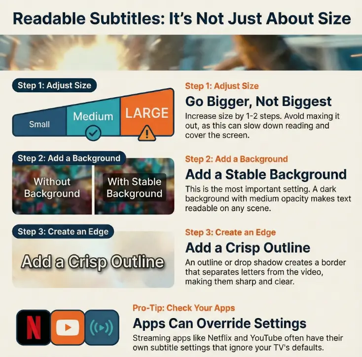
Start with the smallest size that is still readable from the usual seat. Bigger is not always better—huge captions wrap into two lines and slow reading down. A quiet win is one clean line, not a billboard.
- Text size: go up 1–2 steps, not straight to maximum.
- Font style: choose a simple, clean font if available.
- Edge/outline: turn it on early (we’ll tune it later).
Turn on captions in two places (TV + streaming app)
Here’s the part that causes 80% of family arguments: you turn captions on in the TV menu… and Netflix still does its own thing. Or YouTube ignores everything. That’s not you failing. That’s the system.
- Device-level: TV settings or streaming box settings (Roku/Fire TV/Apple TV).
- App-level: Netflix, Prime Video, YouTube—each may have its own caption style.
Micro-check: “If you only change ONE thing…”
Turn on a caption background (even a light one). People chase font size, but background is the lever that keeps text visible when the picture changes every half-second.
- Enable captions at the device level first.
- Set a “readable minimum” instead of maxing size.
- Plan to check app overrides next.
Apply in 60 seconds: Increase size one step and enable a caption background.
- Yes/No: Are you watching through a streaming app (Netflix/YouTube/Prime) rather than cable?
- Yes/No: Does your device show caption options like Background, Opacity, or Text edge?
- Yes/No: Do captions look different between apps?
Next step: If you answered “yes” to the third one, you must tune captions inside the app too.
2) Text size isn’t enough: the contrast settings that actually stop squinting
With AMD, central vision can get unreliable—detail, edges, and fine contrast are the first things to feel “mushy.” That’s why a slightly larger font can still look like it’s dissolving into the scene. The goal isn’t just big text. It’s separation. (If you’re also tuning reading comfort, low-vision reading for an 80-year-old with AMD has practical strategies that pair well with better captions.)
Choose high-contrast pairs that work on real scenes (not menus)
Menu screens lie. They’re tidy. Real TV is messy: bright skies, white shirts, flashing captions over moving faces. Pick a color combo that survives chaos.
- Best starting point: White or off-white text + dark/black background (with some opacity).
- Alternate: Yellow text + dark background (many people find it “sticks” better).
- Avoid: White text on transparent background. It looks sleek—until it disappears.
Make letters “stand off” the picture with outlines/edges
If you do nothing else for clarity, do this: add an outline (sometimes called Text edge, Outline, Drop shadow, or Raised). It’s not decorative. It’s the border that tells your brain, “This is text.”
- Outline: crisp border around letters (my favorite for mixed scenes).
- Drop shadow: softer separation (helpful if outlines look harsh).
- Raised/Depressed: varies by device—test quickly and keep what feels clean.
Pattern interrupt: Let’s be honest—white text fails on snow, weddings, and sitcom kitchens
If your loved one watches holiday movies, cooking shows, or anything involving bright countertops, white-on-transparent captions will betray you. You don’t need better eyesight. You need better caption engineering. (And if you’re still sorting out what “AMD” includes, dry vs wet age-related macular degeneration can clear up the language without adding panic.)
Show me the nerdy details
Readability is mostly a contrast-and-edge problem. When the background changes fast (camera cuts, motion blur, bright highlights), your eyes must constantly re-lock onto letter boundaries. Outlines and solid-ish caption backgrounds reduce the “re-lock” effort. That matters for low vision and for tired caregivers who don’t want to troubleshoot every episode.
3) Background & opacity: the hidden lever most families miss
This is where captions go from “sometimes okay” to “consistently readable.” Think of the caption background as a quiet stagehand: it moves the set pieces so the actor (the text) can be seen.
Turn on a caption background (and avoid the “gray fog” look)
Many TVs offer a background color and an opacity slider. If you’ve ever turned it on and hated the look, you probably used the default “foggy gray” at high opacity. You can do better.
- Background color: black or very dark gray.
- Opacity: start around the middle; adjust until faces aren’t blocked but words stay solid.
- Window vs background: some devices let you style the box behind each line separately from the whole caption area.
Set opacity so subtitles stay readable without blocking faces
A quick household-friendly rule: captions should be readable even on a bright scene, but you should still see the actor’s mouth shape if the viewer is also lip-reading. If the background is too opaque, it becomes a moving censor bar. If it’s too transparent, it becomes decorative.
Caption window vs full-screen dimming (know the difference)
Some TVs have a feature that dims the entire screen when captions appear. That can reduce glare, but it can also make people feel fatigued—like the room lights keep flickering. If you see anything like “Caption Display” or “Reduce bright scenes,” test it carefully and don’t assume it’s helpful. (If “tired eyes at night” is part of the story, a simple 15-minute night routine for dry eyes can make screens feel less punishing.)
- Input 1: Distance from couch to TV (in feet or meters).
- Input 2: Caption size setting you chose (Small / Medium / Large / Extra Large).
- Input 3: Background opacity (Off / Low / Medium / High).
Output: If you can read a full caption line without leaning forward for 60 seconds, keep it. If posture changes (leaning/squinting) happen, increase background first, then size.
Neutral next step: Write down the winning combo so you can reapply it after updates.
4) Edge style & font: the readability upgrade nobody explains
The weird truth: two caption styles can have the same font size and look completely different in comfort. The difference is usually the edges (outline/shadow) and the font’s shapes.
Add an outline/drop shadow for “crisp” letter borders
A small anecdote: I once watched a whole episode thinking the captions were “fine,” then turned on an outline and realized I’d been using my forehead muscles like a clamp the entire time. The relief was immediate—like someone adjusted the focus on a projector.
- Try first: Outline (thin or medium).
- If outline halos: Switch to drop shadow.
- If text looks fuzzy: Reduce any “soft” shadow settings.
Switch fonts for simpler shapes (when fancy fonts blur)
If your TV offers a font choice, pick the simplest one. Decorative fonts can have thin strokes and flourishes that vanish in motion. A plain font is not boring—it’s merciful.
Adjust character/line spacing (if your device supports it)
Some platforms let you tweak character spacing or line spacing. If captions feel cramped, slightly increased spacing can improve comfort. But don’t overdo it—too much spacing makes sentences feel like a scattered puzzle.
- Turn on outline/edge before maxing size.
- Choose a clean font with thicker strokes.
- Keep captions mostly one line when possible.
Apply in 60 seconds: Toggle Outline on, then replay the same scene for 20 seconds.
5) Placement & motion: keep captions out of the “busy zone”
Many caption systems assume the bottom of the screen is safe. In real living rooms, it’s often the noisiest place: sports tickers, news banners, app overlays, and the “Skip Intro” box that appears exactly when you’re trying to read.
Move captions away from fast graphics (sports tickers, news chyrons)
If your device supports caption positioning, use it. Even a small shift upward can remove captions from the collision zone. If you’re watching cable through a box, the box may control caption position instead of the TV.
Lower-third clutter: when “bottom” is the worst spot
Quick test: put on a sports highlight or live news. If captions overlap on-screen graphics, your viewer is forced to choose: read captions or read the game score. That’s exhausting. In my house, this was the difference between “I can follow this” and “turn it off.”
Scene-by-scene testing: the 3 clips that reveal your best position
- Bright clip: daylight kitchen / white shirt / snow scene.
- Dark clip: night street / dim interior / thriller lighting.
- Motion clip: sports pan or fast-cut action trailer.
Your “best” caption style is the one that stays readable across all three without constant tweaking. If it fails on one, adjust background/edge before touching size again.
6) App overrides: why your perfect settings “disappear” on Netflix/YouTube
This is the section that saves families from doing the same setup three times. Many streaming apps can override your device captions. Some do it per profile. Some do it per device. Some quietly revert after updates. It’s not malicious—it’s just layered settings.
Check caption settings inside the app (Netflix, Prime Video, YouTube)
Treat each app like it’s its own little TV. Look for “Subtitles,” “Captions,” or “Accessibility” inside the app’s settings. Netflix often ties caption styling to the user profile. YouTube captions can be toggled quickly, but style options vary by device.
Device-level vs app-level captions (who wins the tug-of-war?)
A practical rule: if captions look different between apps, the apps are in control. If captions look consistent across apps but not on cable, your cable box may be in control. If captions look consistent everywhere except one app, that app is the culprit.
- Choose TV/Device settings if captions look wrong in every app.
- Choose App settings if Netflix looks fine but YouTube doesn’t (or vice versa).
- Choose Cable box settings if only live TV is the problem.
Neutral next step: After changes, replay the same 30-second scene to compare.
Curiosity gap: The one toggle that silently resets your captions after an update
When captions “mysteriously” revert, it’s often because a device or app flips back to a default like “Automatic,” “Use app settings,” or “Use device settings.” If you see a toggle with wording like that, treat it as the master switch. After any update, check it first—before you redo all the styling.
7) Brand-by-brand paths: find the right menu fast (without hunting)
TVs and streaming devices love hiding captions behind different words: “Captions,” “Subtitles,” “Closed Captions,” “Accessibility,” “Hearing,” “Audio,” or “Language.” Below are the most common paths. Labels may vary by model year, but the logic is the same.
Roku TV / Roku devices: where captions hide
- Common path: Settings → Accessibility → Captions
- Style controls: Caption style / Text style / Background / Opacity
- Tip: Roku often makes styling easier at the system level, then apps may still override.
Fire TV: the extra “Accessibility” layer
- Common path: Settings → Accessibility → Closed Captions
- Style controls: Text, Edge, Background, Opacity (varies by device)
- Tip: Fire TV sometimes nests captions under “Preferences” or “Display & Sounds,” depending on version.
Apple TV: the easiest place to fine-tune style
- Common path: Settings → Accessibility → Subtitles and Captioning
- Style controls: Style presets, font, size, background, outline
- Tip: Apple TV presets can be a lifesaver for “set it once” households.
Samsung (Tizen) vs LG (webOS): similar words, different locations
- Samsung often: Settings → General → Accessibility → Caption Settings
- LG often: Settings → Accessibility → Closed Caption (or Subtitles)
- Tip: If you can’t find “Captions,” search for “Accessibility” first. If your TV has a search icon in Settings, use it.
Google TV / Android TV: when “Captions” isn’t under “Display”
- Common path: Settings → Device Preferences → Accessibility → Captions
- Tip: Some models place it under “Sound,” “Language,” or “System.” Don’t trust your instincts; trust the word “Accessibility.”
- Search settings for “Captions,” “Subtitles,” or “Accessibility.”
- Style changes are often system-level; toggles are often app-level.
- Model year changes labels—don’t panic.
Apply in 60 seconds: Use the Settings search bar and type “captions.”
8) Who this is for / not for
For: AMD readers who rely on captions for comfort, comprehension, or hearing support
If you’re living with AMD (or caring for someone who is), captions can be less about “hearing” and more about reducing mental load. When the center of vision is unreliable, you don’t want to waste energy guessing at dialogue. (For broader context on how common these conditions are later in life, see age-related eye diseases after 60.)
For: caregivers setting up a “no-fuss” TV for parents/grandparents
If you’ve ever been summoned by a text that says “THE WORDS ARE GONE AGAIN,” you’re in the right place. We’re aiming for a setup that survives updates, app switches, and accidental button presses.
Not for: people needing medical vision guidance (captions help viewing—not AMD treatment)
This is practical setup guidance. It doesn’t treat AMD. For medical questions—changes in vision, new distortion, sudden blind spots—talk to an eye-care professional. Captions are support, not medicine. (If you want a simple way to track those changes in vision with a printable symptom diary for seniors, it can make conversations with your clinician clearer.)
Not for: viewers who primarily watch on a cable box that controls captions separately
If you’re watching mostly live cable through a set-top box, the box can control captions. You can still use this guide, but be ready to change settings in the cable device too.
9) Common mistakes that make subtitles harder (even after you “increase size”)
This is the “we’ve all done it” section. I’ve done every one of these. Most families do. The good news: fixes are fast once you know what’s actually happening.
Mistake #1: Changing only the TV—while the app overrides everything
Symptom: captions look perfect on one app, awful on another. Fix: tune the app’s subtitle style (often per profile) or switch the app to “use device settings” if that option exists.
Mistake #2: Using white-on-transparent captions (the “invisible on daylight scenes” trap)
Symptom: captions disappear on bright scenes. Fix: turn on a dark background with medium opacity, then add a thin outline.
Mistake #3: Maxing size until lines wrap (and reading gets slower, not easier)
Symptom: captions break into two lines and cover faces; the viewer falls behind. Fix: reduce size one step, increase background/edge instead, and keep text mostly to a single line.
Mistake #4: Ignoring edge/outline (the sharpness you didn’t know you needed)
Symptom: captions look “soft” even when large. Fix: enable outline or a clean drop shadow. Edges matter.
- TV brand + model (photo of the sticker on the back is fine).
- Streaming device (Roku, Fire TV, Apple TV, Google TV) and model if used.
- Top 3 apps you watch (Netflix, Prime Video, YouTube, Hulu, etc.).
- A phone photo of the caption settings screen once you find it.
Neutral next step: Keep these notes in one place so changes are easy to repeat.
10) Don’t do this: “helpful” settings that backfire in real living rooms
Accessibility settings can be wildly well-intentioned and quietly brutal in practice. Here are the ones that tend to create fatigue, glare, or frustration—especially for older adults who just want the TV to behave.
Over-darkening the screen (fatigue + lost detail)
If you dim the entire screen too much, you may reduce glare, but you can also lose facial detail and scene context—which increases confusion and eye strain. Prefer a caption background window over full-screen dimming.
Ultra-bold fonts and neon colors (haloing + glare)
Neon captions can bloom or “glow” on some TVs, especially with certain picture modes. If captions look like they have a fuzzy aura, switch to a calmer color and rely on outline/background instead.
Captions + motion smoothing (when text jitters on pans)
Some TVs apply motion smoothing (sometimes branded as “Auto Motion,” “TruMotion,” or similar) that can make text edges shimmer during camera pans. If captions appear to jitter, try reducing or turning off motion smoothing.
Curiosity gap: Why your eyes feel tired even when captions look “bigger”
Bigger captions can still be exhausting if your eyes have to constantly re-focus because the background is changing, the text has no edge, or the picture mode is adding artificial sharpening. Comfort comes from stability: consistent contrast, clean outlines, and minimal visual flicker. (If this sounds familiar, digital eye strain in seniors often shows up exactly like this—“bigger,” yet still tiring.)
FAQ
Can macular degeneration make subtitles harder to read even with glasses?
Yes. Glasses correct focus, but AMD can affect central detail and contrast. That’s why caption styling (background, outline, high-contrast colors) can make a bigger difference than “just making it larger.” (If you’re comparing treatment paths or trying to understand the bigger picture, AMD injections is a helpful starting point to explore—separate from caption comfort.)
What is the best subtitle color for low vision on a TV?
A reliable starting point is white or pale yellow text on a dark background with medium opacity, plus a thin outline. The “best” choice is the one that stays readable across bright and dark scenes without needing constant changes.
Should I use closed captions (CC) or subtitles—what’s the difference?
Subtitles usually show dialogue. Closed captions often include extra audio info like sound effects or speaker cues. For many seniors, closed captions are more helpful because they add context when audio clarity is inconsistent.
Why do my subtitle settings change between Netflix and YouTube?
Apps can override device settings. Netflix often ties subtitle appearance to the viewer’s profile. YouTube’s caption style options vary by device and platform. If you see a “use device settings” or “automatic” toggle, that may be the controlling switch.
How do I make captions bigger on a Roku/Fire TV/Apple TV?
Start in the device’s Accessibility menu and look for Captions or Subtitles. Increase size one step at a time, then add a background and outline. After that, check each app’s own caption settings if the style isn’t consistent.
What does “caption opacity” mean, and what should I set it to?
Opacity controls how solid the caption background is. Too low and captions disappear in bright scenes; too high and the background blocks faces. Start around the middle, then adjust while watching a bright clip and a dark clip.
How do I add an outline or shadow to subtitles?
Look for settings named Text edge, Outline, Drop shadow, Raised, or Depressed. If outline looks harsh, try a drop shadow. If shadow looks blurry, reduce it and rely more on a background window.
Can I move subtitle position up or down on a Smart TV?
Some devices support caption positioning, but many don’t. If you can’t move captions, you can still reduce clutter by using a background window and avoiding overly large text that overlaps graphics at the bottom of the screen.
Do updates reset caption settings on Smart TVs?
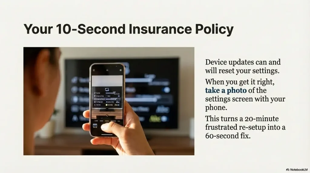
They can. Some updates revert to defaults like “Automatic” or switch between device-level and app-level preferences. Keeping a photo of your settings screen makes restoration fast.
What’s the simplest setup for a parent who hates menus?
Pick one stable preset: medium-large text, dark background with medium opacity, and a thin outline. Then leave everything else alone. If an app overrides, fix it once inside that app and don’t keep “optimizing.”
12) Next step: a one-page “Grandma-ready” preset you can set tonight
Let’s make this painfully simple. If you’re caring for someone with AMD, the most loving thing you can do is eliminate the need to keep tweaking. Below is a preset that survives most content types and feels calm—not shouty.
The night we finally got captions “right,” nothing dramatic happened. No applause. No grand thank-you speech. My relative simply stopped pausing the show every two minutes. That was the tell. We were watching a cooking competition—bright counters, white aprons, frantic edits—and the captions stayed readable without swallowing the screen. The setup was almost boring: medium-large text, a dark background that wasn’t too heavy, and a thin outline that made letters look crisp instead of watery. The best part was what didn’t happen: no leaning forward, no squinting, no “what did they say?” every other scene. Later, when an app update tried to reset things, the fix took 30 seconds because we had a phone photo of the settings page. It wasn’t a tech victory. It was a comfort victory. And honestly, those are the ones that matter.
Do this now: set Size + Background + Edge (in that order)
- Size: Increase one step. Stop before captions regularly wrap to two lines.
- Background: Turn it on. Use dark/black with medium opacity.
- Edge: Enable outline (thin/medium). If it looks harsh, use a subtle drop shadow instead.
Save it: take a phone photo of the settings screen (so you can restore later)
This sounds silly until you’ve lived through the “it changed again” message. A photo turns a 20-minute re-setup into a 60-second correction.
Quick test: play one bright scene + one dark scene + one sports clip
If captions stay readable across all three, you’re done. If they fail on the bright scene, increase background opacity slightly. If they fail on motion, consider reducing motion smoothing. If they feel “soft,” strengthen the outline.
- Tier 1 (Minimal): Medium text + outline only.
- Tier 2 (Balanced): Medium-large text + outline + low/medium background.
- Tier 3 (Most households): Large text + medium background + thin outline.
- Tier 4 (Maximum stability): Large text + higher background opacity + outline (watch for blocked faces).
- Tier 5 (Last resort): Very large text + strong background (only if comprehension is otherwise impossible).
Neutral next step: Choose the lowest tier that stays readable across bright/dark/motion clips.
Conclusion
Remember the curiosity loop from the beginning—why “Huge” captions still didn’t work? Because the enemy wasn’t size. It was instability: bright scenes, moving backgrounds, and apps overriding your choices. Once you treat captions like a readability system—size, background, edge, and a quick three-clip test—the TV stops being a daily puzzle.
If you do one thing in the next 15 minutes, do this: set medium-large text, enable a dark caption background at medium opacity, turn on a thin outline, then take a photo of the settings screen. That’s the “Grandma-ready” win: not perfect typography—just reliable comfort. (And for the bigger “health-maintenance” rhythm behind the scenes, an annual eye exam checklist for seniors can keep the basics from slipping through the cracks.)
Last reviewed: 2025-12.