

Precision Through Contrast
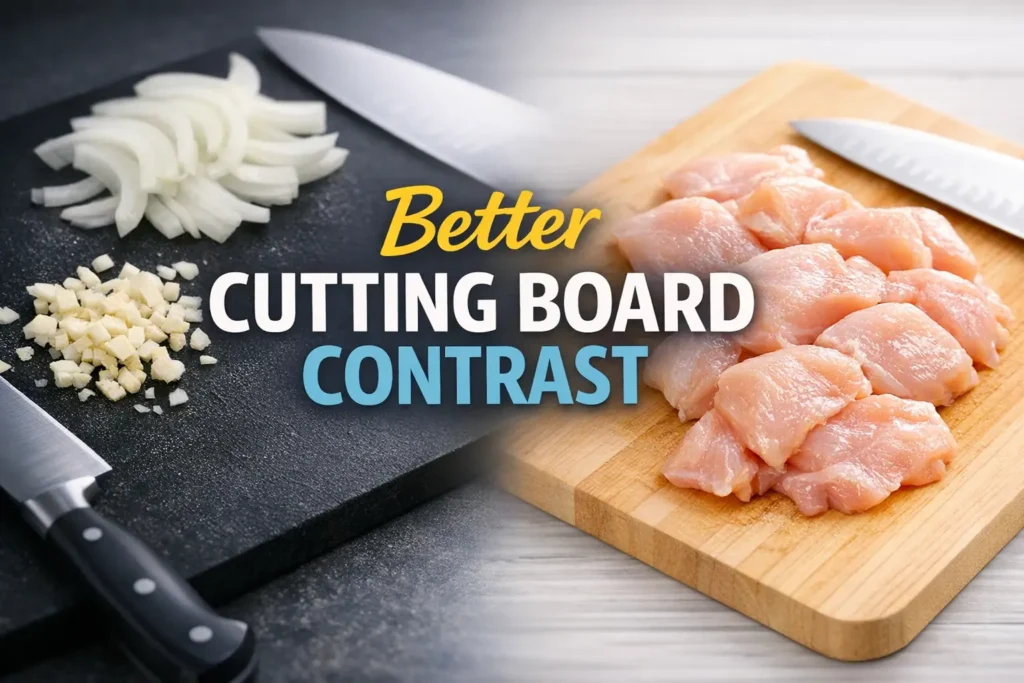
A cutting board can waste more time than a bad knife. When low vision is part of the kitchen, the wrong board color turns white onion into camouflage, minced garlic into confetti, and raw chicken into a cleanup problem you can feel before you can fully see.
The real frustration isn’t the cooking itself. It’s the constant visual drag of separating pale food from a surface that swallows the details. When contrast is poor, you don’t just lose speed; you lose the confidence and precision that make cooking manageable.
This guide breaks down the best cutting board colors for low vision contrast. Learn why a two-board setup beats the “perfect board” fantasy by testing contrast against ingredients, moisture, and lighting. Because pretty is not the same as readable, and readable is what makes dinner easier.
Table of Contents
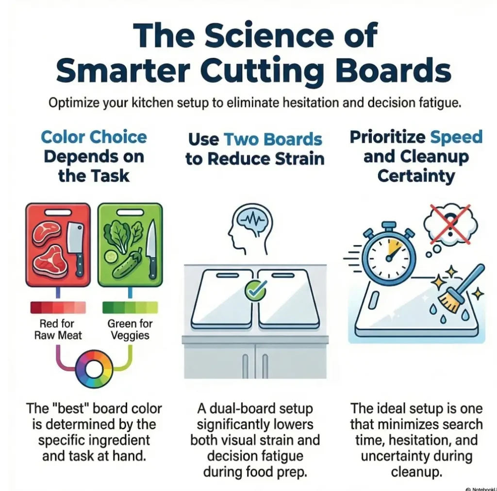
Fast Answer: For low-vision cooking contrast, there is no single best cutting board color for every ingredient. A dark board usually makes white onion and garlic easier to see, while a light board often makes raw chicken edges, shine, and residue more visible. In ordinary home kitchens, the simplest winning setup is often two boards: one dark for pale produce and one light or medium board reserved for raw poultry.
Start with the real question: contrast for what food, exactly?
White onion, garlic, and chicken do not disappear in the same way
The first mistake is treating all pale foods as one blur. They are not. White onion tends to be translucent, glossy, and slippery. Garlic is smaller, chalkier, and far more likely to scatter into tiny pieces. Raw chicken is pale pink to off-white, reflective, damp, and visually messy in a completely different costume.
I learned this the boring way, standing over a cutting board that looked perfect in the store and useless at 6:40 p.m. Minced garlic vanished like snowfall on a white driveway. Chicken, meanwhile, was not invisible so much as hard to read. Its edges showed up, then disappeared the moment the light caught moisture.
Color is only half the story, because texture and moisture change visibility too
Contrast is not just a paint-chip question. It is a working relationship between food color, surface shine, board finish, overhead light, countertop reflection, and your own visual fatigue. That is why a board that feels excellent in a bright showroom can become a practical nuisance at home.
What you are really buying is readability. Not just a board. Readability under onion juice, chicken moisture, knife marks, and tired eyes.
The board that helps with garlic may work differently for raw chicken
Garlic rewards a strong dark background. Chicken often rewards a cleaner, lighter background that makes residue and uneven bits easier to notice. That is why a universal winner rarely exists. The best answer is usually more like a duet than a solo.
- Garlic and white onion usually benefit from a dark background
- Raw chicken often benefits from a light or medium background
- Glare and moisture can overturn your first impression fast
Apply in 60 seconds: Put one onion slice, a pinch of minced garlic, and a small piece of chicken on three different surfaces in your kitchen and notice which one your eyes find first.
Best board colors first: what usually works in a real kitchen
Dark boards often make white onion pieces easier to track
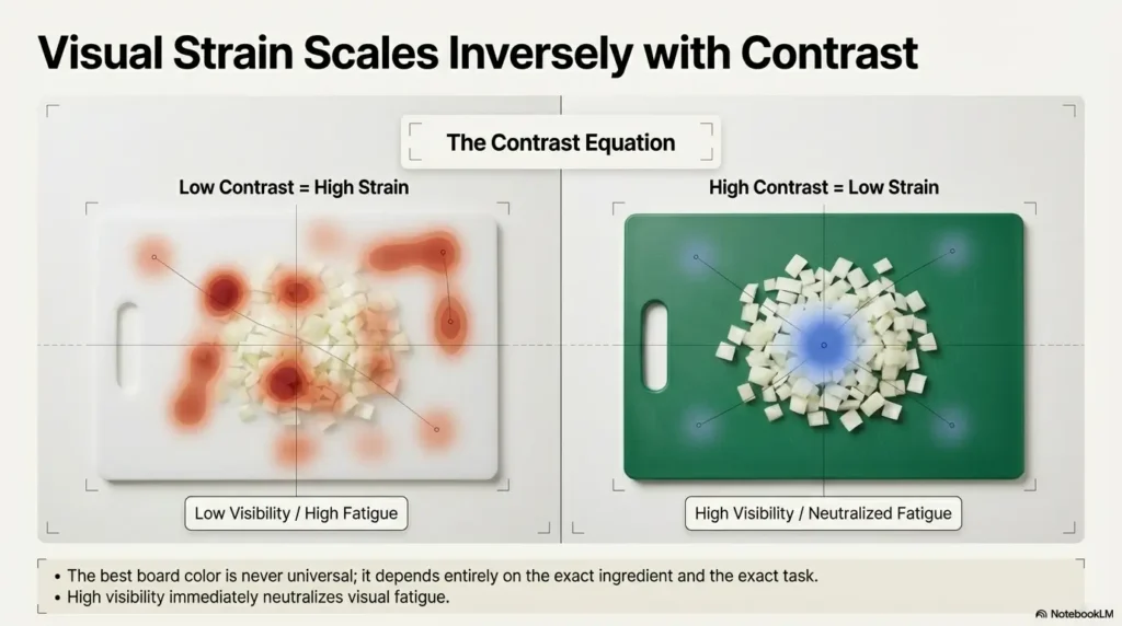
For white onion, the friendliest background is often dark charcoal, slate, or matte black. Onion pieces become easier to outline, especially after the first few cuts, when the board starts to shine with moisture and your eyes are trying to separate food from surface.
Dark charcoal or black boards can help garlic stop “vanishing”
Garlic is the tiny saboteur of the pale-food family. It is easy to lose because the pieces are small, irregular, and quick to spread. On a dark matte board, garlic usually becomes easier to spot and gather. That can reduce the annoying two-step where you mince, then hunt, then mince again because a few fugitives escaped the pile.
Light boards can make raw chicken edges and residue easier to notice
Chicken is where people often hesitate. “Shouldn’t pale meat need a dark board too?” Sometimes. But in many home kitchens, a light or medium board works better because it lets you see wet residue, streaks, and leftover fragments more clearly during cleanup. Chicken is not only about seeing the piece you are cutting. It is also about seeing what remains after the knife lifts away.
Medium-tone boards are the compromise choice when you only want one board
If you insist on one board, medium gray is often the least-annoying compromise. It will not make garlic sing. It will not make chicken residue leap up and introduce itself. But it can reduce the extremes. Think of medium gray as the sensible raincoat. Not glamorous. Not terrible. Dependable.
Decision card: When dark vs light vs medium makes sense
- Choose dark if pale produce is your main frustration and you lose track of garlic or onion pieces
- Choose light if poultry prep and residue visibility are your main concern
- Choose medium if you only want one board and can accept a compromise
Neutral next step: decide which ingredient causes the most visual stress in your kitchen, then choose for that first.
The practical ranking for most households: dark matte for onion and garlic, light or medium easy-clean board for chicken, medium gray only if you truly want one-board simplicity.
White foods vanish fast: why onion and garlic need a darker background
Fine garlic pieces get lost before larger onion slices do
Large onion slices still cast shape. Minced garlic does not. It fragments into tiny off-white flecks that can disappear on pale boards and patterned surfaces with almost comic efficiency. One minute you are cooking. The next minute you are peering downward like a detective in a kitchen apron.
That is why dark boards help more with garlic than almost any other pale ingredient. You are not only improving color contrast. You are reducing search time. A kitchen task that normally takes 20 seconds can quietly sprawl into 2 or 3 minutes when your board keeps swallowing the evidence.
Translucent onion can blend differently than fully white garlic
Onion is tricky because it is not always fully white. It can be translucent, glossy, or faintly yellow under warm bulbs. On a light board, those layers flatten. On a dark board, the edges often return. That edge definition matters. If you can see the edge, you can keep your knife placement steadier and your pile more contained.
Here’s what no one tells you: shine can erase contrast even on the “right” color
A glossy board can sabotage a good color choice. Add onion juice, and a bright stripe of reflected light may run right across the area you need to see. Suddenly your excellent black board behaves like a tiny skating rink with stage lighting.
I have seen cooks blame their vision when the real villain was glare. That matters emotionally too. A better board should feel like relief, not like a new exam you forgot to study for.
Show me the nerdy details
Dark surfaces improve figure-ground separation for many pale chopped foods, but reflectance still matters. A matte dark gray surface often feels easier than a glossy pure black one because it preserves edge information without throwing back as much glare. In other words, hue helps, but finish often decides the winner.
Raw chicken changes the equation: contrast is not just about color
Pale pink, glossy, wet surfaces behave differently from chopped vegetables
Raw chicken is not simply “light colored.” It is wet, reflective, and variable. Some pieces look pinker, some whiter, some almost beige under warm bulbs. What your eyes need is not only contrast with the meat itself, but clarity around edges, trimming lines, and the places where moisture collects.
A board that helps you see chicken residue matters as much as seeing the chicken itself
This is the part pretty board ads rarely mention. Poultry prep has a second stage: cleanup visibility. If a board color hides residue, tiny streaks, or uneven patches after rinsing, it is less useful, even if the chicken looked visible during prep. For many people, a lighter or medium board makes that residue easier to monitor.
Food safety agencies such as the USDA and the FDA repeatedly emphasize keeping raw meat prep surfaces clean and separated from ready-to-eat foods. That does not tell you which color to buy, but it does support the logic of using a dedicated poultry board rather than asking one heroic board to do everything.
Let’s be honest, “easy to see” should also mean easy to clean and reserve for meat
For chicken, readability and sanitation should travel together. An easy-clean, non-busy, non-porous-feeling surface with a reserved role can lower mental load. You do not want to be asking, “Was this the garlic board or the chicken board?” while holding a wet knife and a half-open package.
Eligibility checklist: Do you need a separate poultry board?
- Yes, if raw chicken prep makes you lose visual confidence
- Yes, if cleanup visibility is harder than cutting visibility
- Yes, if household cooks share the kitchen and need a simple color cue
- No, if you rarely prep poultry and already have a reliable system
Neutral next step: if you answered yes twice or more, a dedicated poultry board is probably worth it.
One board or two boards? This is where most kitchens get stuck
The one-board setup: workable, but always a compromise
One board can work. Let us be fair. Plenty of people cook happily with one medium board and a decent lamp. But a one-board setup asks you to accept trade-offs. Garlic may still scatter into camouflage. Chicken cleanup may still feel slightly murky. The question is not whether one board is possible. It is whether it keeps asking your eyes to negotiate.
The two-board setup: dark for pale produce, light or medium for poultry
Two boards simplify decisions. Dark matte for onion and garlic. Light or medium board for chicken. Suddenly the kitchen becomes easier to read. Not because you bought something magical, but because you stopped forcing one surface to do contradictory jobs.
When I first switched to a two-board setup, the surprising benefit was not visual. It was emotional. Less second-guessing. Less pausing. Less “wait, where did that piece go?” The kitchen felt quieter.
Color-coding can reduce hesitation when your eyes are tired
Color-coding is not childish. It is merciful. Tired eyes love simple systems. If one board is always dark and one is always light, the decision arrives already made. That is especially useful for caregivers, multigenerational households, or anyone cooking at the end of the day when visual patience has already been spent elsewhere.
The simplest winning combo for most households
For most low-vision kitchens, the easiest combo is this: one dark matte board for white onion, garlic, mushrooms, and other pale produce; one light or medium board reserved for poultry. If you cook fish often, that poultry board can usually handle that role too.
- Dark helps pale produce stand out
- Light or medium can make poultry cleanup easier to monitor
- A fixed color system helps when energy is low
Apply in 60 seconds: Label your current boards by role today, even before you buy anything new.
Surface finish matters more than people expect
Matte finishes usually create calmer visibility than glossy ones
If color is the headline, finish is the fine print that changes the contract. Matte boards usually give calmer, steadier visibility because they reflect less harshly. Glossy boards can create bright flares that wash out chopped edges and moisture lines, especially under ceiling lights.
This is one of those humble truths that saves money. A less glamorous matte charcoal board may outperform a sleek glossy black board every single day. Beauty in the store is not the same thing as usability at home. Kitchens are full of that lesson. The same tradeoff appears in bigger home surfaces too, which is why many readers also wrestle with matte vs. glossy paint choices when glare keeps turning ordinary rooms into visual static.
Heavy knife marks can reduce visual clarity over time
Knife grooves matter more than people think. Deep scratches collect moisture, trap tiny fragments, and create visual noise. The board that looked easy to read when new can become mottled and visually busier after months of hard use. That does not mean you need perfection. It means you should treat wear as part of visibility.
Busy patterns, faux wood grain, and speckles can sabotage contrast
Patterned boards often backfire for low vision. Faux marble, dramatic grain, terrazzo speckles, decorative flecks, and trendy mottling can all compete with the actual food. A patterned board is like asking the background to perform a solo while the ingredients whisper from the corner.
Before you compare boards, gather these details
- Main pale foods you prep each week
- Whether you also need a poultry-only board
- Your kitchen’s dominant lighting: overhead, under-cabinet, or side lamp
- How bothered you are by visible knife marks
- Whether matte or glossy surfaces usually feel easier for your eyes
Neutral next step: carry this list when shopping so you compare for readability, not just color names.
Don’t buy the wrong “pretty” board: what often backfires
White marble-look boards can swallow garlic pieces whole
They photograph beautifully. They can be dreadful for minced garlic. The pale swirls and visual variation act like camouflage. White-on-white is already hard enough without inviting fake marble veins into the argument.
Very dark boards can hide pale residue if lighting is poor
Dark is not automatically perfect. In dim kitchens, a very dark board can make pale residue less obvious after a messy prep session, especially if the light falls from directly overhead and leaves the board looking flat. This is why some cooks adore black boards at noon and dislike them after sunset.
Transparent glass boards are usually the wrong answer for low-vision prep
Glass boards bring glare, noise, slipperiness, and a visual echo of whatever lives beneath them. Countertop pattern shows through. Reflections stack up. Knife feedback gets harsh. For low-vision readability, they are often less a tool and more a tiny opera of inconvenience.
Here’s the quiet trap: stylish color is not the same as usable contrast
The wrong board can pass every aesthetic test and fail the one that matters most: can you quickly see what you need to cut, gather, and clean? A board should reduce work, not add a scavenger hunt.
One small anecdote here. A caregiver once described buying a beautiful pale bamboo board because it felt warm and natural. Three dinners later, she was using a dark placemat underneath just to spot chopped onion. That is the kind of accidental workaround that tells you the tool was wrong from the start.
Lighting decides more than color alone
Overhead glare can flatten the very contrast you paid for
A board can be correct in theory and wrong in practice because your lamp is doing strange theater above it. Overhead light often creates a flattening effect, especially on glossy or wet surfaces. You paid for contrast, and the light politely erased it.
Side lighting can make chopped edges easier to detect
Side lighting or angled task lighting can make edges pop. Not always dramatically. Sometimes just enough. Enough to see minced garlic as a pile instead of dust. Enough to see the outline of onion slices without leaning in so far that your posture starts writing complaint letters.
Warm light versus cool light can change how chicken and onion appear
Warm bulbs can make pale foods look softer and more beige. Cooler light can make edges feel crisper to some cooks. There is no universal winner because eyes differ. What matters is testing under your real bulbs, at your real prep spot, at the time of day you actually cook.
If your board color seems wrong, the lamp may be the real culprit
This is one of the most useful reframes in the whole conversation. Do not replace three boards before you test one board under better lighting. Sometimes the expensive-seeming fix is a lamp angle, not another shopping spiral. Readers who deal with shiny surfaces in the kitchen often notice the same pattern with under-cabinet lighting glare on glossy finishes or discover that glare-free under-cabinet lighting changes the whole workspace more than a new product does.
Quick contrast map for a low-vision kitchen
Dark matte board
Best for: white onion, garlic, pale mushrooms
Watch for: poor lighting hiding residue
Light board
Best for: chicken cleanup visibility, easy role separation
Watch for: pale produce blending in
Medium gray board
Best for: one-board compromise
Watch for: no ingredient gets the absolute best contrast
Rule of thumb: choose the board that makes your hardest ingredient easiest to read under your actual kitchen light.
Common mistakes
Using one pale board for every pale ingredient
This is the most common miss. A light wood or pale plastic board may feel neutral, but it asks onion and garlic to disappear politely into the background. If pale ingredients already frustrate you, this choice often keeps the frustration alive.
Choosing patterned boards that create visual noise
Busy patterns are a tax on attention. For low-vision prep, the goal is not visual excitement. It is visual obedience. The background should sit down and behave.
Ignoring finish, glare, and countertop reflections
People often buy by color name alone. But a glossy black board on a reflective quartz counter under a hard ceiling light may work worse than a matte gray board in the same kitchen. The environment joins the conversation whether you invite it or not.
Mixing accessibility goals with raw-meat cleanup without a system
It is easy to focus only on seeing the food better and forget that cleanup visibility matters too. For poultry, a board system is often safer and more relaxing than a single “good enough” surface.
Replacing contrast with memory and speed when fatigue sets in
Many people adapt by memorizing where they left the pile, moving faster, or trusting feel over sight. That works until it does not. Fatigue is the hour when systems matter most.
A better question than “Can I manage?” is “Why am I asking my eyes to work this hard?”
Who this is for / not for
This is for low-vision cooks who lose track of pale ingredients during prep
If you keep losing minced garlic, misreading onion edges, or feeling uncertain about where pale food ends and board begins, this guidance is for you.
This is for caregivers setting up a more readable kitchen workstation
Caregivers often do a quiet, beautiful kind of engineering. They change one object, one lamp, one habit, and suddenly a task becomes possible again. A better cutting board can be one of those modest revolutions. The same care often extends to other daily systems, from low-vision spice jar labels to the patient work of helping a spouse with vision loss without turning every task into a struggle.
This is for home cooks deciding between dark, light, and medium boards
If you are standing in that annoying aisle of almost-right options, trying to choose between charcoal, bamboo, white, gray, and “natural stone look,” this article is meant to save you from buying the wrong handsome rectangle.
This is not for people looking only for chef-grade knife-performance comparisons
This is a visibility-first article, not a pro-chef equipment ranking. Knife feel matters, but readability is the lead singer here.
This is not for commercial food-safety certification advice
This is practical home guidance, not a certification manual. For official food handling guidance, use the reputable public health and food safety resources linked in this article.
The better test at home: do this before buying three more boards
Place chopped onion, minced garlic, and raw chicken on three different backgrounds
Use what you already have first. A dark baking tray, a pale plate, a gray placemat, a current cutting board. Put the same ingredients on each and notice what your eyes pick up fastest. This fast home test is more honest than shopping by imagination.
Test morning light, evening light, and overhead task light separately
Do not trust one moment of day. The board that looks marvelous in morning sun may become useless under warm ceiling light. Kitchens are moodier than catalog photos admit.
Compare visibility when the board is dry and when it is wet
This matters. Onion juice, chicken moisture, rinsing water, and quick wipe-downs all change reflectivity. Your board needs to stay readable in the conditions you actually create while cooking, not just in the pristine moment before the knife touches it.
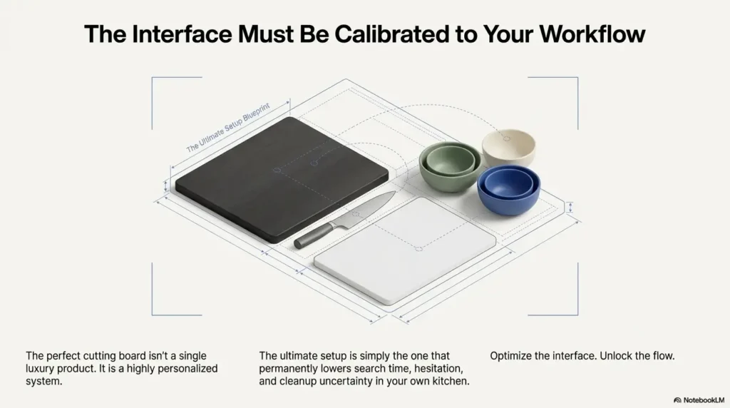
Let’s keep this simple: the best board is the one you can read quickly under your actual kitchen light
That sentence is the whole game. Not the trendiest color. Not the fanciest material. The best board is the one your eyes understand quickly, especially when dinner is late and patience is thin.
Short Story: A reader once described her mother’s kitchen as “all beige, all the time.” Beige counters, beige backsplash, pale wood board, warm yellow bulbs. She kept wondering why onion prep felt exhausting. They changed only two things. A matte charcoal board appeared for vegetables, and a simple lamp was angled from the side instead of from directly overhead. Nothing else became younger, brighter, or more stylish. But onion stopped disappearing. Garlic stopped turning into guesswork.
The real shift was not only visual. Her mother stopped apologizing during meal prep. That detail stayed with me. Sometimes accessibility is not a grand renovation. Sometimes it is one dark square on the counter and the sudden return of dignity in ordinary tasks. That same logic often improves the rest of the room too, whether you are rethinking how to make measuring tools easier to read or building a calmer system for low-vision freezer organization.
Show me the nerdy details
A reliable home test compares three ingredients across multiple backgrounds under both dry and wet conditions. This reveals how reflectance and edge definition change in your specific environment. It is a better predictor than judging color names online because online photos hide lighting behavior and surface sheen.
FAQ
Is a black cutting board best for low vision?
Often for pale produce, yes. A matte black or charcoal board usually helps white onion and garlic stand out better than a pale board. But black is not automatically best for every task. In poor lighting, it can make some residue harder to notice after poultry prep.
What cutting board color makes garlic easiest to see?
For many low-vision cooks, dark charcoal or matte black makes minced garlic easiest to track. The key word is matte. A glossy dark board can create glare that cancels some of the benefit.
Is white onion easier to chop on a dark board?
Usually yes. Onion edges and chopped pieces often become easier to separate from a dark background, especially once moisture appears on the board.
What board color is best for raw chicken?
A light or medium easy-clean board is often a strong choice because it can make residue and leftover streaks easier to monitor during cleanup. The best answer depends on your lighting and whether you use a separate poultry board.
Should I use separate cutting boards for vegetables and chicken?
For many households, yes. A two-board system can improve both readability and cleanup confidence. It also reduces hesitation about which surface is reserved for raw poultry.
Are bamboo boards good for low-vision cooking contrast?
They can be fine structurally, but many bamboo boards are too light for garlic and white onion contrast. If pale produce is your main frustration, a darker board will often feel easier to use.
Do patterned cutting boards reduce visibility?
Often yes. Busy grain, speckles, marble looks, and decorative patterns can make small pale pieces harder to locate because the background competes with the food.
Is a gray cutting board better than black or white?
Gray is often the best compromise if you want one board. It usually will not outperform dark for garlic or light for poultry cleanup, but it can reduce the worst trade-offs.
Does kitchen lighting matter more than board color?
Sometimes it does. A good board under bad glare can disappoint. A decent board under well-placed task lighting can feel surprisingly effective. In many kitchens, color and lighting work as a pair.
What is the easiest cutting board setup for a low-vision kitchen?
The easiest setup for many people is one dark matte board for pale produce and one light or medium board reserved for poultry. It is simple, memorable, and practical.
Next step
Pick one dark matte board for onion and garlic, and one light or medium easy-clean board for raw chicken, then test both under your actual kitchen lighting for one week
If you want the plainest honest recommendation, that is it. Start with a dark matte board for white onion and garlic. Add a light or medium board for chicken if poultry prep causes uncertainty. Use them for one week, in your real kitchen, under your real bulbs, at the hour when you usually cook.
You are not trying to win an equipment debate. You are trying to make dinner easier to read.
- Dark matte usually helps white onion and garlic most
- Light or medium often helps raw chicken cleanup visibility
- Lighting and finish can matter as much as color itself
Apply in 60 seconds: Tonight, choose one current dark surface and one current light surface, then do a five-minute comparison before you buy anything.
For broader low-vision information, the National Eye Institute explains low vision in practical public-facing language. For cutting board and safe food prep guidance, the FDA and USDA both offer clear, official basics that are worth keeping in your browser bookmarks rather than trying to memorize after a long day. And if kitchen visibility problems are showing up alongside broader safety concerns in the house, it can help to think in terms of aging vision fall prevention at home rather than treating each daily frustration as an isolated nuisance.
The curiosity loop from the beginning closes here. The real issue was never just color. It was whether your cutting board helped your eyes do honest work. White onion, garlic, and chicken each ask for slightly different visual support. Once you stop demanding one perfect board for every ingredient, the answer becomes calmer and more practical.
Within the next 15 minutes, run the home test. Put onion, garlic, and chicken on a dark surface, a light surface, and a medium surface under your normal kitchen light. Your eyes will usually tell you more truth than a product label ever will.
Last reviewed: 2026-03.