

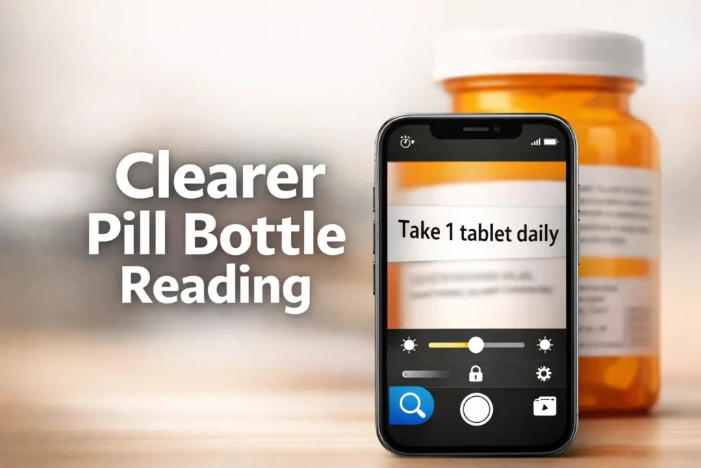
Mastering iPhone Magnifier for Prescription Safety
Most people do not need a “better filter” to read a pill bottle label on iPhone. They need a better sequence. On a glossy, curved prescription bottle, the wrong lighting and too much zoom can make perfectly real text disappear faster than bad eyesight ever did.
The real frustration behind finding the best iPhone Magnifier filters is the tiny print and plastic that throws glare like a stage light. One swipe too far turns useful text into a dramatic blur. When accuracy matters most, the cost of guessing isn’t just annoyance, it is the risk of misreading drug names, strengths, or warnings.
This guide prioritizes safer verification over aesthetic clarity. You will learn:
- Which Magnifier controls actually help with curved labels.
- When contrast beats color filters for amber bottles.
- How to use Freeze, Focus Lock, and Glare Control for heavy lifting.
“The method is practical, not theatrical: fix your angle first, stabilize focus, improve contrast, then freeze the frame before you start chasing settings.”
Because glare changes everything. Because zoom is often the trap. And because a two-minute reset can save a very avoidable mistake.
Table of Contents
Best Filters First: Which iPhone Magnifier Settings Usually Help Most on Pill Bottles
Start with contrast before you touch color filters
If the label text is present but weak, contrast usually gives you more honest help than filter roulette. Many people open Magnifier and immediately start swiping through color looks as if they are auditioning paint chips for a hallway. The better move is duller and more effective: raise contrast first, because it strengthens letter edges before you alter the whole image mood. Apple specifically provides contrast and brightness controls in Magnifier, and those are often the first levers worth pulling for label reading.
I learned this the boring way. One evening I was sure a filter would rescue a washed-out pharmacy label. Ten seconds later, I had converted the bottle into a dramatic teal artifact and the text was still coy. A small contrast bump did more than five flashy filter passes.
When amber bottles change the game
Amber prescription bottles are not evil, but they do bend the visual rules. Their color and curvature can mute the edge between print and background, especially under warm indoor light. This is why a setup that works beautifully on a white OTC box can suddenly feel useless on a round pharmacy bottle. In practice, amber plastic often rewards angle changes, lower brightness, and moderate contrast before any color experimentation. If your room lighting is part of the problem, the larger issue may look a lot like the same glare puzzle discussed in reading lamp positioning for central vision loss.
Why the “best filter” depends on glare, not just text size
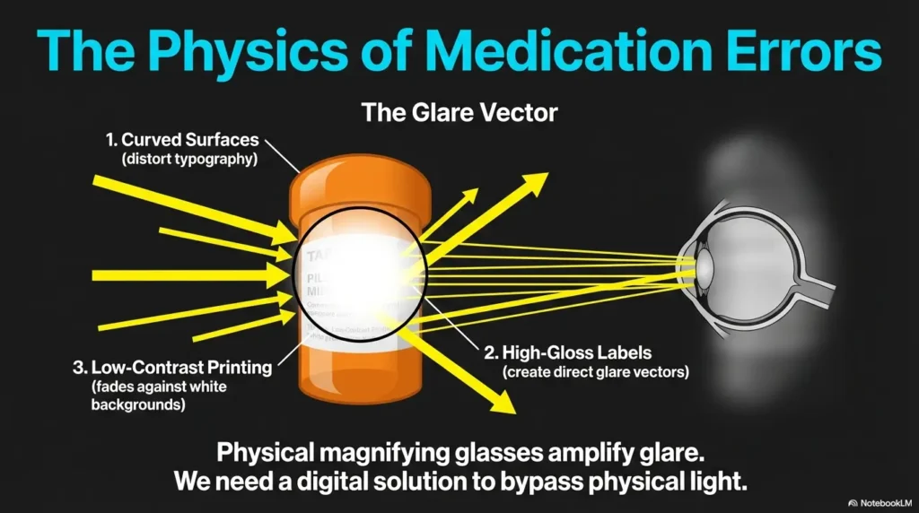
Small text is only half the story. The more common villain is glare. A label can be large enough to read in theory yet still fail in real life because one white streak from the overhead light cuts through the dosage line like a censor bar. In those cases, changing the phone angle or bottle angle beats adding more zoom. If the letters are there but washed by reflection, the correct fix is optical, not theatrical.
- Use contrast to sharpen edges before changing colors
- Fix glare with angle before adding zoom
- Treat amber bottles as a separate reading problem
Apply in 60 seconds: Open Magnifier, point at the flattest part of the label, raise contrast one step, and only then test a filter.
Tiny Print, Big Problem: Why Pill Labels Fail in Normal Lighting
Glossy plastic, curved bottles, and pharmacy fonts
Pill bottle labels are an awkward design object. They wrap around curves, sit on reflective material, and often compress critical instructions into a tiny strip. Even a good camera struggles when the target is both shiny and bent. Human eyes, already tired after a long day, tend to lose the crisp border that separates “take one tablet” from “take two tablets.” That is not user failure. That is hostile geometry wearing a pharmacy sticker.
Low-ink gray text is a different problem from small black text
A dense black label and a faded gray label do not need the same rescue. Black text on white may benefit from modest zoom and a frozen frame. Gray or low-ink print usually needs contrast and lower glare first. If you treat every label as a mere text-size problem, you may end up enlarging blur. That is like hanging a bigger curtain on a dirty window.
The hidden culprit: reflections that make letters vanish
FDA materials on medication use keep returning to one central principle: read and follow the label directions carefully, because medication mistakes can cause serious harm. The small practical translation is this: if reflections erase part of the text, your reading conditions are part of the safety problem. A bottle under bad light can manufacture uncertainty where none should exist.
I once watched a bottle go from unreadable to ordinary just by moving from directly under a ceiling light to two feet sideways near a window. No new app. No new lens. Just different light. It felt annoyingly simple, which is usually how the best fixes arrive. In homes with persistent reflection problems, it can also help to think more broadly about window film for glare control or under-cabinet lighting glare on glossy surfaces.
Eligibility Checklist: Is Magnifier a good first tool here?
- Yes: The label is intact, the print exists, and your main problem is size, contrast, or glare.
- Yes: You can steady the phone long enough to freeze the frame.
- No: The label is torn, smeared, or missing key text.
- No: You are still unsure about the drug name, strength, timing, or warnings after reading.
Neutral next step: use Magnifier for visibility, then verify uncertain details with the pharmacy paperwork or pharmacist.
Not All Filters Win: What Each Magnifier Control Is Actually Solving
Filters for color separation
Filters can help when the label and print are close in tone or when the amber bottle throws the whole image into a muddy middle. But filters are best seen as separation tools, not miracle tools. If a filter helps, it is usually because it creates cleaner distance between text and background, not because it somehow improves optical sharpness. That distinction matters.
Brightness for washed-out labels
Brightness is tricky. More brightness can help a dim scene, but too much brightness can bleach the label and make pale text disappear. Think of it as the salt in the recipe. A pinch helps. A fistful creates regret. On pill bottles, brightness is often most useful in tiny increments.
Contrast for edges that keep dissolving
Contrast is the workhorse. When letters feel like they are fraying at the edges, contrast can restore enough border definition to make the word readable again. Apple’s Magnifier includes contrast directly among its available controls, which is one reason it deserves first billing in a pill-label workflow.
Focus Lock for bottles that refuse to stay sharp
If your camera keeps hunting because the bottle is curved, your hand is moving, or the label has low detail, Focus Lock becomes quietly heroic. This is the kind of setting people overlook because it sounds technical and slightly annoying. Yet when the image keeps drifting in and out of clarity, a focus lock can do more for readability than another jump in zoom.
Show me the nerdy details
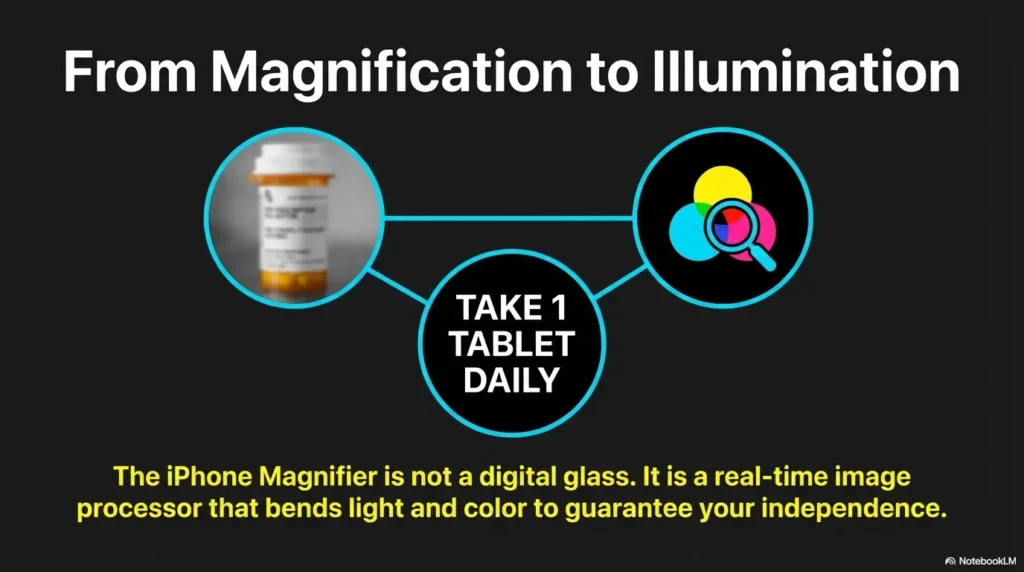
Sharpness and legibility are not identical. A magnified image can still be unreadable if edge contrast is poor or glare clips the highlights. In practical terms, pill-label reading is often a three-part problem: optical focus, tonal separation, and reflection control. Filters mostly change tonal separation. Contrast improves edge definition. Freeze reduces motion blur by letting you inspect a stable frame.
Apple also lets you capture the frame and open Reader options for text, where you can adjust text color, background color, text size, font, bold text, and high-legibility characters if text is detected in the captured frame. That can be especially useful when the live camera view is fussy but the phone can still detect the text cleanly once captured.
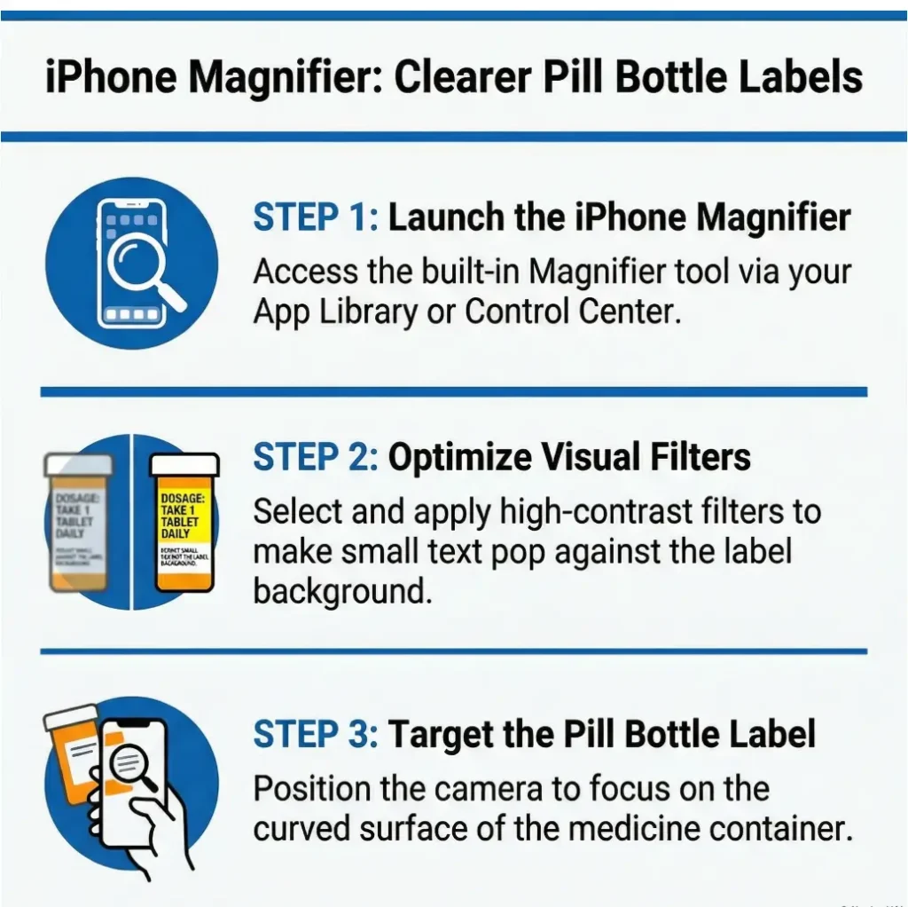
Use This Order: The Fastest Way to Find the Right View
Step 1: Center the flattest part of the label
Do not begin on the curve. Start where the label looks most flat. The edge of the bottle is where text goes to become interpretive dance. If you line up the central, flattest strip first, the camera has a fairer target and you will make every later adjustment work harder for you.
Step 2: Adjust zoom only after the text is stable
People often zoom because they are anxious, not because the image is ready. That is understandable. Tiny text triggers urgency. But early zoom magnifies shake, blur, and glare at the same time. Get a stable live view first. Then zoom modestly. Think 1.2x to 2x before 5x fantasyland.
Step 3: Raise contrast before cycling filters
If the letters still look weak, nudge contrast. If that helps, great. If not, then test one filter at a time. One variable at a time matters here because otherwise you will not know whether the better result came from lower brightness, different angle, or a filter that happened to flatter the scene.
Step 4: Freeze the frame when your hand starts negotiating with gravity
Apple’s Magnifier lets you temporarily capture what is in the frame without saving it to Photos, then either inspect it or move into Reader when text is detected. This is wildly useful for pill bottles because your hands do not need to win a stillness contest forever. Freeze the frame the moment it looks good enough. Then read with less pressure.
Mini Calculator: How much effort are you spending before you freeze?
Ask yourself three quick questions:
- How many times did you re-aim the phone? ___
- How many times did focus drift? ___
- How many zoom changes did you make? ___
If your total is over 6 before you freeze the frame, you are probably adjusting too many things live. Neutral next step: freeze earlier and inspect the captured view instead.
My own rule is embarrassingly simple: if I hear myself exhale in annoyance twice, I freeze the frame. The bottle does not deserve a third performance.
Glare Is the Villain: Best Filter Logic for Shiny or Curved Prescription Bottles
What to try when overhead light creates a white streak
That bright white stripe across the label is not a sign you need stronger zoom. It is a sign the light is landing at the wrong angle. Rotate the bottle a few degrees. Raise or lower the phone. Step slightly left or right. In many homes, the successful move is embarrassingly small, like shifting the bottle half a hand-width away from the hottest pool of light.
Why moving the phone can beat adding more zoom
Zoom cannot restore detail that glare has already erased. Once the reflection wipes out the letters, all you are doing is enlarging absence. A slight angle change can bring the letters back. That is why phone movement often beats zoom during the first 10 seconds of setup.
Flashlight can help, but it can also make glare worse
Yes, extra light can help. No, it is not always a win. A straight-on flashlight aimed at glossy plastic may create the very washout you were trying to escape. Use it sparingly and indirectly. Treat the flashlight as a supplement, not a throne. If the label is getting shinier but not more legible, back off. Readers dealing with household reflection issues more broadly may also recognize some of the same patterns from bathroom mirror glare and white tile floor glare.
- Move the bottle a few degrees
- Shift the phone instead of instantly zooming
- Use flashlight only if it improves the letters, not the shine
Apply in 60 seconds: Turn the bottle slowly while watching one dosage line until the white streak slides away.
Let’s Be Honest… Most People Over-Zoom Too Early
Why extreme zoom makes labels harder, not easier
Over-zooming feels productive. It looks like action. It is also one of the fastest ways to lose clarity. At high zoom, tiny hand movements become large jumps, the focus box gets twitchy, and the curved label falls out of the sharp plane more easily. You end up with giant letters that somehow feel less readable, which is one of modern life’s ruder jokes.
The clarity tradeoff nobody expects
There is almost always a sweet spot where the text is big enough but still stable. On many pill bottles, that sweet spot is moderate zoom, not maximum zoom. The live image remains brighter, steadier, and less distorted. Once frozen, you can inspect the captured frame or use Reader-based text viewing if the phone detects text. Apple’s support materials make that captured-text workflow explicit.
How to get a readable still image before enlarging it
Try this sequence: stabilize the angle, set moderate zoom, bump contrast, then freeze. Only after you have a readable still frame should you enlarge further inside that calmer context. It is the difference between reading in a rocking bus and reading after the bus stops.
One of my small embarrassments is how often I used to pinch harder when the view got worse. It felt like determination. It was mostly just stubbornness with glass.
Who This Is For / Not For
Best for: small print, contrast problems, mild vision difficulty, medication double-checks
Magnifier is a good support tool when the label is intact and your main issue is visibility. That includes tiny type, low contrast, mild hand tremor that makes live reading tiring, or simple end-of-day eye fatigue. It is also helpful for double-checking a bottle against printed paperwork when you want a slower, steadier read.
Not ideal for: severe blur, damaged labels, poor lighting habits, urgent medication uncertainty
If the label is smeared, torn, half-peeled, or badly faded, the phone cannot conjure missing information. If the room lighting is terrible and you refuse to move three feet to fix it, the phone also cannot save you from that choice. And if you are urgently unsure what medicine this is or how much to take, this is no longer a camera problem. It is a verification problem.
When a phone tool is support, not solution
FDA guidance emphasizes reading directions carefully and asking questions when medication details are uncertain. Patient labeling and OTC label information exist precisely to reduce medication errors. So the right frame is not “Can my phone solve this?” but “Can my phone help me read this clearly enough to verify it safely?” For a broader home system around pills, bottles, and daily routines, it also helps to think in terms of low vision medication management rather than camera settings alone.
Decision Card: When Magnifier is enough vs when to escalate
Use Magnifier first when the label is present, the bottle is yours, and the problem is visibility.
Escalate to the pharmacist when the drug name, dose, timing, or warning text is still uncertain after a careful read.
Time trade-off: 2 to 3 minutes of careful setup is reasonable. Guessing is not.
Neutral next step: if uncertainty remains after one full pass, verify before taking the medicine.
Don’t Do This: Common Mistakes That Make Pill Labels Harder to Read
Using flashlight straight-on against glossy plastic
This is the classic own goal. You add more light, but because it lands directly on a shiny surface, you create a bright wash that eats the letters. Try side lighting or a different angle first.
Chasing filters before fixing angle and focus
A filter cannot rescue a crooked, glared-out, soft image. It can only recolor the problem. Start with geometry. Then optics. Then tones.
Reading from the curved edge instead of the flattest section
The edge of the bottle is where text stretches, bends, and slips out of focus. If you are trying to read critical instructions from the side curve, you are making the task harder than it needs to be.
Treating one saved setup as universal for every bottle
Different bottle colors, label materials, print densities, and room lighting conditions mean the same settings will not win every time. Save favorites, yes. Worship them, no. A white OTC label and an amber prescription bottle are cousins, not twins.
There is a strange comfort in preset loyalty. Press the same thing, hope for the same result. But labels have their own weather. Some days you need contrast. Some days you need less brightness. Some days you just need to stop standing directly under the chandelier like a Victorian suspect.
Here’s What No One Tells You… The Bottle Color Matters More Than You Think
Amber plastic can mute contrast in surprising ways
Amber changes how light and print feel together. Even when the label itself is white, the surrounding bottle color can influence the overall image, especially in warmer indoor light. That is one reason color filters sometimes feel more useful on prescription bottles than on OTC packaging. The bottle is contributing visual noise.
White labels with faded print behave differently from bright retail packaging
OTC medicine packaging often uses larger, more structured label areas, while pharmacy labels may condense critical text into narrower bands. FDA’s OTC Drug Facts materials reflect how much information is expected on nonprescription labels, including directions and warnings. In practice, those layouts often remain visually easier than a tightly wrapped pharmacy sticker.
Why OTC bottles and pharmacy bottles often need different settings
OTC packaging may respond well to Reader text capture or moderate zoom because the print blocks are flatter and more consistent. Pharmacy bottles often demand more angle management and more frequent use of Freeze. Different object, different strategy.
Infographic: What to change first
Change first: Angle
Then: Lower flashlight use
Then: Freeze
Change first: Contrast
Then: Lower brightness slightly
Then: Freeze
Change first: Stabilize angle
Then: Focus Lock
Then: Moderate zoom
Change first: Contrast
Then: Test one filter
Then: Reader if text is captured
Customize the Tool: How to Make Magnifier Faster for Repeated Medication Checks
Add only the controls you actually use
The best accessibility setup is usually a stripped one. If you only ever use contrast, brightness, zoom, and freeze, keep those front and center. Apple allows you to customize Magnifier controls, which is worth doing because every extra control you never touch becomes a tiny speed bump in a moment that should feel calm.
Save your favorite filters instead of scrolling through clutter
Apple’s captured-text Reader options allow custom themes to be renamed and reused. If one theme works well for your usual label-reading conditions, save it with a plain name you will instantly recognize, such as “Pill label high contrast.” That is better than trusting your future self to remember which mysterious greenish variant saved the day last Tuesday.
Put Magnifier where you can reach it fast in real life
Accessibility tools work best when they are not trapped three menus deep. If you often check labels in the kitchen or bedroom at night, put Magnifier somewhere frictionless on your iPhone. Convenience matters because medication checks happen in real rooms, with real fatigue, not in the abstract serenity of setup tutorials. If bright screens themselves become part of the discomfort, there is a related workaround in making an iPhone screen dimmer than the minimum setting.
One small personal improvement for me was reducing the number of taps. The less time I spent opening and arranging things, the less likely I was to mutter, “It’s probably fine,” which is the sentence nobody wants near medication.
The Better Setup: Filter Combinations That Tend to Work by Label Problem
Faded text setup: contrast + lower brightness + freeze
If the label exists but looks weak, lower brightness slightly, raise contrast, and freeze the frame once the letters sharpen. This tends to help pale print or low-ink labels more than dramatic color shifts do.
Glare setup: angle shift + focus lock + minimal flashlight
When glare is the problem, change angle first. If focus keeps wandering during that process, use Focus Lock. Add flashlight only if it improves the letters rather than polishing the plastic into a tiny moon.
Tiny dense text setup: moderate zoom + freeze + contrast
For packed instruction blocks, use moderate zoom, not maximum. Then add contrast and freeze. This gives you a larger but still stable target. It is a pragmatic trio and much kinder than the wild pinching many of us start with.
Color-confusing label setup: selective filter testing, one variable at a time
If the label and print feel tonally muddy, test one filter at a time after you have already fixed the angle and brightness. The winning filter is the one that makes the letters more distinct, not the one that makes the whole frame look artistically severe.
- Faded print wants tonal help
- Glare wants angle changes
- Tiny text wants stability before enlargement
Apply in 60 seconds: Name the problem out loud first: glare, fade, blur, or tiny print. Then make only the matching adjustment.
Short Story: A friend once texted me in mild panic because her prescription bottle looked unreadable after dinner. She had already tried zooming, turning on the flashlight, and swiping through filters until the label looked like modern art. We did a two-minute reset. She moved from directly under the ceiling light to the side of the counter, rolled the bottle until the flattest section faced the phone, lowered the brightness a touch, raised contrast, and froze the frame as soon as the dosage line snapped into place.
Suddenly the problem stopped being “my phone can’t do this” and became “I was asking the wrong question.” The words had been there all along, just hidden behind glare and hurry. That small moment is why this topic matters. Better readability does not guarantee safety, but it creates the conditions for safer verification, which is often the real win.
Common Mistakes, But Specifically the Dangerous Ones
Misreading dosage because you optimized color, not sharpness
A pleasant-looking image is not the same as a legible one. If the colors feel better but the letter edges are still soft, you may create false confidence. That is the dangerous part. Comfort can arrive before clarity does.
Confusing similar bottles after relying on memory instead of the label
FDA advice on medicine safety repeatedly points back to following label directions and asking questions when you are unsure. If two bottles are similar, do not let familiarity carry the day. Read the label, confirm the name, confirm the dose, confirm the timing. Memory is helpful until it suddenly is not. A parallel safety habit is having a one-page medication list or a low vision medication tracker printable nearby when your routine includes multiple bottles.
Assuming Magnifier fixes every reading problem equally well
Some problems are visual. Some are informational. Some are safety-critical. Magnifier can help with the first category. It cannot replace professional verification in the latter two. That line matters, and it is worth keeping bright.
Show me the nerdy details
False confidence is a bigger risk than visible struggle. When an image looks “clean enough,” the brain often fills missing information from expectation. That is why sharpness and confirmation matter more than aesthetic improvement. In a medication context, the goal is reliable reading, not visually pleasing reading.
When the Phone Isn’t Enough: What to Do Before You Guess on Medication Text
Use the original packaging if the bottle label is unclear
If you still have the carton, handout, Medication Guide, or pharmacy printout, use it. FDA explains that prescription medicines may come with patient labeling such as Medication Guides, Patient Package Inserts, and Instructions for Use, and that these materials help patients use medicines safely and effectively.
Compare with pharmacy paperwork instead of squinting harder
Squinting is not a strategy. It is a sign you need a second source. If the bottle line looks uncertain, compare the bottle with the pharmacy paperwork or the OTC Drug Facts panel. FDA’s OTC labeling materials emphasize that the label includes detailed directions and warnings for proper use. If the issue is not only the active bottle but also dating and storage habits, this pairs naturally with how to read expiration dates with low vision.
Call the pharmacist when the dose, name, or timing is uncertain
This is the line in the sand. If you are unsure about the drug name, strength, dose, timing, or warning language, stop and verify. FDA’s medicine-safety guidance stresses asking questions and following directions because incorrect use can cause serious harm. That is not drama. That is the plain architecture of safe use. For people building a more reliable physical setup, pill bottle tactile label placement and large print prescription labels can reduce repeat confusion before the next dose ever arrives.
- Use printed materials when the bottle is unclear
- Match the bottle against directions and warnings
- Call the pharmacist before guessing on anything critical
Apply in 60 seconds: Put the bottle and pharmacy paperwork side by side before your next dose if the label has been difficult to read.
FAQ
What is the best iPhone Magnifier filter for reading prescription bottle labels?
Usually, there is no single best filter for every bottle. Contrast is often the best first adjustment, with filters tested afterward only if the text and background still blend together. On amber bottles, one filter may help, but glare control and stable focus still matter more.
Is contrast better than color filters for pill bottles?
Often, yes. Contrast improves edge definition, which is usually the main need when text looks weak or fuzzy. Color filters are more useful when the label has a tonal or color-separation problem rather than a pure sharpness problem.
Why does my iPhone Magnifier make bottle labels look worse when I zoom in?
Because zoom also magnifies hand movement, focus drift, curvature distortion, and glare. If you zoom before the image is stable, you can make the scene larger and less readable.
Should I use the flashlight when reading medication labels?
Only if it genuinely improves readability. On glossy plastic, straight-on flashlight can create more glare. Try changing the bottle angle or moving to softer light first.
Can Magnifier help with amber prescription bottles and faded text?
Yes, but usually by combining settings rather than relying on one filter. Amber bottles often benefit from contrast, small brightness adjustments, angle changes, and Freeze once the live image becomes readable.
What settings should I customize first in Magnifier for daily medication use?
Keep your most-used controls easy to reach. For many people, that means zoom, contrast, brightness, and freeze. If captured text works well on your labels, a saved Reader theme can also be useful.
Why does the label look blurry even when the text is enlarged?
Because enlargement does not guarantee sharpness. The blur may come from camera movement, glare, curved surfaces, or focus drift. Stabilize the image first, then enlarge modestly.
Is Freeze or Focus Lock better for reading small medicine text?
They solve different problems. Focus Lock helps when the live image will not stay sharp. Freeze helps when you already have a readable moment and want to inspect it without hand shake or camera drift.
Next Step
Test one bottle tonight with this sequence: angle first, contrast second, filter last
Here is the practical close to the loop we opened at the start. The problem usually is not that your iPhone lacks the right effect. The problem is that pill bottles are visually awkward, and most people start at the wrong end of the chain. So tonight, try one calm pass on one bottle: find the flattest section, shift away from direct glare, use moderate zoom, raise contrast, then freeze the frame. Only after that should you test a filter.
Keep the winning setup only if it improves readability without adding confusion
If your saved setup makes the text clearer and easier to verify, keep it. If it merely makes the image more dramatic, let it go. The goal is not prettier labels. The goal is safer reading. That is the sober little heart of the whole exercise.
Last reviewed: 2026-03.
If you can improve one medication label check in the next 15 minutes, that is enough. Small clarity is still clarity. And with medications, clarity is never a minor luxury. Then, if you want the improvement to last beyond tonight, build a quieter system around it with a wallet card emergency info template and a repeatable medication routine rather than relying on memory and hurry.