

Senior readability guide
Best Font Size for Notes and Labels for Seniors with Presbyopia
A calmer home starts with words people can actually read
A tiny label can look harmless until it sits on a pill organizer, a freezer container, a microwave button, or a bathroom cabinet at 7 p.m. under warm light. For seniors with presbyopia, the problem is rarely just “small print.” It is small print plus glare, thin ink, cramped spacing, poor placement, and the quiet fatigue that builds when every label asks the eyes to work overtime.
This guide gives you practical starting points: 16–18 point font for many everyday notes and labels, 18–24 point for high-stakes reminders, and larger sizes for wall signs or anything read from standing distance. It also shows how to test labels in real rooms, not under perfect desk lighting where everything behaves better than it does in the kitchen.
The goal is not to turn a home into a clinic. The goal is kinder typography: clear words, honest contrast, fewer guesses, and less daily friction for older adults, caregivers, spouses, aides, and anyone trying to make the home easier to navigate without making it feel less like home.
Know the starting size
Use realistic font-size ranges for notes, labels, reminders, and signs.
Fix the hidden blockers
Adjust contrast, spacing, lighting, glare, and placement before blaming the reader.
Test before sticking
Build a simple label test kit and upgrade the five most important labels first.
Small design choice, big daily relief: the best label is the one that can be read quickly, calmly, and correctly. 🔎
Snapshot
This article is for older adults with presbyopia, adult children, caregivers, senior living organizers, and home helpers who need notes, food labels, medication reminders, appliance tags, and everyday instructions to be easier to read. You will learn what font size to start with, when to go bigger, which design mistakes to avoid, and how to test labels in the rooms where they actually live.
Fast Answer: The Font Size Most Homes Should Start With
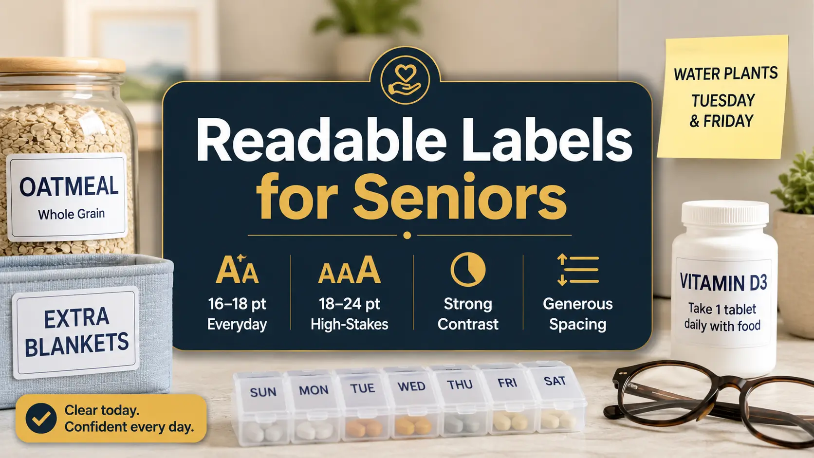
For seniors with presbyopia, most everyday notes and household labels are easier to read when printed at 16–18 point font or larger, using high contrast, simple letterforms, and generous spacing. For critical labels such as medication reminders, emergency contacts, food dates, allergy notes, and appliance instructions, use 18–24 point font when space allows.
That said, font size is only one instrument in the orchestra. A 20 point label in pale gray ink on glossy tape may still fail. A 16 point label in bold black text on matte white paper, placed at eye level under good light, may work beautifully.
The simplest starting rule is this: use 16 point for ordinary close-up labels, 18 point for anything that gets read often or quickly, and 20–24 point for labels where a mistake could cause confusion, food waste, missed routines, or safety trouble.
Key takeaway
Start with 16–18 point type, then test. The best font size for seniors with presbyopia is not the largest size that fits. It is the smallest size that feels easy under real lighting, from the real viewing distance, for the real person who will use it.
Quick Size Chart for Senior-Friendly Notes and Labels
| Label or note type | Suggested starting size | Why it works |
|---|---|---|
| Pantry bins, drawer labels, simple desk notes | 16 point | Large enough for close-up reading without taking over the space |
| Daily reminders, fridge notes, shared household labels | 18 point | Easier to read quickly and repeatedly |
| Medication reminders, food safety dates, appliance warnings | 18–24 point | Better for labels where confusion has a real cost |
| Wall reminders, laundry signs, calendar cues | 24 point and up | Needed when read from standing distance |
| Handwritten notes | Large block letters | Ink thickness, spacing, and clarity matter more than exact point size |
Think of these numbers as a strong beginning, not a stone tablet hauled down from a mountain. Presbyopia affects near focus, but every reader has a different mix of glasses, lighting, contrast sensitivity, hand steadiness, memory load, and patience at the end of the day.
A good label does not ask the reader to decode. It greets them at the door.
Safety Note: Bigger Print Is Helpful, But It Is Not Eye Care
This guide offers practical readability tips for everyday notes and labels. It does not diagnose vision problems, prescribe glasses, or replace advice from an eye care professional. If reading suddenly becomes harder, vision changes quickly, or labels remain difficult to read even with larger print and good lighting, the next step should be an eye exam.
This matters because home labels often sit near tasks that carry real consequences: medication timing, food storage, hot appliances, cleaning products, fall-prone rooms, and emergency contact information. A bigger label can reduce friction, but it cannot explain sudden blur, eye pain, double vision, missing areas of sight, flashes, or new floaters.
For broader home vision and safety planning, you may also find this related guide helpful: senior near vision problems. If the main concern is medicine handling, see low vision medication safety for a more specific setup.
Safety / disclaimer block
Use larger labels to make everyday routines clearer, not to ignore new symptoms. Sudden vision changes, eye pain, flashes, new floaters, double vision, or a quick drop in reading ability should be treated as a medical concern, not a label-maker problem.
Why This Topic Is Safety-Adjacent
Font size sounds like a design detail. In a senior household, it can become a safety detail. A tiny “take with food” note can be missed. A low-contrast freezer date can become a food safety guess. A faint appliance warning can turn a simple chore into an avoidable problem.
This does not mean every label needs sirens and giant letters. It means high-stakes information deserves higher readability. The home should feel calm, but calm is not the same as vague.
The Best Label Is Not Always the Biggest
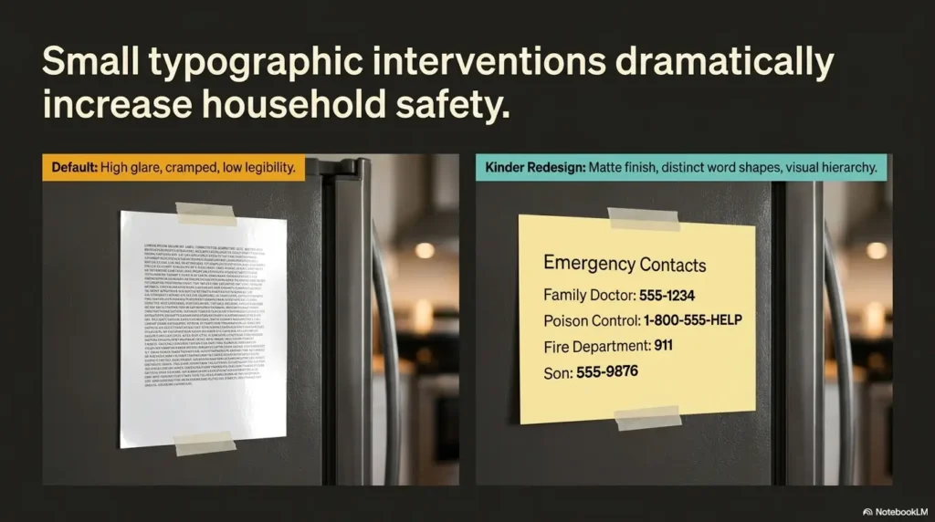
One of the sneakiest mistakes is assuming that bigger automatically means better. Sometimes a label becomes larger but also more crowded. The letters touch the edge. The line wraps awkwardly. The sticker gets placed in a shadow because it no longer fits where it should.
Good readability is a mix: size, contrast, spacing, wording, lighting, surface, angle, and distance. If one part fails badly enough, the whole label starts wobbling like a chair with one short leg.
Who This Guide Is For, And Who It Is Not For
This guide is for seniors who can still read print but find ordinary labels, small notes, medication inserts, calendar reminders, and household tags tiring. It is also for the people who help them: adult children, spouses, caregivers, home aides, occupational therapy helpers, senior living staff, and practical friends who arrive with a label maker and a determined expression.
Presbyopia is a normal age-related change in near focusing. Many people notice that menus, medicine bottles, receipts, and phone screens start demanding longer arms and better light. The aim here is to make home text easier to read without making the person feel managed, monitored, or reduced to a checklist.
For Seniors Who Can Read Print But Need Less Strain
If regular print is still readable with glasses or readers, but it takes more effort than it used to, this article is in the right neighborhood. Maybe the person can read a book in a comfortable chair but struggles with freezer labels. Maybe the medication bottle is readable at noon but not before breakfast. Maybe handwriting that once looked charming now looks like a thicket.
In these cases, the goal is not a dramatic overhaul. It is a thoughtful reduction in tiny daily annoyances. Better labels can make routines feel less brittle.
For Caregivers Making the Home Easier To Navigate
Caregivers often notice the friction first. The parent asks, “What does this say?” The spouse holds a bottle closer to the lamp. The aide sees that three pantry bins have lovely labels nobody uses because the print is too small. The adult child realizes that the emergency contact sheet exists, but it looks like a tax document written for ants.
The best caregiver label is helpful without being bossy. It keeps instructions brief, uses respectful wording, and avoids turning the kitchen into a command center. “COFFEE FILTERS” is useful. “PLEASE REMEMBER THAT THE COFFEE FILTERS ARE IN THIS DRAWER” is a paragraph wearing a sticker costume.
Not for Sudden or Severe Vision Changes
If vision changes quickly, the label is not the main character. Sudden blur, missing vision, eye pain, new double vision, flashes, new floaters, or trouble reading that appears abruptly should be checked by an eye care professional or urgent medical service as appropriate.
For warning-sign context, this related article may help: senior vision changes warning signs. Labels can support a safer home, but they are not a substitute for care when the eye itself is sending smoke signals.
Readiness checklist
- The person can read ordinary print with glasses or readers, but it takes effort.
- Labels are mainly needed for home routines, not complex medical instructions.
- Lighting can be improved in the areas where labels will be used.
- The reader can give feedback on which sample size feels easy.
- No sudden, painful, or severe vision symptoms are being ignored.
The 16–18 Point Rule Most Homes Should Start With
The practical starting point for senior-friendly labels is simple: 16 point for ordinary close-up labels, 18 point for daily-use labels, and larger for high-stakes or distant reading. This rule works because it respects the messy truth of real homes. People do not read labels in a perfectly lit studio. They read them while making tea, sorting laundry, checking a pill box, or looking for soup in a cabinet that has somehow become a cave.
Standard 10–12 point text is common in books, documents, receipts, instructions, and default label-maker settings. It can be fine for younger eyes under good conditions. It is often too small for quick household labels meant for seniors with presbyopia, especially if the label is read at an angle, through a plastic container, or under dim light.
Why Standard 10–12 Point Text Often Fails
Small text asks for precision. It asks the eyes to focus cleanly, the lighting to behave, the surface not to glare, the reader to be patient, and the paper to sit close enough. That is a long list of demands for a freezer label or a note on the back door.
Many older adults can technically read 12 point text, but “technically” is not the standard we want for home safety. If the person must squint, tilt the label, lift their glasses, or ask someone else, the design has already failed its quiet little job.
For labels, easy beats elegant. The label does not need to win a design award. It needs to say “leftovers, Monday” before the fridge door starts beeping.
When 16 Point Is Enough
Sixteen point font can work well for short, close-up labels where the reader naturally stands near the item. Think pantry bins, desk drawers, craft supplies, bathroom baskets, file folders, and basic fridge notes. It is a good minimum when the label is only one or two words and the background is plain.
For example, “TEA,” “TOWELS,” “BATTERIES,” or “DOG FOOD” in 16 point bold black text on matte white tape may be perfectly readable. The words are short. The viewing distance is close. The task is low-risk.
But if the label is longer than a few words, read from farther away, used in dim light, or connected to medication, food safety, or appliance use, 16 point may be too polite. It may need to speak up.
When 18 Point Should Be the Default
Eighteen point is the better default for labels read often, shared by more than one person, or used during a routine. It gives the eyes more breathing room without turning every drawer into a billboard.
Use 18 point for daily medication zone labels, coffee maker instructions, fridge reminders, laundry sorting cues, calendar notes, bathroom cabinet labels, and anything the person reads while standing, moving, or thinking about another task.
One helpful test is the “morning brain” test. If the label has to be read before coffee, before glasses are perfectly adjusted, or before the house has fully woken up, start at 18 point.
Key takeaway
Use 18 point when the label matters more than the decor. For daily-use labels, shared household reminders, and anything read quickly, 18 point is often the friendlier default.
Critical Labels Need Bigger, Bolder, Kinder Design
Some labels carry more weight than others. A tiny “extra napkins” label is annoying if missed. A tiny “morning pills” label is a different matter. Critical labels deserve larger type, stronger contrast, fewer words, and better placement because they support decisions that affect health, safety, and daily independence.
For high-stakes labels, use 18–24 point font when space allows. The label should be readable without hunting. It should not require a magnifier, a second person, or the kind of squint that turns a forehead into folded paper.
Use 18–24 Point for High-Stakes Labels
Use the larger range for medication schedules, emergency numbers, food expiration notes, allergy reminders, hot-surface warnings, laundry instructions that protect clothing, and appliance notes that prevent unsafe use.
For medication areas, a label might say “MORNING,” “EVENING,” “TAKE WITH FOOD,” or “ASK BEFORE TAKING.” For a freezer container, it might say “SOUP, MAY 28.” For an appliance, it might say “HOT AFTER USE” or “DO NOT UNPLUG.” The words should be few, firm, and readable.
If medication labels are a recurring concern, connect this article with more specific systems such as large print prescription labels or a one-page medication list template. Home labels help, but pharmacy labeling and medication lists can make the whole routine more dependable.
Make the Important Word Impossible To Miss
Bold the key word, not the whole paragraph. A label with everything bold can become visually loud without becoming clear. The reader needs an anchor, a single word or phrase that catches the eye first.
Good anchor words include “MORNING,” “NIGHT,” “HOT,” “FRIDGE,” “FREEZER,” “ALLERGY,” “DO NOT DRY,” “CALL FIRST,” and “TAKE WITH FOOD.” These words act like little handrails for attention.
For a longer note, use sentence case for the full instruction and bold only the key cue. For example: “EVENING: Take after dinner.” This keeps the label readable while still making the first action obvious.
Tiny Label, Big Consequence
Small labels often fail in quiet ways. A caregiver may not know a label was missed until food is thrown away, laundry is damaged, a routine is skipped, or the same question gets asked again and again. The problem may look like forgetfulness when it is partly unreadable design.
That distinction matters. If the note is too small, the fix is not nagging. The fix is better typography. Better labels preserve dignity because they reduce the number of times someone has to ask for help with a task they used to do automatically.
Font Size Alone Will Not Save a Bad Label
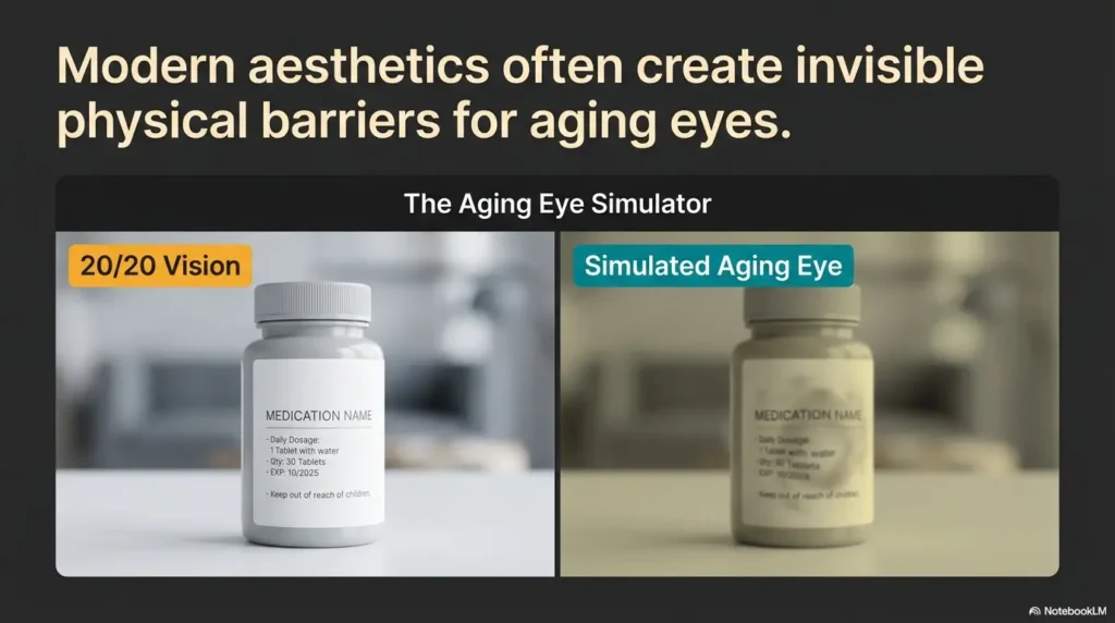
Here is the slightly rude truth: a label can be large and still be bad. Large pale letters on a shiny surface are still hard to read. Large decorative script is still a tiny maze. Large words crammed into a narrow sticker can look like they are trying to escape.
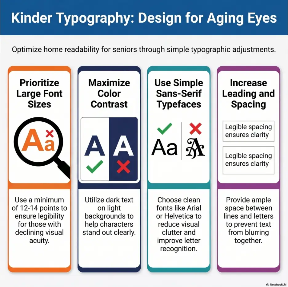
For seniors with presbyopia, the best font size works only when the rest of the label supports it. Contrast, spacing, line length, surface texture, and lighting all decide whether the label feels easy or irritating.
Contrast Beats Cleverness
Dark text on a light, plain background is usually the safest choice. Black on white is not glamorous, but it is reliable. Black on pale yellow can also work well when the paper is matte and the lighting is warm.
Avoid pale gray text, gold on cream, red on black, light blue on white, and color pairings chosen mainly because they match the room. Stylish low-contrast labels can become visual fog, especially in the evening.
If you want the home to look warm, use color as a border or category marker rather than the main text color. Let the words stay dark. The label can be tasteful without whispering.
Letter Spacing Matters More Than People Think
Presbyopia can make crowded text feel like a small gray storm cloud. Roomy spacing helps letters separate from one another. Short lines help the reader keep their place. White space gives the eyes a place to rest.
For labels, avoid long strings of words. Use line breaks intentionally. “TAKE WITH FOOD” is better than “Remember to take this medication with breakfast or another meal.” A label is not a diary. It should carry one job and carry it well.
If your label maker offers margin settings, do not shrink every margin to fit more words. A little blank space is not wasted. It is the quiet padding that makes the message readable.
Bigger But Cramped Is Still Hard To Read
One common mistake is increasing the font size while keeping the sticker the same size. The result is a label with tall letters, tight spacing, chopped edges, and awkward line breaks. It looks bigger, but it does not feel easier.
If the label becomes cramped, simplify the wording before reducing the font. Replace “Please remember that this drawer contains the clean dish towels” with “DISH TOWELS.” Replace “Do not put these pants in the dryer” with “DO NOT DRY.” The shorter version is not colder. It is clearer.
Show me the nerdy details
Point size measures the height of type, but readability depends on more than the number. Two fonts at 18 point can feel different because x-height, stroke thickness, spacing, and letter shape vary. A font with a larger x-height, open counters, and clear differences between similar characters may read larger than a decorative or condensed font at the same point size. That is why testing matters.
Contrast also has a large effect. Thin gray 20 point text can be harder to read than bold black 16 point text. Lighting changes the result again. A glossy label under overhead light may reflect glare directly into the reader’s eyes, reducing practical readability even when the font is technically large.
Key takeaway
Do not solve every readability problem by enlarging the font. First remove clutter, improve contrast, shorten the wording, reduce glare, and place the label where light can reach it.
Choose Fonts That Behave Themselves
The best fonts for senior labels are not dramatic. They do not twirl, squeeze, sparkle, or pretend to be handwritten by a poet on a wedding envelope. They behave. They show each letter clearly and leave the reader alone.
For practical household notes and labels, choose simple sans-serif fonts such as Arial, Helvetica, Verdana, Calibri, or Atkinson Hyperlegible. These fonts usually have clean letterforms and familiar shapes, which helps the brain recognize words quickly.
Sans-Serif Fonts Usually Work Best
Sans-serif fonts do not have the small finishing strokes found in many serif fonts. For labels, especially short labels, that simplicity can be helpful. The letters look cleaner at a glance, particularly on small stickers, label tape, or signs read from a distance.
Verdana is often a strong choice because it was designed with screen readability in mind and has generous spacing. Arial and Helvetica are familiar and widely available. Calibri is common and plain in a useful way. Atkinson Hyperlegible was designed with low vision readability in mind and has distinct letter shapes.
The exact font matters less than the behavior. Look for letters that are open, clear, not too thin, and not squeezed. If the “I,” “l,” and “1” look too similar, choose another font.
Avoid Script, Condensed, and Decorative Fonts
Decorative fonts have their place. That place is usually not a medication station, freezer bin, stove reminder, or hallway note. Script fonts can blur together. Condensed fonts save space by making letters narrower, which can make them harder to identify. Thin modern fonts may look elegant but disappear in low light.
If you want beauty, use a clean font and give the label good spacing. A well-placed, readable label has its own quiet grace. It says, “I thought about the person using this,” which is better than any flourish.
The Lowercase Trap, the All-Caps Trap, and the Middle Path
All caps can work for one-word labels: “TOWELS,” “TEA,” “SOAP,” “FRIDGE.” The blocky shape makes the label feel clear and direct. But all caps becomes harder for longer instructions because word shapes disappear. A full sentence in all caps can feel like a small printed shout.
For longer labels, use sentence case or title case. “Take with food” is easier than “TAKE WITH FOOD BEFORE BREAKFAST OR LUNCH.” If the label needs urgency, bold one key phrase rather than capitalizing everything.
| Font choice | Use it? | Best use |
|---|---|---|
| Arial | Yes | General labels and notes |
| Verdana | Yes | Labels where spacing matters |
| Calibri | Yes | Printed notes and home instructions |
| Atkinson Hyperlegible | Yes | Low-vision-friendly print projects |
| Script fonts | No | Avoid for practical labels |
| Condensed fonts | Usually no | Avoid when readability matters |
| Thin decorative fonts | No | Avoid in kitchens, bathrooms, and medication areas |
The Reading Distance Test Before You Stick Anything Down
A label that looks perfect at a desk may fail in its natural habitat. The kitchen has shadows. The bathroom has glare. The laundry room has awkward angles. The refrigerator door may hold a note lower than expected. Real rooms are tiny weather systems for typography.
Before you commit to a label size, test it from the distance where it will actually be read. This one habit prevents many wasted labels and many “Why did I make these so small?” afternoons.
Countertop Notes Need One Size
Notes read at 12–18 inches can usually be smaller than labels read across a room. A note on a medication tray, kitchen counter, desk, or nightstand may work at 16–18 point if the text is short and high contrast.
But even close-up notes should not be tiny. The person may read them before putting on the right glasses. They may be tired. They may be standing instead of sitting. They may be trying to read while holding something else.
For close-up notes, ask: “Can this be read without leaning in?” If the answer is no, go bigger or simplify the wording.
Wall Reminders Need Another Size
Wall reminders, laundry room signs, door notes, and appliance instructions often need 24 point or larger because they are read from standing distance. The farther the reader stands, the larger the text must be.
A calendar reminder on the wall may need a large heading plus a short line underneath. For example, “EYE APPOINTMENT” in large type, then “Thursday, 10:30 a.m.” beneath it. The key word catches the eye, and the detail follows.
Do not use the same label size for a spice jar and a back-door reminder. They live different lives.
Test It in the Real Room, Not at the Desk
Print one phrase in several sizes: 16, 18, 20, and 24 point. Put each sample where the final label might go. Then ask the actual reader to read it from the normal position, under normal lighting, at a normal time of day.
Do not ask, “Can you read it?” Many people will say yes if they can force their way through it. Ask, “Which one feels easy?” That question changes everything. It shifts the goal from possible to comfortable.
Step-by-step label test
- Choose one short phrase, such as “TAKE WITH FOOD.”
- Print it in 16, 18, 20, and 24 point using the same font.
- Place the samples in the real location: fridge, cabinet, counter, appliance, or wall.
- Test in the lighting used most often, including evening light if relevant.
- Ask which size feels easy, not merely readable.
- Use that size as your household baseline for similar labels.
Readable label framework
1
Size
Start at 16–18 point, then go larger for critical or distant labels.
2
Contrast
Use dark text on a plain light background with matte surfaces.
3
Distance
Test from the actual reading position, not from a desk.
4
Light
Place labels where shadows and glare do not erase the message.
Room-by-Room Label Sizes That Make Sense
Different rooms create different reading problems. Kitchens have containers, dates, steam, glossy packaging, and busy mornings. Bathrooms have moisture, reflections, cleaning products, and safety concerns. Bedrooms need calm reminders that do not turn rest into a bulletin board. Laundry rooms ask for quick sorting decisions before someone ruins a sweater with tragic enthusiasm.
Room-by-room thinking helps you avoid making every label the same size. It also helps you prioritize the labels that matter most.
Kitchen: Food, Dates, and Appliance Cues
The kitchen is the kingdom of quick reading. Labels need to work while someone is standing, reaching, carrying, cooking, cleaning, or deciding whether the container in the fridge is soup, sauce, or a science project.
Use 16–18 point for pantry bins and drawer labels. Use 18–24 point for leftovers, freezer dates, allergy notes, and appliance reminders. For refrigerator labels, matte tape or paper often works better than glossy labels because fridge lighting can create glare.
Good kitchen labels include “LEFTOVERS, JUNE 2,” “LOW SALT,” “NO NUTS,” “COFFEE FILTERS,” “MICROWAVE COVER,” and “HOT PLATE.” If food dates are a challenge, this related guide on how to read expiration dates with low vision may fit naturally into the same home setup.
Bathroom: Safety Beats Aesthetics
Bathrooms are small rooms with big stakes. Water, glare, slippery floors, cleaning products, medications, towels, and poor lighting can team up in unhelpful ways. Labels here should be plain, waterproof enough for the location, and placed where they do not require bending or twisting to read.
Use 18 point or larger for cleaning products, medicine zones, towel shelves, and safety reminders. Avoid faint labels on clear bottles if the liquid or background color makes the text vanish. For shampoo and conditioner, combine large print with tactile markings if needed. A label that can also be felt is useful when steam fogs the room.
For bathroom safety beyond labels, consider related topics such as tactile labels for shampoo and conditioner or anti-slip shower strip placement.
Bedroom: Calm Labels, Not Visual Noise
The bedroom needs readability without clutter. Too many labels can make a restful room feel busy, especially for someone who already feels watched by reminders. Use labels where they reduce effort: drawers, nightstand zones, glasses stations, hearing aid chargers, medication trays, and laundry baskets.
Use 16–18 point for drawer labels and 18 point for nightstand reminders. Keep wording gentle and practical. “GLASSES HERE” is useful. “Do not forget your glasses again” is a tiny scold with adhesive backing.
If poor vision affects bedroom movement at night, this article on bedroom safety for seniors with poor vision can support a fuller plan.
Laundry Room: Fewer Words, Stronger Cues
Laundry labels should be blunt in the best possible way. Nobody wants to read a paragraph while holding damp towels. Use short, high-contrast labels: “DELICATE,” “TOWELS,” “COLD WASH,” “HANG DRY,” “DO NOT DRY,” and “SOAP.”
Use 18–24 point for machine instructions and 16–18 point for baskets or shelves. If the washer and dryer controls are hard to see, pair print labels with tactile dots or tape. For appliance safety in the kitchen and beyond, you may also connect readers to kitchen appliance safety for seniors.
| Room | Best label examples | Suggested size | Extra tip |
|---|---|---|---|
| Kitchen | Freezer dates, leftovers, appliance cues | 18–24 point | Use matte labels to reduce glare |
| Bathroom | Medication zones, cleaning products, towel shelves | 18 point and up | Place labels above splash level when possible |
| Bedroom | Drawers, glasses station, hearing aid charger | 16–18 point | Keep the room calm and uncluttered |
| Laundry | Wash settings, sorting baskets, do-not-dry notes | 18–24 point | Use short commands and strong contrast |
| Entryway | Keys, mail, emergency card, door reminders | 18–24 point | Test from standing distance |
Key takeaway
Match the label to the room. A freezer date, a nightstand note, and a laundry sign do not need the same size, wording, or placement. Let the task decide the typography.
Handwritten Notes Need Their Own Rules
Handwritten notes can be warm, quick, and human. They can also become tiny gray riddles if written with a faint ballpoint pen in polite little letters. For seniors with presbyopia, handwriting needs more generosity than most people think.
The basic rule is simple: use dark, thick ink; write fewer words; make letters larger than feels necessary; and leave space between lines. Clear first, pretty second.
Use Thick Pens, Not Faint Ballpoints
Thin ballpoint pens often create pale, narrow lines that disappear under weak light. Use a dark felt-tip pen, broad gel pen, or marker that writes smoothly without bleeding through the paper. Black ink is usually best. Dark blue can work if it is strong enough.
Avoid red for long notes. Red can be useful for a warning word, but full red sentences may be harder to read and can feel unnecessarily alarming. Save red for rare moments when the label truly needs attention.
Write Fewer Words, Larger Letters
Most handwriting shrinks when people try to be neat. The note looks tidy at first glance, but the reader pays for that tidiness later. Write larger than your instinct tells you. Leave space between words. Use block letters for key labels.
Instead of “Please remember to take the blue folder with you when you go to the appointment,” write “TAKE BLUE FOLDER.” If details are needed, add them on a separate line. One idea per line is kinder to tired eyes.
Short Story: The Note on the Fridge
Marianne wrote a note for her father before leaving for work: “Soup is in the fridge. Heat two minutes.” She used a pretty blue pen and her neatest handwriting. The note looked lovely, almost like a small letter from a calmer century.
That evening, the soup was untouched. Her father had seen the note, but the words looked pale against the white paper under the fridge light. He did not want to bother her, so he made toast.
The next day she rewrote it with a black marker: “SOUP. FRIDGE. 2 MIN.” She placed it at eye level, not buried under magnets.
He ate the soup. The lesson was not that he needed more reminders. The reminder needed more kindness.
A Simple Handwritten Note Template
Use this structure for most handwritten reminders: action first, object second, detail third. That means “TAKE,” “BLUE FOLDER,” “9 A.M.” instead of a long sentence.
Handwritten note template
ACTION
OBJECT OR PLACE
TIME OR WARNING
When To Seek Help or Stop
Larger print can make daily life easier, but it cannot solve every vision problem. If labels remain hard to read after improving size, contrast, lighting, and placement, it is time to ask whether the person needs updated glasses, a low vision evaluation, better task lighting, medication review, or medical attention.
This section is not meant to frighten anyone. It is meant to prevent the common household habit of explaining away every reading problem as “just aging.” Sometimes it is normal near-vision change. Sometimes it is not.
Bigger Print Does Not Solve Everything
Schedule an eye exam if the person struggles even with large, high-contrast labels under good light. The issue may be outdated reading glasses, cataracts, dry eye, medication side effects, macular changes, glaucoma-related field loss, or another concern that needs professional attention.
Also consider whether the person is using the right correction for the task. Bifocals, progressives, readers, and task-specific glasses can behave differently depending on distance and angle. A label on a low shelf may be awkward through progressives because the person has to tilt their head in an uncomfortable way.
Watch for Sudden Changes
Do not wait on sudden blurry vision, flashes, new floaters, double vision, eye pain, a curtain-like shadow, or sudden loss of vision. These are not problems to solve with a larger font. They need prompt medical guidance.
Also pay attention to behavior changes. If a person suddenly stops reading mail, avoids labels, guesses at medication instructions, or becomes anxious around routine tasks, the issue may be more than preference. The home setup may need adjustment, and the eyes may need evaluation.
Ask About the Right Reading Correction
When visiting an eye care professional, bring examples. Take photos of the medication area, kitchen labels, appliance controls, and reading distances. Write down where reading fails: morning, evening, low shelves, glossy packages, medicine bottles, phone texts, or wall calendars.
This makes the appointment more practical. Instead of saying, “Reading is harder,” the person can say, “I can read books, but I cannot read freezer labels or medication notes unless I move them under a lamp.” That detail helps the professional understand the task, not just the symptom.
Key takeaway
Escalate when effort stays high. If 18–24 point labels, strong contrast, and better lighting still do not help, the next useful step is not more stickers. It is an eye exam or task-specific vision support.
Question list for an eye care visit
- Are the current reading glasses still the right strength?
- Would task-specific glasses help for kitchen, medicine, or hobby work?
- Could glare, dry eye, cataracts, or contrast sensitivity be part of the problem?
- Are there warning signs that need urgent attention?
- Would a low vision specialist or occupational therapist be helpful?
- What lighting setup would work best for near tasks at home?
FAQ
What is the best font size for seniors with presbyopia?
For most everyday notes and labels, start with 16–18 point font. For medication reminders, emergency contacts, food safety labels, and appliance warnings, use 18–24 point when space allows. Adjust based on reading distance, contrast, lighting, and the reader’s comfort.
Is 12 point font too small for seniors?
Often, yes, especially for labels and quick-read notes. Twelve point text may be readable in a book under good lighting, but it is often too small for medicine areas, cabinets, freezer labels, and reminders read while standing or moving.
What font is easiest for seniors to read?
Simple sans-serif fonts are usually easiest for practical labels. Good choices include Arial, Verdana, Calibri, Helvetica, and Atkinson Hyperlegible. Avoid script, condensed, thin, or decorative fonts for important household labels.
Should labels for seniors be in all caps?
All caps can work well for one-word labels such as “TOWELS” or “SOAP.” For longer instructions, sentence case is usually easier to read because word shapes remain more recognizable. Bold the key word instead of capitalizing everything.
What size should medication reminder labels be?
Medication reminder labels should usually be 18–24 point when space allows. Use short phrases, bold keywords, strong contrast, and clear placement. For pharmacy bottles, ask the pharmacy about large-print labels if available.
Are handwritten notes okay for seniors with presbyopia?
Yes, if they are written with dark thick ink, large block letters, generous spacing, and short wording. Avoid faint ballpoint pens and cramped cursive for practical reminders.
What color combination is easiest to read?
Dark text on a light, plain background is usually safest. Black on white is the simplest reliable choice. Avoid pale text, shiny backgrounds, patterned paper, and stylish low-contrast combinations.
How can I test if a label is readable enough?
Place the label where it will actually be used, then ask the senior to read it from the normal distance under normal lighting. Ask which size feels easy, not just which size is technically readable.
Make One Readable Label Test Kit Today
The best next step is small enough to do in 15 minutes: make a readable label test kit. You do not need a perfect organizing system, a new label maker, or a full weekend. You need one phrase, four font sizes, and the actual rooms where the labels will live.
Choose a phrase such as “TAKE WITH FOOD,” “SOUP IN FRIDGE,” “DO NOT DRY,” or “CALL BEFORE LEAVING.” Print or write it in 16, 18, 20, and 24 point. Use a clean sans-serif font, dark text, and a plain background. Then test it on the fridge, near the medication area, in the laundry room, and on a cabinet.
Ask the actual reader which sample feels easiest. Do not argue with the answer. The reader’s eyes are the final editor.
Upgrade the Five Most Important Labels First
Start with the labels that carry the most daily value: medication, emergency contacts, food safety, appliance instructions, and daily routine reminders. These are the labels that can reduce confusion, prevent avoidable mistakes, and make the home feel less demanding.
After that, move to pantry bins, drawers, laundry baskets, hobby supplies, files, and decorative organization. The pretty labels can wait in line. The useful labels get the first chair.
15-minute action plan
- Print one phrase in 16, 18, 20, and 24 point.
- Use black text on white or pale matte paper.
- Test the samples in the real room and lighting.
- Ask which size feels easy to read.
- Upgrade five important labels using that winning size.
A readable label is a small act of respect. It says the home should meet the person halfway. It says daily routines should not require squinting, guessing, or surrendering independence one tiny word at a time.
Start with one label. Make it larger, darker, shorter, and kinder. Then let that little square of clarity teach the rest of the house how to speak.
Last reviewed: 2026-06