


A clearer, calmer trip to the mailroom
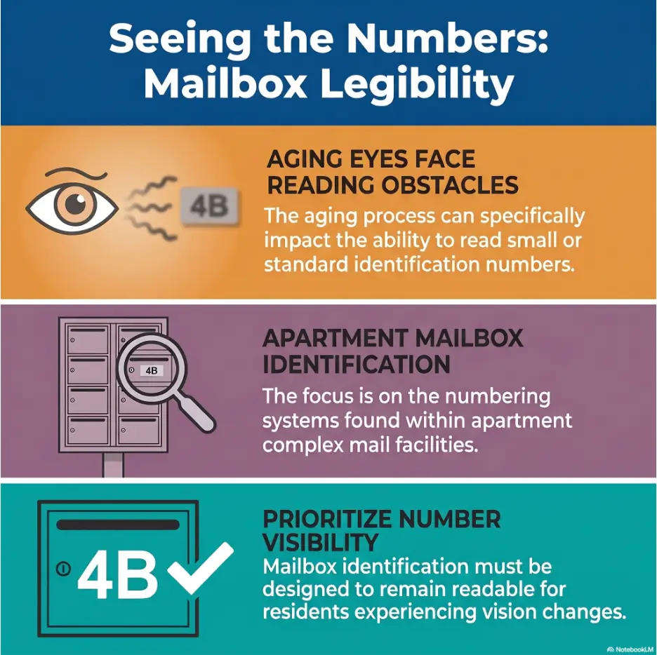
How to Read Apartment Mailbox Numbers
With Aging Eyes
A mailbox number should be a tiny piece of information, not a daily eye exam conducted under humming lobby lights. Yet brushed metal, faded labels, glare, awkward viewing angles, and rows of similar-looking digits can turn a simple errand into a guessing game.
The useful answer is not always stronger reading glasses. Often, the fastest improvement comes from changing contrast, distance, angle, lighting, or the way you use your phone camera. A dependable routine can also prevent the most common mistake: confidently opening, tugging at, or checking the wrong box.
This guide shows residents, visitors, caregivers, and helpful neighbors how to identify mailbox numbers without permanently altering shared property. It also explains when a frustrating label is mainly a building problem and when a new change in vision deserves professional attention.
🔎 The goal is not to stare harder. It is to make the information easier for your eyes to receive.
Article snapshot: This guide is for apartment residents, older adults, visitors, caregivers, and anyone who struggles with small mailbox labels, glare, or similar-looking digits.
You will learn a quick reading routine, phone-camera methods, safe lighting tactics, a private mailbox-map system, and the right way to request a clearer label from management.
The Fastest Way to Read a Small Mailbox Number
To read apartment mailbox numbers more easily, improve contrast before adding magnification. Stand squarely in front of the mailbox, shade glare with your hand, and step slightly backward if the number blurs at close range. Use your phone camera or Magnifier app to enlarge and freeze the label. Then confirm the full number by checking neighboring boxes before inserting a key.
For repeated use, take a respectful reference photo of the entire mailbox bank when no private mail is visible. Record the row, column, and a stable nearby landmark in a private phone note. Residents can ask apartment management for a larger, high-contrast, management-approved label instead of attaching a permanent sticker themselves.
Key takeaway
Use this order: position, shade, distance, focus, zoom, verify. Beginning with maximum zoom usually creates a shaky silver blur rather than a readable number.
The six-step method you can use today
- Stop directly in front of the mailbox bank and keep both feet comfortably planted.
- Identify the correct row or general area before searching for one small number.
- Use your hand, hat brim, or body position to block glare without touching other boxes.
- Move your head slightly left, right, up, and down to find the clearest reflection-free angle.
- Open your phone camera, tap the number to focus, and increase zoom gradually.
- Compare the number with the boxes beside it before using your key.
Why this order works better than simply leaning closer
Moving closer makes an object look larger, but it does not guarantee clarity. Reading glasses are designed for a particular working distance. When you bring your face too close to the mailbox, the label may move inside the distance at which your glasses focus best.
Leaning also makes the phone harder to hold steady. Your head, hand, and screen begin performing a small lobby ballet, while the reflective surface throws ceiling lights back at you. A more stable position usually gives your eyes and camera a cleaner image.
Safety note for shared mailrooms
Keep the floor and other residents in mind while concentrating on a label. Do not stand on a chair, crouch in a way that makes you unsteady, block an exit, or leave letters exposed while working with your phone. If the mailbox is too high, too low, or awkward to reach safely, ask for assistance rather than stretching.
This article offers practical visibility strategies, not a diagnosis. A long-standing difficulty with tiny reflective numbers is different from a sudden change in vision, new double vision, eye pain, flashes, a curtain-like shadow, or a sudden increase in floaters. Those changes deserve prompt professional guidance.
Start With Contrast, Not Stronger Glasses
Mailbox labels are often designed for durability and uniform appearance, not easy reading. A gray engraved digit on brushed stainless steel may be technically present yet visually faint. The problem becomes more noticeable when the lobby contains several competing reflections, shadows, lock cylinders, name strips, notices, and parcel-box doors.
Aging eyes generally need more favorable lighting and stronger separation between an object and its background. That does not mean every difficult label signals eye disease. It means a low-contrast number can become harder to extract from visual clutter, particularly when the surface shines.
Why gray numbers on brushed metal seem to disappear
Contrast is the difference between the number and the surface behind it. Black digits on a matte white label offer a strong edge. Silver engraving on silver metal offers a weak edge, especially when light fills the groove and makes the digit almost the same brightness as its background.
Brushed metal adds directional texture. From one angle, the number may appear dark. Shift your head by a few inches and the same number can turn pale. This is why a person may read the label easily in the morning but struggle under evening lobby lights.
How glare, shadows, and viewing angle change the digits
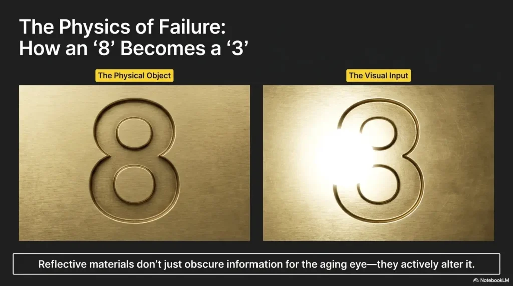
Glare does more than feel bright. It can wash out the border that tells your brain where a digit begins and ends. A narrow “1” may fade into a vertical seam. The open top of a “7” may disappear. A shallow engraved “3” can briefly resemble an “8” when a reflection closes its open side.
Shadows can create the opposite problem. A lock, label frame, or raised edge may cast an extra line beside a digit. Your brain then receives more marks than the number actually contains. The best view is usually not the brightest possible view. It is the view with the cleanest separation between the digit and its background.
Try the three-second visibility test
Stand at a comfortable distance and look at the number for three seconds without leaning, squinting hard, or guessing. Can you identify the entire number? Can you distinguish the uncertain digit from likely alternatives? Can you repeat the number after looking away?
If the answer is no, treat the setup as unreadable and change one condition. Shade the surface. Move slightly sideways. Step back. Add gentle light. Use the phone camera. The test keeps you from spending thirty seconds staring at a poor image and then trusting the first number your brain invents.
Bigger numbers can still be unreadable
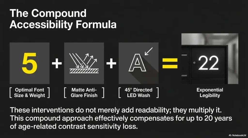
A large digit printed in pale gray on reflective aluminum may be less readable than a smaller black digit on a matte cream label. Size helps, but only when the edges remain clear. Font shape, spacing, glare, surface finish, mounting position, and background contrast all matter.
This point is useful when speaking with management. Asking only for “larger numbers” may produce a larger version of the same weak design. Ask for larger, high-contrast numbers on a matte background. That wording describes the actual problem more accurately.
Use Your Phone as a Pocket Magnifier
A phone camera is often the most practical tool because it separates viewing distance from reading distance. You can hold the phone near the label while keeping the screen at a comfortable distance from your eyes. The camera also lets you freeze the image, adjust brightness, and inspect the number without maintaining an awkward pose.
You do not need a new phone or a special low-vision app to try the basic method. The ordinary camera is enough for many situations. Built-in accessibility tools can add contrast filters, image freezing, and easier controls when the standard camera is not comfortable.
Open the camera, focus first, and zoom slowly
- Open the rear camera and hold the phone with both hands when possible.
- Aim at the number and fill roughly one-quarter of the screen with the label.
- Tap directly on the digit or number plate to tell the camera where to focus.
- Pause until the edges become sharp.
- Increase zoom in small steps rather than jumping to the maximum.
- Take a photo or freeze the view when the number is clearest.
Maximum digital zoom enlarges camera shake, surface grain, and compression artifacts. At high zoom, the grooves in brushed metal may become more prominent than the number. Moderate zoom with a steady phone usually produces a more trustworthy result.
Control screen brightness without lighting up the whole lobby
A dim screen can make a clear camera image hard to read, particularly in a bright lobby. Raise the phone’s screen brightness enough to see the digit comfortably. This is different from turning on the camera flash or shining a strong flashlight directly at the metal.
If your phone screen is reflective, angle it away from ceiling lights or use your body to shade it. Readers who struggle with screen reflections may also find the practical tips in this guide to an anti-glare screen protector useful.
Try the built-in Magnifier features on iPhone and Android
On iPhone, the Magnifier app can enlarge nearby text and objects, adjust brightness or contrast, use filters, and freeze a frame. Available controls can vary by device and software version, so it is worth opening the app at home before relying on it in the mailroom.
Android devices offer accessibility magnification for enlarging screen content, and many models also include camera-based magnifier functions or accessibility tools. Menu names differ among phone makers. Search the phone’s Settings app for “magnification,” “magnifier,” or “accessibility shortcut.”
Save one reference photo instead of solving the puzzle every day
A reference photo is most useful when it shows both the target box and enough surrounding structure to locate it. A close-up of “307” may prove the number, but it will not remind you whether the box sits in the second row or fourth row.
Take two images if building rules and privacy conditions allow: one wider photograph of the mailbox bank and one closer photograph of the number. Avoid capturing exposed names, addresses, envelopes, tracking labels, or another resident’s open mail. Store the image in a private album with a neutral title such as “Mailroom map.”
Key takeaway
The best phone image is not the largest image. It is the sharpest, steadiest image with enough surrounding context to confirm the box’s location.
Change the Angle, Distance, and Light
Before buying another device, conduct a ten-second environmental check. Mailbox numbers can appear and disappear as your position changes. A tiny adjustment may produce more improvement than doubling the magnification.
Stand squarely before reading from the side
Reading from the side compresses digit shapes. A “0” becomes narrower, the horizontal stroke of a “7” becomes less obvious, and engraved lines may blend into the metal’s grain. Begin with your shoulders facing the box and your eyes roughly level with the label.
If another person needs to pass, step away fully rather than twisting your torso while trying to preserve your view. Stability matters. A few seconds of resetting your position is safer than reading while half-turned with one foot searching for balance.
Shade reflective metal with your hand
Hold your open hand several inches above or beside the number, creating a soft shadow over the reflective patch. Do not cover the label itself. Move your hand until the bright hotspot retreats and the digit edges appear darker.
This technique is particularly effective when the lobby has exposed ceiling fixtures. It is less effective when the entire surface is evenly bright, in which case changing your own angle or using the phone camera may work better.
Step back when close-up focus becomes worse
It feels natural to move closer when something is small. Yet many people with presbyopia or a fixed reading-glasses prescription see more clearly at a particular distance. Move backward by six inches, pause, and test again. Then try another six inches.
If you regularly switch between several pairs of readers, this article on setting up reading glasses for seniors can help organize them by task and working distance. A pair suited to a book in your lap may not suit a vertical mailbox label.
Use a flashlight gently, not directly
When extra light is permitted and truly needed, hold a small flashlight or phone light to the side rather than pointing it straight at the number. Side lighting can create a slight shadow inside engraved digits, making their shape easier to see.
Direct light often produces a white glare spot on polished metal. If that happens, move the light farther away, lower its brightness, or bounce it from a light-colored wall. The guide to making an iPhone flashlight less harsh offers additional ideas for situations where the default beam feels too intense.
The Clear-Number Flow
Build a Repeatable Mailbox-Finding Routine
Finding a mailbox is easier when you stop treating the wall as dozens of separate doors. First identify the region, then the row, then the column, and only then read the exact number. This reduces the amount of visual searching your eyes must perform.
A routine also helps on tired days. Vision can feel less efficient after prolonged screen use, errands, bright outdoor light, or a poor night’s sleep. A stable method carries more of the workload when concentration is thin.
Find the correct row before the exact number
Begin with a large visual feature: top half or bottom half, left bank or right bank, above the parcel lockers or beside the notice board. Once you are in the correct region, count rows using a fingertip held in the air rather than touching every mailbox.
For example, your note might say, “Left bank, third row from top, second box from the right.” That instruction remains useful even if the printed number fades further. It also prevents you from scanning every label in the room.
Use fixed landmarks, not temporary objects
Good landmarks include a corner, wall edge, parcel locker, permanent lock style, fire-safety cabinet, support column, or a clear break between mailbox sections. Poor landmarks include a trash can, movable chair, seasonal decoration, taped notice, or another resident’s name strip.
The landmark should remain in place even after maintenance staff rearrange the lobby. Think of it as a lighthouse rather than a parked bicycle.
Translate the mailbox bank into a memorable grid
A grid replaces visual clutter with coordinates. Count rows from the top if that is easiest to see. Count columns from the nearest solid edge, not from a central point that may be difficult to judge.
| What to record | Useful example | Why it helps |
|---|---|---|
| Mailbox section | Right-hand bank | Eliminates half the search area |
| Row | Second row from bottom | Avoids reading every number |
| Column | Third box from left edge | Creates a repeatable coordinate |
| Landmark | Directly above the small parcel door | Confirms the coordinate visually |
| Full number | Apartment 407 | Prevents a location-only assumption |
Confirm the name only after matching the number
Name labels can be outdated, handwritten, abbreviated, obscured, or incorrectly placed. In shared housing, surnames also repeat. Treat the apartment or mailbox number as the primary identifier and the name as a secondary check when a current name label is clearly visible.
Visitors delivering a note or helping a neighbor should never rely on a familiar surname alone. Confirm the unit information directly with the resident or management, especially when the numbering pattern is unusual.
Short Story: The box that moved without moving
Elaine had used the same mailbox for six years. One winter afternoon, she inserted her key into the box she remembered as “the one beside the blue notice.” The key resisted. She tried again, gently but with growing certainty.
The blue notice had been replaced that morning. Without it, she had shifted one column to the left. The mailbox had not moved. Her landmark had.
Her daughter helped her create a private note: “Right bank, third row down, second box from the wall, directly above parcel locker B.” They added a wide photo that showed the wall edge and the parcel locker, not anyone’s mail.
After that, Elaine rarely needed to read every tiny number. The lesson was simple: memory works better when it rests on permanent structure, not yesterday’s decoration.
Key takeaway
Memorize the mailbox as a coordinate, not a vague picture: bank + row + column + permanent landmark + full number.
Stop Similar Digits From Causing Wrong-Box Errors
Many mailbox mistakes are not failures to see anything. They are failures to distinguish between two plausible choices. The reader sees enough information to feel confident, but one incomplete line changes a 3 into an 8 or a 1 into a 7.
The digits most often confused on small labels
| Possible confusion | What to inspect | Helpful check |
|---|---|---|
| 1 and 7 | Look for the top horizontal stroke | Compare another 1 or 7 nearby in the same font |
| 3 and 8 | Check whether the left side is open or closed | Shade glare that may falsely close the 3 |
| 5 and 6 | Inspect the upper opening and bottom curve | Rotate the phone slightly to sharpen edges |
| 0 and 8 | Look for the center pinch or dividing stroke | Freeze the image before enlarging |
| 4 and 9 | Check the lower stem and closed upper loop | Use neighboring sequence information |
| 2 and 7 | Look for the lower curve or base stroke | Compare labels printed by the same machine |
Read the full number twice
Do not isolate only the uncertain digit. Read the whole number from left to right, look away briefly, then read it again. The pause helps reveal whether you are recognizing the label or merely repeating your first guess.
Say the number quietly or enter it into a phone note in large text. For a three-digit number, group it clearly: “four, zero, seven,” rather than “four-oh-seven” if the middle digit is uncertain.
Use neighboring numbers to uncover the sequence
If the box above appears to be 405 and the box below is 409, your unclear label may be 407. This is a useful clue, not final proof. Some buildings place odd and even units on different sides, skip numbers, assign boxes by resident rather than apartment, or arrange boxes in an order that reflects construction phases.
Use sequence information to narrow the possibilities, then confirm with a clearer image, your lease or resident records, management, or a trusted person. Never force a physical key because the pattern “probably” makes sense.
When mailbox order does not match apartment order
Some properties number mailboxes according to postal delivery routes, building wings, floor groupings, or installation order. A resident in apartment 312 may not have the box between 311 and 313. Renovations can make the arrangement even less intuitive.
If the sequence breaks more than once, stop using neighboring numbers as your main method. Ask management to confirm the assigned box and record its physical coordinate. One verified answer is better than an elegant theory built on a crooked numbering system.
Show me the nerdy details
Reading a tiny digit is not just a magnification task. Your visual system must detect an edge, separate it from the background, identify the shape, and compare it with stored number patterns. Glare weakens edges. Blur removes small gaps. Similar fonts reduce the distinctive features that separate one digit from another.
Context can help, but it can also create confident errors. Once you expect a number to be 307, the brain may interpret an incomplete mark as the missing 7. That is why the routine includes a second reading and an independent check using position or neighboring labels.
Avoid Risky Mailbox Fixes
A frustrating label can tempt residents to solve the problem with a marker, adhesive number, strip of tape, or tactile dot. The intention is practical. The trouble is that apartment mailboxes are shared or managed property, and unauthorized changes may interfere with identification, maintenance, postal procedures, or another resident’s use.
Do not attach permanent stickers without permission
Adhesive can damage finishes, trap dirt, cover an official identifier, or leave residue when a resident moves. A label that looks helpful to one person may also create ambiguity for postal staff if it does not match the assigned mailbox number.
Ask management what type of label is permitted and who should install it. A removable solution may still require approval. Written permission protects both the resident and the property team from misunderstandings.
Do not trace faded digits with a marker
Tracing an unclear number assumes you have interpreted it correctly. A mistaken stroke can turn one unit into another. Marker ink may also run, stain the metal, or reduce readability when it reflects light.
Report fading as a maintenance issue. Photograph the label for the report without including visible mail or personal information. Describe the visibility problem rather than attempting a private repair.
Do not leave mail exposed while using your phone
Put letters securely inside a bag or close the mailbox before adjusting camera settings. Avoid resting envelopes on top of the mailbox bank. A phone task that should take ten seconds can stretch into a minute, especially when the camera refuses to focus on the first try.
If you take a reference photo, check the frame before saving it. Crop out names, addresses, barcodes, package labels, open doors, or other private details that are not needed for your map.
Never force a key after matching only part of the number
A key that does not turn is information. Stop, remove it gently, and verify the full number. Forcing the key can bend it, damage the lock, or leave a broken piece inside. It may also alarm another resident who sees someone struggling with their mailbox.
Mistake checklist: stop before doing any of these
- Writing on the mailbox or official number plate
- Covering an existing number with a homemade label
- Attaching tactile markers without management approval
- Photographing exposed mail or resident names unnecessarily
- Standing on furniture to reach a high label
- Forcing a key into a box that is only partly confirmed
Key takeaway
Use temporary viewing aids for yourself. Request management-approved changes for the mailbox. Keeping those two categories separate prevents most property and identification problems.
Ask Management for a More Readable Label
When a mailbox label is consistently difficult to read, a building-level fix is often more sensible than asking every resident to carry a magnifier. Clear identification supports residents, visitors, caregivers, maintenance workers, and delivery staff.
Request a larger, high-contrast label on a matte surface
Describe the design characteristics you need rather than prescribing a specific product. A useful request might ask for bold dark digits on a light matte background, adequate spacing, and placement that can be viewed from a stable standing position.
In some buildings, management may need to preserve a standard style or coordinate with postal personnel. Ask what options are permitted. The first answer may be a replacement for a faded label rather than a custom label, and that simple maintenance step may solve the problem.
Explain the accessibility problem without oversharing
You can state the functional problem plainly: “I have difficulty distinguishing the current low-contrast number because of glare and small print.” You do not need to provide a long medical history in an initial maintenance request.
If you are making a formal accommodation request, local procedures and documentation requirements may apply. Ask the property manager which process they use and keep a copy of written communication.
Ask about tactile, raised, or repositioned identifiers
A tactile marker can be useful for some residents, but it should be installed only with approval and in a location that cannot be confused with the lock or another mailbox. Raised numbers may be easier to see when side light creates a clear shadow, although poor color contrast can still make them visually difficult.
Repositioning may help when a label sits too high, too low, or directly beneath a reflective light. Management may also be able to improve the surrounding fixture, replace a cloudy protective cover, or adjust lighting.
Document recurring lighting or maintenance problems
Write down when the number is hardest to read. Is the fixture flickering? Does a bulb fail repeatedly? Does afternoon sun strike the metal directly? Is the label peeling or scratched? Specific observations are easier for maintenance staff to act on than “the mailbox is hard to see.”
Management request template
Hello, I am having difficulty reading the number on my assigned mailbox because the current label has low contrast and catches glare from the lobby lighting.
Could you please confirm whether the label can be replaced with a larger, high-contrast version on a matte background, or whether another approved identification option is available?
I would also appreciate confirmation of my assigned mailbox location before any change is made. Thank you.
When to Seek Help or Stop
Difficulty with one faded, reflective number is often an environmental problem. Difficulty that is new, widespread, rapidly worsening, or accompanied by other symptoms is a different matter. The safest response depends on what changed and how quickly it changed.
Arrange a routine eye appointment when everyday near tasks are becoming harder
Consider scheduling an eye examination if you increasingly struggle with mailbox numbers, food labels, medication directions, phone text, menus, or bills even under good lighting. Other signs include needing to hold reading material progressively farther away, frequent eyestrain, headaches during close work, or relying on brighter light than before.
Bring examples of the tasks that cause trouble. A phone photograph of the mailbox label can help explain the distance, surface, and contrast involved. Mention whether the difficulty affects one eye, both eyes, certain times of day, or only reflective surfaces.
Readers who are unsure whether the issue is ordinary near-vision change may find this overview of senior near-vision problems helpful when preparing questions for an appointment.
Get prompt medical guidance for sudden or alarming changes
Seek prompt professional advice for sudden vision loss or blurring, new double vision, eye pain, a curtain or shadow across part of your sight, new flashes, a sudden shower of floaters, marked redness with vision change, or symptoms following an eye injury. Do not test the problem repeatedly in the mailroom and hope it clears.
If symptoms are severe or you cannot safely travel, contact local emergency services or ask another person for immediate help. Avoid driving yourself when your vision is suddenly impaired.
Stop if bending, reaching, or standing feels unsafe
The mailbox number may not be the main risk. A low box can require deep bending. A high box may tempt you to reach overhead. A narrow mailroom can make it hard to step back without encountering a wall, mat, package, or another resident.
If you feel dizzy, unsteady, short of breath, or unable to maintain a secure stance, stop and ask for help. Do not use a stool or improvised step. A trusted person, building employee, caregiver, or neighbor can verify the box while you remain in a stable position.
Who may need a different solution
A phone camera may not be the best tool for someone with significant hand tremor, limited grip, cognitive changes, or difficulty navigating small touchscreen controls. A stand magnifier, voice-based assistance, a simplified photo shortcut, or help from a low-vision occupational therapist may be more dependable.
Someone with central vision loss may need to use an off-center viewing technique. Someone with field loss may need stronger landmarks and a deliberate scanning pattern. Someone with arthritis may need help opening the mailbox even after the number is confirmed. The correct solution should address the whole task, not merely enlarge one digit.
Key takeaway
A difficult label calls for a better viewing setup. A sudden change in vision, pain, flashes, new floaters, double vision, or a shadow in sight calls for professional attention.
FAQ
What is the easiest way to magnify a mailbox number?
Use your phone’s rear camera. Stand steadily, tap the number to focus, increase zoom gradually, and take a photo when the edges are sharp. You can then enlarge the still image without holding the phone in the same position.
Can I use my phone camera to read small apartment numbers?
Yes. The standard camera works well for many people, while built-in Magnifier or accessibility tools may offer filters, freezing, brightness adjustment, and easier enlargement. Keep private mail and resident information out of saved photographs.
Why are mailbox numbers harder to read in bright light?
Bright light can reflect from polished metal and reduce the visible difference between the digit and its background. Shade the surface, change your viewing angle, or move so the light is no longer reflected directly toward your eyes.
Should I use a flashlight on a reflective mailbox?
Use one only when permitted and needed. Hold it off to the side at low or moderate brightness. Direct light can create glare, while side light may cast a small shadow inside engraved digits and improve their shape.
Can apartment management install larger mailbox numbers?
Management may be able to replace faded labels or approve a larger, high-contrast identifier, although building and postal requirements differ. Ask about the approved process before changing the mailbox yourself.
May I place my own large-print label on a shared mailbox?
Do not attach a label without permission. Adhesive, placement, wording, and number format may be regulated by the property or postal setup. Request a management-approved option in writing.
How can I remember which mailbox is mine?
Create a private coordinate using the mailbox bank, row, column, permanent landmark, and full number. Save it in a large-text phone note and add a wide reference photo that does not reveal other residents’ mail.
Why do I confuse similar numbers even with reading glasses?
Reading glasses can improve focus but cannot repair low contrast, glare, faded print, poor font design, or an unsuitable viewing angle. Compare the unclear digit with another example in the same font and verify the full number twice.
Is it safe to photograph the mailbox bank?
A private reference photo may be useful when building rules allow it, but avoid capturing exposed mail, addresses, tracking labels, open boxes, or unnecessary resident names. Crop the image and store it in a private album.
Key takeaway
When the same question returns every day, convert the answer into a saved routine. A good system is quieter than repeated effort.
Create Your 30-Second Mailbox Map
The most useful next step is small enough to complete during one calm visit. You do not need to redesign the mailroom, buy a device, or memorize every number. You need one verified coordinate that leads you back to the correct box.
A 15-minute action plan
- Visit the mail area at a quieter, brighter time when possible.
- Confirm your assigned mailbox number using reliable resident records or management.
- Stand squarely in front of the bank and test shade, distance, and camera focus.
- Identify the permanent bank, row, column, and landmark.
- Take a privacy-conscious wide photograph and a clear number photograph if permitted.
- Create a large-text phone note with the complete coordinate.
- Ask a trusted person to verify the map once.
- Report a faded label, failed light, or severe glare to management.
Copy this private mailbox note template
My mailbox map
Assigned number: ____________________
Mailbox bank: Left / center / right / other
Row: ____________________ from top or bottom
Column: ____________________ from left or right
Permanent landmark: ____________________
Best viewing method: Shade / step back / phone camera / side light
Verified by: ____________________ on ____________________
The calm final check
At the mailbox, follow the same sequence each time: locate the bank, find the row, find the column, read the full number, and test the key gently. When the light is poor or your eyes are tired, open the saved map before you begin searching.
The number itself has not become more important. Your method has become more dependable. That is the quiet victory: less squinting, less guessing, less time standing beneath a bright lobby light while identical metal doors blur into one another.
Within the next 15 minutes, create the note template on your phone and add the five headings even if you are not near the mailbox. On your next visit, fill in the blanks. A thirty-second map can retire a daily puzzle.
Last reviewed: 2026-06