

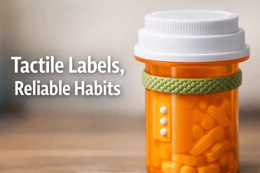
The Tactical Fail-Safe: Medication Labeling for Real Life
The fastest way to get a medication mix-up is to build a tactile labeling system that only works when you’re calm, two-handed, and saintly. Real life is none of those things.
“If you’ve ever stood over the counter at night, bottle in one hand, brain buffering at 3%, you already know the pain: lid vs side vs shoulder feels like a tiny decision until it’s the only decision that matters.”
Keep guessing and you risk the quiet kind of error, the one that doesn’t announce itself until later. This guide provides a repeatable pill bottle tactile label placement standard that your fingers can run on autopilot, plus a backup cue that survives bag friction, humidity, and “someone touched my stuff.”
Built from real-world stress tests, not craft-store optimism.
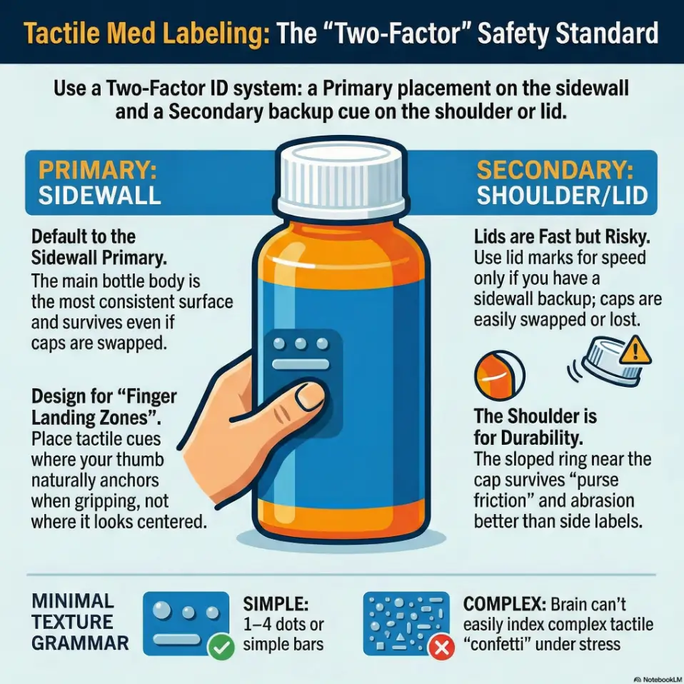
For most people, the best tactile label placement on a pill bottle is the sidewall (main cylinder), aligned consistently so your fingers “land” on it the same way every time. Lids can be fast for ID but get swapped, washed, or mis-threaded. Shoulders (the sloped/upper ring) help when side labels rub off, but vary by bottle shape. Choose one placement standard, add a secondary backup cue, and test it one-handed in real-life lighting and stress.
Table of Contents
1) The decision in 10 seconds: lid vs side vs shoulder
If you only remember one thing, remember this: choose a placement standard your hand can repeat. Your fingers are better at habits than your brain is at “I’ll remember later.” (Ask my past self, who once confidently reached for the “night meds” and discovered it was actually “the meds that make you nap at 2 PM.”)
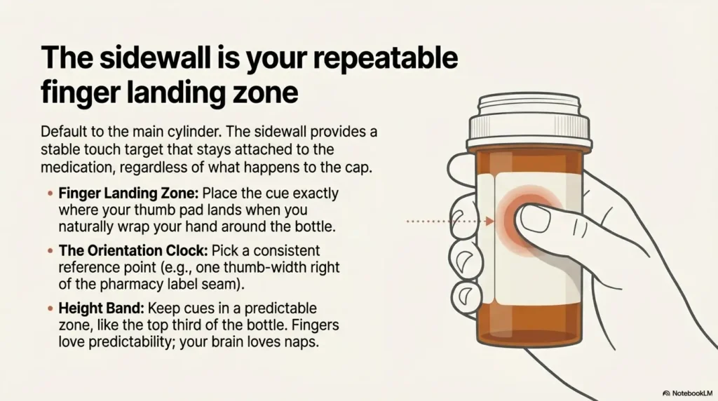
Side-first default: the “repeatable landing zone”
Default to the sidewall, because it’s the most consistent surface across pharmacy bottles. Side placement gives you a stable “touch target” that doesn’t depend on cap type, and it keeps your cue attached to the bottle even if the cap goes on a little crooked. If you’re building a bigger system, this pairs well with a broader low vision medication management routine so the labeling becomes part of a calm, repeatable flow.
- Best for: daily meds, multiple lookalike bottles, one-handed checks
- Why it wins: you can build a motor pattern: grab, rotate slightly, land on cue
Lid-first exception: when speed matters more than swap risk
Lid cues can be fast. If you dose frequently and need instant ID, a lid cue can help. But lids are also the part most likely to betray you: caps get swapped between identical bottles, rinsed, sanitized, or replaced with a different child-resistant style. If you still want lid speed, consider keeping it as a “third factor” while leaning on large print prescription labels (when available) for quick verification.
Shoulder as backup: when side labels fail in pockets and purses
The shoulder is that sloped ring near the top of many bottles. It’s a “grip zone,” which is exactly why it can work as a backup cue. If your bottle lives in a gym bag, pocket, or crowded toiletry kit, the shoulder often survives abrasion better than a label stuck mid-body.
Quick rule: primary cue + secondary cue (never one cue alone)
Your goal is not artistry. It’s redundancy. Use one primary placement (usually sidewall), and one secondary cue (often shoulder or a small cap mark), so a single failure doesn’t turn into a guessing game. If you’re juggling many meds, it’s also worth understanding how polypharmacy can interact with vision problems, because “more bottles” tends to amplify the risk surface.
- Use lid cues for speed only if you control swap risk
- Use shoulder cues as a durability backup for travel
- Always build redundancy: two cues, not one
Apply in 60 seconds: Pick your “primary placement” right now and commit for 30 days.
- Choose Side if you manage 3+ bottles or share space with others.
- Choose Lid if you dose 2+ times/day and caps never get swapped (single-user, controlled setup).
- Choose Shoulder if bottles travel in bags or pockets and side cues peel fast.
Neutral next step: Pick one primary placement and one backup cue to test tonight.
2) Side placement done right: “finger landing zone” rules that prevent mix-ups
Side placement is powerful for a boring reason: you touch the side every time. But the “done right” part matters. The difference between a reliable cue and a nightly scavenger hunt is usually orientation.
Put it where your thumb naturally rests (not where it looks centered)
Most people grip a bottle the same way: fingers wrap, thumb anchors. Put your primary tactile cue where the thumb pad lands. Not where it’s visually centered. Not where it feels symmetrical. Where your hand actually goes.
Small lived detail: I used to place dots “artist-style” in the middle. Then I realized my thumb never touched the middle. It touched the upper third, like it had signed a contract.
Choose an “orientation clock” (e.g., label at 12 o’clock from seam)
Pick a consistent reference point, then place the tactile cue relative to it. Options:
- From the pharmacy label seam: cue sits one thumb-width to the right of the seam
- From the barcode edge: cue sits directly under the first digit row
- From the bottle’s molded line: cue sits above/below the ridge
Anything works if you do it the same way every time. Your fingers love predictability. Your brain loves naps.
Keep a consistent height band (top third, middle, or bottom third)
Pick one “height band” for your primary cue. Top third tends to be easiest because it’s near the cap and near where you naturally pinch. If you pick “middle,” stick with it. The worst system is the one where every bottle is a new surprise.
Pattern interrupt H3: Let’s be honest… you won’t “remember later”
Later is where errors breed. Later is where you’re holding a bottle in one hand and your phone in the other, trying to recall whether “two dots” meant “morning” or “the one that requires food.” Build for no-memory operation. Build for the version of you that’s half awake and fully convinced you’re fine.
Show me the nerdy details
Sidewall works because it supports a stable “grasp-rotate-confirm” loop. In human factors terms, you’re reducing cognitive load and increasing repeatability. Consistent placement creates a motor routine. Motor routines survive stress better than recall-based systems, especially when bottles look and feel similar.
I once built a beautiful tactile system. It was, frankly, adorable. Different textures, different patterns, a tiny tactile “language” that made me feel like a competent wizard. Then a stressful week arrived. I was doing night dosing with one light on, one eye tired, brain fog humming like a fridge.
I grabbed the bottle I thought I knew, felt for the cue, and found… a cue. Great. Except I had placed that cue on the lid. And the lids had quietly swapped sometime during a rushed refill day. Same brand. Same cap. Same threading. Different medication. I caught it only because the bottle body felt slightly different in my hand. That night I rewrote my system with one goal: make it hard to be wrong. Sidewall primary. Shoulder backup. And zero reliance on my “smart, calm, well-rested self,” who rarely shows up on weekdays.
3) Lid placement: fast ID, fragile truth (what can go wrong)
Lid placement feels elegant: top of bottle, quick touch, instant answer. The problem is that lids are the most replaceable part of the system. If your goal is medication-safety intent, you have to respect swap risk the way you respect gravity: it doesn’t care about your confidence.
The lid swap problem: same brand, different meds, identical caps
Many pharmacy bottles share cap types across multiple prescriptions. If you have two bottles open at the same time, or a caregiver is helping, the swap risk goes up. Even “accidental half-swaps” happen: a cap goes on the wrong bottle for one night, then gets corrected later. Your tactile system now contains a hidden trap. If a partner is supporting your setup, it can help to read a caregiver lens like helping a spouse with vision loss, because “who touches the bottles” is part of the risk model.
Personal note: the swap usually happens during the most normal moment. Refilling a weekly organizer. Chatting. Being human. That’s exactly why you plan for it.
Child-resistant caps: extra rotations can shear raised dots
Child-resistant caps require push-and-turn or squeeze-and-turn motions. Over time, those motions can scrape or flatten certain tactile materials. Also, if the cap is frequently over-tightened, textures can snag on fabric or rub against counter edges.
Cleaning and humidity: why lids lose texture sooner than you think
If you wipe lids with sanitizing wipes or wash hands and handle bottles frequently, lid cues see more moisture and friction than side cues. Bathroom humidity and kitchen grease are their own villains. (They’re quiet villains. The worst kind. 😅) If night routines happen in dim hallways, pairing this with low vision nighttime bathroom safety upgrades can reduce the “3% brain buffering” moments that make labeling do all the heavy lifting.
Curiosity gap: the “cap migration” test you can run tonight
Open two bottles. Put them side by side. Close them without looking. Now, without looking, swap the caps and see how long it takes you to notice. If your answer is “I might not,” lid-only labeling is not your safest bet.
- Use lid marks as a secondary cue, not the only cue
- Assume caps can migrate during refills or travel
- Stress-test your system when you’re calm, not after a near-miss
Apply in 60 seconds: Add a small sidewall cue to any “lid-only” bottle you use weekly.
4) Shoulder placement: the underrated “grip ring” strategy
Shoulder placement is the quiet professional in the room. Not flashy, not trendy, but oddly reliable when your bottle lives a rough life.
What “shoulder” means (and why many guides skip it)
The “shoulder” is the sloped area or upper ring where the bottle transitions from the wide cylinder to the narrower neck under the cap. Many guides skip it because bottle shapes vary, and variation makes writers nervous. In real life, variation is exactly why shoulder cues can help: your fingers naturally pinch there.
Best for: travel bottles, gym bags, loose-pocket carry
If you toss a bottle into a bag, the side label gets scraped. The shoulder often sits protected under your grip. In travel, I like shoulder as a backup cue because it survives friction better than “mid-body tape.” If you travel often, a broader system like low vision travel tips can help you design for “bags, hotels, and unfamiliar lighting,” not just home countertops.
Worst for: small amber vials and smooth-taper pharmacy bottles
Some amber vials have minimal shoulder geometry. Some pharmacy bottles taper smoothly with no defined ridge. In those cases, shoulder cues can be hard to locate consistently. That’s when sidewall returns as the anchor.
Curiosity gap: why shoulder cues feel “louder” to your fingertips
Because your grip pressure concentrates near the top, the tactile signal can feel stronger there. It’s not magic. It’s geometry and pressure. And yes, it’s unfair that physics is so helpful sometimes.
Show me the nerdy details
Shoulder placement benefits from higher grip force and a more consistent pinch point. Tactile perception improves when contact pressure increases, which is common near the neck where fingers stabilize the bottle. That can make smaller cues feel more detectable at the shoulder than on the mid-body.
5) Tactile label materials that actually survive real life
This is where most “tips” get unhelpful, because they turn into shopping lists. Instead, think in tradeoffs: durability, detectability, and cleanup. You want something that stays put, stays readable, and doesn’t turn into gummy residue by week three.
Raised dots vs bump strips vs textured tape: durability tradeoffs
- Raised dots: great for simple grammar (1–4 dots). Some styles flatten over time, especially on lids.
- Bump strips / bars: easier to feel quickly, good for “one long bar = morning” style coding.
- Textured tape: strong tactile signal, but can fray or peel in bags and humid rooms.
Lived detail: I once used a super “grippy” tape that felt amazing, until it collected lint like it was auditioning for a sweater role.
Adhesives: the heat, oil, and sanitizer triangle (what fails first)
Adhesives fail fastest under a triangle of doom: heat (near stoves or in cars), oil (kitchen handling, lotion), and sanitizer (wipes, gels). You can’t avoid all three, so pick your enemy:
- Bathroom storage? Choose moisture-resistant materials and add a shoulder backup.
- Kitchen storage? Choose grease-resistant placement and avoid near-stove heat.
- Travel? Assume abrasion and friction, plan redundancy.
Avoid tactile confetti: limit textures so your brain can sort them
One of the most common failure modes is “every bottle feels unique.” That sounds good until you have 6 bottles and your fingertips are hearing a jazz band when you needed a metronome.
Pattern interrupt H3: Here’s what no one tells you about “too many dots”
Too many dots isn’t “more information.” It’s more uncertainty. Under stress, your brain does not calmly count to seven. It guesses. So keep patterns small, bold, and repeatable. If you’ve already built tactile “micro-systems” elsewhere at home, borrowing consistency from something like a low vision clothing tag system can help you keep your tactile grammar minimal and stable across contexts.
- Yes/No: Do you have 3+ prescription bottles that feel similar?
- Yes/No: Do bottles get handled by more than one person (caregiver, partner, staff)?
- Yes/No: Do you travel with bottles in a bag or pocket weekly?
Neutral next step: If you answered “yes” to any, set sidewall as your primary cue and add a shoulder backup.
6) The “two-factor ID” method: stop relying on one tactile cue
In the security world, two-factor is standard because one factor fails. Medication labeling deserves the same respect. This isn’t paranoia. It’s a practical safety habit.
Factor 1: placement (lid/side/shoulder)
Pick your primary placement (again: sidewall wins for most). Then pick a secondary placement that covers your primary’s failure mode.
- If sidewall can peel in travel: add a shoulder backup cue
- If you love lid speed: keep lid cue, but add sidewall confirmation cue
Factor 2: texture grammar (dot count, bar length, shape)
Keep grammar small. Examples that scale:
- Dots 1–4 only (never more)
- Short bar vs long bar (two categories only)
- One dot + one bar for “high attention” meds (only if you can maintain it)
Personal anecdote: the day I cut my textures down to two categories, my “search time” dropped. Not by magic. By sanity.
Factor 3 (optional): a non-tactile backup (large print, QR/NFC, audio app)
If you can, add an external verification method. In the US, accessible prescription options have expanded in recent years, and some major pharmacy chains offer talking labels or app-based spoken label features for blind and low-vision customers. If you’re making requests, it helps to skim what to ask for with large-print prescription labels and keep the request concrete and short.
Curiosity gap: the “wrong-bottle in the dark” rehearsal
Tonight, stand in your kitchen with the lights low. Pick up a bottle, identify it by touch, then verify using your secondary method (large print, app, or a caregiver double-check). If your tactile system and your verification disagree, your tactile system gets redesigned. No shame. Just iteration.
7) Who this is for / not for
For: low vision, blind users, caregivers, ADHD/brain-fog, night dosing
This is for anyone who needs an ID system that works when attention is thin. If you’ve ever said “I’m sure this is the right bottle” and then felt the chill of doubt, welcome. You’re exactly who this is for. If the emotional load is part of the story, you might also appreciate a gentle companion piece like anxiety before eye surgery, because fear and fatigue tend to make routines wobble.
For: anyone managing 3+ lookalike bottles in one place
The moment you have multiple similar bottles, the risk is no longer theoretical. It becomes a daily operations problem.
Not for: situations requiring regulated packaging changes (ask your pharmacist)
Some medications have special storage requirements, original-container requirements, or packaging that should not be altered. If your medication instructions specify special packaging or handling, follow those instructions and ask your pharmacist what labeling options are safe.
Not for: high-risk meds without professional guidance on storage and labeling
If you manage high-risk meds (for example anticoagulants, insulin, seizure medications), build a double-check system with a pharmacist or caregiver. This guide helps you reduce confusion, but it does not replace professional safety planning.
- Start small: top 3 most-used bottles
- Use two factors: tactile + verification
- Ask for accessible labeling services when available
Apply in 60 seconds: Choose the 3 bottles you touch most and label only those today.
8) Common mistakes that cause the worst kind of error (the quiet one)
The worst medication error at home is often not dramatic. It’s quiet. It’s a small mismatch repeated once, then twice, then normalized. Here are the mistakes that create that kind of risk.
Mistake #1: labeling only the lid (then caps get swapped)
This is the classic trap. Lid-only systems feel clean, until the day they aren’t. Add a sidewall confirmation cue and you eliminate the single point of failure.
Mistake #2: placing cues where your hand never naturally touches
Many people place cues based on “where it seems right.” But your hand has its own map. Put cues where your fingers actually land in real life.
Mistake #3: using “random systems” (today dots, tomorrow tape)
Random is exhausting. Random is also how you end up with a system nobody else can help maintain. Consistency is kindness, especially if a caregiver needs to assist. If you’re building a maintainable routine for two people, coping with vision loss as a couple can help frame the system as shared logistics, not personal burden.
Mistake #4: making every bottle feel unique (your fingers can’t index chaos)
Your fingertip memory is great at categories. It’s not great at an encyclopedia of textures. Keep the grammar minimal.
- Pharmacy name and location (or mail-order provider)
- What format helps you most: large print, braille, talking label, app-based audio
- How many prescriptions you need labeled (start with top 3)
- Whether you use child-resistant caps or easy-open caps
Neutral next step: Call or message your pharmacy with one clear request and one fallback option.
9) Don’t do this: placement choices that look clever and fail under stress
Don’t put the cue on the back label seam (rotation ruins consistency)
Seams rotate. Labels shift. If your cue depends on a seam always being “at the back,” your system will drift.
Don’t place cues on the bottom (sets down, rubs off, hard to find)
Bottom cues are slow to locate and easy to abrade. Also, you’ll often be holding a bottle one-handed. Bottom cues force awkward flips.
Don’t stack multiple cues close together (texture collisions)
When cues collide, your fingers get a blended signal. You want crisp categories, not tactile soup.
Don’t rely on smell, shake-sound, or “weight” as your identifier
Smell changes. Pills change. Sound changes when counts change. Weight changes after you take doses. These are not identifiers. They are vibes. Vibes are not medication safety tools.
Show me the nerdy details
Under stress, people rely more on pattern recognition than deliberate analysis. That makes ambiguous cues risky. “Smell/sound/weight” cues are inherently variable, so they increase the chance of confident misidentification, which is worse than uncertainty.
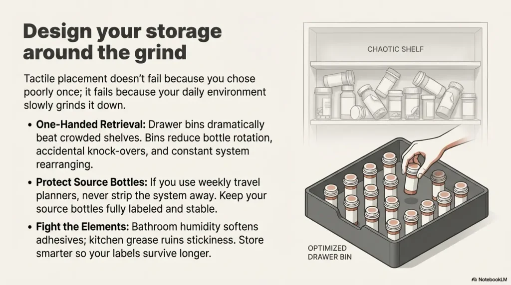
10) Storage + handling: where placement fails (and how to design around it)
Placement doesn’t fail because you chose wrong once. It fails because your environment slowly grinds it down. Design around the grind.
Bathroom humidity, kitchen grease, and purse friction: pick your enemy
Humidity softens adhesives. Grease reduces stick. Friction peels edges. If you store meds in a humid bathroom, consider moving them to a cool, dry location that’s still convenient. Medical organizations and public health guidance commonly emphasize that heat and moisture can damage medicines and that original containers and safe storage matter. Practical takeaway: store smarter so your labels last longer. If your storage zone shares space with other tactile systems (like shower items), keeping consistent “feel rules” across categories can help, for example using tactile labels for shampoo and conditioner so your fingertips aren’t forced to learn a new dialect in every room.
One-handed retrieval: why drawer bins beat crowded shelves
One-handed retrieval is the reality for many people. Drawer bins reduce bottle rotation and accidental knock-overs. A crowded shelf turns into a tactile crowd scene.
Small lived detail: the week I moved bottles into a shallow bin, I stopped “accidentally rearranging” my system every time I reached for one. My fingers finally got consistent.
Travel dose planners: how to keep “source bottle” IDs intact
If you use a weekly organizer, keep the source bottles labeled and stable. Don’t strip your system away by moving pills into unlabeled containers without a verification method. If you must travel with smaller containers, add a secondary verification method (app-based audio, large print, or a caregiver check). For many households, printing a simple reference like a one-page medication list template can also reduce “which bottle is which” confusion during refills.
Mini checklist: “Find, confirm, dispense, re-confirm” in 15 seconds
- Find: locate bottle by primary cue (sidewall)
- Confirm: verify by secondary cue (shoulder or lid mark)
- Dispense: open, dose
- Re-confirm: before returning bottle, touch cue again
Enter (1) number of daily dosing moments, (2) average seconds spent locating/confirming, (3) number of bottles you manage.
Result: (Click Calculate)
Neutral next step: If you’re spending more than 30 seconds/day, simplify placement and add a second cue.
11) Safety/Disclaimer block (read once, then proceed calmly)
This guide is for organization and tactile accessibility, not medical advice. It does not tell you what to take, when to take it, or how to change your regimen.
- Never change pills, combine meds, or repackage without pharmacist guidance, especially if your medication has special storage requirements.
- If you’re unsure about an ID: pause and verify using a non-tactile backup (large print, talking label, app, pharmacist, caregiver).
- If you’ve had a near-miss: treat it as a signal to upgrade your system, not as a personal failure.
Real talk: everyone’s attention slips. A good system is the one that catches you when it does.
12) When to seek help (worth it, no shame)
If you’ve had a near-miss, ask your pharmacist about accessible labeling options
In the US, accessible prescription information has become more available through a mix of pharmacy services and assistive label systems. If you’re blind or low vision, ask about large print, braille, or talking label options. Some systems use RFID or app-based audio features to read label information aloud.
If bottles are identical, request large-print labels or differentiating packaging
If two bottles are physically identical, your tactile system has to work harder. That’s a great moment to add an official accessibility service as the “third factor.”
If you manage high-risk meds (e.g., anticoagulants, insulin), get a double-check system with a caregiver
A double-check system can be as simple as: tactile confirm + talking label + caregiver check during weekly refills. The goal is not dependency. The goal is risk reduction where it matters most.
- Touch sidewall cue to identify category
- Touch shoulder cue to confirm
- Optional: verify by talking label / large print
- Dispense, then re-confirm before putting away
- Lid-only fails via cap swap
- Side-only fails via peel/abrasion
- Shoulder-only fails on smooth-taper bottles
- Two-factor reduces single-point failures
Use it like a map: choose one primary, one backup, then test in the dark for 30 seconds.
FAQ
1. Where should I put tactile dots on a prescription pill bottle?
Start with the sidewall (main cylinder), placed where your thumb naturally lands. Add a secondary cue on the shoulder or lid so one failure doesn’t force guessing.
2. Is it better to label the lid or the side of a pill bottle for blind users?
For most people, the side is safer because it stays with the bottle even if caps migrate. Lids can be fast, but caps are the highest swap risk. A lid cue is best used as a speed cue, not the only identifier.
3. What is “shoulder placement” on a pill bottle and when is it best?
The shoulder is the sloped ring near the top under the cap. It’s best as a backup cue when bottles travel in bags, pockets, or humid environments where side adhesives peel.
4. How do I stop pill bottle caps from getting swapped and causing mix-ups?
Use a cap rule: only open one bottle at a time, recap before touching another, and keep a sidewall cue so a swapped cap won’t trick you. For weekly organizers, do refills in a quiet routine and re-confirm each bottle before moving to the next.
5. What tactile label materials last longest on pharmacy bottles?
Durability depends on your environment, but in general: bump strips/bars often stay readable longer than tiny dots, and textured tapes can be very detectable but may fray in bags. Whatever you choose, avoid “too many textures.”
6. Can I put tactile labels on child-resistant caps without ruining the function?
You can often add a small tactile cue, but be careful not to obstruct the push-and-turn mechanism or reduce grip. If the cue changes how the cap closes, move the primary cue to the sidewall and keep any lid cue minimal.
7. What’s the safest way to label multiple medications that feel identical?
Use two-factor ID: placement standard (sidewall primary) + minimal texture grammar (1–4 dots or a short/long bar system). Add an optional third factor like a talking label or large print when available.
8. Should I repackage pills into organizers if I’m visually impaired?
Organizers can help, but they remove the original bottle context. If you use one, keep source bottles labeled, use a verification method during refills, and consider asking a pharmacist about accessibility services if you’ve had confusion or near-misses.
9. How can caregivers set up a tactile system that’s easy to maintain?
Keep it simple: one placement standard, two textures max, and a written reference card (large print or digital note). Train the routine: open one bottle at a time, confirm twice, then move on.
10. What should I do if I can’t identify a pill bottle by touch?
Pause and verify. Use a non-tactile backup (talking label/app, large print, pharmacist call) before taking anything. If this happens once, redesign your system to remove single points of failure.
Conclusion
Let’s close the loop from the beginning: the “best” placement is the one that still works when you’re tired, one-handed, and life is loud. For most homes, that means sidewall as the primary cue, plus shoulder as the backup. Lids can be a helpful speed cue, but only when you treat cap swapping as a real risk and design around it.
Your 15-minute next step: label your top 3 bottles today using one standard (same height band, same orientation reference), add a shoulder backup cue, then run one quick test tonight: find, confirm, dispense (pretend), and re-confirm with the lights low. If your fingers hesitate, don’t blame yourself. Adjust the placement until your hand lands correctly every time.
Last reviewed: 2026-02-28