

Light as a Helper, Not a Heckler: Navigating Paint Sheen for Low Vision
A paint finish can change a room more than a new lamp, a new rug, or a better shade of white. In a low-vision home, the choice between matte vs. glossy is not a style debate. It is a daily usability decision about glare, contrast, and visual comfort.
Paint stores often sell sheen as a durability choice, but in practice, it often becomes a visibility problem. A wall that looks calm on a sample card can flare up once daylight hits the cabinets, trim, and mirrors.
“`“Easy to clean” can quietly become “hard to look at.”
This guide helps you choose the right finish for glare sensitivity with less regret. Our goal isn’t showroom polish. It is a calmer room that is easier to navigate, easier on the eyes, and easier to live in.
Table of Contents
Start with the real problem: glare is not just “too much light”
People often talk about glare as if it were simply brightness turned up too far. In real rooms, it behaves more like bad acoustics. The trouble is not only the amount of light in the room. It is where the light lands, how it bounces, and what it bounces off.
RNIB describes two kinds of glare that matter in daily life: discomfort glare, which feels unpleasant or painful, and disability glare, which actually makes it harder to see. That distinction matters. A surface can feel annoying, yes, but it can also wash out edges, flatten detail, and make a room harder to navigate.
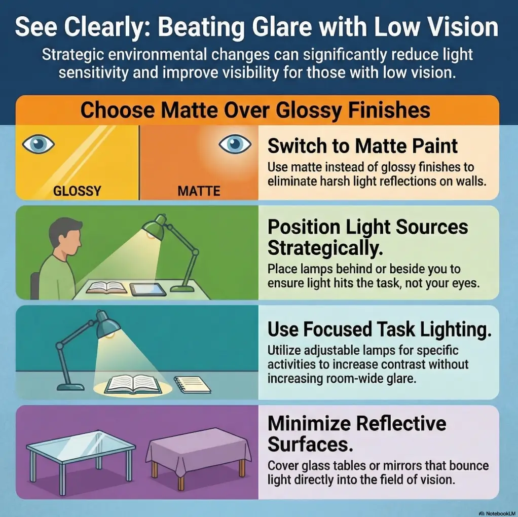
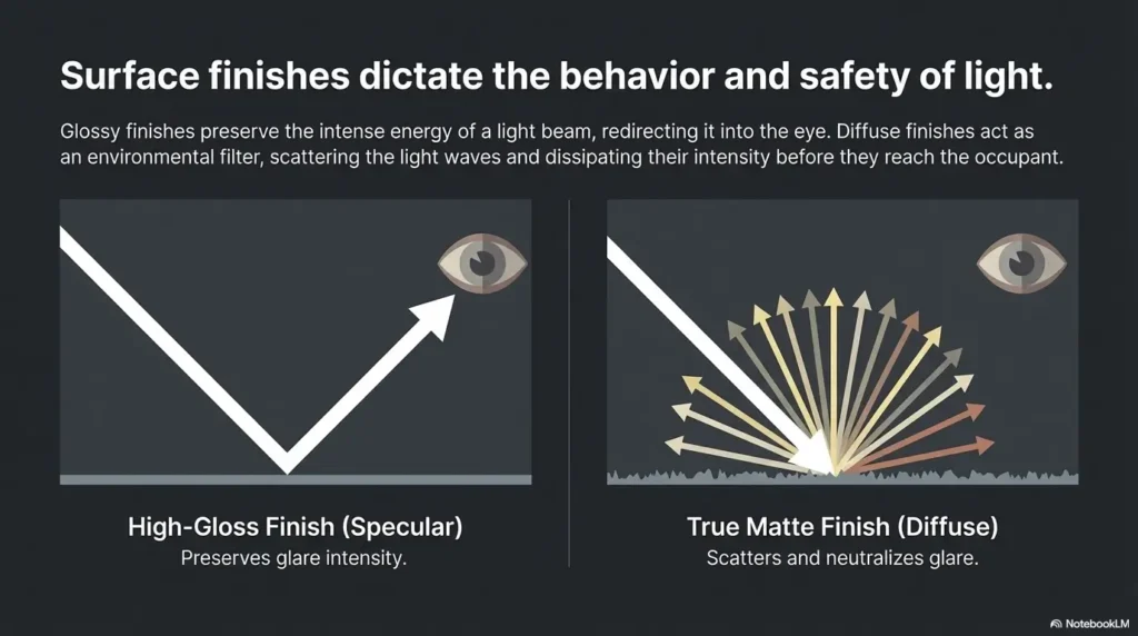
Paint sheen changes that bounce. Matte and flat finishes scatter light more softly. Glossy finishes reflect more directly. On a kitchen brochure, that direct reflection looks polished. At 8:10 a.m. with sunlight hitting a white cabinet door and a quartz counter returning the favor, it can feel like breakfast is being served inside a headlight.
I learned this the boring way, which is the educational way. Years ago, I stood in a beautifully finished hallway that looked elegant in photos and strangely hostile in person. The problem was not the paint color. It was the chain reaction between semi-gloss trim, polished flooring, and a window at the far end. The room had become a light pinball machine.
Why paint sheen can change visual comfort more than color depth
Color gets all the romance. Sheen does more of the actual behavior. A rich muted green in semi-gloss can throw more visual noise than a lighter warm neutral in matte. That surprises people because paint chips train us to think in hue, not in reflectance.
How reflected light bounces off walls, trim, and cabinets differently
Walls are broad planes. They spread light across your field of view. Trim creates narrow edges that can catch and outline light sharply, especially around windows and doors. Cabinets sit at eye level and often share space with tile, appliances, counters, and under-cabinet lighting. Each surface plays a different instrument in the glare orchestra.
When “easy to clean” quietly becomes “hard to look at”
The old sales pitch is simple: shinier paint wipes better. True enough, up to a point. But the second half of the sentence is usually missing. Shinier paint also reveals reflections more aggressively. In a low-vision household, that trade can be expensive in a way the paint aisle does not list on the shelf tag.
- Glare is about reflection, not only brightness
- Walls, trim, and cabinets should not be treated as one category
- Higher sheen can improve wipeability while worsening visual comfort
Apply in 60 seconds: Look at your brightest wall right now and note whether the discomfort comes from the lamp, the window, or the surface itself.
Who this is for / not for
This guide is for low-vision adults, seniors, caregivers, renters choosing limited repaint options, and remodelers trying to make a room easier to use instead of merely prettier to photograph. It is also for the practical person who has felt a room was “off” without being able to name why. Sometimes the answer is not taste. It is reflectivity.
It is not for diagnosing sudden light sensitivity, eye pain, new headaches, or vision changes. Those deserve medical attention, not a heroic trip to the paint store. It is also not written for resale-first styling where the main goal is trim that gleams in listing photos. There is nothing morally wrong with sparkle. It is just not the main character here.
This is for low-vision adults, seniors, caregivers, and accessibility-minded remodelers
If someone in the home needs stronger contrast, calmer surfaces, and fewer sharp reflections, sheen becomes a daily-living tool. This is especially true in kitchens, bathrooms, hallways, and any room where labels, edges, or floor transitions matter.
This is for renters choosing repaint options or landlords improving visual comfort
Even if a full repaint is not possible, understanding sheen helps you choose the surfaces that matter most. One lower-glare accent wall, one less reflective trim repaint, or even one cabinet door test panel can tell you more than ten mood boards.
This is not for structural lighting defects, urgent eye symptoms, or medical diagnosis
Persistent or worsening light sensitivity needs a proper clinical look. The American Academy of Ophthalmology notes that low vision rehabilitation can include glare control, but home changes are not a substitute for evaluation when symptoms shift suddenly.
This is not for people choosing paint only for resale shine or luxury-photo aesthetics
Resale logic often rewards whatever looks crisp under staged lighting. Daily-life logic asks a humbler question: can the person using the room see what they need to see without strain? That is the better question.
Eligibility checklist: Is this a glare problem worth solving with paint?
- Yes / No: Someone in the home squints or avoids certain rooms at specific times
- Yes / No: Reflections from walls, cabinets, mirrors, or counters are noticeable
- Yes / No: The room has strong daylight, shiny flooring, or multiple task lights
- Yes / No: Cleaning needs are important, but comfort matters more than showroom shine
Neutral next action: If you answered yes to two or more, a sheen test is worth doing before buying gallons.
Walls first: matte often wins, but not for the reason people think
Matte often wins on walls, but not because it is trendy, cozy, moody, European, or whatever adjective the paint catalog is courting this season. Matte wins because walls occupy a lot of your visual field. When they throw back direct reflection, the whole room feels louder.
A lower-sheen wall tends to soften that experience. It can reduce the sensation of bright streaks or hot spots moving across the room as the day changes. This is especially helpful when windows are large, walls are pale, and the person using the room is sensitive to reflected light rather than just dimness.
There is a catch, naturally. Matte is less forgiving of scrubbing, greasy fingerprints, and life as lived by children, pets, and pasta sauce. Modern paint formulas have improved, but physics remains delightfully stubborn.
Why flat and matte walls usually soften visual noise
Low-sheen walls diffuse light rather than returning it in a sharper beam. That does not make the room dark. It makes the room less jangly. For many glare-sensitive households, that feels like the wall stopped arguing back.
Where eggshell can be the safer compromise in busy family spaces
Eggshell can be a smart middle path when a matte wall would suffer daily scuffs. In mudrooms, family rooms, and kid zones, eggshell sometimes preserves enough calm while improving cleanability enough to keep the peace. The exact result depends on color, light angle, and adjacent finishes, which is why sample testing matters.
Here’s what no one tells you: bright walls can still glare even in “soft” sheen
A soft finish does not magically neutralize a bright white wall facing strong daylight. If the room already contains polished tile, glossy furniture, stone counters, or mirrors, even eggshell can become part of a broader reflection problem. Sheen helps. Room context decides.
I once tested two nearly identical off-whites on sample boards, one matte and one eggshell. The color difference was tiny. The behavior difference, at 4 p.m., was not. One looked calm. The other looked as though it had opinions.
Show me the nerdy details
Paint sheen changes how much light reflects in a directional way. Lower sheen produces more diffuse reflection, which tends to reduce sharp highlights. Higher sheen increases specular reflection, meaning brighter, more mirror-like bounce at certain angles. In practical terms, that means the same bulb and same wall color can feel dramatically different once finish changes. Because the room also includes counters, floors, appliances, and windows, the result is cumulative rather than isolated.
Decision card: When matte vs eggshell makes more sense on walls
- Choose matte when glare reduction is the main goal and the wall is not a frequent scrub zone
- Choose eggshell when the room gets daily touch traffic and you need a little more durability
- Be cautious with satin on large walls if the room already has reflective floors or strong daylight
Neutral next action: Sample your wall in at least two sheens before committing.
Trim gets weird: the default semi-gloss rule can backfire
Traditional paint advice says semi-gloss trim, full stop. It is durable, wipeable, and gives crisp contrast. In many homes, that works fine. In glare-sensitive homes, the rule can backfire with almost comic precision.
Trim sits where light loves to collect: around windows, doors, corners, baseboards, and transitions. Semi-gloss on trim can turn those edges into bright outlines. Sometimes that sharp edge helps. Sometimes it becomes a distracting streak that pulls the eye or obscures the very boundary it was meant to clarify.
This is why accessibility decisions often depart from decorator defaults. The goal is not “high-end finish language.” The goal is usable contrast without unnecessary sparkle.
Why traditional trim advice does not always fit glare-sensitive homes
Standard advice assumes durability and visual crispness matter most. In a low-vision household, visual comfort may matter just as much. The better trim sheen depends on whether the edge needs to stand out through color contrast, through reflectivity, or not through reflectivity at all.
When satin trim reduces harsh edge reflections around doors and windows
Satin often lands in a productive middle ground. It can provide some wipeability and some distinction from the wall without producing the more aggressive bounce of semi-gloss. Around windows especially, this matters. The window already brings light drama. The trim does not need to audition for a speaking role.
How glossy baseboards can create surprise light streaks at floor level
Baseboards are sneaky. Daylight can hit them at low angles. Lamps can skim across them in the evening. If flooring is also reflective, the baseboard and floor start reflecting each other like two extroverts at a networking event. Suddenly the quietest part of the room has become visually busy, which is one reason fall-prevention planning at home for aging vision often pays attention to floor-level visual clutter as well as obvious trip hazards.
- Satin trim often lowers harsh edge reflections
- Contrast can come from color difference, not only shine
- Windows and floors can magnify trim glare
Apply in 60 seconds: Check your brightest trim line near a window and see whether the problem is the color or the reflection.
Cabinets are the hardest choice in the room
Cabinets are the hardest choice because they live in the messiest light. Kitchens and bathrooms combine task lighting, reflective counters, metal hardware, appliances, tile, mirrors, and water. A cabinet finish does not sit alone like a wall. It joins an entire reflective committee.
This is why a finish that looks modest in a showroom can feel loud at home. Under-cabinet lighting, for instance, can turn a satin or semi-gloss door into a bright stripe right where someone is trying to read a label or find the mug without a tiny battle.
Why kitchen and bathroom cabinets face a sheen trade-off walls do not
Cabinets need wiping. That is real. Oil splatter, fingerprints, soap residue, and daily traffic all argue for more durable finishes. At the same time, cabinet fronts often sit at eye level and face strong artificial light. That makes them much more likely to create bothersome reflection than a wall across the room.
Matte cabinets cut glare, but fingerprints and wipe-downs matter
Matte cabinets can be wonderfully calming in the right kitchen. They are often easier on the eyes, especially when paired with matte counters and fewer shiny surfaces. But fingerprints, especially on darker colors, may show up with theatrical enthusiasm. A cabinet that reduces glare but demands constant fussing can become its own form of fatigue.
Satin cabinets may be the practical middle path for low-vision homes
Satin is often the best compromise for cabinets because it keeps maintenance practical without going full mirror-adjacent. If the rest of the kitchen is already reflective, even satin may feel lively. If counters, backsplash, and hardware are subdued, satin can work beautifully.
Let’s be honest: the prettiest showroom finish may be the worst one at breakfast time
Showrooms are curated. Homes are inhabited. A glossy cabinet under perfectly controlled retail lighting can look crisp and expensive. At home, with sun hitting the toaster, the kettle, the fridge, and the backsplash at once, it can feel like the room has picked a fight before coffee. If that scenario sounds familiar, comparing glare-free under-cabinet lighting options or a deeper look at under-cabinet lighting glare on glossy surfaces can help you solve the room as a system instead of blaming paint alone.
Mini calculator: Will your cabinets likely feel glare-heavy?
Count 1 point for each: under-cabinet lights, glossy or polished countertop, tile backsplash with sheen, metal hardware, direct morning or afternoon sun.
0–1 points: satin may be comfortable. 2–3 points: test satin and matte. 4–5 points: avoid high-gloss and test the calmest finish first.
Neutral next action: Use the score only to choose sample sheens, not to skip testing.
Room by room: where glare trouble usually starts
Not every room misbehaves in the same way. Glare is annoyingly specific. One room is fine until 4 p.m. Another is troublesome only when the under-cabinet lights come on. A third becomes difficult because the trim reflects more than the wall. This section matters because broad rules often fail at room scale.
South-facing living rooms with strong daylight bounce
These rooms can make even soft finishes seem brighter than expected. Large windows, pale flooring, glass tables, and light-colored walls can build a bright field that reduces comfort. Matte walls usually help here. Trim often benefits from satin instead of semi-gloss, especially if window trim is catching direct sun.
Kitchens with under-cabinet lights and reflective counters
Kitchens are classic glare amplifiers. One change in sheen can help, but only when read alongside counters, backsplash, appliance finish, and hardware. If the countertop is polished stone, the cabinet should probably not also be trying to sparkle. In many homes, the same visual logic that improves cabinets also helps everyday organization tools such as low-vision spice jar labels or measuring cups designed for low vision, because calmer surfaces make small text and tactile cues easier to use.
Bathrooms with vanity lighting, mirrors, and tile multiplying glare
Bathrooms are sneaky because the mirror doubles the drama. Light bounces from sconce to tile to mirror to cabinet and comes back as a brighter, more chaotic experience than the paint can explain on its own. Lower-sheen walls and calmer cabinetry often help more than people expect. The same principle carries into routines where product mix-ups matter, which is why some households also benefit from tactile labels for shampoo and conditioner in glare-prone bathrooms.
Hallways where trim contrast matters more than shine
In hallways, usable contrast often matters more than luminous trim. A modest difference in wall and trim color can clarify the boundary more effectively than a shinier finish. This is one of those cases where designers may reach for polish and accessibility usually prefers restraint.
Quiet truth: Some rooms do not need more brightness. They need better-behaved brightness.
Don’t do this: copying standard designer formulas without testing your light
The most common mistake is importing a generic formula into a very specific room. “Matte walls, semi-gloss trim.” “Satin cabinets are always safest.” “White brightens the room.” These can all be true somewhere and wrong in your exact home by lunchtime.
Online photos are especially unhelpful here. Cameras compress, correct, and flatter. They do not reproduce the discomfort of a bright reflection landing right in your line of sight. They also do not tell you what the floor, window treatment, bulb color temperature, or countertop finish is doing outside the frame.
Why “semi-gloss trim everywhere” is not accessibility advice
It is habit, not law. Accessibility asks a more grounded question: does this finish help the person using the room see and move more comfortably? If not, the rule can go sit down.
Why online paint photos hide real-world reflection problems
Photos are taken from flattering angles, often under softened lighting. The image may show color accurately enough, but it rarely tells the truth about how a finish behaves at 7 a.m., 2 p.m., and 8 p.m. in your home.
How mixed bulbs, blinds, and flooring can change the answer completely
A matte wall in a room with warm lamps and low-glare flooring may feel perfect. The same wall in a room with cool LEDs, uncovered windows, and polished tile may still feel too bright. Finish choice is relational, not absolute.
When I see a room go wrong, it is rarely one villain. It is the ensemble cast. The floor contributes. The mirror contributes. The chrome faucet contributes with suspicious enthusiasm. Paint matters, but it is often being judged inside a bigger conspiracy.
Common mistakes
Let us spare you a few expensive detours. Most sheen regrets are not caused by wild design ambition. They come from perfectly understandable shortcuts. Paint is often chosen under store lights, from tiny chips, with more attention to color than reflection. Then the room behaves differently at home and everyone acts surprised, including the wall.
Choosing sheen under store lighting instead of home lighting
Store lighting is a controlled fiction. Your home contains direction, timing, shadow, and competing surfaces. A sample that looks calm in a retail aisle can look lively in your kitchen or bathroom.
Testing color but not testing reflection at morning and evening angles
People often test hue and stop there. But reflection changes through the day. Morning sun can be brutal in one room, evening lamps in another. A proper sheen test must include multiple times, not one flattering noon glance.
Pairing glossy paint with mirrors, polished tile, and stone all in one sightline
One reflective element can be fine. Three in one view is where rooms start performing light tricks nobody requested.
Forgetting that trim, cabinets, hardware, and countertops reflect together
A cabinet door is not judged alone. If the pull is shiny, the counter is polished, and the backsplash has shimmer, the overall effect may be much brighter than the paint sample suggested.
Assuming darker paint always reduces glare
Sometimes it helps. Sometimes darker satin or gloss shows reflections quite dramatically, especially in daylight. Darker does not automatically mean calmer.
Using washable high-sheen paint in every room “just in case”
This is the home-improvement version of wearing snow boots indoors because weather exists somewhere. Use durability where you need it, not everywhere by reflex.
- Evaluate reflection, not just color
- Test at more than one time of day
- Judge the room as a system, not a single painted surface
Apply in 60 seconds: Make a list of every shiny surface visible from your most troublesome spot in the room.
Quote-prep list: What to gather before comparing paint options
- Room direction and strongest glare time
- Current wall, trim, and cabinet sheen
- Bulb type and color temperature if known
- Countertop, flooring, mirror, and hardware reflectivity
- Which surfaces need frequent wiping
Neutral next action: Bring this list when ordering samples or discussing paint with a contractor.
The finish triangle: glare, durability, and cleanability rarely peak together
There is no magical finish that maximizes glare control, durability, and easy cleaning all at once on every surface. That is the triangle. Every choice leans toward one corner and away from another. Once you accept that, the decision becomes much easier and much more honest.
Matte is often kinder to the eyes, especially on broad walls. Gloss is often tougher in high-contact areas. Eggshell and satin tend to occupy the diplomatic middle. None of these are moral categories. They are trade-offs wearing nice labels.
Why matte is kinder to eyes but less forgiving for scrubbing
Matte lowers the visual chatter of reflected light. On walls, that can create a calmer field and reduce the feeling of glare moving across the room. But repeated scrubbing, moisture, or heavy touch traffic can leave visible marks faster than higher-sheen finishes.
Why gloss is durable but can create hot spots and visual fatigue
Gloss and high-gloss are champions of toughness and reflectivity. That second trait is the problem. If the room already has strong light, gloss can create bright spots that pull attention, reduce comfort, or make edges harder to parse.
Where eggshell and satin sit on the real-life compromise curve
Eggshell often works best on walls that need some cleanability. Satin often works best on trim or cabinets where a little durability matters but full shine would be too assertive. The best choice is frequently asymmetrical: matte walls, satin trim, satin or matte cabinets depending on the room.
Coverage tier map: How sheen choices usually behave
| Tier | Typical sheen | Glare comfort | Cleaning ease |
|---|---|---|---|
| 1 | Flat / Matte | Highest | Lowest |
| 2 | Eggshell | High | Moderate |
| 3 | Satin | Moderate | Good |
| 4 | Semi-gloss | Lower | Very good |
| 5 | Gloss / High-gloss | Lowest | Highest |
Neutral next action: Use the map to narrow options, then test your top two sheens at home.
Color is not innocent either: sheen and color team up
Sheen is not working alone. Color and sheen team up, sometimes sweetly, sometimes like two people encouraging each other’s worst habits. A bright cool white in eggshell can feel sharper than a warm off-white in matte. A dark satin navy can show highlight streaks more than expected. The point is not to fear color. It is to stop treating sheen and hue as separate decisions.
RNIB’s guidance on color and contrast makes an important point: preferences can be personal, and people with glare issues may prefer different contrast arrangements depending on condition and severity. That is why one household loves bright walls and another finds them exhausting.
Why bright whites can amplify reflection even in lower sheen
Bright whites reflect more light. Pair that with a sheen above matte and the room may feel more active than intended. This is especially noticeable in south-facing rooms, kitchens, and bathrooms.
How warm off-whites and muted colors can feel calmer in low-vision spaces
Warm off-whites, soft mushroom tones, muted greens, and gentle grays often feel calmer because they reduce the intensity of reflected light without pushing the room into gloom. The difference can be subtle on a chip and substantial on a wall.
When contrast helps navigation more than extra brightness helps visibility
A calmer wall with clear trim contrast may support navigation better than an all-white room that blasts reflected light everywhere. The useful question is not “How do I make this brighter?” It is “How do I make edges easier to read?”
- Bright whites can intensify reflection
- Warm, muted colors often feel calmer
- Contrast may help navigation more than extra brightness
Apply in 60 seconds: Compare one bright white sample and one warm off-white sample in the same sheen before deciding.
Test before you commit: a two-board method that saves expensive regret
This is where you save money, time, and several muttered regrets. The smartest way to test sheen is not painting random swatches directly on the wall and squinting once. It is using a repeatable two-board method that lets you move the samples around the room.
Paint the same color in matte, eggshell, satin, and semi-gloss sample swatches
Use two lightweight boards or sample panels. Paint each with the same color in different sheens. Label the backs clearly because once they dry, human confidence becomes wildly unearned.
Check morning sun, lamps-on evening light, and task-light conditions
View the boards at least three times: strongest daylight, evening lamp light, and task-light conditions such as vanity or under-cabinet lighting. Stand, sit, and approach from the path someone actually uses in the room.
Watch the wall, not just the paint chip
Look for bright streaks, hotspots, edge glare, and loss of contrast near trim or hardware. Notice whether your eyes feel more settled with one board than another. The body often knows before the vocabulary catches up.
Tiny experiment, big payoff
Twenty dollars in sample pots can prevent a repaint that costs hundreds or thousands. This is one of the least glamorous ways to save real money. Naturally, it is also one of the most effective.
Infographic: A simple glare-control map for paint sheen
Lowest glare
Lowest scrub tolerance
Low glare
Moderate cleaning
Middle trade-off
Good for trim/cabinets
More reflection
Durable
Highest reflection
Showroom energy
Short Story: A friend once repainted a small kitchen because the old cabinets looked tired. The new color was lovely, a soft white that seemed harmless on the sample card. The finish, though, was glossier than the old one. At first everyone admired the crispness. Then came the first sunny morning. Light bounced off the cabinet doors, hit the polished countertop, jumped to the stainless kettle, and came back through the room like a relay race nobody had authorized.
Her father, who already struggled with glare, stopped lingering in the kitchen and started making tea in near darkness on purpose. The fix was not dramatic. They changed the under-cabinet bulb, reduced a few reflective accessories, and eventually repainted the most troublesome doors in a calmer sheen. The room did not become dim. It became usable again. Sometimes accessibility looks less like invention and more like stopping the room from showing off.
Don’t do this: fixing glare with paint alone when the room is the real culprit
Paint can help a lot. Paint cannot fix a room that is being sabotaged by every other reflective surface in it. This matters because people often repaint first and only later discover that the real culprits were the unshielded bulbs, mirror placement, polished floor, or shiny backsplash.
How bulbs, blinds, mirrors, and polished flooring may be doing most of the damage
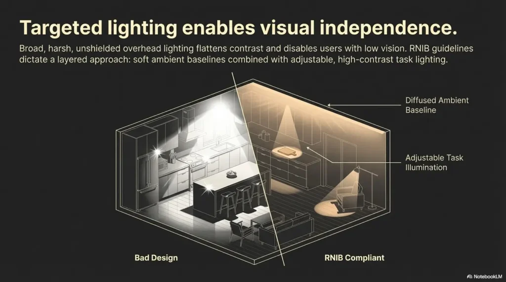
RNIB notes that direct glare from windows and lamps should be avoided where possible. In practical terms, that means a matte wall may help, but glare can persist if the window is uncovered at the wrong time of day or if lamps are aimed poorly. Flooring matters too. A low-sheen wall above a reflective floor is still living with a highly reflective partner.
When cabinet hardware and backsplash shine matter more than cabinet sheen
Sometimes the cabinet finish is not the main source of discomfort. Chrome pulls, glossy tile, mirrored outlets, and polished stone can do more harm than a satin door ever will. This is why surface systems matter. Rooms behave as groups.
Why one lower-glare paint choice can fail inside a highly reflective room
If every other element is shiny, the calmest paint in the world may barely move the needle. The good news is that this also means relief may come from smaller changes: lamp shades, under-cabinet diffusers, less reflective hardware, blinds, or a different counter finish in a future update. Similar low-vision home adjustments often show up in unexpected places too, from freezer organization for low vision to tactile dots for microwave buttons, because usability usually improves when surfaces and cues stop competing with glare.
The National Eye Institute and low-vision rehabilitation guidance more broadly tend to emphasize practical home adaptation, not one silver bullet. That spirit is useful here. You are not looking for a perfect finish. You are building a better-behaved room.
When to seek help
This article is about home-design and accessibility planning, not diagnosis. If glare sensitivity suddenly worsens, arrives with pain, headaches, halos, or new vision changes, treat that as a medical issue first. Decoration is many things. Emergency medicine is not one of them.
There is also a gentler kind of help worth mentioning. If room changes are still not enough, a low-vision specialist or occupational therapist may help identify better lighting, contrast planning, and safer navigation strategies. Sometimes what feels like a paint problem is partly a lighting-layout problem or a task-position problem.
That is not bad news. It means you have more than one lever to pull. Paint is one. Lighting is another. Contrast, window control, hardware, and furniture placement all matter. A home can become easier to use through a series of small mercies rather than one dramatic renovation. For households already noticing broader changes in balance, confidence, or mobility, related guides on low-vision nighttime bathroom safety and helping a spouse with vision loss can also be useful companions.
- Seek medical help for sudden symptom changes
- Consider low-vision or OT support when room changes are not enough
- Use paint as one tool within a larger glare-control plan
Apply in 60 seconds: Decide whether your next change should be paint, lighting, window control, or a professional evaluation.
FAQ
Is matte paint always best for glare sensitivity and low vision?
No. Matte is often the safest starting point for walls because it reduces harsh reflection, but it is not automatically best for every surface. On cabinets or trim, you may need eggshell or satin for durability and cleaning. The most reliable answer comes from testing the same color in multiple sheens under your actual lighting.
Is eggshell better than satin for low-vision walls?
Often yes, especially if glare control matters more than scrub resistance. Eggshell typically reflects a bit less than satin while still offering more cleanability than matte. In a bright room with reflective flooring or large windows, that small difference can matter.
Should trim be matte too in a glare-sensitive home?
Sometimes, but not always. Matte trim can reduce reflection, yet it may scuff more easily and can blur edges if there is not enough color contrast from the wall. Satin is often a practical compromise because it keeps trim calmer than semi-gloss while still giving some durability.
Are glossy cabinets bad for people with light sensitivity?
They can be troublesome, especially in kitchens and bathrooms with strong task lighting, polished counters, mirrors, or direct sun. Glossy cabinets are not universally wrong, but they increase the chance of sharp reflected light. For many glare-sensitive homes, satin or matte is a better place to start.
Does darker paint reduce glare better than lighter paint?
Not always. Darker colors can reduce overall brightness, but in satin or gloss they can still show reflections very clearly, especially beside mirrors, polished counters, or bright devices. In some homes, even a screen can become part of that story, which is why people sensitive to glare sometimes also explore tricks like making an iPhone screen dimmer than the normal minimum.
What paint sheen is easiest to clean without too much reflection?
Satin often lands in the sweet spot for trim and cabinets, while eggshell often does well on walls that need moderate cleanability. It is not reflection-free, but it is usually less intense than semi-gloss or gloss. The right answer depends on how reflective the rest of the room already is.
Is flat paint too fragile for a kitchen or bathroom?
It can be, depending on use, moisture, and how often the surface needs wiping. Flat or matte may work on some kitchen walls away from splatter zones, but cabinets and high-contact areas often need something more durable. This is why mixed-sheen strategies are so useful.
Can renters reduce glare without repainting everything?
Yes. You can change bulbs, soften window light, reduce reflective accessories, use less shiny hardware where possible, add lower-glare task lighting, and even test removable or limited repaint areas if allowed. Sometimes cutting one or two reflection sources helps more than a full repaint.
Do warm whites glare less than cool whites?
Warm whites often feel calmer, especially in lower sheens, but the result depends on daylight, bulb color temperature, and nearby materials. They are not inherently glare-proof. Think of them as potentially softer partners, not miracle workers.
Should I change lighting before I change paint sheen?
If the room has obviously harsh bulbs, poor lamp placement, or direct unfiltered window glare, fix those first or at least at the same time. Paint sheen works with lighting, not instead of it. The smartest approach is usually to test both together.
Next step
We can close the loop now. The issue was never simply “matte versus glossy.” The real question was how to stop a room from turning ordinary light into visual friction. For most glare-sensitive, low-vision homes, that usually means matte or eggshell on walls, careful restraint on trim, and satin or matte as the first cabinet finishes to test rather than high-gloss heroics.
Your next move does not require a renovation weekend or a spiritual commitment to beige. Paint one wall sample and one trim board in your actual room using matte, eggshell, and satin. Check them at three times of day. Stand where the person actually stands. Sit where they actually sit. Watch what happens to the light. In 15 minutes of honest testing, you will learn more than a hundred polished room photos can teach.
Last reviewed: 2026-03.