


Precision Beyond Sight: Choosing High-Contrast Tools
A high-contrast measuring spoon set for low vision can save only a few seconds at a time, but in a real kitchen those seconds add up into something larger: less hesitation, fewer mistakes, and one less tiny argument with the drawer. When 1 teaspoon and 1 tablespoon look annoyingly similar under bad light, “accessible” stops being a branding word and becomes a test of whether dinner keeps moving.
The problem is rarely just color. It is glare on polished metal, markings that vanish after washing, spoons that feel identical in the hand, and storage systems that turn every recipe into a scavenger hunt. Keep guessing, and you lose more than time. You lose confidence in an ordinary task that should feel easy.
This guide helps you spot what actually works: readable markings, low-glare finishes, clear size cues, and storage logic that holds up when the kitchen is busy and your energy is not at its best. The point is not to find the prettiest set. It is to find one you can trust.
The standard here is simple: if you cannot identify the right spoon quickly under imperfect conditions, the design is not doing its job. Because glossy product photos love to flatter. Real kitchens do not. And the difference matters more than most listings admit.
Table of Contents
- Contrast matters, but glare can erase it
- Large markings beat decorative finishes
- Shape cues can rescue you when eyesight varies by day
Apply in 60 seconds: Open your current drawer and time how fast you can grab 1 teaspoon without squinting. That result is your baseline.
Start Here: Why “High-Contrast” Is Not Always Enough
Contrast helps, but contrast alone can still fail under glare
“High contrast” sounds like the answer because it sounds crisp, decisive, and slightly heroic. Unfortunately, kitchens are less heroic and more slippery. A spoon can look bold in a product photo and still vanish under overhead glare, steam, or a badly placed under-cabinet light that creates harsh reflection. That matters because low vision is not one single experience. Some people need stronger contrast. Some need larger print. Some need less reflection. Some need all three before coffee.
The National Eye Institute notes that low vision can interfere with everyday activities, and it points people toward vision rehabilitation to make daily tasks easier and safer. That framing matters here because the real target is not “a nice spoon set.” It is functional independence in an ordinary task.
Why spoon shape, marking size, and spacing matter just as much
I once used a measuring spoon set that looked like it had been designed by a minimalist with a grudge. Sleek handles. Tiny lettering. Reflective metal polished to the point of vanity. On a white countertop, every spoon looked like a fish scale that had learned sarcasm. Contrast was technically present. Usability was not.
That is the first important shift in thinking: accessibility in the kitchen is rarely one feature deep. A useful spoon set works as a small system. The label needs to be readable. The bowl shape needs to be distinguishable. The order needs to be obvious. The storage method needs to make sense when you are moving quickly. The best sets reduce decision friction before the ingredient even hits the bowl.
The real question: can you identify the right spoon in three seconds or less?
This is the test that separates adaptive design from decorative optimism. In a real kitchen, you should be able to spot or feel your way to the right spoon in a few seconds, not perform a tiny archaeological dig while the onions brown into regret. Fast recognition is the standard that matters, especially for baking, repeat cooking tasks, and shared kitchens where multiple people put things back in slightly cursed ways.
Eligibility checklist: Is a high-contrast spoon set likely to help you?
- Yes if you still rely on visual labels but need them bigger, darker, and easier to find.
- Yes if glare, polished metal, or tiny fonts slow you down.
- Yes if your kitchen works better with repeatable visual organization.
- No if you cannot reliably read labels even when enlarged and high-contrast.
- No if grip pain or tremor is the bigger problem than legibility.
Next step: Decide whether your main pain point is seeing, gripping, or organizing. Buy for the main failure point first.
Before You Buy: What Low-Vision Cooks Actually Need From a Measuring Spoon Set
Fast recognition beats stylish design every time
Shoppers often get trapped by the aesthetic version of accessibility. A set may use black handles, trendy matte gold, or cheerful color coding and still be miserable to use. What low-vision cooks usually need is much simpler and much less glamorous: a set that gives the answer fast. Which spoon is this? Is that label still visible? Did I grab teaspoon or tablespoon? These are not small questions in the middle of a recipe. They are the whole game.
Large, legible markings reduce hesitation during cooking and baking
Hesitation is the tax you pay when kitchen tools make you decode instead of act. That tax gets expensive. You stop mid-recipe. You double-check. You tilt the handle toward the light. You wipe off flour. You wonder whether you should just estimate and hope for the best. For soup, maybe hope survives. For baking, hope is a chaotic ingredient.
In mixed-vision households, large markings do double duty. They help the low-vision user, but they also make the tool more intuitive for everyone else. That means the adaptive choice often feels pleasantly normal rather than specialized in a way that isolates the user. That matters more than many product descriptions admit.
Distinct spoon sizes help when vision is partial, variable, or fatigued
Vision is not always a stable ruler. It can vary with fatigue, time of day, contrast sensitivity, glare, dry eyes, or just the kitchen being a little too shadowy at 6:40 p.m. The National Institute on Aging notes that aging eyes can become more sensitive to glare and may need more support in daily life than people expect. So when spoon sizes have visibly or tactually different proportions, the user is not betting everything on a printed label.
A set should still work when the kitchen light is bad
This is the quiet standard nobody puts in the product title. A spoon set should still be usable when the lighting is mediocre, because many kitchens are. There is a difference between “works in a studio photo” and “works beside a kettle, a cutting board, and a child asking where the cinnamon went.” Low-vision design that depends on perfect lighting is not robust design. It is a polite fantasy.
Research on home lighting and visual impairment has found that lighting conditions at home can affect everyday function, and improved lighting has been associated with better performance in daily activities. That does not make lighting a magic wand, but it does explain why some shoppers think their tools are failing when the room is. If kitchen glare is a recurring villain, it is worth looking at glare-free under-cabinet lighting options before assuming the spoon itself is the whole problem.

Look for These Features First, Not Last
Bold black-and-white or dark-light contrast that stays visible over time
Contrast is still valuable. It is just not the only star of the opera. The best visual contrast tends to be dark text on a light field or light text on a dark field, with enough size and separation to remain legible after repeated washing. What you want is stable contrast, not novelty contrast. A spoon that is vivid for two weeks and vague by week six is not a bargain. It is a subscription to annoyance.
Deeply engraved or permanently printed measurements instead of faint surface ink
For most households, permanence is a bigger deal than showroom charm. Deeply engraved markings usually age better than light surface printing, especially in a tool that gets wet, stacked, knocked together, and occasionally left in a sink like a tiny metallic raft. If a seller will not show a close-up of the labels, take that as a small but meaningful weather forecast.
Rounded handles, wide bowls, and clean edges that are easier to manage
Low vision rarely lives alone in the household. Sometimes the buyer is also older. Sometimes the user has mild hand pain, a weaker pinch grip, or less patience for fiddly objects. A spoon with a handle wide enough to orient quickly and a bowl shape that does not feel fussy can cut down on micro-errors. Not every problem is visual. Good tools understand that without making a speech about it.
Connected sets vs loose spoons: which is easier to track in a busy drawer?
There is no universal winner here. Some users prefer connected sets because the ring keeps the collection from scattering into drawer folklore. Others dislike the ring because flipping through connected spoons can feel clumsy or visually noisy. Loose spoons can be faster if they live in a fixed organizer and each one has strong visual or tactile identity. The better choice is the one that supports your retrieval habit, not the one with the prettier lifestyle photos.
Show me the nerdy details
When two spoons share nearly identical handle length, finish, and bowl silhouette, users rely more heavily on the printed label. That creates a single point of failure. Adding a second cue such as different handle lengths, textures, or bowl widths lowers identification load because the user can cross-check size without reading every time.
- Permanent markings outlast pretty finishes
- Wider handles can improve orientation
- Storage style matters as much as the spoon itself
Apply in 60 seconds: Make a shortlist of three non-negotiables before you shop: label clarity, low glare, and storage method.
The Markings Test: Can You Read It Without Performing a Tiny Miracle?
Printed labels vs engraved labels vs color-coded labels
Printed labels can be excellent when they are large, bold, and protected from wear. They can also become a ghost story after a few dishwasher cycles. Engraved labels are often more durable, but they need enough depth and contrast to remain readable without demanding a spotlight and a monologue. Color-coded labels can help, but color alone is a flimsy hero if the user also struggles with low contrast, glare, or visual fatigue.
Why small silver-on-silver text is the villain in disguise
Nothing announces “designed by people who never actually cooked with this” quite like a shiny stainless handle with a tiny silver measurement stamped into it. It looks refined. It behaves like a riddle. Under bright light it reflects. Under dim light it disappears. Under flour it becomes performance art. This is where many supposedly premium sets fail the most ordinary test of all: being readable while used.
Here’s what no one tells you: reflective metal can cancel out “contrast”
Reflective metal is not evil. It is just often overtrusted. When light bounces across a polished handle, the eye may lose edge definition and label visibility even if the product technically includes a visible mark. Studies on glare and contrast sensitivity show why that matters: glare can reduce functional visibility in ways ordinary high-contrast vision charts do not fully capture. For some users, the finish is not a cosmetic detail. It is the difference between immediate recognition and squint-based gambling.
How US measurements should appear to stay kitchen-friendly
For U.S. shoppers, the friendliest sets display standard units clearly and plainly: 1 tbsp, 1 tsp, 1/2 tsp, 1/4 tsp, and so on. Fractions should not be compressed into tiny decorative scripts that make a basic measurement feel like deciphering an 18th-century invitation. If metric is included, great. But the display should not force the user to hunt for the unit that actually matches the recipe in front of them.
A simple rule helps here: if the unit style makes you pause, the design is already costing you time. Time-poor readers know this instinctively. The spoon either answers the question or adds one. The same logic shows up in other adaptive kitchen tools, including low-vision measuring cups with clearer markings and easier differentiation.
National Eye Institute: Low VisionNational Eye Institute: Vision Rehabilitation Resources
National Institute on Aging: Aging and Your Eyes
Size Cues That Save Time When Vision Is Inconsistent
Different handle lengths can make each spoon easier to identify
One of the most underrated features in a usable spoon set is simple proportion. If each spoon has a noticeably different handle length or bowl width, the user can confirm size before reading. That matters when the day has been long or the lighting has gone from “adequate” to “mood lighting by accident.” Visual design should help your hand make sense of the tool before your eyes finish the job.
Nesting order should feel obvious, not puzzle-like
Nesting can be efficient, but only when the order feels intuitive. Some sets tuck together so tightly that separating the spoons feels like persuading shellfish. Others are too visually similar, which means you pull out two, compare them, put one back, and immediately doubt yourself. A good nesting design reduces clutter without turning retrieval into a tiny logic exam.
Raised patterns, textured grips, or tactile cues can outperform color alone
This is where many buyers level up. Tactile cues are not just for users who are fully nonvisual. They can also help people with variable sight, low contrast sensitivity, or fluctuating confidence. A small raised dot, a textured grip, or a distinct handle edge can provide a second source of confirmation. That means less rechecking and more forward motion.
Let’s be honest: if every spoon feels the same, contrast will not rescue it
There is a broader design truth hiding in your utensil drawer: one cue is rarely enough. If every spoon shares the same finish, same shape, same weight, and same general mood, the label ends up doing too much work. And when the label fails, the whole system fails. The strongest accessible products are usually the least romantic. They build redundancy on purpose.
Decision card: When to choose A vs B
Choose a connected set if you lose tools easily, want one fixed storage point, or cook in a shared kitchen where wandering spoons become folklore.
Choose loose spoons in a tray if you want faster single-spoon access, use the same few sizes constantly, or dislike flipping through a ring.
Time trade-off: connected sets often reduce loss; loose sets can reduce retrieval friction.
Neutral action: match the storage style to the way you actually reach into your drawer, not the way brands imagine you do.
Who This Is For / Not For
This is for low-vision cooks who rely on visual contrast plus simple repeatable cues
If you still use visual labels but need them to work harder for you, this category makes sense. The National Eye Institute explains that vision rehabilitation can help people with low vision continue everyday tasks more safely and effectively. In plain kitchen English, that means a better spoon set is not trivial. It is one small adjustment inside a larger strategy for keeping daily life workable.
This is for caregivers buying adaptive kitchen tools that feel normal to use
Caregivers often walk a thin line between usefulness and accidental condescension. The best adaptive kitchen tools do not announce themselves like medical equipment at a dinner party. They just work better. That quiet normality matters. It reduces friction, dignity loss, and the subtle loneliness that can come from needing help with everyday tools.
This is for mixed-vision households where some users want larger print and clearer organization
Plenty of households are mixed in exactly this way. One person wants bigger print. Another wants a dishwasher-safe set that does not fade. A third person just wants the teaspoon to stop disappearing into the abyss behind the whisk. Accessibility features often improve usability for everyone, which is one reason universal design tends to age so well. The same principle shows up in low-vision spice jar labeling systems that make everyday cooking less guessy.
This is not for shoppers who need fully tactile or audio-based measurement tools instead
If you cannot reliably read the labels even when enlarged and high-contrast, a different tool category may be the better investment. At that point, tactile markers, measuring systems with distinct physical identifiers, or broader low-vision rehabilitation strategies may matter more than a prettier spoon handle. The useful purchase is not always the obvious one.
This is not for anyone expecting contrast alone to solve every identification problem
A high-contrast spoon set can absolutely help. It just cannot fix glare, poor storage, bad lighting, cramped labels, and zero tactile differentiation all by itself. That expectation is where disappointed reviews are born. The spoon set is one player in a larger kitchen routine. Asking it to solve everything is a little like asking a potholder to do the job of an oven mitt, timer, and therapist.
Don’t Get Fooled by These “Accessible” Design Choices
Don’t assume bright colors automatically mean better visibility
Bright colors photograph beautifully and perform unpredictably. A saturated handle may look helpful online, but if the actual measurement label is tiny or the color contrast around the text is poor, the feature becomes decorative noise. Color can support visibility. It cannot substitute for label clarity.
Don’t trust product photos that never show the measurement labels up close
This is one of the simplest filters and one of the most useful. If the seller offers six glamorous overhead photos and not one sharp close-up of the marking itself, that omission is telling you something. A brand that understands usability usually shows the usable part. A brand that understands only aesthetics will show you lemons, linen, and a suspiciously serene countertop.
Don’t pick tiny nested sets just because they save drawer space
Space-saving is lovely. So is being able to find the right spoon before the vanilla spills. Very compact sets can be attractive for small kitchens, but extreme compactness often comes with smaller markings, tighter nesting, and less shape differentiation. Drawer efficiency is useful right until it begins charging a usability fee.
Why “sleek” often means harder to read, harder to grip, and easier to misplace
Minimalism has done many fine things for the kitchen. It has also persuaded a generation of utensils to become unnecessarily anonymous. When handles narrow too much, edges get too smooth, and labels become whisper-small, the tool stops communicating. In accessibility design, “sleek” can be a warning label wearing expensive shoes.
- Demand close-up label photos
- Be skeptical of polished reflective finishes
- Prioritize clarity over compactness
Apply in 60 seconds: Reject any listing that does not clearly show the measurement labels at readable size.
Common Mistakes
Buying based on color instead of label clarity
The most common shopping error is buying the promise of visibility instead of the mechanics of it. You are not buying “red” or “black” or “multicolor.” You are buying immediate identification. If the label itself is not large, high-contrast, and durable, the handle color is just scenery.
Ignoring glare from polished metal surfaces
Glare has a sneaky reputation because it can make a tool look premium in bright light while becoming far less readable during actual use. Many older adults and many people with low vision experience glare as a practical barrier, not a minor nuisance. That is one reason finish matters as much as font. In kitchens already full of shine, the broader issue may resemble what happens with white tile floor glare in bright interiors: the room itself starts fighting the eye.
Choosing decorative fonts that look elegant and read terribly
There is a place for elegant typography. That place is not a quarter-teaspoon label. Kitchen tools need blunt honesty. Sans-serif, bold, spacious, and boring is excellent here. Boring is underrated. Boring gets the cinnamon into the batter without a debate.
Overlooking whether the markings wear off after washing
Durability is where many otherwise good sets collapse. A spoon set that starts strong and fades fast becomes a trust issue. Once a user has been burned by disappearing labels, they tend to over-check everything, which quietly steals time and confidence. If reviews repeatedly mention fading text, believe the chorus.
Forgetting that baking needs more precision than casual cooking
A forgiving soup can survive a little improvisation. A batch of shortbread is less sentimental. Precision matters more for baking, supplements, and repeat recipes where small errors accumulate. That means the threshold for acceptable legibility should be higher when the task is less forgiving. For tasks where exactness matters even more, some households may do better pairing spoons with a talking kitchen scale that reduces visual guesswork.
Short Story: A reader once described her old spoon set as “fine until evening.” That sentence stuck with me because it captured the whole problem in four words. In the morning, with sunlight and energy, she could make it work. At night, after work, under one harsh ceiling bulb, the same spoons became guesswork.
She was not failing at measuring. Her tools were. She replaced the set with one that had larger engraved labels, darker handle contrast, and one fixed storage cup by the stove. The recipe did not change. Her stress did. The kitchen felt less like a place where small objects played tricks. That is what a good tool does. It removes one unnecessary argument from the room.
In a Real Kitchen: What Makes a Set Easy to Live With
Easy-to-clean designs matter more than shoppers think
Some spoon shapes collect spice paste, oil film, or stubborn flour in corners that look innocent online and vindictive in practice. Low-vision-friendly design should also be easy to rinse and inspect. If residue hides easily, the spoon becomes harder to read and harder to trust. Clean edges and simple bowl shapes are deeply unsexy and deeply useful.
Dishwasher-safe claims are not enough if the text fades anyway
“Dishwasher safe” is one of those phrases that can mean everything and nothing. The base material may survive. The markings may not. A genuinely usable set needs both structural durability and information durability. Because when the label goes, the spoon has not merely aged. It has lost its job.
Ringed sets, magnetic storage, and fixed storage spots reduce loss
Low-vision usability is not only about the moment of reading. It is also about retrieval. Fixed storage spots reduce search time and reduce that peculiar drawer-rummaging frustration that makes even calm people briefly consider shouting at cutlery. Whether the system is a ring, a hook, a labeled bin, or a magnetic strip, consistency matters more than cleverness. If your broader kitchen setup is chaotic, a guide to low-vision freezer organization can spark useful ideas about zoning and repeatable storage beyond the drawer.
The best spoon set is the one that creates fewer pauses mid-recipe
This is the clearest measure of success. Not brand prestige. Not aesthetic coherence. Not whether a stranger on the internet called it elegant. The best set is the one that interrupts you less. That is a beautiful standard because it is easy to test. Cook once. Count the pauses. Your kitchen will tell the truth even when marketing copy will not.
Mini calculator: Is your current spoon set costing you time?
Count three things during one recipe:
- How many times you re-check a label
- How many seconds it takes to find the right spoon
- How many times you wipe or tilt the spoon to read it
If the total is over 30 seconds or more than 3 re-checks per recipe, your tool is adding friction.
Neutral action: replace the set only if your current one repeatedly fails the same test, not because a newer one looks smarter online.
Compare by Use Case, Not by Marketing Category
For everyday cooking: prioritize quick recognition and durability
Everyday cooking is messy, repetitive, and gloriously uninterested in product poetry. Here, the best spoon set is one with quick visual recognition, low-maintenance cleaning, and markings that survive ordinary life. You want a workhorse, not a runway model. If the set is easy to grab and obvious to read, it earns its keep.
For baking: prioritize exact markings and stable portion sizes
Bakers should be fussier. This is a compliment. Small errors matter more when ratios are tight. Choose sets with crisp fractions, stable bowl shapes, and labels that are visible at a glance. When a recipe repeats often, a trustworthy spoon set becomes part of consistency, not just convenience.
For older adults: prioritize readability, grip comfort, and simple organization
The National Eye Institute explains that low vision becomes more common in older adults because many eye conditions become more common with age, even though aging itself does not automatically cause low vision. That is a useful reminder to avoid one-size-fits-all assumptions. Older adults are not one user type. Still, larger labels, lower glare, and easier storage are common wins.
For gift buyers: prioritize usability over “assistive” branding
Gift buyers often mean well and drift toward products that look specially designed while missing what the person actually wants: something that blends into ordinary life and works with less fuss. A practical gift is not a failure of imagination. In this category, it is often the most considerate choice available.
Feature tier map: what changes from Tier 1 to Tier 5
| Tier | What you usually get | Watch out for |
|---|---|---|
| Tier 1 | Color only | Tiny labels, poor contrast, no close-up photos |
| Tier 2 | Color + readable print | Possible fading after washing |
| Tier 3 | Readable print + lower-glare finish | May still lack shape cues |
| Tier 4 | Readable print + durable markings + clear size differences | Storage may still be awkward |
| Tier 5 | Low glare + durable labels + size cues + fixed storage logic | Usually less “sleek,” often more useful |
Neutral action: buy at the highest tier that solves your actual problem, not the tier with the prettiest finish.
When a High-Contrast Set Is Still the Wrong Tool
If labels are hard to read even with contrast, tactile cues may matter more
There is no medal for insisting on visual solutions after they stop being practical. If high contrast still leaves too much doubt, move toward tools with stronger tactile differentiation or a broader low-vision strategy. Vision rehabilitation resources often point people toward support for daily living activities, which is a useful reminder that the right answer may be bigger than one product category.
If hand pain or grip weakness is also part of the picture, handle shape becomes critical
A readable label does not help much if the handle is awkward to pinch, hard to steady, or unpleasant to orient. This is where many “good on paper” products fail in practice. Handle width, edge shape, and bowl stability start to matter more than color. In other words, your body gets a vote too.
If kitchen routines involve frequent spills, flour, or steam, visual contrast may degrade fast
Some kitchens are tidy. Others are lively. Flour drifts, steam clouds, sauce splashes, children narrate, phones buzz, and the cumin cap rolls away like it has plans. In that environment, visual contrast can weaken fast. A spoon set that depends on pristine surfaces will feel less usable than one with deeper markings and a finish that does not turn every light source into a tiny eclipse.
Sometimes the problem is not the spoon set. It is the lighting, storage, or workflow
This is the part that saves people money. Before blaming the tool alone, look at the conditions around it. Is the drawer chaotic? Is the label only unreadable at night? Does one fixed countertop container solve the retrieval issue? Does a brighter task light do more than a new purchase? Better home lighting and better environmental setup can materially affect functional performance for people with visual impairment. Sometimes the smartest upgrade costs less than the product you were about to buy. A practical place to start is understanding which bulb temperature is gentler for glare-sensitive eyes.

Next Step
Pick one spoon set and test it against this four-point filter: readable markings, low glare, clear size differentiation, and easy storage
By this point, the answer should feel simpler than it did at the start. Do not ask whether a set is marketed as accessible. Ask whether it passes four practical tests. Can you read it fast? Does glare kill the label? Can you distinguish the sizes without a squint-heavy ritual? Will it live somewhere consistent? That is the whole courtroom.
Use a one-minute home test before keeping it: dim kitchen light, fast identification, wet hands, and drawer retrieval
Run the tool through ordinary conditions, not showroom conditions. Turn on the light you actually cook under. Damp your hands lightly. Retrieve the spoon from the drawer or storage cup. Find 1 teaspoon, then 1 tablespoon, then 1/4 teaspoon. If the set becomes coy under those conditions, return it. A kitchen tool should not require optimism to function.
A good set should feel obvious, not admirable
This closes the loop from the beginning. The real problem was never the existence of measuring spoons. It was the quiet pileup of doubt they can create when design is all surface and no signal. The right set makes the answer feel immediate. It lowers friction. It lets the recipe keep moving. In 15 minutes, you can shortlist better options or test the set you already own with more honesty than most product pages will ever offer. If you are building a more workable kitchen overall, pairing this mindset with a low-vision-friendly meat thermometer can make another common task feel far less brittle.
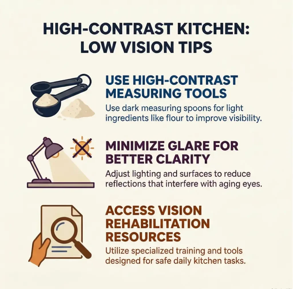
Infographic: The 4-Part Filter for a Low-Vision-Friendly Measuring Spoon Set
Large, bold, plain labels you can identify quickly without tilting the handle into a spotlight.
Finishes that do not wash out contrast under overhead lights, daylight, or steam.
Different handle lengths, bowl shapes, or textures so you are not relying on print alone.
A fixed home in the drawer, on a ring, or in a cup so retrieval stays predictable.
Best test: if the set passes under dim light with wet hands and a little kitchen chaos, it will usually pass on calmer days too.
- Test under real lighting, not ideal lighting
- Keep only sets with durable readable markings
- Let storage logic carry part of the accessibility load
Apply in 60 seconds: Write down your four-part filter before shopping so product photos cannot sweet-talk you into a bad choice.
FAQ
What colors are easiest to see on measuring spoons for low vision?
There is no universal winner, but strong light-dark contrast usually helps more than bright color by itself. Dark text on a light background or light text on a dark background tends to work better than decorative multicolor designs with weak label contrast. The key is readable labeling, not cheerful paint.
Are engraved measuring spoons better than printed ones?
Often, yes, especially when the engraving is deep enough to remain visible over time. But engraving is not automatically better if the handle is reflective and the letters are tiny. The real goal is durable legibility, whether achieved through engraving or high-quality permanent printing.
Do metal measuring spoons work well for low vision users?
They can, but polished reflective metal can create glare that cancels out readability. Matte or lower-glare finishes are often easier to use. If you prefer metal, look closely at the label size, the finish, and whether the spoon offers other cues besides the printed text.
Is a high-contrast measuring spoon set good for older adults with reduced vision?
Often yes, especially when the set also includes larger markings, easier grip, and predictable storage. Older adults may notice more problems with glare or lighting than they expect, so the best sets support visibility under ordinary home conditions, not just bright daylight.
What is better for low vision: color coding or tactile markings?
For many users, the best answer is both. Color can speed recognition, while tactile cues provide backup when lighting is poor or vision is inconsistent. If you must choose only one, pick the cue that matches your main problem. If labels vanish under glare, tactile support may outperform color alone.
How can I tell if the measurement labels will fade over time?
Look for close-up images, review photos after use, and language that specifies engraving or permanent markings rather than simple surface printing. If the product page avoids showing the labels clearly, that is a clue in itself. Durability should be visible before purchase, not discovered the hard way.
Are connected measuring spoon sets easier to use than loose spoons?
They can be, especially for users who lose utensils or prefer one predictable storage point. Loose spoons can be faster for some people if they live in a fixed tray and are easy to distinguish. The better system is the one that reduces your personal search time.
What size markings should I look for in a low-vision-friendly spoon set?
Look for markings that are readable at a glance under ordinary kitchen lighting, not only under bright direct light. Large, plain lettering and clear fractions matter more than an exact font measurement. If you need to tilt the spoon repeatedly to confirm the unit, the marking is too small or too weak in contrast.
Last reviewed: 2026-03.