
The Screen-Reading Relief Guide
The phone is often where small print goes to start a tiny rebellion. A pharmacy refill code, a banking confirmation, a grandchild’s photo caption, a calendar reminder: all of it can shrink into gray crumbs at the exact moment someone needs clarity.
The best phone font size settings for older adults with aging eyes are not simply “make everything huge.” That sounds helpful, then quietly hides buttons, breaks app layouts, and turns a simple text message into a hallway of giant words.
The better answer is more practical: increase font size one or two steps, pair it with display zoom only when needed, add bold text, reduce glare, and test the apps that matter most.
This guide uses a calm, real-world setup method shaped around iPhone, Android, accessibility basics, and eye-comfort habits. The goal is to make reading feel easier without making the phone feel unfamiliar.
The Quick Readable Phone Setup
Start with font size, not every accessibility setting at once. Move the text one step larger, test Messages and Settings, then add bold text if letters still look thin. Use display size or display zoom only after the text size feels close. The winning setup is readable, steady, and easy to reverse.
- Best first move: increase font size one step.
- Best second move: turn on bold text or high contrast.
- Best reality check: test banking, pharmacy, email, and phone dialer screens.
Table of Contents
Start Here: The “Readable, Not Huge” Phone Setup Rule
The right phone setup for aging eyes should pass a simple test: the text is easier to read, and the phone still behaves like itself. If larger letters create a scavenger hunt for the Send button, the setting has crossed from helpful into theatrical.
Older adults often need a little more size, a little more contrast, and a little less glare. That trio does more good than one heroic font-size leap. Think of it as tuning a piano rather than dragging it into the driveway and calling the job finished.
Why the biggest font is not always the best font
Maximum font size can be useful for some people with low vision, but it can also cause practical trouble. Buttons may move off-screen. Forms may wrap awkwardly. Confirmation messages may require extra scrolling. In some apps, the text becomes larger while the touch targets remain cramped, which is rude in the quiet way software can be rude.
Apple’s own guidance notes that making text too large can make it harder to tap buttons or use app functions. Google also notes that Android font-size settings may not apply to every app. That is why the best setup is tested, not guessed.
The sweet spot: larger text plus stable screen layout
For many older adults, the sweet spot is one or two steps above default font size, with bold text turned on. If the home screen, Settings, Messages, Contacts, and browser remain easy to navigate, the setup is probably close.
Display zoom, screen zoom, and magnification tools are still valuable. They simply belong later in the sequence, after basic text size has been adjusted.
The 30-second readability test before changing anything
Before adjusting settings, open three places: a text message, the phone’s Settings app, and one high-stakes app such as banking, pharmacy, insurance, or email. Ask the person to read a sentence, identify a button, and return to the home screen.
This little pre-test matters. It gives you a before-and-after comparison instead of the classic family tech ritual: change eight things, forget five of them, and everyone stares at the phone like it joined a witness protection program.
- Start one step above default.
- Test real apps, not just the settings preview.
- Avoid maximum size unless the person truly needs it.
Apply in 60 seconds: Open Messages and Settings, increase font size one step, and check whether buttons still fit.
Money Block: Readability Fit Checklist
Use this yes/no checklist before deciding the font size is “done.”
- Yes/No: Can the person read a text message without squinting?
- Yes/No: Can they still find Back, Send, Save, and Continue buttons?
- Yes/No: Can they read a banking or pharmacy confirmation screen?
- Yes/No: Does the screen feel less tiring after two minutes?
- Yes/No: Can they reverse the setting or describe what changed?
Neutral action line: If two or more answers are “No,” reduce font size one step or test bold text before adding display zoom.
Who This Is For, And Who Needs More Than Font Settings
This guide is for older adults who can use their phone but find reading tiring, thin, glare-heavy, or inconsistent. It is also for caregivers and family helpers who want to improve readability without accidentally redesigning a parent’s digital life during one Sunday visit.
Aging eyes often need more light, more contrast, and larger print. Presbyopia, cataracts, dry eye, macular changes, and glaucoma can all affect phone comfort in different ways. A setting can help, but it cannot diagnose the reason reading became harder.
Older adults who squint, zoom, or avoid phone tasks
Common signs include holding the phone farther away, pinching to zoom repeatedly, misreading short codes, avoiding email, or asking someone else to read pharmacy labels, appointment reminders, or insurance messages.
If the person also struggles with printed labels, mail, menus, or medicine instructions, phone settings are one part of a larger comfort system. Tools like reading labels aloud with a phone can help when text size alone is not enough.
Caregivers setting up a parent’s iPhone or Android
The best caregiver setup respects ownership. Ask what feels hard, change one thing, and let the person test it. A phone is not just a device. It is a pocket-sized room full of habits, photos, messages, maps, and tiny rituals. Moving everything around without permission can feel like rearranging someone’s kitchen in the dark.
Not for sudden vision loss, eye pain, or new visual distortion
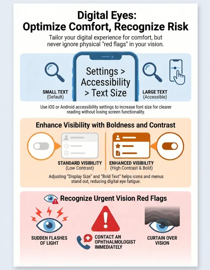
Settings are not the right first response to sudden blurry vision, flashes of light, a new shower of floaters, eye pain, double vision, or a curtain-like shadow. Those symptoms deserve prompt professional evaluation. The Mayo Clinic and American Academy of Ophthalmology both warn that sudden new floaters or flashes can signal urgent eye problems.
If symptoms changed quickly, do not spend the afternoon comparing font sliders. Make the call.
Font Size First: The Safest Setting To Adjust Before Everything Else
Font size is the cleanest first adjustment because it changes letters without necessarily changing the whole phone layout. It is also easier to reverse. That matters when the helper leaves and the phone owner wants to know what happened.
iPhone font size: what to change before touching display zoom
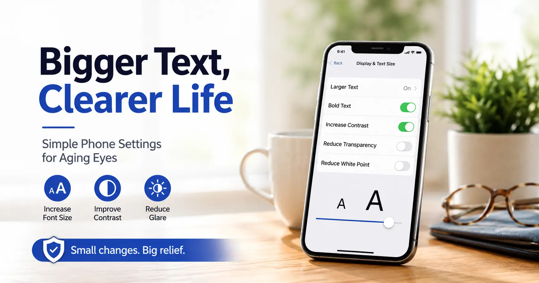
On iPhone, the usual path is Settings, Accessibility, Display & Text Size, then Larger Text. The slider lets you increase text size, and larger accessibility sizes can be enabled for people who need more. Apple also offers Bold Text, Increase Contrast, Reduce Transparency, and related display options in the same general area.
Start with the text slider. Test Messages, Mail, Contacts, Safari, and Calendar. If those feel easier but still a little thin, try Bold Text next.
Android font size: why phone brands label it differently
On Android, the exact menu path can vary by brand. Pixel, Samsung, Motorola, and other Android phones may use slightly different labels, but the common pattern is Settings, Accessibility, then Font size or Display size and text.
Google’s Android Accessibility Help explains that font size changes preferred text size, while display size changes the size of items on the screen. It also notes that some apps may not follow the font-size setting. That little warning explains many family tech mysteries.
Let’s be honest: “default” was not designed for tired evening eyes
Default phone settings are often designed to look clean in a store, not necessarily to help someone read a pharmacy code at 8:47 p.m. under a kitchen light that hums like an old refrigerator. A small font may look elegant. It may also be functionally stingy.
There is no medal for staying on default settings. The goal is not to prove the eyes are young. The goal is to read the message, tap the right button, and get on with dinner.
Money Block: Font Setting Decision Card
| Choose this | When it helps | Watch for |
|---|---|---|
| Font size +1 | Text feels small but layout is usable | Very little risk |
| Font size +2 | Messages and menus still need effort | Wrapped buttons in some apps |
| Bold text | Letters look thin or gray | Visual clutter in dense screens |
| Display size or zoom | Icons, buttons, and menus are too small | Reduced screen space |
Neutral action line: Pick the least aggressive setting that solves the reading problem in the apps used every day.
Display Size vs Font Size: The Tiny Difference That Causes Big Confusion
Font size and display size sound like twins. They are more like cousins who borrowed the same jacket. Font size changes the letters. Display size, display zoom, or screen zoom changes the whole interface: buttons, icons, menus, spacing, and sometimes the amount of information that fits on the screen.
Font size changes letters; display size changes the whole interface
If text is the main problem, start with font size. If icons, tabs, buttons, and keyboard keys are also hard to see, display size may help. The trade-off is space. Larger interface elements mean fewer items fit on the screen, which can create more scrolling.
When display zoom helps older adults more than larger text
Display zoom can be helpful when the person misses small tap targets, struggles to identify app icons, or has trouble reading labels under icons. It may also help people who have mild tremor or reduced finger precision because larger visual targets are easier to aim for.
If tremor is part of the picture, a phone setup may need to work alongside physical tools. For example, choosing between a handheld versus stand magnifier for tremor can make printed material easier while the phone handles digital text.
When display zoom makes buttons vanish into the furniture
Some apps are designed with tight layouts. When display zoom increases everything, the screen can become crowded. A Continue button may sink below the fold. A form field may hide behind the keyboard. A date picker may become strangely dramatic, as if choosing a birthday required a negotiation team.
That is why testing matters. Display zoom should make the phone calmer, not turn every task into a scrolling expedition.
Show me the nerdy details
Many modern apps use scalable text systems, but support is uneven. On iPhone, apps that support Dynamic Type respond better to system text-size changes. On Android, apps may respond differently depending on how developers built layouts and text styles. When text scales but containers, buttons, or menus do not adapt well, larger fonts can create clipping, overlap, wrapping, or hidden controls. The practical test is simple: after changing size, inspect the smallest high-stakes screens such as payment confirmation, prescription refill, login verification, and appointment scheduling.
Make letters larger first. Lowest layout risk.
Add weight when letters look thin or gray.
Use when icons and controls are also too small.
Check banking, pharmacy, email, and phone dialer.
The Hidden Pairing: Bigger Text Works Better With Bold Text
Sometimes the problem is not size. It is weight. Thin gray letters on a bright screen can look delicate in a product demo and exhausting in a grocery store parking lot. Bold text can improve readability without taking up as much space as another jump in font size.
Why bold text can reduce squinting without making screens messy
Bold text increases stroke thickness. That can help letters stand apart from the background, especially in menus, contact names, calendar events, and short labels. For many older adults, bold text plus moderate size is better than enormous regular-weight text.
It is a quiet upgrade, the cardigan of accessibility settings: not flashy, but suddenly everything feels less drafty.
Best use cases: messages, contacts, settings, and medication reminders
Bold text is especially useful in places where quick recognition matters. Contact names, message previews, alarms, medication reminders, and calendar alerts all benefit from stronger letter shapes.
For medication-related tasks, readability is part of safety. If someone manages multiple prescriptions, pair phone readability with a simple system such as a low-vision medication tracker or low-vision medication safety routine. Tiny text and medication instructions are not a charming duo.
When bold text becomes visual clutter
Bold text can make dense screens feel heavy. News apps, long emails, spreadsheets, and crowded portals may become harder to scan. If everything shouts, nothing speaks clearly.
Test bold text for two minutes. If the phone feels calmer, keep it. If the screen feels crowded, turn it off and use one more font-size step instead.
Don’t Do This: Common Font Size Mistakes That Make Phones Harder
Most phone readability mistakes come from good intentions wearing oversized boots. Someone wants to help, so they turn on every helpful-sounding setting at once. The phone becomes larger, brighter, louder, zoomier, and somehow less usable.
Mistake 1: maxing out font size immediately
Maximum font size can be necessary for some low-vision users, but it should not be the automatic first move. Start smaller. Move gradually. Let the person test each step.
The best setting is not the biggest setting. It is the setting the person will actually use without dread.
Mistake 2: ignoring app-specific text settings
Some apps have their own text-size controls. Browsers, e-reader apps, email apps, and messaging apps may offer separate settings. If system text size helps everywhere except one app, look inside that app before changing the whole phone again.
Safari and Chrome also allow page zoom or text scaling in certain contexts. For reading websites, browser settings may matter as much as phone settings.
Mistake 3: fixing text but leaving brightness painfully high
Large text on a harsh bright screen can still feel awful. Glare, white backgrounds, reflective protectors, and overhead lights can make reading uncomfortable even when letters are large.
If glare is a major problem, an anti-glare screen protector may help more than another font-size increase. For iPhone users who find the screen too bright even at low brightness, making an iPhone screen dimmer than minimum can be part of a gentler setup.
Mistake 4: changing too many settings in one sitting
Change one setting, test it, then decide. This protects independence. It also prevents the helper from becoming the only person who understands the phone, which is not help. That is a tiny monarchy with charging cables.
- Do not start at maximum size.
- Check app-specific settings before changing the whole phone.
- Control brightness and glare alongside text size.
Apply in 60 seconds: Write down the original setting before adjusting it, then test one daily task.
App-by-App Reality: Why Messages Look Better But Banking Still Feels Tiny
Phone settings are not magic dust. Messages may look perfect while a banking app still uses tiny confirmation text. A pharmacy app may enlarge the menu but keep the refill code small. A travel app may respect text size until the boarding pass appears, then suddenly become a postage stamp with ambition.
Some apps obey system font settings, some only pretend to
Good apps respect system accessibility settings. Others partially respond. Some barely respond at all. The difference often comes from app design choices, not anything the phone owner did wrong.
This is why the final test should use real tasks. Reading a sample paragraph in Settings is helpful, but it does not prove the Medicare portal, pharmacy login, or bank transfer screen will cooperate.
Banking, pharmacy, travel, and insurance apps need extra testing
High-stakes apps deserve special attention because mistakes can cost time, money, or safety. Test one login screen, one confirmation screen, and one saved document or message.
For low-vision users who rely on pharmacies, a written script can make support calls easier. A practical low-vision pharmacy help script can pair well with larger phone text, especially when refill instructions are hard to read.
Here’s what no one tells you: the hardest text is often the confirmation screen
The biggest risk is not always the menu. It is the final screen: “Confirm payment,” “Approve refill,” “Verify appointment,” “Submit request.” Those screens often pack small text into tight boxes because designers assume users are moving quickly.
Slow down at confirmation screens. Increase text or use screen reading tools when needed. A wrong tap can create more work than a careful pause.
Short Story: The Banking Button That Disappeared
Elaine’s son made her phone text enormous after she complained that her banking app looked “printed by ants.” At first, she loved it. Her text messages looked glorious, bold enough to march across the room. Then she tried to pay a utility bill. The amount was readable, the account name was readable, and the confirmation button had politely wandered below the screen where she did not know to scroll.
She called her son, half amused and half ready to mail paper checks forever. They reduced the font one step, turned on bold text, and tested the payment screen again. This time, everything fit. The lesson was simple: readability is not a contest for the largest letters. It is a working agreement between text, buttons, and the person holding the phone.
Money Block: High-Stakes App Test List
Before calling the setup finished, test the screens most likely to cause trouble.
- Banking: login, balance, transfer confirmation, bill pay confirmation.
- Pharmacy: refill request, dosage message, pickup notification.
- Health portal: appointment, lab result preview, message center.
- Email: subject lines, message body, reply button.
- Phone: contacts, recent calls, keypad, voicemail.
Neutral action line: If any confirmation screen becomes harder to use, reduce display size before reducing font size.
iPhone Setup Path: A Calm Sequence For Aging Eyes
The iPhone has strong readability tools, but the order matters. Start with text. Add weight. Test zoom last. Keep the home screen familiar unless the owner asks for a larger layout.
Step 1: increase text size gradually
Open Settings, then Accessibility, then Display & Text Size, then Larger Text. Move the slider one step. Test Messages, Settings, and Contacts.
If the reader says, “That’s better, but still thin,” do not immediately jump three sizes. Try bold text first.
Step 2: turn on bold text if reading still feels thin
Bold Text is in the Display & Text Size area. Turn it on and give the phone a moment to apply it. Ask the person to read a message preview and a contact name.
If the letters look steadier without crowding the screen, keep it. If it feels visually heavy, turn it off and increase text size another step instead.
Step 3: test display zoom only after font size feels close
Display Zoom can make icons and interface elements larger. It may help if the person struggles with small buttons, not just text. But it can reduce the amount of screen space, so test the home screen, phone dialer, Safari, Mail, and Calendar after enabling it.
For people who often use the camera as a reading helper, iPhone tools can go beyond font size. The iPhone Back Tap Magnifier shortcut can make labels, receipts, and menus easier to inspect without digging through menus.
Step 4: check Messages, Mail, Contacts, Safari, and Calendar
These apps shape daily confidence. If they work well, the phone feels friendlier immediately. Then test one app that matters for money or health.
For receipt reading or small print, phone camera tools may help too. A guide to iPhone receipt reading settings can support tasks where app text is only half the battle.
- Use Larger Text before Display Zoom.
- Test Apple’s everyday apps first.
- Check one money or health app before stopping.
Apply in 60 seconds: Change Larger Text one step and ask the person to read a recent message aloud.
Android Setup Path: A Practical Route Through Different Menus
Android phones vary, but the principle is steady: adjust font size first, then display size, then contrast. Pixel, Samsung, and other phones may use different menu names, so search within Settings if the path is not obvious.
Step 1: adjust font size before screen zoom
Open Settings and search for “Font size.” Move the slider one step larger. Test Google Messages, Gmail, Chrome, and the phone dialer.
Some Android phones combine font and display controls under “Display size and text.” Others place them under Accessibility. Do not worry if the labels differ. The idea is the same.
Step 2: test display size on home screen and settings pages
If icons, menus, and touch targets are still hard to see, increase display size. Then check whether buttons still fit. Display size can make the phone feel easier, but it can also make dense screens feel crowded.
Step 3: use high-contrast text where available
Some Android devices offer high-contrast text or color correction tools. Try these carefully. Contrast can make letters clearer, but too much contrast can feel harsh for glare-sensitive eyes.
If white screens bother the user, compare display comfort with lighting changes and screen dimming. A guide to Reduce White Point versus Night Shift can help iPhone users think through brightness and warmth, and the same comfort logic applies across devices.
Step 4: check Google Messages, Gmail, Chrome, and phone dialer
The phone dialer matters more than people admit. If someone cannot quickly read recent calls or tap the right contact, the phone becomes less safe. Test emergency contacts too, especially for people with low vision, dizziness, or fall risk.
Beyond Bigger Text: The Settings That Protect Reading Comfort
Bigger text is only one ingredient. Reading comfort also depends on contrast, glare, brightness, motion, screen warmth, and how long someone spends looking at the display.
Increase contrast so letters stop blending into the background
Low contrast can make letters look washed out. On iPhone, Increase Contrast and Reduce Transparency can help some users. On Android, contrast options vary by device.
Contrast matters off the phone too. For central vision loss, a thoughtful reading lamp position can reduce strain during paper reading, while phone contrast settings support screen reading.
Reduce motion if scrolling makes reading feel slippery
Some people feel unsettled by animations, parallax effects, or fast scrolling. Reducing motion can make the phone feel less slippery. It will not enlarge text, but it may reduce visual fatigue.
Use night shift, blue-light filters, or warmer tones carefully
Warmer screen tones may feel easier in the evening, but they can also reduce color accuracy and contrast. If the person has trouble distinguishing buttons, warnings, or color-coded labels, test carefully.
For glare-sensitive users, lighting and surface reflections often matter as much as color temperature. Articles on window film for glare and TV glare reduction can help create a more comfortable room, not just a more comfortable phone.
Keep brightness adaptive, but not bossy
Auto-brightness can help, but it sometimes overreacts. A screen that suddenly blasts bright in a dark room can feel like a tiny lighthouse with personal boundaries issues.
Set brightness where reading feels comfortable. If auto-brightness keeps fighting the user, adjust it or turn it off after discussing the trade-off.
Money Block: Comfort Tier Map
| Tier | Adjustment | Best for |
|---|---|---|
| Tier 1 | Font size +1 | Mild squinting |
| Tier 2 | Font size + bold text | Thin or gray-looking letters |
| Tier 3 | Display size or zoom | Small icons and controls |
| Tier 4 | Contrast and glare control | Washed-out text or light sensitivity |
| Tier 5 | Magnifier, voice tools, low-vision support | Persistent reading difficulty |
Neutral action line: Move up one tier at a time and stop when daily tasks become easier without crowding the screen.
Caregiver Setup: How To Help Without Taking Over The Phone
Helping someone change phone settings is partly technical and partly emotional. The person may feel embarrassed, annoyed, relieved, or suspicious that “the phone changed again.” The helper’s job is not to win the settings menu. It is to preserve confidence.
Ask what feels hard before changing settings
Start with a practical question: “Which screen gives you the most trouble?” The answer may not be text messages. It may be voicemail, pharmacy codes, weather alerts, calendar invites, or the little keyboard that appears when typing passwords.
For doctor visits, a phone can support independence when paired with a simple system. A doctor appointment note-taking system can help older adults capture questions and instructions without relying entirely on memory.
Change one setting, then let the person test it
Do not grab the phone and perform a silent settings ballet. Explain the change, make it, and hand the phone back. Let the owner read, tap, scroll, and react.
The most important feedback is not “looks bigger.” It is “I can use it.”
Write down the final setup so it can be restored later
Write a small note: font size level, bold text on or off, display zoom on or off, brightness preference, and any app-specific text settings. Store it in Notes, print it, or add it to a caregiver binder.
If the person uses tactile labels or home organization tools, this kind of written setup record fits naturally with systems like bump dots versus tactile tape for everyday devices.
Keep emergency contacts and medical apps easy to find
After readability is improved, check the home screen. Phone, Messages, Contacts, medical apps, pharmacy apps, and emergency information should be easy to locate. If the user has low vision, consider pairing phone settings with a wallet card emergency info template so critical details are not trapped behind a locked screen.
- Ask what screen is hardest.
- Change one setting at a time.
- Record the final setup for future fixes.
Apply in 60 seconds: Ask the owner to choose one problem app before opening Settings.
When Bigger Fonts Are A Clue, Not The Cure
There is a quiet line between “my phone text is too small” and “my vision is changing.” Phone settings can improve comfort, but they should not become a curtain over symptoms that need care.
Reading glasses may solve what settings cannot
If the phone is hard to read but distance vision seems fine, reading glasses or an updated prescription may help. Many adults experience presbyopia with age, which makes near focus harder. A phone setting can reduce friction, but proper correction may make every close task easier.
Cataracts, glaucoma, macular degeneration, and dry eye can change phone comfort
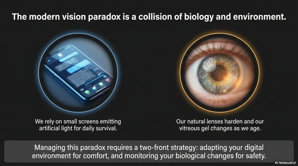
Cataracts may increase glare and reduce contrast. Glaucoma can affect visual field. Macular degeneration can make central reading harder. Dry eye can make vision fluctuate, especially during long screen sessions.
If glare, distortion, blind spots, or fatigue are persistent, explore practical home supports and clinical guidance. For example, scotoma reading contrast, eccentric viewing practice, and low-vision fatigue strategies may be relevant when standard phone adjustments are not enough.
When to seek help from an eye care professional
Seek prompt eye care for sudden blurry vision, new floaters, flashes of light, eye pain, double vision, sudden distortion, or a shadow across vision. For slower changes, schedule an eye exam if phone reading keeps getting harder despite reasonable settings, better lighting, and updated glasses.
For older adults, routine eye exams can detect treatable conditions before daily life shrinks around them. A practical annual eye exam checklist for seniors can make appointments more productive.

FAQ
What is the best font size for older adults on iPhone?
The best iPhone font size for many older adults is one or two steps above default, then tested in Messages, Mail, Contacts, Safari, Calendar, and one high-stakes app. If letters still look thin, try Bold Text before jumping to the largest size.
What is the best font size for older adults on Android?
On Android, start by increasing Font size one step in Accessibility or Display settings. Then test Google Messages, Gmail, Chrome, and the phone dialer. Because Android brands vary, use the Settings search bar for “Font size” or “Display size.”
Is bigger text always better for aging eyes?
No. Bigger text can help, but very large text can hide buttons, crowd forms, and make confirmation screens harder to use. The best setting balances readable letters with a stable layout.
Should older adults use display zoom or font size first?
Use font size first if the main problem is reading letters. Use display zoom or display size later if icons, buttons, menus, and touch targets are also hard to see. Testing order matters because display zoom changes more of the interface.
Why do some apps still have tiny text after changing settings?
Some apps do not fully follow system text-size settings. Banking, pharmacy, travel, and insurance apps are common trouble spots. Check app-specific settings, browser zoom, or built-in accessibility tools if one app remains difficult.
Does dark mode help older adults read better?
Sometimes. Dark mode can reduce glare for some people, but it can also make text harder for others, especially if contrast is poor or the person has certain vision conditions. Test dark mode in real reading situations rather than assuming it is better.
Can bold text make a phone easier to read?
Yes. Bold text can make letters appear stronger without using as much screen space as another font-size increase. It works especially well for messages, contacts, settings, reminders, and short labels.
What phone settings help seniors with low vision?
Helpful settings may include larger text, bold text, display size, high contrast, reduced transparency, reduced motion, magnifier tools, voice reading, and glare control. People with significant low vision may also benefit from occupational therapy, low-vision specialists, and task-specific tools.
Next Step: Run The Two-Minute Readability Tune-Up
The phone does not need a grand makeover. It needs a readable path through daily life. The smartest setup starts small, checks real apps, and respects the person holding the screen.
Open Messages, Settings, and one banking or pharmacy app
Use these three places because they cover casual reading, system navigation, and high-stakes decisions. If all three improve, the change is meaningful. If only Messages improves, keep tuning.
Increase font size one step, then test again
Move the slider one step. Read a text message. Open Settings. Find a button. Check a confirmation screen. Then decide whether to add bold text or adjust display size.
Stop when reading feels easier without hiding buttons
This is the whole secret, plain as a kitchen table: stop at the point where the phone becomes easier, not louder. A good setting feels almost boring after a minute. That is the sign it belongs.
Within the next 15 minutes, choose one phone, one owner, and one problem app. Increase font size one step, turn on bold text only if needed, and test the app that matters most. That small adjustment can turn a tiny daily irritation into a calmer habit.
Last reviewed: 2026-05.